Showing posts with label book design. Show all posts

16 March 2024

“Historic Children’s Voices” Coming from American Antiquarian Society

The American Antiquarian Society in Worcester will launch a website on “Historic Children’s Voices, 1799-1899.”

Its introductory page explains: “The holdings to be digitized are not children’s literature, i.e., works created BY adults FOR children, but rather are direct testimony as well as imaginative works created BY children. As such, they constitute an archive of historical evidence not previously accessible.”

The materials to be digitized include diaries, letters, stories, poems, and the AAS’s “large amateur newspaper collection—most printed on home parlor presses.” There will be 15,000 pages of content in all.

Those presses were very popular in the late 1800s. When L. Frank Baum issued the Rose Lawn Home Journal and later self-published works on stamp collecting and chicken farming, he was among thousands of young people working their own small presses.

Accompanying the website, the AAS will host an in-person and online symposium on 2–3 May featuring panel discussions on “Authentic Children’s Voices,” “Archival Silences,” “Visual Culture of Children’s Production,” and “Hearing the Child’s Voice.”

On 5–9 August, the AAS will host an institute for K-12 teachers on the subject, with hands-on workshops using the collection and a field trip to Lowell National Historical Park.

24 December 2019

Life Lessons from the MGM Movie

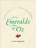
Emeralds of Oz: Life Lessons from Over the Rainbow is a short but not insubstantial riff on the MGM Wizard of Oz. The author, Peter Guzzardi, is a veteran book editor, but this is the first book published under his own name, several years in the making.

Emeralds of Oz is not based on the Oz mythos as a whole—just the famous movie. Guzzardi writes nostalgically about watching that film on television with his family but shares no fond memories of reading the Oz books as a child. He read a lot, but his taste leaned toward boys’ adventures. It takes over a dozen pages before Guzzardi even mentions L. Frank Baum, and there are only a couple of times when the book invokes parts of Baum’s story that didn’t make it into the movie.

Guzzardi isn’t just playing to the MGM movie’s larger contemporary fan base. That movie really defines his idea of Oz. At one point he recalls a difficult journey, noting he was about the same age as when Dorothy went to Oz. Context makes clear that he’s picturing the young adolescent Dorothy portrayed by Judy Garland, not the little girl drawn by W. W. Denslow.

The bulk of the book consists of lessons drawn from rewatching the MGM movie, rather like a sincere Mystery Science Theater 3000 viewing. A fair number of these homilies actually grow out of the vaudeville-style jokes mixed into the screenplay. There are longer meditations on the movie’s more explicit lessons, and of course a struggle at the end because of the screenplay’s ethical knots.

The “Emeralds of Wisdom” found in the movie tend toward pleasant reminders to keep doing what we normally do or know we should do, not deeper digs into the philosophical and ethical questions that the movie could raise. (Can one be a very good man while pretending to be a wizard?) The working title was All I Need to Know I Learned from the Wizard of Oz, with the implication that we knew it all from when we were young. Guzzardi drops mentions of the Kabbalah, mantras, Maslow’s hierarchy of needs, and other mainstays of modern self-help books. The more interesting commentary grows from his own life, however.

As an editor, Guzzardi’s specialty was crowd-pleasers, sometimes with fantastic results—Stephen Hawking’s A Brief History of Time, most notably. Emeralds of Oz grew out of that same commercial impulse. It’s designed as a gift, with glittery emerald endpapers, deckle edges, eye-catching interior design, and other hallmarks of the book as object. For people who like the movie and this sort of advice, it’s a fine package. But its strength comes from Guzzardi’s sincerity as he seeks guidance in the question, “What Would Dorothy Do?”

10 September 2019

Mid-Century Modern in the Emerald City

After the original publisher of The Wonderful Wizard of Oz went bankrupt, Bobbs-Merrill became the book’s one and only US publisher.

At first Bobbs-Merrill included W. W. Denslow’s illustrations, though not in the original ground-breaking multi-color design that integrated text and art. The company kept the book in print until the World War 2 paper shortages. As the war wound down, it looked for a way to reintroduce the title.

In 1944, Bobbs-Merrill commissioned entirely new art by Evelyn Copelman (1919-2003, also known as Evelyn Campbell and Evelyn Copelman Baker). She created black-and-white art on scratchboard and painted several color plates.

The title page of that new edition stated that Copelman’s art was “adapted from the famous pictures by W. W. Denslow.” Obviously those pictures weren’t the only source. Copelman’s Dorothy, Scarecrow, and Wizard are clearly designed like the characters in the 1939 MGM movie, and her Tin Woodman and Cowardly Lion look like hybrids.

Bobbs-Merrill had asked Copelman to create an edition that matched the movie, but it didn’t have rights to the MGM designs. It did own the rights to Denslow’s art, however. The title page claim apparently provided legal cover.

In 1949 MGM re-released its movie into cinemas. Not coincidentally, Bobbs-Merrill gave the book a new push. Copelman reworked her line art and added more plates.

With the book still under copyright, Bobbs-Merrill was the exclusive producer of new copies of The Wizard of Oz. Thus, for over a decade in the middle of the century, Evelyn Copelman’s artwork introduced young readers to Oz.

Then the copyright lapsed in 1956. Reilly and Lee, the publisher of the rest of the Oz series, created an edition with black-and-white reproductions of Denslow’s art in a trim that matched its other titles. Other publishers commissioned their own illustrations. As the years passed, Copelman’s art disappeared from bookstore shelves.

Archive.org, working with the San Francisco and other public library systems, has made a digital copy of a Copelman edition available for borrowing. This is a 1994 Illustrated Junior Library edition, with cover artwork by Michael Zimmer but Copelman’s line art and five plates inside. It’s worth a virtual thumb-through, especially if that’s the edition you remember.

23 August 2018

Another Job Lost to Advancing Technology

From the Los Angeles Review of Books’s interview with Holly Tommasino, who created the hand-lettered journal entries in the original Baby-Sitters Club books. Tommasino was first an in-house designer for Scholastic, then a freelancer, then out of a job:
What was your role with The Baby-Sitters Club?

When all the design elements for the series were initially coming together, I created the handwriting styles for each character. And then I handwrote all portions of the manuscripts that were flagged by editorial — usually BSC journal entries, but also the postcards and letters and lists that popped up from time to time. I continued to produce the handwriting even after I left Scholastic.

What happened then?

I worked as a freelancer until 1996. At that point, due to advances in technology, I was sent font forms by a company. They asked me to letter each character’s handwriting in spaces on the form. And these forms were long! They had me do a few different y’s and then write a w attached to a y or a t attached to a y. They didn’t want the handwriting samples to look totally uniform, so it was quite an extensive process. After that, the freelance work stopped, but the books continued.
The 1986-2000 series has of course been rejuvenated with comics adaptations by Raina Telgemeier and then Gale Galligan. Those editions appear to be the bestsellers today.

In contrast, 2010 Scholastic reissued two early titles, evidently retaining or reproducing the cursive writing, but those books didn’t spark a new craze among the children of the original readers. The latest reissue is clearly for the nostalgia market. Was the cursive handwriting, which kids today are said not to be able to read, to blame?

30 September 2017

Pocketing the Bad Machinery Series

I heartily enjoy John Allison’s Bad Machinery graphic novels, following a team of teen detectives in the fictional mid-sized city of Tackleford, England.

Allison created these stories first as webcomics, and they retain that form’s rhythm. Each page has a payoff of its own. The narrative can jerk ahead in time from one to the next. That serves the sprawling stories well since they’re as much about upper-school personalities and the British class system as that term’s mystery.

Allison drew his pages to the dimensions of a computer screen, about half again as wide as they are tall. As a result, the first print editions were more than a foot wide, floppy and hard to shelve. I loved the stories, but I didn’t have space for them all.

Oni Press has started to reissue the Bad Machinery books in “Pocket Editions,” a shade less than nine inches wide. That makes them the same size as the seventh and latest volume, The Case of the Forked Road, which Allison created in a more traditional vertical format for print.

I was worried, however, that my aging eyes wouldn’t be able to read the balloons on the smaller pages. But I took a chance on the first two volumes, The Case of the Team Spirit and The Case of the Good Boy, and my eyes worked fine. While I still don’t see as many commas of direct address as I’d like, Allison’s verbal wit comes through just as well as his visuals.

(In addition to the seven Bad Machinery novels, one of the Tackleford teens, Charlotte, crosses over into another of Allison’s series in Murder, She Writes, set in the cutthroat world of children’s publishing. It’s a fine introduction to Allison’s work.)

21 November 2015

The G-Man Retcon

Chris Giarrusso created his comic G-Man in bits and pieces: short stories, backup features, comic strips, half-parodies of other superhero sagas.

As the Image Comics webpage for the first volume says, G-Man: Learning to Fly “Collects the origin of G-Man and Great Man, the G-Man Christmas Story, Mean Brother/Idiot Brother adventures, and a complete collection of the original G-Man comic strips that started it all.”

Because that book is a grab bag, its pieces come in different sizes and lengths. Some were obviously designed for different sizes, and they have different storytelling rhythms. It’s still a fun read. We see Mikey and his big brother Dave gaining their powers from the family’s magic cape. Several of their (male) friends already have superpowers, with no explanation. It’s just a fact of life at their school.

Two G-Man miniseries/graphic novels followed, each with a wider focus showing more of the brothers’ universe. There’s more explanation of the magic cape in Cape Crisis, the best of the volumes. We meet the Color Guardians, female classmates who are one unfathomable mass to the boys, and the Suntroopers and Thunderfriends teams of grown-up heroes.

The latest G-Man installment comes from another publisher and takes another form: an illustrated middle-grade novel written as a daily journal, like Jeff Kinney’s Diary of a Wimpy Kid and Rachel Renee Russell’s Dork Diaries. Most of the pictures, supposedly by young Mikey, are in a simpler, line-art style which Giarrusso is also using for a weekly online comic strip. There are occasional full-color pin-up pages as well, in the guise of photos taped into the journal.

In addition, The G-Man Super Journal: Awesome Origins is a prequel, going back not only to before Mikey gained his powers but before all his friends had theirs. It folds in characters who first appeared in the graphic novels, such as the Color Guardians, Cool Wraps, and that annoying kid Tony. And it offers explanations for how all the kids got their powers. Actually, several explanations for each: alien birth, divine descent, freak accidents, top-secret website in Japan, and so on. As a result, G-Man: Super Journal is now the most complete introduction to the G brothers’ saga.

Whereas Learning to Fly’s big scenes are mostly at home and Cape Crisis on the playground, Awesome Origins is driven by events at school: Mikey’s struggle with a teacher who doesn’t like superheroes, tests to join the Suntroopers, and most especially that annoying kid Tony. The illustrations have a deadpan sarcasm that (along with the superpowers, of course) distinguishes this series from its diaristic forebears.

I still prefer the G-Man comics, but a mostly-new G-Man story in illustrated prose form is still a lot of fun. And its publisher’s wider distribution might bring new readers to all the volumes.

10 November 2015

The Emerald City in the Gutter

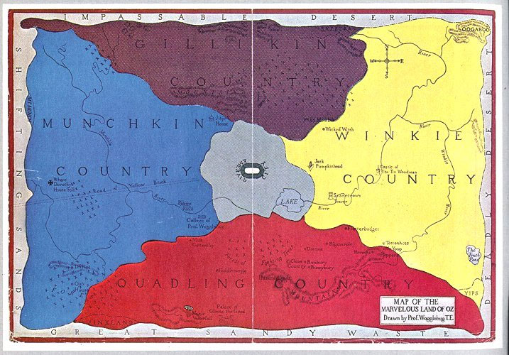
Here’s another view of the map of Oz as issued by Reilly & Lee. Can you spot two big differences between it and the map shown last week, from David Maxine’s Hungry Tiger Talk blog?

One difference is that this is a later reprinting of the map that first appeared in Tik-Tok of Oz (1914). As David discussed, the compass rose originally put east on the left and west on the right, contrary to the usual approach. At some point in subsequent decades, the publisher changed the labels so “E” was on the right as usual.

Of course, that change also meant the map showed the Winkie Country to be east of the Emerald City instead of west, as all of L. Frank Baum’s books described it. But his successors Ruth Plumly Thompson and John R. Neill started to state that the Winkies lived to the east, conforming to the reprinted map and its conventional compass.

Another difference is that the version of the map above is a broadside while the image David showed was scanned from an early copy of Tik-Tok of Oz, where it served as the endpapers. And that highlights a feature I find really interesting from the perspective of book design.

This map had to look good both as endpapers, when a thin strip of its middle would be concealed in the book’s binding, and as a poster or broadside lying flat. The artist accomplished that by making sure that almost no sites and no lettering fell within that central strip. Some large labels bridge the strip, such as the word “GILLIKIN” in the top quadrant—but there’s a little extra space between the second I and the K that could disappear into the binding.

The Emerald City was a challenge because Baum was clear that it’s in the middle of Oz—and thus in the middle of this map. How to keep it from vanishing into the gutter? The artist’s solution was to depict the city as a horizontal oval, with the word “Emerald” on the left and “City” on the right. (David Hulan once pointed out that the oval approximates an “emerald cut” in jewelry.) Then when the central strip of the map is hidden (look back on David’s map), the city appears as a circle and its full name remains legible.

On the accompanying map of Oz and surrounding countries, shown below, the Emerald City is safely off-center. And it appears as a circle, as it would appear in the endpapers form of the Oz map. This time the artist tried to keep other labels and locations out of the central strip. In the image from Wikipedia below, you can see where that got tough.

22 March 2014

Dummy Type

Book designers, especially those packaging books that haven’t been written yet, often use “dummy type” to show how words will look on the page. Back when I was in publishing, American designers tended to use English text, but British designers used a passage that began:

Lorem ipsum dolor sit amet, consectetur adipiscing elit. Nam hendrerit nisi sed sollicitudin pellentesque. Nunc posuere purus rhoncus pulvinar aliquam. Ut aliquet tristique nisl vitae volutpat. Nulla aliquet porttitor venenatis.
I remember my first department head saying how when she’d started in the business she’d always been impressed by design samples from Britain because they looked so classy.

But it turns out that this isn’t real Latin—it’s a jumble of Latin-like words and phrases reminiscent of Cicero and established in the 1600s. The London Review of Books just published a Cambridge graduate student’s translation of the whole paragraph, designed to recreate the feeling of reading the original as if it were meaningful. It begins:
Rrow itself, let it be sorrow; let him love it; let him pursue it, ishing for its acquisitiendum. Because he will ab hold, uniess but through concer, and also of those who resist. Now a pure snore disturbeded sum dust. He ejjnoyes, in order that somewon, also with a severe one, unless of life. May a cusstums offficer somewon nothing of a poison-filled.
Equally enjoyable, the British scholar who produced that prose is named Jaspreet Singh Boparai, showing how bad Latin and bad English both became worldwide languages.

24 November 2013

Counting All Covers

In preparation for the “Celebrating 75 Years of Dick Grayson” anniversary, I got a question about the assertion that Robin was on the cover of more DC comic books of the 1940s than any other costumed hero.

A commenter told me that fact soon after I started the weekly Robin, saying it was a good way to win bar bets. (Not at any sort of bar I know, but okay.) A quick check of titles confirmed the fact, but I decided to do a more careful accounting.

In the 1940s, Superman appeared on the covers of:
  • Action Comics, #20-139 (120 comic books).
  • Superman, #3-61 (59).
  • World’s Fair, #1, and World’s Finest, #2-42 (42).
  • All-Star Comics, #36 (1).
  • Superman’s Christmas Adventure for 1940 and 1944 (2).
  • Superboy, #1 (1).
Total: 225 comic books.

Batman appeared on:
  • Detective Comics, #35-154 (120).
  • Batman, #1-56 (56).
  • World’s Fair, #1, and World’s Finest, #2-42 (42).
  • All-Star Comics, #36 (1).
  • Star Spangled Comics, #88-94 (7).
Total: 225 comic books.

Robin appeared on:
  • Detective Comics, #38-152 and #154 (116).
  • Batman, #1-46 and #48-56 (55).
  • World’s Fair, #1, and World’s Finest, #2-42 (42).
  • Star Spangled Comics, #65-95 (31).
Total: 244 comic books.

I might have missed some of the more obscure guest appearances, but Superman and Batman still have a lot of ground to cover before they catch up to the Boy Wonder. His usually-solo run on Star Spangled at the end of the decade put him in the lead.

Now I can’t claim that Robin was more prominent or popular than Superman or Batman in the 1940s. On many of those covers he appears subordinate to Batman, as a background assistant, observer, or boy hostage in need of rescuing. When Superman and Batman guest-starred on All-Star Comics with the Justice Society, Robin didn’t come along. When sales of Star Spangled featuring Robin began to slip, the editor added Batman to the cover before finally replacing the Boy Wonder with Tomahawk.

Furthermore, if we count the appearances of Superboy on the covers of More Fun Comics, #104-106; Adventure Comics, #103-147; and Superboy, #2-5 (52 more comic books in all) in Superman’s column, then he’s the clear leader. Superman was undoubtedly DC’s flagship property, with a national comic strip, radio show, movies, and novelizations. Starting in 1942 the company even included the name of Superman in its logo. But the US courts have decided that Superboy is a separate legal property.

So those are the numbers.

04 November 2013

“Add a Manicule in the Margin,” Tom Said Pointedly.

I read a couple of interesting extracts from Keith Houston’s new book on typography, Shady Characters: The Secret Life of Punctuation, Symbols, and Other Typographical Marks, including an article on the history of the “manicule”: the pointing hand drawing readers’ attention to a particular line or passage.

Created by medieval scribes, that symbol was reproduced by early printers. The presence of the pointing hand in many early sets of lead type justifies Houston’s decision to treat it as a form of standard punctuation. Web-browser programmers adapted or reinvented it for designating hyperlinks as one moves a computer cursor over that part of the screen.

But what’s the standard term for the pointing hand? Houston uses the Latinate word “manicule,” which carries an air of antiquity. However, Michael Quinion reports in World Wide Words:
The history of manicule in English is a bit of a mystery. It isn’t recorded in the recent review of the letter M in the Oxford English Dictionary, nor is it in any other dictionary I’ve been able to consult. And I’ve found no example in print before 1996. However, William Sherman wrote in a detailed study of the sign in 2005 that he had been told it had become the standard term among scholars who study ancient manuscripts. I wonder if his informant actually had manicula in mind, either the Latin word or the identical Italian one; this has certainly been used in English-language works on manuscripts. Alteration of the final letter to turn it into an English equivalent seems to have happened very recently.
William H. Sherman’s essay was titled “Toward a History of the Manicule” (PDF download), and it became part of his 2009 book Used Books: Marking Readers in Renaissance England. Sherman noted a host of terms for the symbol:
I have now found 15 other names for what I prefer to follow the manuscript specialists in calling the manicule: hand, pointing hand, hand director, pointer, digit, fist, mutton fist, bishop’s fist, index, indicationum, indicator, indicule, maniple, and pilcrow. The last three terms are outright mistakes: indicule and maniple are mishearings, misrememberings, or conflations of similar words.
(Houston’s book also has a long discussion of the pilcrow, which is this: ¶.)

The official, and long-established, English term for the pointing hand is “index.” However, we use that word for other things in designing books today, so perhaps we should adopt “manicule” and pretend it’s much older than what the evidence points to.

21 October 2013

Battling for Space

On Saturday a bunch of us were standing around the Million Year Picnic comics store looking at my newly purchased copy of Paul Pope’s Battling Boy, volume 1. (Okay, one of us was Jeff Smith.)

We were struck by the book’s size: 6 inches wide by 8.5 tall. That’s what publisher First Second has chosen as its “typical trim size.” (This spring the company tried 7 by 9 inches for the first time on a book for younger readers, more like a picture book.)

We weren’t convinced that size was ideal for Battling Boy. It’s an epic story of, basically, a godling come to Earth to fight huge monsters. Pope’s draftsmanship combines small details and messy chaos. Likewise, his lettering is too full of energy to be crisp. Those pages might have much more impact at a larger size.

But there is hope. According to this interview with Bleeding Cool, Pope and First Second are planning “a black and white oversized artists edition” for his 1990s THB comic, and:
We might even do this with Battling Boy depending on how the popularity is. My drawings are huge and a lot of the artists I meet in the industry give me the only complaint I’ve heard about Battling Boy which is that they wish it was black and white like THB where they can really see the line work.
Until then, maybe one quality that makes Battling Boy a comic for kids is that their eyes can get more out of it than us readers on the aging side.

21 August 2013

What Fell Out of 52 Pickup

It was a warm, clear day when I heard that crime novelist Elmore Leonard had died after well over eighty years and forty books. That news reminded me that I’d been meaning to write about the experience of recently reading one of his novels—52 Pickup, to be exact—in digital form.

Like many caper novelists, Leonard wrote lots of short scenes and jumped from one point of view to another as needed. When one of those shifts occurred within a chapter, his print publisher followed the usual format of leaving extra space between the end of one section and the start of another. If those blank areas wound up at the bottom or top of a typeset page, the publisher hauled out the simple • dingbat to alert readers to the otherwise hard-to-spot section break. 

Typesetting conventions for ebooks are different, however. Most notably, the standard ebook format follows most web pages (including this one) by putting an extra line space between paragraphs and not indenting the first line of each new paragraph. 

In converting 52 Pickup to its digital format, HarperCollins ebooks reformatted the paragraphs: no indent, extra space in between. But it also wiped out the extra spaces between one section and the next. If there was a dingbat on the printed page, the • also appeared in the digital form, but most shifts from one point of view and scene to another come with no such signal for readers. That meant Leonard’s transitions, originally smooth, were bumpy, requiring me to notice the shift, stop, and look back to confirm when it happened.

The copyright page of the 52 Pickup ebook says it was converted in 2002. I hope the process has grown more sophisticated since, but then I’d hope it would have been applied to older books. It’s an easy fix, and Leonard and his readers deserve better. 

06 August 2013

Why Thompson Oz Books Smell a Little Like Vanilla

Back in 2009 I wrote fondly about the smell of Ruth Plumly Thompson’s Oz books, as originally published by Reilly & Lee in the 1920s and ’30s. Lots of American books of that era shared the same perfume, though perhaps not as strongly, given that publisher’s low budgets.

This summer the Smithsonian blog noted an article from the International League of Antiquarian Booksellers on the chemistry of that smell:
Scientists say that “old book smell” is more than just mustiness; it contains hints of grass and vanilla. That’s because all the compounds used to make the book release distinctive odors as they break down. For example, lignin, which is present in all wood-based paper, is closely related to vanillin. As it breaks down, the lignin grants old books that faint vanilla scent.

It’s even possible to approximate the age of a book based on its smell. Chemists have identified 15 substances often present in books (known as VOC’s) that degrade (and therefore emit a gas) at a predictable rate.
The abstract of the underlying scientific paper, published in 2009, goes into more detail:
The main volatile degradation products of paper, constituting the particular “smell of old books”, were determined using headspace analysis after a 24 h predegradation procedure. Using supervised and unsupervised methods of multivariate data analysis, we were able to quantitatively correlate volatile degradation products with properties important for the preservation of historic paper: rosin, lignin and carbonyl group content, degree of polymerization of cellulose, and paper acidity.
Those scientists, some working with the Centre for Sustainable Heritage in Britain, appear to have been most interested in the preservation and dating of books. But I can also imagine interest in their findings from people who wish to create books as luxury items. What could be more luxurious than a book that smells wonderfully old but is actually in great shape?

11 June 2013

Are Those Gargoyles? Is That a Mangaboo Sun?

From Flavorwire’s roundup of “Twenty Embarrassingly Bad Book Covers for Classic Novels”:

Some of the other covers on this list are simply out of fashion, or designed for other cultures. But a lot reflect the underside of digital publishing: outfits slapping any old art onto a public-domain text in order to squeeze a few dollars out of some bargain-hunting reader.

(Hat tip to Gili Bar-Hillel, whose Hebrew translation of The Marvelous Land of Oz will have a much more traditional John R. Neill image on the cover.)

18 November 2012

A Sidekick in the Pants

Sidekicks has a mighty “tween”-looking cover for a book that starts out with a boner.

In fact, teen-sidekick-getting-an-erection was the starting-point for novelist Jack D. Ferraiolo, as he explained on his blog:
I was a full-fledged Batman freak... and being that this was the early eighties (and the Batman comics from the 70s were still pretty available), the DC writers/artists were continuing the process of aging Robin up. I remember…looking at a comic of a late teen/early 20’s Robin and thinking, “Man, he should really cover up.” Here he is fighting hardened criminals – thugs, thieves, murderers – and he's wearing the tiniest pair of green jockey shorts imaginable. And no one mentions it?  I mean, not one street tough has something to say about Robin’s itty-bitty bikini bottoms? Especially with all those high kicks he was throwing around?
Actually, Robin’s friends had been calling him “Shortpants” for years by then. Marv Wolfman and George Pérez acknowledged the oddity of an eighteen-year-old in trunks as they discussed the early New Teen Titans. Mention of Dick Grayson’s bare legs was forbidden only for villains and, of course, Bruce Wayne.

Then came Frank Miller’s The Dark Knight Returns and more emphasis on realism/grittiness in superhero comics. In 2007, even DC addressed the erection question in Nightwing Annual, #2, which shows a late-teens Robin wishing for a longer cape and a minute to compose himself after getting too close to Batgirl.

Ferraiolo’s prose novel examines the plight of the adolescent sidekick through the voice of Bright Boy, ward of Phantom Justice. Their relationship is obviously modeled on that of Batman and Robin. As a dark-caped crimefighter, Phantom Justice says, “Good soldier”; he talks about “embracing the night” but can’t connect with anyone emotionally. There’s even an Alfred figure, a butler and voice of common sense.

However, in this world some people have been born with extra strength, speed, and/or intelligence. Phantom Justice and Bright Boy aren’t “badass normal” like Bruce Wayne and Dick Grayson. They’re “plus-plus.” And while their world has mad scientists with amazing inventions, there’s no Wonder Woman, Green Lantern, or Spectre to keep them from the top of the pecking order.

Reviewers obviously new to the superhero genre seem struck by the drastic reversals built into the plot, but those are common in adventure comics. What seems fresh to me is the realistic dialogue between the two adolescents feeling their way into a complicated love affair. On the downside, there are pages and pages of exposition.

I thought the biggest flaw in Sidekicks is that it ends with no “price of fantasy,” as Ellen Howard has termed it. At the start of the book, protagonist Scott feels like a nobody in high school and an embarrassment in the media—those are the costs of being a superpowered hero. (In addition, Scott’s parents died in an accident when he was little, but—unlike the ache that drives the Harry Potter books, even though Harry never knew his parents—we don’t feel that loss.)

At the end of Sidekicks [and that means SPOILERS AHEAD], Scott has solved the problems that bothered him at the start. He’s got a girlfriend, and pals, and cooler clothes, and public adultation, and freakin’ superpowers. For a while it looks like he has to pay a big price—he thinks two of the people he loves have died. But everyone turns out okay in various futuristic ways. The only person he really loses is someone whom he could never warm up to. Scott even manages to come out on top of the Oedipal conflict. It’s total wish-fulfillment with very little cost. [End of SPOILERS] But, as with the plot reversals, that probably won’t look like a flaw to teen readers not yet jaded about this genre.

Which brings me back to that cover. Amulet designer Chad Beckerman has shown how it went through a lot of changes, starting with a more realistic close-up of the main character (wearing braces, though I don’t think they’re mentioned in the book) before ultimately ending up with the art above. One intermediate version appears to the left. Twice, Beckerman writes, the design sketches had “too much crotch.” Yet “too much crotch” is exactly where the story starts.

Ferraiolo writes that he’s heard some criticism (from adults) and lost some library speaking gigs because people thought the novel was inappropriate for younger readers. I think the story’s quite appropriate for young adolescents. But the final cover’s cartoony art, and our culture’s assumption that all superhero stories are appropriate for kids, may suggest to some adults that this is a book for the middle grades.

01 October 2012

Baum and The Inland Printer

In the 1890s L. Frank Baum and his family moved to Chicago. He supported them as a freelance journalist and traveling salesman before parlaying his (brief and unsuccessful) experience as a shopkeeper in Aberdeen, South Dakota, into a job editing The Show Window.

In 1900 a Chicago-based trade magazine called The Inland Printer described Baum’s magazine in a squib that might have been supplied by the editor himself:
The Show Window, edited by L. Frank Baum, Chicago, is growing in interest from month to month. It is the official organ of the National Association of Window Trimmers of America, and contains an amount of information in this line to be had through no other source. Its half-tone illustrations of window display are worth more than the price of the publication. No storekeeper can afford to be without such a magazine. Its suggestions for Easter window decorations in the special Easter number are a treat to even the uninitiated.
By then Baum also had a second career as a children’s author. The Inland Printer noted that as well a few issues later:
The author of “Father Goose,” Mr. L. Frank Baum, has followed up his success with a remarkable juvenile entitled “A New Wonderland,” which is shortly to be issued by R. H. Russell, of New York. The reader is introduced to a marvelous and hitherto undiscovered country, peopled with the quaintest and merriest characters ever conceived to delight childish hearts. Frank Ver Beck has made many colored pictures for the new book, which bids fair to attain a popularity seldom accorded a juvenile publication.
That book is better known now under its reissue title, The Magical Monarch of Mo.

The Inland Printer didn’t take note of Baum’s other fantasy for children published in 1900, The Wonderful Wizard of Oz. However, that year’s volume did feature illustrations from W. W. Denslow, including the spooky “What’s the Use?” and three bookplates for the Wilkins family (two reproduced here via Google Books, and thus at less than optimum crispness).

So we know Baum was almost certainly reading The Inland Printer, and probably contributing to it. Which gives more significance to another item from the 1900 volume, a response to a reader’s proofreading inquiry on whether “climb up” was incorrect.

The Inland Printer’s editors said the word “up” was unnecessary and noted other common phrases that were equally redundant. The column added:
No dictionary except one even mentions the phrase “climb down,” and that one, the Funk & Wagnalls Standard, says that it is a United States colloquialism.
Thus, when Baum had Dorothy Gale pass on a lesson from her teacher not to say “climb down,” he was echoing advice he’d probably read a few years before.

TOMORROW: But did that usage bother Baum?

17 September 2012

Dark Horse Stumbles?

There’s only one reason that Dark House Books reprinted It Rhymes with Lust, script credited to Drake Waller and art to Matt Baker and Ray Osrin: it’s one of the first American attempts to publish a novel-length story in comics form. In other words, it’s a candidate for being the earliest graphic novel.

But you couldn’t tell that from the reprint. Nowhere on or inside the book is the date of its original publication in 1950; instead, the date on the copyright page in 2007, when Arnold Drake wrote the afterword. Nowhere does the book state that its author is a pseudonym for Drake and Leslie Waller. Indeed, Drake’s afterword doesn’t even make clear that what it calls “that first story” is the same volume one is holding.

Nowhere on or inside the book is a statement—even a single sell line—about the book’s significance in comics history. Instead, Dark Horse has carefully recreated the front and back covers of the original, with all the breathless, melodramatic text. In combination with a 2007 copyright date, the result looks like a parody or a nostalgic attempt to recreate comic noir.

Given that the market for stories about family dysfunction and corruption in post-WW2 mining towns is probably small, I think Dark Horse missed a bet in how they packaged this book. They found space on the copyright page for a list of publishing personnel (something one rarely sees from mainstream American publishers), yet nowhere said, “This book is a piece of comics history, and here’s why…”

I guess the company thought its target readers would find the book in comics shops and recognize its significance from Wikipedia. And some people might say those assumptions reflect a larger problem with the American comics industry.

23 July 2012

Gatsby as “a magical magic guy”

Sunny Chanel at Babble bribed her six-year-old daughter with toys to look at the covers of various famous adult novels and guess what they were about.

About The Great Gatsby, our young critic said:
I think it's a book about a haunted theme park and it stars a magical magic guy and he's good and evil and he's trying to get rid of the ghosts. And I think at the end, since it's haunted by a ghost, he tried to make the park go on fire and it did.
Now that could sell.

A few years back I was doing research in the Special Collections at Princeton University Library, and I spotted the Great Gatsby cover hung over one staffer’s desk. Except that it was the original cover art, part of the Charles Scribner’s Sons collection. How’d you like those eyes looking down on you all day?

01 May 2012

Pulling Out the Emerald City

As books become electronic, and public-domain texts are as easy to find online as ads for World of Warcraft, one response for print publishers is to make their books into beautiful objects—luxury goods that readers will want not just for the content but for the form and for what they say about their owners.

Among these ventures seems to be the Penguin Threads line, which describes itself this way (minus the all-caps):
Commissioned by award-winning Penguin art director Paul Buckley, the Penguin Threads series debuted with cover art by Jillian Tamaki and continues with art by Rachell Sumpter for gift-worthy Penguin classics. Sketched out in a traditional illustrative manner, then hand stitched using needle and thread, the final covers are sculpt embossed for a tactile, textured, and beautiful book design that will make truly special gifts and will be welcome additions to any craft or literature lover’s collection.
Last month Sumpter gave a publicity interview to the Huffington Post about one project, sharing some rejected designs and a picture of her work in progress. The public-domain book was an omnibus of L. Frank Baum’s The Wonderful Wizard of Oz, The Emerald City of Oz, and Glinda of Oz. The canned interviewer asked:
In your own words, what is this book about?

A child figures out the rules of a strange land and helps others believe in themselves after getting stranded. She goes on a quest to return home. She’s reluctant to be exceptional, the person everyone in Oz thinks she is. Believes strongly that she is normal. Always does what is right. I think it’s a child’s perspective of how to be a hero.

What was the mood, theme or specific moment from the text you depicted with this cover? 
This is Dorothy and her companions approaching the Emerald City. Oz is such a dense world, it was challenging to pick out one moment. There are important elements from other parts in the book also. The poppies are so iconic and beautiful I had to include them. I also wanted to include the four main heroes since the book is about how they support one another.
Although Sumpter had created some noted book covers before, particularly for books associated with McSweeney’s, she didn’t have that much experience in stitchwork or embroidery design.

That may be one reason this cover strikes me as busy and unattractive. The approach to the Emerald City along the Yellow Brick Road is an iconic American image, but this mass of blobby colors doesn’t evoke that cultural memory. Though it’s possible to pick out the Scarecrow, Tin Woodman, and Cowardly Lion in the bottom half of the scene, Dorothy’s faceless figure appears as just another blob and Toto’s an asterisk.

Sumpter does a better job with The Wind in the Willows, showing Mr. Toad at the wheel, and Tamacki’s Black Beauty brings an older Penguin Classics look to the new medium.

24 April 2012

Max Acts Out

I may be wrong, but I’m assuming the kid in the metal costume with a pointy nose and an empty chest is dressed as the Tin Woodman. That’s enough Ozzy content for a Tuesday, I decided.

These panels come from this August 2010 installment of Max Overacts, a webcomic about a theatrically minded (i.e., loud, egocentric, and usually irrepressible) nine-year-old. Yesterday I received my copy of the first collected volume of the strip, subtitled Hold On to Your Stubs, mailed to me direct from Calgary.

The comic’s creator, Caanan, published the book in part by soliciting advance orders through Indiegogo last year. The paperback volume is nicely printed in full color. There are previously unseen strips about Max’s older sister, Andi. The only thing I feel is missing is some sort of introduction or commentary.

The book has the horizontal format specified by DC Comics’s Zuda initiative years back. That’s designed for reading on a computer screen, a format that goes back to the movie screen via TV. A lot of other webcomics have adopted the same aspect ratio. Zuda is no more, but its specs live on. As I wrote back here, that's a less common format for books and comics, but I expect we’ll see more of it.

Also from Caanan, a convention sketch of the New Teen Titans, disco era: