Showing posts with label going digital. Show all posts

02 May 2026

Assessing the Ultimate Oz Universe for the Baum Bugle

The spring 2026 issue of The Baum Bugle contains my review of The Lost Lands, the first volume of the Ultimate Oz Universe graphic retelling of L. Frank Baum’s Oz books.

There’s a big team behind this comic, some of them having worked for years to develop this version of Oz for various media. But the main creators of what we see on the book’s pages are the writers Cullen Blum and Larry King and the artist Mike Deodato, Jr.

My bottom line is that The Lost Lands is interesting to sample as an alternate version of Oz and often visually striking, but sadly not as original as it presents itself.

Firstly, there have been many “dark” adaptations of the Oz books in comics form over the years. The Ultimate Oz Universe is far from the first to recast Dorothy as a teenager, the Tin Woodman as a robot, the Scarecrow as truly scary, and so on.

Second, this graphic novel is a streamlined retelling of The Marvelous Land of Oz. Nothing wrong with that, but the project also draws without acknowledgment on work still under copyright, including later books and the syncretic maps created by James E. Haff and Dick Martin for the Oz Club.

Third, Deodato’s art is notable not only for its dramatic hyperrealism and solid comic-page design but its inconsistency on the details. I spent two paragraphs listing examples, such as:
Over one action sequence, Glinda’s sleeves grow from being short and off-the-shoulder to long and puffy. Mrs. Yoop’s shoes have straps in one panel but not the next. On a single spread, the Cowardly Lion’s belt takes on three separate designs.
Based on such discrepancies, other comics artists have accused Deodato of using AI imagery. He’s denied doing that. (Using AI should have been disclosed during the book’s Kickstarter campaign.) I don’t have hard evidence on that question, so I wrote simply about sloppiness in the visual details.

The overall lack of originality limits how compelling this volume can be. Fans of the Oz books already know the twist at the end of The Marvelous Land of Oz. Seeing the same basic story play out with a teen-aged Tip, a bipedal Cowardly Lion and Hungry Tiger, and other changes doesn’t make it a different story.

Other articles in thus Bugle issue cover the release of Wicked: For Good, a detailed analysis of the art of John R. Neill, a tour of the Hotel del Coronado, and a look at the Australian textile artist Raquel Caballero’s Ozzy work (showcased with eight pages of color), as well as many other reviews.

21 March 2025

Pulled into the World of AI Language Models

The Atlantic Monthly just published a searchable listing of works uploaded to the LibGen collection of pirated writing.

I found two things I wrote in that database: my book The Road to Concord and a book review published in the New England Quarterly.

The LibGen collection is based on material that was digitally published in some protected format, such behind a journal’s paywall or under some a form of DRM.

That means my first book, never published in electronic form, wasn’t there. It also means the database lacks everything I’ve written for the web, including this blog, the Boston 1775 blog, many articles, and a 600-page National Park Service study, even though (or because) those texts aren’t protected at all.

LibGen is a shadowy operation, apparently centered in Russia, though it receives material from all over the world. In December, a consortium of global publishers sued and shut down access to many LibGen domains. A US court also ordered LibGen to pay $30 million, but there’s no identified owner or manager to hold personally responsible.

In his article accompanying the Atlantic database, Alex Reisner reported on how the Meta corporation used all or part of that database to train its AI language model. The company decided that legal options would take, well, money and time.

Back in 2023 Reisner reported on a smaller pirated collection of 180,000 books called Books3 used by multiple companies for the same purpose. In fact, piracy appears to be so embedded in AI language programs that last year KL3M announced it was “the first Legal Large Language Model.”

As the Authors Guild reports:
Legal action is already underway against Meta, OpenAI, Microsoft, Anthropic, and other AI companies for using pirated books. If your book was used by Meta, you’re automatically included in the Kadrey v. Meta class action in Northern California without needing to take any immediate action. The court is first deciding whether Meta broke copyright laws, with a decision expected this summer, before officially certifying everyone as a class.
So I guess I’m involved in that lawsuit.

It seems clear to me that the LibGen operation breaks publishers’ legal licenses, in some cases to the detriment of royalty-earning authors. The downloading of that material by Meta and other corporations looks unethical, but I don’t know if any laws have been written that would make that act illegal.

22 October 2020

The “Thomas Nast” Art Team, Part 3

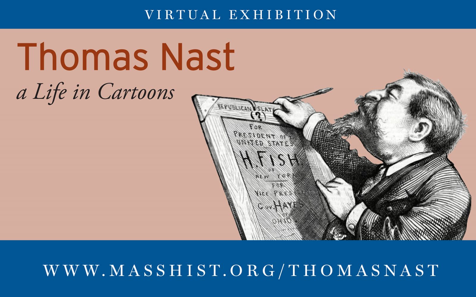
Yesterday’s Boston Globe praised the approach of the Massachusetts Historical Society’s “Thomas Nast: A Life in Cartoons” online exhibit: “In a nice twist, the exhibition doesn’t emphasize Nast’s own work (though it offers links to many of his cartoons). Instead, nine contemporary cartoonists illustrate episodes from Nast’s life.”

I discussed six of those artists in the two preceding postings. Here’s the rest of the team.

Under Harper’s Weekly publisher Fletcher Harper, Nast had editorial freedom in the topics he chose and how he approached them. That often put him at odds with the magazine’s political editor, George William Curtis, who was more gentle and loyal to the Republican Party as a whole rather than just President U. S. Grant. We illustrated that conflict in what I later realized was yet another Nast-speaking-to-his-editor scene. But hey, his job was speaking to editors, and it’s a scene I know well.

The line “hit the enemy between the eyes” line came straight from Nast. The historical society understandably wanted more Massachusetts content, so this cartoon includes Nast’s unflattering caricatures of two Bay State politicians, Benjamin Butler and Charles Sumner.

The artist for this panel is Sam Cleggett. When the core team were thinking of cartoonists to recruit, two of the qualities we looked for were political work and visual style reminiscent of Nast. I pointed out, “Sam knows hatching,” and this energetic cartoon shows that he sure does. Sam also creates animation art for television and video games.

On top of his political cartoons, Thomas Nast’s biggest contribution to American culture was to popularize a certain look for Santa Claus. He had grown up with a German Christmas tradition of “Pelze-Nicol,” which he used to illustrate the Dutch tales of ”St. Nick” preserved in New York. Nast’s Santa was round and jolly, the size of a child, and swathed in fur.

For years Nast drew black and white pictures of Santa Claus for Harper’s. They became so popular that McLoughlin Bros., a pioneering picture-book publisher, offered to publish a book of Nast’s pictures converted to color lithographs. That technique approximated brown by printing black lines and highlights on a red field, with the result that the fur tinged toward red—and a red suit became what we expect Santa to wear.

Dan Mazur produced the cartoon of a McLoughlin brother showing Nast his page proofs for Santa Claus and His Works. As usual, he loaded it up with historical detail, hunting for the right sort of press and Pelze-Nicol himself.

Dan was also one of the organizers of this project, and he was one of the founders of both the Boston Comics Roundtable and the Massachusetts Independent Comics Expo. His latest comic as a publisher is the Boston Powers series, and his upcoming comic as an author-illustrator is Lunatic.

After losing his editorial independence, Thomas Nast left Harper’s Weekly. He launched his own magazine, which lasted only a few months. He went on the lecture circuit, but that was exhausting. He produced history paintings looking back on the Civil War. His investments went bust, leaving him in a precarious financial state.

For our final cartoon, I imagined a cheeky take on the moment when Nast accepted a post in the U.S. diplomatic corps under Theodore Roosevelt. Artist Nick Thorkelson chose to render that in three panels to enhance the timing of the vaudeville dialogue. Unfortunately, it wasn’t so funny when Nast caught yellow fever only a few months after arriving at his first assignment. (We didn’t illustrate that moment.)

Nick Thorkelson has made political cartoons for the Boston Globe and many other outlets. One of his specialties is graphic biography, with his latest being Herbert Marcuse: Philosopher of Utopia (2019).

So that’s our look at the career of American cartoonist Thomas Nast, from his childhood immigration to his death overseas.

17 October 2020

The “Thomas Nast” Art Team, Part 2

With the next set of pictures for “Thomas Nast: A Life in Cartoons,” we got into the political part of his career. And the three cartoonists drawing those moments all have experience in political art.

Nast joined the staff of Harper’s Weekly in 1859, just in time for the US Civil War. Some of the magazine’s artists, such as Winslow Homer, drew battle scenes from life. Nast, though he took some trips to camp, preferred symbolic scenes with unmistakable pro-Union messages. His images could be so powerful that the Republican Party adopted them as campaign material.

We illustrated that connection with a symbolic meeting between Nast and President Abraham Lincoln, drawn by Shea Justice. Lincoln voices oft-quoted praise for Nast’s work in front of three of his most famous works from the war years. I suggested adopting elements from two cartoon traditions: making Lincoln and Nast into a “Mutt and Jeff” pair, and borrowing Tom Toles’s technique of adding commentary on the main scene from a couple of characters in the corner.

As for that commentary, that grew from my inability even in the age of Google to find any source for Lincoln’s praise before A. B. Paine‘s 1904 authorized biography of Nast. Fiona Deans Halloran wrote the same in her modern biography, expressed in the polite language of a footnote.

Stated more bluntly, this “Lincoln quotation” seems to have come from, or at least through, Nast himself. After consulting with Halloran, we made her the voice of doubt (or reason) while Nast speaks up for printing the legend.

Shea Justice, MFA, is a teacher at Lincoln-Sudbury Regional High School and a member of the African-American Master Artists in Residence Program. His portraits of figures from African-American history have been collected in this volume.

To hear from Dr. Fiona Deans Halloran herself, check out this video of her far-ranging conversation with longtime political cartoonist Pat Bagley for the Massachusetts Historical Society.

The next cartoon looks at Nast’s campaign during Reconstruction for basic equality for all Americans, built around his iconic cartoon “Uncle Sam’s Thanksgiving Dinner.” Nast’s vision of equality was limited, though. His take on, and caricatures of, non-white Americans could be quite disparaging. And he particularly disliked Irish Catholics, as this cartoon highlights.

Originally I had Nast saying, “Except for the Irish Catholics!” But then my artistic colleagues noticed that one of the figures at Uncle Sam’s table—on the right, near where his finger rests—had the profile that Nast typically gave to his Irishmen. So I tweaked the wording to acknowledge that Nast even gave an Irish couple a seat at Thanksgiving.

E. J. Barnes drew this panel, as well as serving the whole project as art director. She did admirable work assembling all the images, a job that turned out to include not only cajoling the cartoonists but also securing workable reproductions of Nast’s drawings and inserting them into our modern drawings in the midst of the pandemic shutdown. E. J. sells her artwork and comics stories through Drowned Town Press.

The next panel dramatizes one of the most famous episodes in Nast’s career, the second time he helped to bring down William “Boss” Tweed of Tammany Hall. Nast drew a lot of cartoons about Tweed, rousing public opinion enough for other legal authorities to move in. When Tweed fled US custody to Spain, police there recognized him as a wanted man from a cover of Harper’s Weekly—though they weren’t clear about what he was wanted for. Information from across the Atlantic is easier to come by these days, as I found when I sought period images of Spanish police uniforms.

The artist for this panel is Heide Solbrig, another colleague from the Boston Comics Roundtable. With a doctorate in communication from UCSD, Heide has taught arts and media studies at various colleges in New England. She’s working a graphic memoir called The Dandelion King and a series of comics journalism reports about the US-Mexico border. I see a reflection of her interest in immigration at the center of her panel as people line up in front of that transatlantic ship.

COMING UP: Part 3.

15 October 2020

The “Thomas Nast” Art Team, Part 1

Here’s commentary on the “Thomas Nast: A Life in Pictures” web exhibit and how the pictures came together.

The exhibit starts with a portrait of that nineteenth-century political cartoonist by Paul Szep, twentieth- and twenty-first-century political cartoonist. He also did a video interview about political cartooning for the Massachusetts Historical Society this fall.

Szep was the Boston Globe’s cartoonist during the 1970s when I was growing up. I enjoyed finding his picture in each day’s paper, learning about what news stories he was addressing, looking for his daughter Amy’s name hidden in the hatching. I even remember getting his autograph on a Watergate-era collection at a book festival when I was about nine. I suppose Szep was the first professional cartoonist I ever met. So it’s nifty to see him involved in this exhibit.

The first cartoon my team created for the exhibit covers Thomas Nast’s childhood immigration from Bavaria to the US. Initially I imagined a single panel of a little boy in stereotypically German costume on a ship’s deck or a dock, mixed in with other immigrants. But I couldn’t find a Nast print of a nautical scene as a model.

Instead, I alit on a “diary comic” that Nast drew on his first trip across the Atlantic the other way when he was a young journalist, not published until Alfred Bigelow Paine’s 1904 biography. That page provided the structure. The impressionistic memories of the trip that Nast recounted to Paine provided the content—each vignette reflects a real recollection from early childhood.

Catalina Rufin, who’s creating stories about growing up, daily life, and fairies, made a great match for the concept of this cartoon.

The next panel shows Nast as a teenager handing in his first assignment to magazine publisher Frank Leslie. In looking for a Nast picture of an immigrant-crowded dock, I came across a print of the Hoboken ferry landing on eBay. From an anecdote and a little image in Paine’s book, I realized that was Nast’s first published work. So that print is now part of the Massachusetts Historical Society collection, and it became the focus of this cartoon.

Both artist Jerel Dye and I hunted for visual references to provide a reasonably accurate representation of Leslie’s workspace, down to that desk calendar. We used this panel to show how Leslie used assembly lines of artists to produce art for the press. At first Jerel drew Tommy Nast with a little wispy beard, but I objected that he was only fifteen at this time—he didn’t grow a little wispy beard until the next cartoon! Nast’s own caricature of his first meeting with Leslie appears here.

Jerel Dye drew the art for the graphic novel Pigs Might Fly, written by Nick Abadzis, and has created several short comics on his own. In healthy times he teaches at the Eliot School of Fine & Applied Arts. One day I hope to fly on one of Jerel’s spaceships.

COMING UP: Part 2.

09 October 2020

Taking Thomas Nast’s Life Online

It was disappointing to learn, as I described recently, that the cartoon biography of Thomas Nast I’d worked on since this spring would not be displayed in the Massachusetts Historical Society as originally planned. But frankly, in this needlessly calamitous year, that change in plans felt like a minor glitch.

At the time, I was researching visual references for the artists: What did Nast’s editors look like? What about their workspaces? How did Spanish police officers dress in the 1870s? As I did, I tried to imagine our new pictures in an online environment. How would they come across on people’s computer screens instead of up on the wood-paneled walls? Most important, what could a digital exhibit do that a material one could not?

Online, the cartoons would be smaller than they would be when displayed on a wall. But the webpages could give viewers links to the Nast images they played off of—and to many more images than the physical room had space for. I began to reimagine the exhibit as a series of webpages with supplemental webpages offering additional information.

There were still some challenges caused by the pandemic. The M.H.S. is looking after its employees by making sure only a few are in the building at a time, which meant that it took longer to digitize some of the Nast images we needed. There was no chance for all the people involved in the exhibit to sit down in a room, lay out the material, and discuss how it fit together. But again, compared to what else was happening in America, those weren’t big problems.

My colleague E. J. Barnes did a terrific job rounding up all the cartoonists’ drawings, keeping track of the necessary Nast artwork, assembling the hybrid images, and then going back to the artists to ensure they supplied all the info they needed to be credited and paid. And she drew one of the new cartoons as well!

“Thomas Nast: A Life in Cartoons” made its online debut a few days ago. It’s an adjunct of a larger digital exhibit on political cartoons in American history, “Who Counts: A Look at Voting Rights through Political Cartoons.” With the country in the middle of a crucial election, and access to the ballot at issue more than anytime for decades, this is a very timely exhibit. I’m proud that I was able to be part of it, and to help provide a forum for so many talented cartoonists. (More about them coming up.)

On Thursday, 15 October, Nast’s modern biographer, Fiona Deans Halloran, and political cartoonist Pat Bagley will give a virtual talk about the man through the M.H.S. Sign up here.


15 September 2020

Turning Ojo into Woot

A recent online discussion about the relative ages of L. Frank Baum’s young male protagonists took me back almost twenty years to when Oziana magazine published my story “Woot Meets Yoop.”

Woot the Wanderer is one of the heroes of The Tin Woodman of Oz. He hikes around Oz, looking for distraction without danger—which of course makes it easy for a storyteller to get him into danger. In this story I had him run into Mr. Yoop, the caged and carnivorous giant from The Patchwork Girl of Oz.

As I recall, this issue of Oziana was being assembled in a rush to catch up to its annual schedule, so I offered to create illustrations for the story by digitally manipulating some of John R. Neill’s illustrations.

Most of the pictures I worked with came from The Tin Woodman of Oz and showed Woot. But one I wanted to use came from The Patchwork Girl of Oz and showed that book’s young hero, Ojo. This is where Neill’s tendency to draw the children in the Oz stories with quite similar faces became an advantage.

Here’s the picture of Ojo.


My oldest edition of The Patchwork Girl of Oz has no color printing, just line art, which was easier to work with. I removed Ojo’s Munchkin ruff and drew in Woot’s more ordinary Gillikin lapels. I shortened the tails of Ojo’s jacket to approximate Woot’s and added Woot’s knapsack.

Just as important, I stretched out the boy’s legs and body a little. Removing the ruff left plenty of room for a long neck. Because as Baum wrote him, and as Neill drew him, Woot is a bit older than Ojo, further into adolescence.

Here’s the resulting picture of Woot.

I just went back and superimposed these pictures to confirm the differences. With Neill’s standard young-person face at the same level, Woot is a little taller with longer legs. A teenager instead of a boy—at least as I picture him.

25 July 2020

The Mystery of Baum’s Final Book

This year I reread L. Frank Baum’s final Oz book: Glinda of Oz, published one hundred years ago.

Unlike the preceding book, The Magic of Oz, it has a single, focused plot. Ozma and Dorothy venture to the northern edge of Gillikin Country to intervene in a war between two small communities. They get trapped there. Glinda leads an expedition to save them. With the help of local magic-workers, the rescuers succeed. Glinda repairs the war damage, and Ozma installs new rulers in the two communities.

And there the book ends. There’s no detailed return journey to the Emerald City, no celebration in Ozma’s palace, no concluding discussion among Ozma, Dorothy, and Glinda. Ozma says to no one in particular, “it is always wise to do one’s duty, however unpleasant that duty may seem to be.” Done. Baum had filled his requisite number of pages, composing 40,000 words.

The manuscript for Glinda of Oz survives at the Library of Congress. The only parts that have been digitized appear in this online exhibit, and they say contradictory things about who Baum wrote it.

The title page has a note in Baum’s own handwriting that says: “MS. Completed Feb 17th / 1917 by L. Frank Baum.” But the first manuscript page also has a note in his handwriting: “L. Frank Baum / Feb. 1918.” A note added to the manuscript by Baum’s family says, “Written January & February 1917. finished the night before L F entered hospital,” but we know Baum went in for surgery on his gall bladder on 18 Feb 1918. He had alerted his publisher, Reilly and Lee, to the new book just four days before.

Those contradictory clues convinced Baum’s biographer Katharine M. Rogers to theorize that he finished a first draft of Glinda in February 1917 and a second version a year later. Exactly a year later, which seems like a mighty coincidence.

I think Baum simply wrote down the wrong year on his title page. February was still early in the new calendar year, and he had a lot weighing on his mind as he prepared for surgery. That title page in turn confused the relative who knew he finished just before the operation. All the other clues about how Baum wrote his last three Oz books fall into place. He drafted them in the order they were later published over the eighteen months between August 1916 and February 1918, finishing just before he went into the hospital.

Mostly bedridden after that surgery, Baum spent his last year working with his family to polish those texts and prepare typescripts to send to his publisher. Baum died on 6 May 1919. The Magic of Oz was published a month later, and Glinda of Oz eleven months after that.

Someday, after this pandemic is over, I hope to visit the Library of Congress and examine the full manuscript of Glinda of Oz in the same way that I looked at The Magic of Oz. Does it match the book’s final text as closely? Rogers reported one scene revised to be less scary and a few other small changes. I’m curious about a passage describing the famous residents of the Emerald City that strikes me as stylistically distinct from the surrounding prose. Does that appear in Baum’s handwriting?

Still, even if someone else—a relative or an editor—filled out Glinda of Oz for Baum, they didn’t tack on a more detailed ending.

23 July 2020

Making the Most of the Magic of Oz Manuscript

Back in 2005 I examined L. Frank Baum’s handwritten manuscript of The Magic of Oz at the Harry Ransom Center in Austin, Texas, comparing it to the finished book. I published my findings and analysis in an article for the Oz Club’s Baum Bugle called “The Magic Manuscript.” Since then, the Ransom Center has digitized the manuscript pages, letting everyone see how Baum worked.

My article noted how when Baum sat down to write his first draft for The Magic of Oz (or maybe The Magic of the Wizard of Oz), he hadn’t decided on important details, such as the name of a major character and the exact spelling of the crucial magic word. Those vary from one page to the next, and sometimes even on the same page.

Paradoxically, that study also showed how little revising Baum did on his way to publication. As he wrote, Baum wrestled with some small details, such as how to describe Ozma’s age. He later polished his phrasing in little ways, usually by hand and sometimes at the missing typescript stage. But that was fussing over small stuff.

Baum inserted one short episode while still writing in hand and later added another to tie off a loose end at the request of his publisher, Frank Reilly. A couple of times he deleted sentences from the first draft that opened plot possibilities which he had never followed up on. But the manuscript shows no other major rewriting—no shuffling scenes, no big cuts or reworking. At least at this late stage of his career, Baum stuck to the structure of his first draft.

Another question about Baum’s writing process that I addressed in that article was the sequence in which he drafted his last three Oz books. The most recent Baum biographies posited that he didn’t compose those books in the order they were published: The Tin Woodman of Oz (1918), The Magic of Oz (1919), and Glinda of Oz (1920).

In L. Frank Baum: Royal Historian of Oz, Angelica Shirley Carpenter and Jean Shirley suggested the sequence was Magic, Glinda, Tin Woodman. The first two were “a kind of insurance” for his family if he took sick, this book said, and he completed the third after gall bladder surgery in 1918.

The Magic of Oz manuscript makes that sequence untenable, however. The handwritten manuscript includes a mention of the Tin Soldier, a character introduced in The Tin Woodman of Oz. Baum therefore must have written Tin Woodman before Magic.

Baum’s Magic manuscript offers two more clues about the timing of his last books. He wrote two pages of his story on the back of an accounting of money raised at a local D.A.R. war relief event in June 1917. And on the first page a relative wrote, “This was next to the last book Father ever wrote. It was written in the fall of 1917.” Since Tin Woodman could not have come after Magic, Baum must have moved on to Glinda of Oz. In sum, he wrote the books in the order they were published.

COMING UP: Glinda of Oz and the end.

18 July 2020

OzCon Preview: “Glinda the Good and Powerful” Panel


Tonight I’ll be moderating a panel discussion for OzCon 2020, which because of the pandemic will be online instead of in California.

Our topic is “Glinda the Good and Powerful.” The panelists are Mari Ness, Caroline Spector, and Atticus Gannaway, all of whom are practiced fiction writers as well as knowledgeable critics and scholars of fantasy literature.

We’ve recorded the first half of our discussion, and the video above is a one-minute preview of snippets. After playing that, we’ll shift to real-time live discussion with questions from the audience. Part of my job will be vacuuming up those questions from various forums.

Though the magic of YouTube has made Billie Burke the face of Glinda in the image above, most of our conversation will be about the Oz books, and particularly L. Frank Baum’s books since that’s where Glinda looms the largest.

The discussion will take place on Zoom starting at 8:00 Eastern time. We’ll post a recording on the OzConnection channel on YouTube.

11 July 2020

Interpreting Incident at Hawk’s Hill through the Autism Lens

How are we to make sense of the 1971 novel Incident at Hawk’s Hill and the actual 1873 event at its root?

In 2004, Prof. Kenneth Kidd wrote about Allan W. Eckert’s novel for the children’s literature journal The Looking Glass. In that paper, titled “Leave It to Badger,” Kidd reported that he’d found no corroboration of Eckert’s claim that he had based the book on a real incident.

At the time, digital book and newspaper archives were in their infancy, so it wasn’t as easy to find the period sources I quoted back here, or the intervening secondary sources I analyzed here. Not only did Eckert have reason to believe he was working off a report of a real incident, but it’s clear that a lost little boy was indeed found in a badger hole in 1873 Manitoba. Would that knowledge have changed Kidd’s analysis?

Kidd made sense of the novel by applying the thinking in his book Making American Boys: Boyology and the Feral Tale. He discussed the story through the lens of folklore. Many cultures have stories about children being raised by animals, including such famous western examples as Romulus and Remus, Mowgli, and Tarzan. Viewed entirely as fiction, Eckert’s novel fits into that paradigm. Kidd saw an Oedipal dimension to such stories in general and Eckert’s novel in particular.

Of course, when the event at the core of Incident at Hawk’s Hill—a little boy lost on the prairie who survives by finding shelter in a badger’s hole—is real, then the ways people tell that story aren’t new examples of old folklore but attempts to understand what really happened. (Or, in the case of Eckert’s acknowledged fiction, to present what might have happened.)

Bruno Bettelheim’s paper “Feral Children and Autistic Children,” published in the American Journal of Sociology in 1959, was an attempt to explain similar events. Bettelheim posited that the root of many of those stories of children raised by animals is autism, a psychological condition he was groping to understand. Throughout history, he wrote, people had seen “severe cases of infantile autism with seemingly animal-like traits and habits” and explained that behavior by believing the children had been raised by animals.

Bettelheim’s own theory of autism was deeply flawed. In that same paper he posited that it was largely or entirely due to “extreme emotional isolation combined with experiences which they interpreted as threatening them with utter destruction.” As for the source of the emotional isolation, Bettelheim mostly blamed mothers (of course), saying they were the real “feral” ones.

While Bettelheim’s theories about autism and how to respond to it have fallen by the wayside, his suggestion that autism explains many examples of “feral children” has caught on. Uta Frith analyzed some historic cases of "feral children” in Autism: Explaining the Enigma (1989) and elsewhere. She suggested, “an unduly high proportion of feral children suffered from autism before they were abandoned. Indeed autism, with its often severe conduct problems, may be the cause for the abandonment in the first place.”

Frith’s book and others have helped to make our culture much more aware of autism since Incident at Hawk’s Hill appeared in 1971. We now recognize a spectrum of related conditions under the autism label. Not only do we better distinguish autism from other cognitive conditions, but we acknowledge autistic ways of thinking and viewing the world in high-functioning individuals.

That knowledge allows us a new perspective on how authors from earlier generations discussed the story of the little boy lost on the Manitoba prairie. The initial reports said almost nothing about the boy himself, only that he was scared when men came by. It’s not clear how much detail in the oral traditions is based on fact and how much was added by people seeking to comprehend the mystery. Nonetheless, the more detailed recounting by Ernest Seton Thompson and the fictionalized story of Allan W. Eckert lend themselves to interpretation through the lens of autism.

Seton was quite clear about little Harry Service not being normal:
He was a strange child, very small for his age, and shy without being cowardly. He had an odd habit of following dogs, chickens, pigs, and birds, imitating their voices and actions, with an exactness that onlookers sometimes declared to be uncanny.
For Seton, this affinity with animals was a strength. He linked kindness to animals with general goodness, and equated cruelty to animals with cruelty to people. Seton’s tale contained an explanation for how this boy survived in the badger’s hole—because the badger, having lost her own young, showed maternal kindness to this unusual newcomer. And he concluded with an optimistic suggestion that Harry’s experience with the wild badger cured him of his most obvious strangeness.

In Incident at Hawk’s Hill Eckert picked up on those details and made a major subplot of the boy’s parents wrestling with what we’d now call their youngest son’s special needs. Early in the novel, Bill MacDonald tells his wife:
“Oh, what’s the use of trying to fool ourselves? He isn’t normal, Esther, and we both know it, whether or not you’re willing to admit it. He not only isn’t normal physically, he’s not normal mentally, either. Look how he acts toward animals.”
When Eckert finally shifts his narration into the little boy’s own perspective, it states:
Ben had no idea why he was so afraid of people. He was not, as his father seemed to think, retarded in his mental processes. He was, in his way, quite intelligent. He could think things through very well for his age and he retained a surprising percentage of what was taught him by his mother and the others. It was just that he kept what he learned to himself. He didn’t like to talk to people.
Was this Eckert’s attempt to depict an autistic child? Someone he knew, something he felt? Or was he picking up imaginatively on the hints in Seton’s story? I have no idea. In the end, Eckert followed Seton’s line and portrayed the experience out on the prairie as making Ben open up more than ever, especially to his father.

Reflecting the greater awareness of autism today, many recent readers of Incident at Hawk’s Hill interpret Ben forthrightly as on the autism spectrum. Monado at Book Crossing describes him as “a boy, whom these days we’d describe as autistic,” while Lori Steinbach at enotes says he probably has “a condition something like autism.” The Home School Book Review said, “Ben would probably be considered somewhat autistic today.” At Goodreads, the Shayne-Train wrote, “now that I [re]read it with adult eyes, it may be the first novel I’d ever read that had an autistic protagonist.” And the study guide for the novel at Bookrags includes a whole section on autism.

Such a diagnosis is of course only a partial explanation for the character, or the history deep behind it. Did the little Service boy who got lost on the Manitoba prairie have some form of autism? How did that affect his lost time, or his family’s and neighbors’ interpretations of it? What experiences with autism, a condition not yet isolated and named in the early 1900s, did Seton have? What about Eckert, writing in 1971? Is it just coincidence that this modern example of a “feral child” story fits so easily with an autism reading, or are we still seeking an explanation with the partial knowledge we have?

23 October 2019

Raymie: “Everybody’s Kind of Movie”?

I’ve been noodling out a story about kids in a seaside town, so I tracked down the 1960 movie Raymie for visual inspiration.

Raymie came from Allied Artists Pictures, which grew out of the Monogram, one of the “Poverty Row” studios of the 1930s. Allied still took pride in keeping budgets low. There’s a small cast, a limited number of settings, only one action scene, and not a little stock footage.

I hoped the picture would be an interesting exploration of the young title character, played by Hollywood scion David Ladd. Raymie is indeed at the center of the story, his quest to catch a legendary barracuda defining the plot. But there’s a lot more footage of adults discussing Raymie than of the boy expressing himself. Some scenes are outside of his point of view. I believe Ladd was twelve when the movie was made, but he’s playing a simple nine-year-old.

Instead of a character study, Raymie really lays out the culture of a fishing pier somewhere along the California coast. A bunch of white men who have nothing better to do spend their days fishing off the pier, trading stories and jibes. Raymie’s widowed mother works at a diner on the pier, so he gets to fish, too, without paying.

One of the men is a grouch who dislikes Raymie’s presence. The rest use him as an object of their opinions and advice. There’s a wealthy older man who suffers a health crisis partway through the movie. There’s an African-American worker who shares wisdom in scenes with Ladd and no other actors, making me think they were shot separately and possibly ready to trim for certain audiences. And there’s John Agar as Ike, an off-season construction worker who’s trying to woo Raymie’s mother, played by Julie Adams.

In a vaguely Freudian way, some of the action turns on a fishing knife that Raymie inherited from his late father. (The father died in the Korean War, when the boy was an infant.) After resisting for two-thirds of that movie, Raymie trades that knife for the bait he needs to catch the barracuda. Then at the climactic moment he picks up Ike’s knife instead. That change presages how Raymie’s mother, seeing Ike standing up for her son, finally accepts him as a suitor.

Raymie’s mother doesn’t know that, much earlier in the movie, Ike dove off the pier to protect her son from a shark. Presumably she would have warmed up to him earlier if she were aware. But all the men on the pier, and Raymie, conspired to deceive her about how he got knocked into the water. In other words, the pier culture stretched out the movie.

The Raymie theme song was recorded by Jerry Lewis, then at the height of his stardom. He was even featured on the posters, as shown above. I’ve seen reports that a legal dispute over that recording has prevented the movie from being rereleased in any new format. Whether or not that’s true, in order to watch Raymie I had to download a bootleg file made from a scratched 16mm print found a few years back in Australia. It’s available for the curious, but I’m not recommending it as a sadly lost classic.

02 September 2019

The Rise of the “Oxford Comma“

A weekend Twitter conversation with editor Harold Underdown and picture book creator Debbie Ridpath Ohi set me digging for the origin of the phrase Oxford comma.”

That’s the currently popular term for the comma before “and” or “or” in a series of three or more, as in “Tom, Dick, or Harry.” The more established term is “serial comma.” Some people are trained to use that comma, others not to.

Punctuation in the eighteenth century was haphazard to the point of being hazardous. In contrast, the Victorians were prescriptivists, and the spread of print culture meant there was a lot to prescribe.

Around the turn of the twentieth century Horace Hart (1840-1916), controller of the Oxford University Press, issued a set of guidelines for that organization’s type compositors and proof readers. His examples show he expected to see the serial comma, but he never pointed it out or prescribed it.

Around the same time, the polymath Herbert Spencer (1820-1903) wrote to F. Howard Collins (1857-1910) about why the serial comma mattered, stating:

whether to write “black, white, and green,” with the comma after white, or to leave out the comma and write “black, white and green”—I very positively decide in favour of the first. To me the comma is of value as marking out the component elements of a thought, and where any set of components of a thought are of equal value, they should be punctuated in printing and in speech equally: Evidently therefore in this case, inasmuch as when enumerating these colours black, white, and green, the white is just as much to be emphasized as the other two, it needs the pause after it just as much as the black does.
Collins quoted Spencer in a footnote of his 1905 book Author and Printer: A Guide for Authors, Editors, Printers, Correctors of the Press, Compositors, and Typists. Collins wrote that book in part because he felt Hart’s guide didn’t have enough practical advice for authors.

The Inland Printer magazine, published in Chicago, quoted Collins’s footnote in a review of recent references for compositors. By the end of 1905, therefore, Spencer’s argument for serial commas was spreading on both sides of the Atlantic. For decades the serial comma has been a standard put forward by The Chicago Manual of Style, the main style guide of the American book publishing industry.

However, some areas of publishing resisted that rule. One was daily newspaper journalism in the US. A serial comma might be little more than a flyspeck, but if we total up all such commas in a week of newspapers, eliminating it might save a significant amount of ink, paper, and time. For decades, therefore, The Associated Press Stylebook has prescribed not using the serial comma unless it was necessary to avoid confusion.

Americans in different fields can thus train themselves either to use the serial comma or not to, in the firm belief that they’re following the most authoritative writing guide. It’s all a matter of which sort of writing they’ve undertaken.

Meanwhile, after World War 2 Britain went through a great punctuation contraction. I’ve written about this before. Double-quote marks became single-quote marks. Periods disappeared from many abbreviations. Newspapers stopped setting off titles with italics or quote marks. And the serial comma was shooed away.

Except at Oxford University Press. As at the University of Chicago Press, scholarly editors continued to see value in the clarity of the serial comma. Posthumously expanded editions of Horace Hart’s rules made that mark of punctuation a standard even as much of British publishing disagreed.

Because the serial comma had become a hallmark of the Oxford University Press, Peter Sutcliffe dubbed it the “Oxford comma” in his 1978 history of the publisher. He credited Collins with establishing the rule, but his own book established a new term for the mark.

“Oxford comma” is thus a retronym, a term coined for something that was once so standard it didn’t need a special designation (e.g., analog watch, prose novel). At one point all British publishers put commas into series of three or more. Now that most don’t, that comma is notable enough to need a name, and “Oxford comma” has a touch of class. It’s quite possible that “serial comma” is also a retronym, forced by journalism developing a different standard.

Harold and I agreed that “Oxford comma” seems like a parvenu synonym for what we’d learned as the “serial comma.” Indeed, Google Books Ngram confirms that authors used “serial comma” and “series comma” starting around 1920. For a long time the terms appeared at about the same rate, but “serial comma” took off in the late 1970s.

Not until this century did “Oxford comma” spread, perhaps pushed by international internet debate. In the Google Books Ngram database (which stops in 2008), “Oxford comma” has overtaken “series comma” and cut into the dominance of “serial comma.” It has not, however, returned to being standard punctuation in Britain.

20 August 2019

Television the Great and Terrible

The MGM Wizard of Oz has gone through three stages defined by how we the public got to watch it.

First was the reception that the filmmakers envisioned: exhibition in 1939 as a “prestige picture” in movie palaces, mostly owned by Loew’s Theatres. The movie was then moved to smaller venues and eventually taken out of circulation. MGM re-released the film in the same way in 1949 as the Hollywood studio system was under legal and financial siege.

That cinematic run was successful, if not immediately profitable. Even with reduced admission prices for children, The Wizard of Oz earned $3 million in its first release, enough to make it the second highest-grossing movie of 1939. It gained five nominations for Academy Awards, winning two. It established Judy Garland as a box-office star and enabled associate producer Arthur Freed to oversee many more movie musicals over the next two decades. Though most of the songs were novelty numbers, “Over the Rainbow” became a standard.

The next stage of the movie’s history started when MGM licensed the television rights to CBS in 1956. News reports about that deal marveled at how young Garland, Ray Bolger, and Bert Lahr had been when they made the picture—they were all major stars almost two decades later. In 1959 CBS took a further step and launched an annual showing, which the network touted as a major event for families to share.

The medium of television didn’t serve The Wizard of Oz well artistically. With more than 90% of American households in 1966 still watching TV in black and white, the movie’s shift to color as Dorothy arrives in Oz was invisible to most of the audience. Likewise, the nostalgic sepia tone of the Kansas scenes was printed in standard grays, and a bit of the opening was trimmed to free more time for commercials.

Culturally, however, television did wonders for The Wizard of Oz. Watching it once a year became almost required for American children, a common national experience. “Munchkin” entered the language, denoting small children and donut holes. Dorothy’s Ruby Slippers not only supplanted the book’s Silver Shoes in the public imagination but were enshrined in the Smithsonian’s National Museum of American History. In Marvel’s The Avengers, the Flying Monkeys are the one pop-culture reference that WW2 veteran Steve Rogers shares with his Gen-X colleagues and the audience. To be sure, there were American children who grew up without seeing The Wizard of Oz, or who didn’t like it enough to watch year after year, but most of them still knew its main points.

The third and current stage of the MGM movie’s life started with its release on VHS tape in 1980. It sped up as VCRs became standard household equipment and continues into today’s world of DVDs and streaming video. Now anyone ready to make an initial investment can watch The Wizard of Oz anytime they want to. No more waiting years for MGM to re-release the fabled movie into theaters, no more waiting months for the annual television airing.

Artistically, today’s media serve the movie much better than the last stage. Though we’re not watching the picture on giant movie screens as in 1939, the film has been restored to its pristine appearance and full length. What’s more, we can study scenes and frames and edited footage, and multiple behind-the-scenes books tell us about what went into this piece of popular art.

On the other hand, the MGM Wizard of Oz is no longer the cultural colossus it once was. The audience for popular entertainment has splintered, so families rarely gather around one screen to watch one channel. When one can watch the movie anytime, it no longer feels as urgent to watch it tonight. While the live-action recreations of the movie on stage and ice can provide families with a special shared experience as the movie itself once did, those productions are pale projections of the celluloid.

As a result, the fan base of the MGM movie appears to be shrinking and aging. The highest-profile works it inspired in the last three decades—Gregory Maguire’s novel Wicked, the subsequent Broadway musical, and and the movie Oz the Great and Terrible—were created for adult audiences, with sexual content and hardly any child characters. We once thought of The Wizard of Oz as a near-universal part of growing up in America. Now we see that only a couple of cohorts of Americans shared that experience.

Fortunately, the same abundance of entertainment media that swamps the annual airing of The Wizard of Oz offers many other ways to enjoy the Oz mythos. The original books, new books and comics inspired by them, virtually all the Oz movies and TV cartoons ever made—they’re all available for children to try. There are more doorways into Oz fandom now, not one big door that nearly all American children were funneled through to see if they liked it. But will more variety make up for smaller numbers?

[This essay was written at the behest of Michael Booth, to be published on his Facebook page in celebration of the 80th anniversary of the release of The Wizard of Oz on 25 August.

The picture above is PhotoShop art by LunaC, hosted on FreakingNews.com. The challenge was to slip a cathode ray TV into an old painting. LunaC chose Joseph Wright of Derby’s depictions of science in the eighteenth century.]

15 August 2019

“Just” Another Adventure with Jex and Ticca

Last fall I shared news of my story “Relief: A Tale of the Jitney” being published in volume 5 of the Young Explorer’s Adventure Guide anthologies.

Now I’m happy to report that another prose story about Jex and Ticca is now slated for volume 6 of that series. “Just: A Tale of the Jitney” begins like this:


Mama doesn’t usually bring prisoners home.

As magistrate here on Chamulna, Mama keeps prisoners in jail until trial season. Even with all the zirnium miners making trouble on this moon, the jail wing of the Magistracy isn’t full. But I guess she figured this prisoner was too small to stay with the rest.

“I think he’s young,” she told me.

“But he’s a different species,” I said. “We don’t know how his people age.”

Most of Mama’s prisoners are normal Polatians, but this one had smooth, doughy, mahogany skin. His little fern-green eyes were sunk into his face, and his cornsilk hair covered the whole round top of his head. “If he were a Polatian girl like you,” Mama told me, “his crest would be turning light twell—”

“Mama!” I’m sure she could see my cheeks shine.

She wiggled one eye to signal she was joking. “That’ll remind you, Yari, not to assume your mother’s forgotten how alien species work.”

Mama steered the boy into a spare room on the second floor of the Magistracy with a hand on the back of his neck. Half that space was filled with old, mismatched furniture from the squad room downstairs. I moved a broken screen off a crimson sofa, and Jex sat down, his little eyes moving in tandem to take in the mess. On his left wrist, just past his ragged navy shirtsleeve, I spotted a saffron-orange detainment bracelet.

Mama turned to me. “You know how you’re always asking to help with the Magistracy cases?”

“Only a thousand times!” I wanted so much to be an investigator, the way Mama had started out. But she never let me.

“You can help me right now. This boy’s a witness to a crime. I need to question him, and he doesn’t speak Polatian—only Stelpidge.”

Stelpidge was one of the courses I’d chosen from teleschool, but I didn’t think it would come in handy this fast. “Of course I’ll help investigate!” I said.

“Translate,” Mama said.

I let that go and asked, “What are your questions?”

“Let’s start by finding out his basics.”

I’d watched enough investigatory dramas to know what that meant. I pushed a chrome chair in front of the boy and sat down. “Greetings,” I said in Stelpidge. “My name is Yarilotta. This is my mother, Magistrate Squoryvotta. What is your name?”

He said, “Jex.”

“Just Jex?”

He nodded his head. I repeated the name to Mama.

She tapped the name into her handscreen. “We’ll ask Interstel if he has a record. Keep going.”

I asked the boy, “Where do you live?”

“On that space flyer your mother made me park outside.”

“How old are you?”

His narrow eyes peered warily through his fringe of tawny hair. “How young do I have to be to go free?”


Dreaming Robot Press is gathering preorders for this volume through Kickstarter. The higher funding levels bring not only this book in digital and/or print form, but also the previous volumes, so you can own both prose stories of Jex and his jitney and dozens more besides. The press also likes to seed the fondness for science fiction by making its books available to schools and libraries.

03 October 2018

Launching Jitney with Jex and Ticca

This is the first page of “Mine: A Tale of the Jitney,” a short comics story I wrote and saw come to life through the artistic talents of penciler Tim Teague, inker Kendra Hale, colorist Reggie Themistocle, and letterer Alex Giles.

In this story, Jex is an orphan kid piloting his own spaceship. Ticca is the stickbug who keeps the ship in barely working order. Since no sane, upright person would hire their rickety rocket, they end up hauling unwanted freight and disreputable passengers. That offers a lot of opportunity for Jex and Ticca to get into and out of trouble, as in these five pages.

I created this tale for Wonderfunders, a comics-making collective organized on Facebook by publisher James Lynch. That group invited writers to script five-page stories with proposals for longer stories. Then teams assembled to complete the short stories.

“Mine: A Tale of the Jitney” is one of four short stories in this issue of the Wonderfunders Anthology series, available in digital and paper forms through IndyPlanet.

18 September 2018

More on Woodman and Woodsman

My examination of the shifting prevalence of “woodman” and “woodsman” and what that implies for how people speak of L. Frank Baum’s character the Tin Woodman brought this comment:

You don't seem to address the difference in the two professions, Woodman vs. Woodsman, though I'm not sure how well you could specify that in the search. But the word usage rates are clearly dependent on such, IMHO.

A woodman chopped and/or delivered firewood (like the Iceman or Milkman or Postman. A "Woodsman" is a forest ranger, naturalist, etc., that specializes in knowing about "the woods" and the failure to realize this difference in professions is what galls some of us - not the slight change to the spelling. Nick Chopper is a lumberjack not a forest ranger.
When did such a distinction arise, and how established is it?

Dr. Samuel Johnson’s 1755 dictionary didn’t include the word “woodsman” at all. And his definition for “woodman,” with citations from his beloved Shakespeare, said nothing about chopping or delivering wood.
Instead, for Johnson a “woodman” was someone who hunted for sport in the woods.

Let’s jump ahead to Noah Webster’s dictionary in 1828. Once again, there was no entry for “woodsman.” And according to Webster, a “woodman” was:
1. A forest officer, appointed to take care of the kings wood.
2. A sportsman; a hunter.
It would be good to check an American dictionary from the 1860s when Baum was a boy, because that would be the best reflection of usage when he was learning the language. But I couldn’t find one on the web.

So let’s jump again to the 1903 edition of Chambers’s Twentieth Century Dictionary of the English Language, published close to the time of The Wonderful Wizard of Oz, albeit in Britain. It included a subentry for the word “woodsman”—but defined that word simply as a synonym for “woodman.” As for “woodman,” for the first time we see the word defined as Baum used it—but alongside the older definitions: “a man who cuts down trees : a forest officer : a huntsman.”

Finally, the 1913 edition of Webster’s had separate but overlapping entries for the two words. A “woodsman” was “A woodman; especially, one who lives in the forest.” A “woodman” had a more detailed definition, including all of the earlier meanings plus a new one:
1. A forest officer appointed to take care of the king's woods; a forester. [Eng.]
2. A sportsman; a hunter.
3. One who cuts down trees; a woodcutter.
4. One who dwells in the woods or forest; a bushman.
Today’s Merriam-Webster website shows how the popularity of the two terms has flipped: the entry for “woodman” points to “woodsman.” As for the definition of the latter term, the site says: “a person who frequents or works in the woods / especially one skilled in woodcraft.”

The Oxford Dictionaries site likewise has overlapping definitions. Woodman: “A person working in woodland, especially a forester or woodcutter.” Woodsman: “A person living or working in woodland, especially a forester, hunter, or woodcutter.”

The Collins Dictionary site offers the added complication of different entries for American and British usage, but the definitions still overlap. Woodman:
1. a person who looks after and fells trees used for timber
2. another word for woodsman
3. obsolete: a hunter who is knowledgeable about woods and the animals living in them
Woodsman:
1. a person who lives or works in the woods, as a hunter, woodcutter, etc.
2. a person at home in the woods or skilled in woodcraft
Thus, there never appears to have been a widespread understanding that the two words have distinct and different meanings, with “woodman” meaning a woodchopper and “woodsman” meaning a forester. What’s more, the way Baum used the word—to mean someone who made his living chopping down trees—came late to the standard dictionaries of English.

28 August 2018

The Shift from Woodman to Woodsman

One of the attractions at OzCon earlier this month was a showing of James Ortiz’s The Woodsman, produced in New York in 2015. It was a striking piece of theater stylishly adapted from L. Frank Baum’s story of the Tin Woodman.

Another attraction was a preview of R. F. Wohl’s performance as Baum. He was workshopping a new one-person show with an audience of knowledgable Oz fans. Afterwards I heard an attendee note that Baum consistently referred to his tin creation as a “Woodman,” not a “Woodsman”—though many people (not just James Ortiz’s play) now use the longer word.

That prompted some musing that perhaps one form had become more popular than the other, so I turned to the Google Books Ngram Viewer. I asked it to graph out the popularity of “woodman,” “woodsman,” and “woodchopper” from 1800 to 2000. I restricted the query to lowercase only, eliminating “Woodman” as a proper name (and almost all mentions of the Tin Woodman as well).

Here’s the result:

As you can see, “woodman” was the more popular word when Baum grew up and when he published The Wonderful Wizard of Oz in 1900. “Woodsman” rose suddenly in popularity starting in 1880 and around 1910 surpassed the shorter form. Both forms have been declining in print use since 1940 as we’ve moved away from a wood-based economy.

In addition to affecting how people speak of the Tin Woodman, that shift in everyday language has also affected how we quote the George Pope Morris poem that begins, “Woodman, spare that tree!”

23 August 2018

Another Job Lost to Advancing Technology

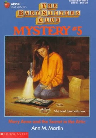
From the Los Angeles Review of Books’s interview with Holly Tommasino, who created the hand-lettered journal entries in the original Baby-Sitters Club books. Tommasino was first an in-house designer for Scholastic, then a freelancer, then out of a job:
What was your role with The Baby-Sitters Club?

When all the design elements for the series were initially coming together, I created the handwriting styles for each character. And then I handwrote all portions of the manuscripts that were flagged by editorial — usually BSC journal entries, but also the postcards and letters and lists that popped up from time to time. I continued to produce the handwriting even after I left Scholastic.

What happened then?

I worked as a freelancer until 1996. At that point, due to advances in technology, I was sent font forms by a company. They asked me to letter each character’s handwriting in spaces on the form. And these forms were long! They had me do a few different y’s and then write a w attached to a y or a t attached to a y. They didn’t want the handwriting samples to look totally uniform, so it was quite an extensive process. After that, the freelance work stopped, but the books continued.
The 1986-2000 series has of course been rejuvenated with comics adaptations by Raina Telgemeier and then Gale Galligan. Those editions appear to be the bestsellers today.

In contrast, 2010 Scholastic reissued two early titles, evidently retaining or reproducing the cursive writing, but those books didn’t spark a new craze among the children of the original readers. The latest reissue is clearly for the nostalgia market. Was the cursive handwriting, which kids today are said not to be able to read, to blame?

30 September 2017

Pocketing the Bad Machinery Series

I heartily enjoy John Allison’s Bad Machinery graphic novels, following a team of teen detectives in the fictional mid-sized city of Tackleford, England.

Allison created these stories first as webcomics, and they retain that form’s rhythm. Each page has a payoff of its own. The narrative can jerk ahead in time from one to the next. That serves the sprawling stories well since they’re as much about upper-school personalities and the British class system as that term’s mystery.

Allison drew his pages to the dimensions of a computer screen, about half again as wide as they are tall. As a result, the first print editions were more than a foot wide, floppy and hard to shelve. I loved the stories, but I didn’t have space for them all.

Oni Press has started to reissue the Bad Machinery books in “Pocket Editions,” a shade less than nine inches wide. That makes them the same size as the seventh and latest volume, The Case of the Forked Road, which Allison created in a more traditional vertical format for print.

I was worried, however, that my aging eyes wouldn’t be able to read the balloons on the smaller pages. But I took a chance on the first two volumes, The Case of the Team Spirit and The Case of the Good Boy, and my eyes worked fine. While I still don’t see as many commas of direct address as I’d like, Allison’s verbal wit comes through just as well as his visuals.

(In addition to the seven Bad Machinery novels, one of the Tackleford teens, Charlotte, crosses over into another of Allison’s series in Murder, She Writes, set in the cutthroat world of children’s publishing. It’s a fine introduction to Allison’s work.)