Showing posts with label AUTHOR Richard Scarry. Show all posts

27 November 2019

The Busytown Neighborhood in New-York

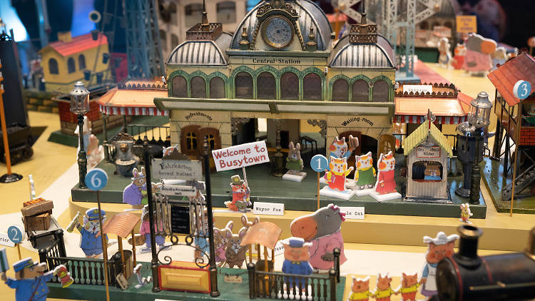
Every December the New-York Historical Society lays out a big model train set to visit, and this year’s design celebrates the centenary of Richard Scarry’s birth by sending the trains through Busytown.

The museum’s webpage doesn’t have any images from the display, but Time Out offered the photo above, showing that Scarry’s characters appear as little flat cutouts direct from his illustrations. (Rather than, say, three-dimensionally modeled adaptations.)

There are also “custom-made Busytown vehicle-themed benches” and larger “Busytown characters” for selfies. Busytown is of course a going commercial concern, licensed from Random House. Given how hard most of its inhabitants work at their jobs, such marketing doesn’t violate the Busytown spirit in the least.

Weekend storytimes will feature Scarry’s books, including The Night Before the Night Before Christmas, and on 14-15 December Scarry’s son and collaborator, Huck Scarry, will get busy sketching characters and talking to visitors.

16 October 2013

I Could Just Eat This Up

I look askance at our current culture’s habit of declaring that something is the best Thing EVER, so that may slightly dampen my expression of enthusiasm for Betsy Bird’s “Re-Sendakify Sendak Project”: inviting a recently celebrated children’s-book illustrator to create art for one of Maurice Sendak’s books in the style of another celebrated children’s-book illustrator.

The example above shows the opening panels from Sendak’s Where the Wild Things Are in the style of Jules Feiffer’s Village Voice cartoons as drawn by Nick Bruel.

Other works of elevated collective genius in Bird’s posting include Pierre in the style of Chris Van Allsburg by Nathan Hale and Bumble-Ardy in the style of Richard Scarry by K-Fai Steele. And then the next generation gets into the act.

It’s the best thing ever.

04 June 2011

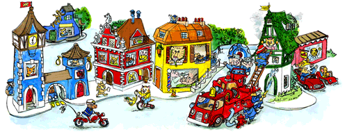
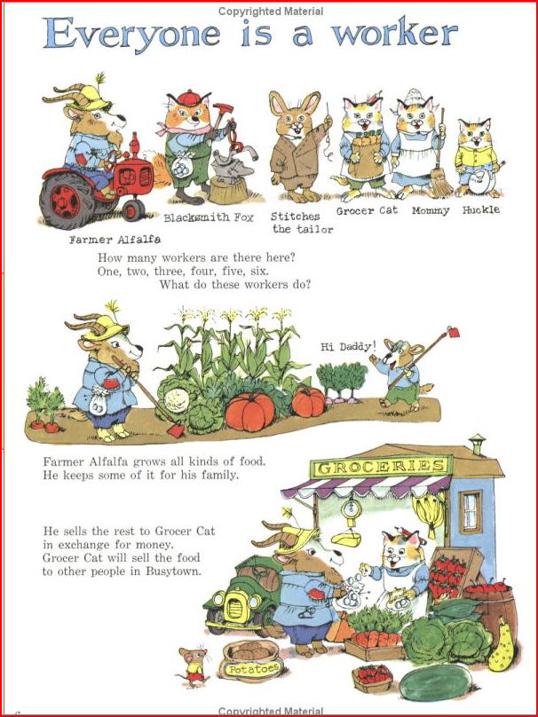
Google’s Tribute to Richard Scarry

It’s a busy, busy image, but with a little effort one can make out the shapes of six letters. On tomorrow’s smaller logo, Lowly Worm makes an excellent l.

11 April 2011

This is the Past

From the Boston Globe I learned that Rizzoli has reissued M. Sasek’s This is… series of travel books for children, such as This is Paris, This is Greece, and the ahead-of-its-time This is the Way to the Moon. The latest is last month’s This is Washington, D.C.

Those eighteen books were published between 1959 and 1974, and I remember leafing through them at the tail end of that span. It wasn’t just the exotic locales that stuck with me, but also Sasek’s style of art and design. Even then the books seemed to come out of the Old World and out of the past, without the fresh vibrancy of, say, Richard Scarry’s Busy, Busy World, which was published in the middle of that same era.

The Globe states, “some facts in the reissued editions have been updated,” but Rizzoli’s catalogue copy for This is Hong Kong (where a lot has changed since 1969) describes those updates “appearing on a ‘This is . . . Today’ page at the back of the book.”

And of course the illustrations can’t easily be altered. Sasek’s art still has a Catch Me If You Can vibe, from when Americans dressed up to travel instead of dressing down. I look at these reissues, and think if they must be selling on the basis of adult nostalgia and artistic appreciation rather than child curiosity. (Not that there’s anything wrong with that.) That would certainly explain the The is London tea towel.

17 December 2009

Writing Advice That Assembled Be Must

Over at Fomagrams, Dave Elzey shared some thoughts on the end of the linear narrative in fiction, and particularly how that might mean something different for boys:

male readers prefer non-fiction to fiction and respond well to non-linear narratives. All those boys who struggle reading novels for school but could spend hours with The Guinness Book of World Records do so because they like the puzzle of putting a narrative together in their heads. It’s why boys take things apart to figure out how they work. It’s how their brains understand the world.
I agree that a lot of boys read nonfiction avidly as a way to understand the world—or, rather, to master one exciting, possibly scary, and well defined part of it: dinosaurs, sports, automotive vehicles, collectible Japanese cartoon monsters, Marvel superheroes, what have you.

I’m not sure I agree that such Guinness Book readers are assembling narratives. Rather, mastering a pool of impressive facts and immersing oneself in a cause-and-effect, conflict-and-resolution story are different ways to mentally organize life into understandable, ordered form. (That said, conquering a realm of knowledge is a heroic narrative that a reader of the male persuasion can tell about himself.)

Dave goes on to further discussion on the limits of linear narratives and the potential for non-linear ones, stories that require readers to do more work putting events together:
Linear narratives are a way to tell stories but we tend to think they are the only way. It fits our natural sense of order, our understanding of time being forward-moving, our progression shuffling from point A to B. But movies have shown us there are ways to tell a story that bend time with flashbacks and fast-forwards that are accepted without jarring our sense of order.
There are older examples of such stories, starting with Tristram Shandy and including such Modernist experiments as Hopscotch and The French Lieutenant’s Woman. The approach may have come to young people’s literature relatively recently with the sorts of books discussed in Eliza T. Dresang’s Radical Change.

Or, as Dave hints, that non-linear approach might have been available for kids all along, just not treated as part of traditionally plotted fiction. The Encyclopedia Brown books, for example, have a gaping hole at the end of each story that readers must fill in through their mastery of facts and observation; few adult mysteries make their readers turn to the back to assemble the complete narrative. Richard Scarry’s What Do People Do All Day? creates a world through snippets of story and lots of information, not a linear narrative.

But are boys more attracted to those books than girls? The most prominent recent example of the to-be-assembled form is the Cathy’s Book series, by Sean Stewart and Jordan Weisman. Those books have a teenaged girl at their center and, I thought, a predominantly female readership. Of course, by that age, the book industry may have given up on winning over more male readers.
22 June 2009

From 1 to 2

At the start of the month I mentioned Sterling's contest for Richard Scarry books, celebrating his ninetieth birthday this month. I couldn't find much on the company's website about the contest for non-librarians and non-booksellers, but I tooks my chances and sents in my contact info.

I was pleasantly surprised to receive a copy of Richard Scarry’s From 1 to 10, published by Sterling last year. This board book reuses some of Scarry's art to, well, count to ten.

The book is now with a toddler. Her grateful mother is from France, and her father from America. I think Scarry, who was born in Boston and lived much of his life in Switzerland, would have approved.

02 June 2009

Ooh—Scarry!

Sterling, the book-publishing wing of Barnes & Noble, has republished eight of Richard Scarry's books. These aren't his best known titles, which are still under contract with Golden. But they all fit into his trademark "Busytown" mode of anthropomorphic animals and crowded pages.

My favorite among them is Richard Scarry's Find Your ABCs--one of the best alphabet books out there, with an ingenious use of colored type. That stars of that book are the inept detectives Sam Cat and Dudley Pig, and Richard Scarry's The Great Pie Robbery and Other Mysteries collects three more stories about the pair.

Sterling's website offers a long account of the man's life, from Boston to Gstaad. An even longer, less reverent, and yet apparently accurate bio appears at rotten.com.

Alan Taylor used Flickr to document how Scarry updated his Best Word Book Ever to keep up with social mores after a quarter-century had passed. I understand some stories that played on ethnic stereotypes have dropped from Richard Scarry's Busy, Busy World, one of my childhood favorites, for the same reason. But cost-cutting might also have factored into that change.

Scarry would be ninety years old this year, so Sterling is promoting their eight titles with giveaways. The first stages are open only to people "employed by a school, academic or professional library, or retail store." But Publishers Weekly also said:

The second giveaway, 90 Books for 90 Birthdays, will be a one-day sweepstakes held on Friday, June 5 (starting at 12 a.m. EDT and ending at 11:59 p.m. EDT), and is open to any Scarry fans. Those who wish to enter can submit their names and addresses to sterlingkids@sterlingpublishing.com.
But darned if I can find anything about that on Sterling's website today.

04 December 2008

Scarry, Lies, and the Anthropomorphic Tradition

The first author I remember writing a fan letter to was Richard Scarry. I got back a reply on onion-skin stationery. It had an ink drawing of Lowly Worm and Dr. Bones, and typewritten word balloons showing their conversation about the artwork I must have enclosed.

Decades later, I realized that the drawing must have been printed onto that stationery, with only the characters' speeches added for me. But I didn't care. I still have that piece of paper.

It was therefore heartening, though not surprising, to see this comment in author-illustrator Brian Lies's recent conversation with Seven Impossible Things:

My favorite picture books were ones with detailed illustrations I could spend hours looking at--Richard Scarry’s Best Word Book Ever, for instance...
In addition to creating images filled with visual detail for such books as Bats at the Library, Brian also follows Scarry in depicting animal characters, with more or less anthropomorphism. He's moved from scratchboard to watercolors to acrylic paints, but the animals have been a constant.

At a Foundation for Children's Books event this fall, I asked Brian if he ever felt "typecast" because he's become so well known for his animals. He's great at creating furry faces with immediately recognizable emotions and personalities, but is he secretly planning a picture book with a completely different approach?

Brian replied that he's far from tired of animal characters, and finds he can express all that he wants through them. So we can look forward to more fine books in this venerable tradition.

07 November 2007

Page Spreads versus Pages

Yesterday I promised my thoughts on how picture books and comics work differently, even though they're both made up of words and sequential pictures. Here's the first major difference I see.

By and large, in modern picture books the main subsidiary unit is a two-page spread containing a single large image. When artists plan a picture book from a manuscript, their first step is to divide the text into page spreads.

In contrast, comics by and large have two or more--usually many more--images assembled in front of the reader at the same time. Together they make up one large image, of course, but each represents a different scene in time and space. Furthermore, historically the main subsidiary unit of comics has been the single page, broken into panels; of all the ways to write comics scripts, the pages/panels organization seems like the only constant.

This is, of course, not a hard and fast rule. Plenty of picture books have two or more separate pictures on a page spread, especially to break up a series of large images and change the mood or pace. Last year I talked about how nicely Chris Wormell's George and the Dragon does this.

Conversely, plenty of comics have two-page spreads. Indeed, a dramatic single-image spread containing title and credits has overtaken the introductory splash page as a comic-book convention. I also see more artists designing comics so that a page spread, even though it contains many images, has a unified visual scheme.

That's a recent development in comics, however--at least in the format that dominated the field in the US for so many years, the comic book. Those books depend on advertising pages that pop up in the middle of the story, making it harder for artists to plan full-page spreads. We can see the consequence in volumes collecting comics that are twenty or more years old. Each page of a story/issue is usually numbered by hand in a lower corner; sometimes even-numbered pages appear on the left in the book, sometimes on the right. In other words, the two pages we see on a spread were probably not designed to be viewed side by side.

The most popular periodical comics still have ads, but their publishers have discovered the additional revenue stream of reprints without ads in "graphic novel" format. That, plus digital tweaking of art, has let comics artists think in terms of page spreads. But there can still be a few bugs in the system. In the book version of DC's histrionic Infinite Crisis, editor Anton Kawasaki says of one segment:

We're also adding two new pages to this issue to "fix" the awkward way the Green Lantern spread originally fell. Damn you periodicals people for not paying attention and making us poor Collected Editions guys work harder!
A two-page spread in the original comic book would have been broken by a page turn in the graphic novel if Kawasaki hadn't commissioned an extra page before and after it. That sort of problem never comes up in picture books because they're designed around spreads from the start (and have no ads).

How does this play out in classic picture books? Munro Leaf and Robert Lawson's The Story of Ferdinand usually has one large illustration on each spread, showing one moment of time. So do Maurice Sendak's Where the Wild Things Are, Robert McCloskey's Make Way for Ducklings, and Ellen Raskin's Spectacles. [I choose my classics; you choose yours.]

But Sendak's In the Night Kitchen does not. As shown yesterday, Sendak took a leaf from his model, comics master Winsor McCay, and pictured more than one instant on a single page. Two other author-illustrators who often used that technique are Jules Feiffer and Edward Gorey--the other children's-book creators that Scott McCloud proudly names in Understanding Comics. Yet another example that McCloud doesn't mention, but who I think clearly belongs in the same group, is Richard Scarry in his larger books. They all have multiple sequential images on a typical page, my first hallmark of comics style.

TOMORROW: How we read picture books and comics differently.