Showing posts with label adventures in lettering. Show all posts

30 January 2014

Balloonacy at the B.C.R.
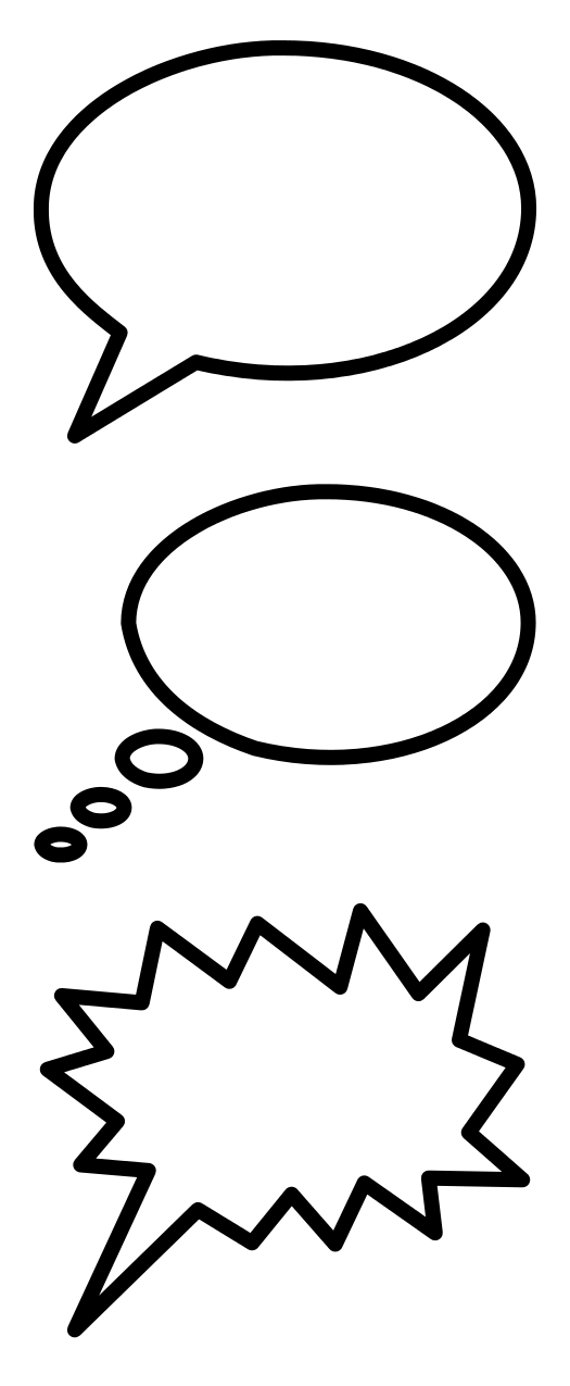
This evening the Boston Comics Roundtable did an activity I invented called Balloonacy. It didn’t pan out exactly as I’d imagined since we’d talked so long about how to make the group more active that there wasn’t as much time left for an actual activity. But I think it was fun and productive for those involved.

I started by drawing the classic ellipsoid balloon with a short pointy tail and the letters “B.C.R.” inside. I posited that that’s the comics equivalent of a sentence with a period at the end. It’s a straightforward statement.

Then I challenged folks to draw balloons in which the lettering, punctuation or other marks inside the balloon, balloon shape, tail shape, or some other visual detail would give the letters “B.C.R.” a different meaning and perhaps sound.

The group then drew (in no particular order):
  • classic thought balloon.
  • dotted whisper balloon.
  • balloon with four tails, for four (or more) people speaking simultaneously.
  • balloon with nine tails over a cityscape to signal a chorus of millions.
  • collage of balloons all saying the same thing.
  • fancy letters for ornate speech.
  • The Yellow Kid with a message on his nightshirt.
  • balloon shaped like a luscious pair of lips.
  • burst balloon for shouting.
  • scroll-shaped balloon with blackletter/Gothic letters for a town crier.
  • three connected balloons each containing one letter for a single, slow, deliberate speaker.
  • three separate balloons each containing one letter pointing to a single depressed figure.
  • three separated balloons each containing one letter with tails pointing different places to denote three speakers.
  • balloon with tail going off the page to an off-panel speaker.
  • block letters and block balloon for a carnival barker.
  • two forms of white letters dropped out of a black balloon, one with the wavery white border that Todd Klein gave to Dream in Sandman. (We also looked at his Delirium balloons.)
  • wavery letters for a spooky voice.
  • icicle-dripping balloon for disdain.
  • two variations of rebuses spelling out “B.C.R.,” one assigned to a mime.
  • balloon with a long, meandering tail suitable for a character who talks and talks without getting to the point.
  • balloon containing musical notes as well as letters for singing.
  • letters strung out on an undulating musical staff for more singing.
  • wavery-bordered balloon with its tail dropping off the bottom of the page where the speaker is collapsing in a faint.
  • two balloons, one overlapping the other to show an interruption.
  • balloon blocked by the side of a panel as something interrupts.
  • vertical balloon containing Japanese kanji sounding approximately like “B.C.R.” 
  • huge letters from a loud character flattening other characters.
  • tiny, lowercase letters within a big balloon for quiet speech.
  • two examples of giant block letters crowding the edges of their balloon.
  • square block letters in a squarish balloon for a real square.
  • letters drawn within concentric radio waves spreading from an antenna.
  • jagged-edged balloon and with a lightning-bolt tail to denote electronic communication.
  • big block letters with small exclamation points instead of periods—verging on a sound effect!
  • round balloon with no tail for a disembodied or off-panel speaker.
  • squarish balloon and lettering for a robot.
  • balloon with its tail ending in a starburst against a window—a recent way of showing that someone is speaking inside that building.
  • various typographical symbols before the letters to indicate profanity.
  • chevrons on either side of the letters and an asterisked footnote to indicate speech in a foreign language (or, some people thought, HTML).
  • tailless thought balloon broken up with breath marks to denote psychic communication.
  • a long, boring speech wallpapered on the back of a panel.
We also came up with three balloons that not everyone agreed on how to interpret.
  • thought balloon with a pointed tail instead of the trail of puffs that thought balloons usually have. Could this indicate thinking aloud?
  • three numbered boxes each containing one letter. I didn’t catch the discussion on that one.
  • balloon butted up against the edge of a panel. That usually means the same thing as a balloon fully inside a panel—it doesn’t seem to reflect anything more than the available space and the preference of the editor and letterer who place that balloon. But perhaps it could have storytelling significance. Say, one dominant character’s speech balloons are always in the center of a panel and another’s are always crowded to one side.
  • word balloon in the shape of a real helium balloon with a knot at the bottom. What might this symbolize?
And that was just balloons. We haven’t yet talked about other ways comics show the invisible.

12 October 2013

A Look at Leroy Lettering

Letterer Todd Klein describes using the Leroy tool used regularly on EC horror comics in the 1940s and ’50s. That lettering was done by Jim and Margaret Wroten, occasionally with assistants.

I’d made the common assumption that those letters were produced by some form of typesetting machine, but Klein explains that they were still drawn by hand:
It has a mechanical look, but is actually pen and ink, made with the Leroy lettering system of scriber and templates manufactured by the Keuffel and Esser company, and created for comics almost exclusively by Jim Wroten and his wife Margaret. The Leroy system was intended for technical artists doing things like machine parts diagrams and architectural drawings.
The letterer drew each letter by following a groove in the template.

According to the Tales from the Crypt collection, Jim Wroten was originally a salesman for Keuffel and Esser, which made tools for architectural and drafting firms. Wroten found a market for the Leroy tool in comics when the industry boomed in the early 1940s. In 1945 he and his wife Margaret joined William Moulton Marston’s Wonder Woman team, according to Bhob Stewart at Potrzebie, who apparently interviewed Margaret Wroten in 1996.

Klein thinks the Wrotens had worked on the earliest Wonder Woman pages; perhaps they’d done so as freelancers, or perhaps someone else was using a Leroy template. That’s the problem with Leroy lettering—it has very little individual style.

Max Gaines, publisher of the Wonder Woman magazines at All-American, gave the Wrotens more business when he started Educational/Entertaining Comics, and his son Bill kept them on after suddenly inheriting the firm. By the 1950s, Klein notes, the Wrotens’ system had become more flexible:
By the time of their work in EC Comics, the Wrotens had a variety of Leroy templates to use for different size lettering. They used vertical letters for regular text and a larger size slanted to the right with a thicker pen point for emphasized words. I believe the Wrotens did only the actual lettering, leaving the balloon and caption borders for the artists of the stories. This accounts for the wide variety of balloon shapes and styles at EC in particular.
Though editor Al Feldstein didn’t care for the Leroy style, it fit well with his approach to writing comics: he scripted the stories, laid out the pages, and had the Wrotens insert the text at the tops of the panels. Only then did the pages go to the illustrators to fill with art. Feldstein’s stories often had a lot of text, and the Leroy characters kept that text clearly legible, if characterless.

02 October 2013

It’s All Dutch to Me

One of the most interesting mini-comics I picked up at the Massachusetts Independent Comics Expo this weekend was Daniel Pucca’s My Dutch Foreskin, published through the A28 Press cooperative.

This story starts with the author on his first day at a new school—in the Netherlands. As an American kid, he struggles to make himself understood, even with a dictionary.

The action then jumps ahead a couple of years to the day when Daniel and his Dutch friends are sent home with a note to parents saying there will soon be health exams. That letter contains a Dutch word our hero doesn’t know. He looks it up, and finds that it’s the equivalent of an English word that he doesn’t know, either. Another pile of books later, and Daniel learns what a “foreskin” is.

Given that theme of communication barriers, Pucca made a fine choice to have his characters’ Dutch dialogue printed in Dutch. But printed below those bright red letters are English translations in a pale blue (not visible in the image above). The comic comes with a translucent plastic red film in a tulip-shaped holder. Place that over the Dutch word balloons, and the red lettering fades while the blue lettering becomes darker and easily legible.

One can also puzzle out the English just by careful observation, preserving the tulip-shaped translator in pristine form. Either way, Pucca has found a nifty visual way to recreate his childhood experience with language barriers. My Dutch Foreskin must have cost a bundle to print and assemble, but it’s a fine mini at a good price.

01 September 2013

Elements of a Digital Dynamic Duo Story

“Elements of Crime,” the story in Legends of the Dark Knight, digital issues #63-65, features a version of the Dynamic Duo never seen before.

The story comes principally from two comics creators with significant experience portraying Batman and Robin. Mike W. Barr scripted many issues of Detective Comics in the 1980s and the Son of a Demon graphic novel that inspired Grant Morrison to create Damian Wayne. Tom Lyle penciled the three Robin miniseries in the early 1990s, establishing the look (well, the now-embarrassing haircut) of Tim Drake.

Lyle’s visual depictions of Batman and Robin in this Legends of the Dark Knight digital-first tale basically match those from the 1990s. Tim is back in his original uniform. Batman doesn’t have the yellow oval around his bat symbol but otherwise looks quite familiar.

But Barr’s dialogue is well out of time. This Batman takes polite leave of Commissioner Gordon and chides Robin for using the mildest of racy language, like “get to first base.” In sum, this is the Batman of the 1960s television show. As for Tim as Robin, he’s hard-working and gets the computer jobs, but he’s also uncharacteristically hot-headed and loud-mouthed.
What’s more, the Batmobile in this story is the version seen in Gotham City before the “New Look” of 1964, with a big bat face on the front and a big fin sticking out the back. Far from acting in the shadows, this Batman is welcome at the Pentagon. And the story itself is a throwback, with the villain deliberately sending Gordon clues about upcoming crimes.

Thus, the story is not just not part of the “New52” universe—it doesn’t quite fit into any of DC’s many continuities over the years. That reflects how the company’s digital-first wing is free of the burden of consistency. Batman: Li’l Gotham likewise serves fans all the happiest bits of the pre-New52 universe, and other digital titles take off of TV shows instead of the current comics.
I wish I could say that “Elements of Crime” was an unalloyed delight because of those old-fashioned touches, but I struggled with the story. Despite several readings I still can’t tell you how Batman escaped the Element Queen’s death trap the first time. Robin does nothing but play Boy Hostage. The art in the last installment sometimes seems unaccountably awkward.

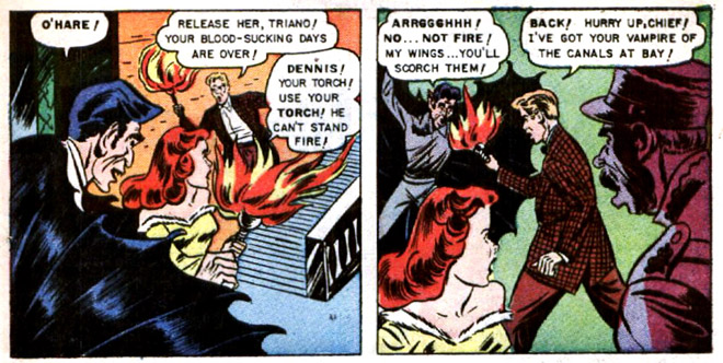
I noticed an interesting lettering technique, though. When characters are speaking on the other side of glass from readers, Saida Temofonte’s balloon tales end in little arrows on the glass surface, as shown in the first two pictures above.

19 August 2013

Is Analyzing The Killing Joke Like Dissecting a Frog?

Retiring Batman scribe Grant Morrison went back on Kevin Smith’s Fat Man on Batman podcast this month and proclaimed his interpretation of The Killing Joke, a landmark graphic novel from 1989. As Robot 6 and Comics Beat reported, Morrison declared:
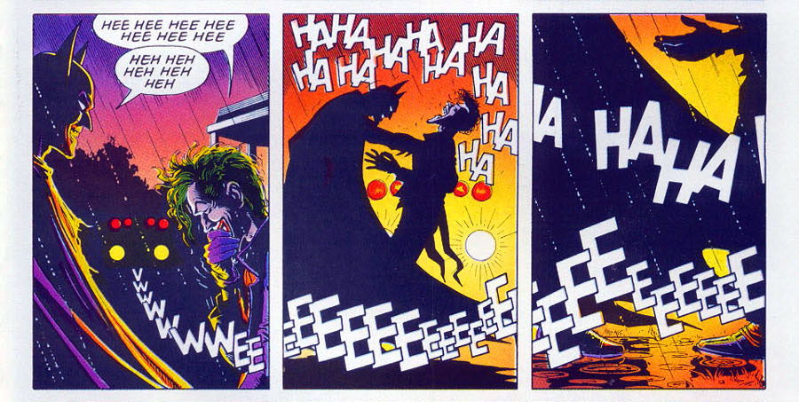
No one gets the end, because Batman kills the Joker. . . . That’s why it’s called The Killing Joke. The Joker tells the “Killing Joke” at the end, Batman reaches out and breaks his neck, and that’s why the laughter stops and the light goes out, ’cause that was the last chance at crossing that bridge. And Alan Moore wrote the ultimate Batman/Joker story—he finished it. . . . the laughter stops, it abruptly stops, it’s quite obvious. . . .

But he did it in such a way that it’s ambiguous, so people will never have to be sure, which means it doesn’t have to be the last Batman/Joker story. It’s brilliant!
This wasn’t a new theory. One can find traces of such speculation or interpretation on the internet for years. Artist Brian Bolland joked about the perceived ambiguity in his afterword to a recolored edition without resolving the questions. But letterer Richard Starkings recalls Bolland saying that he didn’t try to show Batman killing the Joker.

Prof. Scott Eric Kaufman rejected Morrison’s interpretation wholly, in part in a skilled interpretation of art and words and in part because it came from Morrison.

In fact, fans who think Batman kills the Joker don’t even agree on the method. Does he, as Morrison said, wring or snap the man’s neck (and, if so, where is the sound effect)? Or does Batman jab the Joker with one of his own poisoned needles (and does Joker venom even work on the Joker)?

The folks at Bleeding Cool did the important journalistic work of digging up Alan Moore’s script for that final page—which it say the site lifted material from the feed of transcriber Mr. Phil Jackson.

Moore didn’t write that Batman kills the Joker. He didn’t ask Bolland to depict the scene with any ambiguity, and he was quite explicit about motivation, symbolism, and multiple meanings elsewhere. (As I noted before, Moore opened this script by writing paragraphs about the endpapers of the book—that’s detailed.) Bolland’s drawings for the final page closely follow Moore’s very detailed descriptions.

But the sound-effects lettering is significantly different from what’s in the script. As Moore wrote the scene, the laughter ended in panel 5, the center of the nine-panel grid. Police sirens appeared in panels 5 through 7, in 8 “we can no longer hear the sirens” [I can’t bring myself to capitalize like Moore], and in 9 the sirens resume—presumably as the police take the Joker away.
Ultimately the book followed a different timing. The laughter continues for through panel 6 and off the right side of the grid. The sirens don’t recur for the last panel—which is a major improvement over having a bunch of EEEs breaking into what Moore sought for that image: “more an abstract design than anything else.”

Who made those changes and when? The evidence currently available doesn’t say. They probably occurred in the editing process as Moore, Bolland, and their editors discussed the book. So whatever Moore might have meant originally could have changed by the final product. But Bolland would still have needed to know what to draw.

Furthermore, Morrison’s interpretation puts a lot of weight on how “the laughter stops,” a phrase he repeated. But in the final book, the laughter doesn’t stop in panel 5 when Batman touches the Joker. Nor does it stop in panel 6—it continues off the right side.

So what have we learned or relearned from this worldwide discussion?
  • Grant Morrison likes people to think he has secret knowledge. (And to be fair, sometimes he really does.)
  • Superhero comics are a collaborative art form. The storytelling is the product of the writers, artists, letterer, and editors, with only the final product containing all their contributions.
  • A lot of fans really wish Batman could kill the Joker.

23 June 2013

Little Gotham and the Rough Edges

I read through Batman: Little Gotham, #10-12, this month. It remains one of the last vestiges of the DC Universe that existed before the current “New 52” continuity. Or rather, it’s a particular reflection of that universe.

In Little Gotham, not only are there no dead Robins, but most of Batman’s protégé(e)s are on good terms with him and each other. Jason Todd and Cassandra Cain are hanging around Wayne Manor. Nightwing and Oracle are still dating. Damian brings his (sometimes) little friend Colin home with him for play dates instead of keeping him secret.

In other words, this is the universe that many fanfiction writers seem to prefer imagining, where all interpersonal friction among the heroes has been sanded down to nothing more than amusing grumpiness. (Oh, that Jason!)

Little Gotham’s Damian continues to act out of character, as defined by his interpretations in the main comics. He was raised within the al-Ghul clan of assassins and world-conquerors, and in #10 he doesn’t recognize the name Napoleon. (He calls it his favorite ice cream. Overly obsessed Robin fans know that Neapolitan ice cream was Jason’s favorite. Not that I know that fact. No.) Like the Robin of the Teen Titans Go cartoon, this Damian seems greatly concerned with food.

In another panel Damian comments on American men’s fashion from the 1980s and ’90s, when he wasn’t even supposed to be alive. While the Little Gotham Damian has the same lack of patience and politesse as the character in the main comics, his history and outlook are unrecognizable.

That change seems to be part of the same process as the change in the rest of the Batman family: this Damian has become more cute, at the cost of the rough edges and details that made him distinct and more interesting in stories.

A couple of these issues left me with questions about their editing. The villain of #10 is Bane, and about halfway through he develops an accent (“d” for “th”). Batman fans of Latino descent disagree on the use of Spanish words and phrases in this story.

Another editing issue was word-balloon placement in #10-11. (Usually editors handle that job and letterers carry out their instructions.) On several pages I struggled to find the right flow from one balloon to the next unclear. The credited editor, Kristy Quinn, has years of experience with Wildstorm and DC. But maybe those issues were a learning experience for an assistant.

18 October 2012

A Wrinkle in Lettering

Powell’s really really really needs to add Madeleine L’Engle as a linked author on its webpage for Hope Larson’s adaptation of A Wrinkle in Time into comics form. It’ll sell more copies that way.

I was struck by this detail from MTV Geek’s interview with Larson about the particular challenges of adapting A Wrinkle in Time, with its cerebral vibe, to a graphic format:
I tried to trim the dialogue for space wherever possible, but most of the time it wasn’t. The dialogue carries the burden of almost everything that happens in this book. What saved me was doing final lettering as part of my thumbnail step, so I was sure there’d be room for everything before I put pencil to paper. There are a few panels where the characters are being crushed under a ton of text, but those are infrequent. By making the book nearly 400 pages long, I was able to air it out some.
That reminded me of the method Gene Luen Yang used for Prime Baby, as he described here:
Because Prime Baby was both text-heavy (the protagonist is a wordy little sociopath) and limited in space (it was originally published in The New York Times Magazine), I laid out the words in Photoshop first and then sketched over print-outs of the dialog.
Looking ahead to L’Engle’s sequels, Larson said:
I can’t see myself doing another adaptation. I talked to friends about this adaptation being like grad school—I got my Masters in L’Engle, and now I’m done. I’m done drawing comics, period, for the time being. I felt similarly after completing Mercury, and took a year off drawing, which was the same amount of time it took me to draw that book. Maybe I need to be off drawing for two years, since that was how long it took me to draw Wrinkle. I’ll reevaluate things next September.
So if you were the publisher, considering how long adaptations take, would you have already recruited another graphic novelist to adapt A Wind in the Door? And whom would you choose?

23 September 2012

There, I Fixed It: Tim in Batman, #0

This month’s Batman, #0, contains a story scripted by James Tynion IV and drawn by Andy Clarke which shows the new DC Universe’s Dick Grayson, Jason Todd, and Tim Drake before they came Bruce Wayne’s sidekicks.

Some readers complained that the story makes young Jason a killer or a legal accessory to murder. His distinct symbolic value remains having been the Robin on the moral edge, so that doesn’t seem like such a big change to me.

I agree with another set of complaints about that story, however: that Tim Drake comes across as arrogant. He boasts that he’s “the best student in the school,” and tells his antagonist, “you made it ridiculously easy,” and, “how stupid does a man have to be…?” Perhaps this is a new characterization of Tim as intellectually snobbish. Stories about him overcoming that flaw could be interesting, though I think they’d undermine some of his appeal for readers. (Shall we see what Teen Titans, #0, brings?) [ADDENDUM: It brings significant new information that undercuts the basis of this posting.]

But I also found the dialogue on Tim’s two pages to be heavy-handed and wordy, with revelations in odd places and occasional vagueness. So I did a rewrite reflecting my understanding of Tim’s character and the scene’s important revelations while sticking to letterer Patrick Brosseau’s balloons.

My lettering is in the Smack Attack font by Nate Peikos of Blambot. Click on the thumbnails below for full-page images.

15 July 2012

Don’t You Hate When This Happens?


These panels are from Batman: Legends of the Dark Knight, #150. Pencils by Trevor Von Eeden, inks by José Luis García-López, script by J. M. DeMatteis. Note the fine use of shifting light sources in the first two panels and the multiple balloons pacing the query in the third. And of course the classic millionaire playboy’s dressing-gown.

More about kids sneaking out of windows here.

25 March 2012

“Robin Is a Shadow of a Shadow”

The last weekly Robin looked at two ways DC Comics responded to the unexpected popularity of its new Robin character in 1992. This is about a third, known as Robin 3000.

The project originated with Byron Preiss, a New York book packager who loved comics and sci-fi and constantly juggled a lot of projects. Among the titles he commissioned were Bruce Coville’s My Teacher Is an Alien series and Sherwood Smith’s recent Oz sequels. Preiss died in a car accident in 2005, still juggling.

In the mid-1980s, Preiss approached the comics artist P. Craig Russell with the idea of producing a futuristic Tom Swift comic for Simon & Schuster, which then held the license for that technophilic teen. Preiss wrote the script with Steve Ringgenberg.

Russell recalled the project at length, as quoted on this webpage about his work:
It was around ’85 or ’86. . . . after just having finished adaptations of works by the likes of Maeterlinck, Kipling, and Wilde I thought it would be fun to draw a space opera with all the sorts of hardware and futuristic backgrounds I had not drawn since Killraven. A lark. “You know...for kids.” . . .

I had never worked on a project in which the script was being re-written in the course of drawing it. I also had never had to deal, albeit second hand, with such a hands-on art director as I had at S & S. I would send in pages to Byron who would take them to S & S, and then relay to me the needed changes. . . .

…it was finally finished, 58 pages and a cover designed by [Jim] Steranko (an 8 by 11 xerox layout that looked like he tossed it off in a matter of minutes and was absolutely spot-on in its dynamics and composition. I followed it exactly). Nothing happened. It was slated for S & S’s Spring schedule. It was slated for S & S’s Fall schedule. It was slated for Spring. Then Fall. Finally it was slated for bupkis! S & S was not going to be publishing graphic novels.
Preiss’s business model meant he constantly had to sell new titles to pay the costs of current projects while waiting for royalties on those that hit big. So he couldn’t afford to let Tom Swift 3000 die. He held onto Russell’s finished pages waiting for an opportunity.

And then the Tim Burton Batman movie was a huge hit. Tim Drake as Robin was a big hit. The comics market exploded with speculators buying lots of product, especially if it combined an established brand name and a #1 issue.

So Preiss sold DC Comics on the Tom Swift material rewritten to be a variant Batman adventure—what the post-Crisis publisher calling “Elseworlds,” meaning “stories that don’t count as part of our official continuity, even though less than a decade ago we wiped out everything but our official continuity.”
Tom Swift became Tom Wayne, descendant of Bruce Wayne and protégé of Bruce Wayne XXVIII, who had taken up the mantle of Batman a millennium on. Tom Swift 3000 was now Robin 3000! (Officially, the two-issue miniseries is titled Batman: Robin 3000, but the biggest logo on the cover was the same one created for the Robin series.)

Russell explained the necessary changes:
Tom would be re-incarnated as Robin in the year 3000 and new material would be added to incorporate Batman and bracket the story. And why is this guy running around who is now called Robin but is not dressed like him? Um... ’cause he’s undercover... yeah, that’s it, he’s undercover, that’s the ticket. So I called back my ‘Tom’ model, now married, a daddy, and a good 25 pounds heavier and drew the new 18 pages and produced a new cover for the second volume—my Wally Wood/EC Comics/Sci-Fi homage.
The result looks nice, with a mid-1980s MTV vibe on good paper, but it doesn’t read well. It doesn’t draw on the traditional themes of the Robin saga, such as coming of age, inheritance, and justice. Instead, the story’s heart is definitely in Tom Swift territory, all about fantastic flying machines.

Furthermore, the lettering shows how Preiss’s staff crammed the “Tom Wayne” name into existing word balloons. (In addition, Ringgenberg’s name was written poorly enough that many websites credit “Stevev Ringgenberg.”)

As with the Robin miniseries of the same vintage, copies of Robin 3000 are relatively common in US comics shops; more recent comic books are harder to find because, once the comics market bubble burst, they were printed in much smaller numbers.

16 February 2012

3G, IEPs, ADHD, and Fangbone


When young prehistoric warrior Fangbone reaches “our world” in Michael Rex’s Fangbone: Third-Grade Barbarian, he tries to blend in with other children by entering a school. This might seem difficult since he’s shirtless, carrying a sword, and from a preliterate culture.

But Fangbone happens to tag along with Bill from room 3G. Bill’s teacher, Ms. Gillian, is unfazed by this new student. When she learns Fangbone can’t read, she just whispers (the lettering gets small), “You’re in the right class. Welcome to 3G. Everyone here learns at their own speed.” Of course, she hasn’t received an IEP or any of the other paperwork real schools require.

We might chalk this up to plot convenience, but the story actually foregrounds issues of disabilities. Bill takes medicine so, he tells Fangbone, “I don’t go all hyper, like BlAaAaAh!” The other kids in the class are eccentric or beyond. Two-thirds of the way through the book, Bill admits to Fangbone that room 3G “is the LOSER CLASS! . . . We’re just a bunch of messed-up LOSERS!!!”

Fangbone responds by dropping his prejudice against meaningless games and helping his friend’s class win the dodgeball tournament. In fact, he does nearly all the throwing himself. All of 3G gets “I’m a winner!” decals. But it’s worth considering what Fangbone would have done if the first student he’d met had been Duncan, the verbal bully. Would his warrior ethos have fit just fine in another classroom?

The theme continues into the book’s climactic fight. Fangbone tells Bill to relax and focus. Bill answers that he can’t because “I didn’t take my medicine!” Yet the story presents hyperactivity as a strength, not a liability. As a monster charges, Bill shouts, “I like it when things move fast!” He, Fangbone, and 3G take down their foe.

In that respect, Fangbone: Third-Grade Barbarian falls squarely into the recent trend to portray official disabilities as special powers, as Sayantani DasGupta discussed at From the Mixed-Up Files…

(Comments based on autographed advance copy from Renin Publishing Services.)

15 January 2012

“The Guardianship of Dick Grayson!”

“You must have read how Batman first took charge of a young boy named Dick Grayson...whose parents, The Flying Graysons of circus fame, had died in a tragic fall from their trapeze!

“Since that day, the mutual affection between this man and boy has been as strong as that between father and son!”

That’s the start of “Bruce Wayne Loses the Guardianship of Dick Grayson!”, a classic but badly-titled story in Batman, #20 (cover date Dec 1943-Jan 1944). It came out of Bob Kane’s apartment studio, with his pencils, Jerry Robinson’s inking, and George Roussos’s lettering bringing out a script by Bill Finger.

And as far as I can tell, this was the first Batman story based on exploring the legal relationship between Bruce Wayne and his ward Dick Grayson, established in an afterthought back in 1940. In fact, back then the comics rarely mentioned Dick’s circus upbringing, the murder of Bruce’s parents, or what brought them together. Crime-fighting was just what they did.

But then Dick’s paternal uncle George shows up. (The whirling head effect in the first panel is a technique Kane brought from humor comics, his real love.)
It’s striking that Bruce says, “Not after all these years!” Dick has burst onto the scene less than four years before in real time, and in comic-book time Dick Grayson had barely aged. (There was one birthday story.) The same balloon also establishes that Bruce sees Dick “like a son!”

Uncle George goes to court, requiring anguished testimony. Per Reason for Robin, #4, Dick shows more emotion on the stand, but even Bruce is “strained” as he pulls out the word “love.”
But the judge decides that a “nightclubbing, shiftless, café society playboy” is no good guardian for a teenager and awards custody to Uncle George. The Dynamic Duo enjoy a panel of reminiscing…
That upper panel might be the first time the phrase “good soldier” appears in a Batman comic. It’s been echoing since Frank Miller’s The Dark Knight Returns. Back in 1943 it was an allusion to actual soldiers, of course.

I’m also struck by how Roussos chose to draw Bruce’s “Goodbye, kid, goodbye” in such small letters; that’s a very rare technique in 1940s superhero comics, and it again reflects Bruce’s feelings.
Bruce starts to mope around Wayne Manor (which in this era looks much bigger from inside than from outside). While complaining about unfairness as fervently as any thirteen-year-old, Bruce now calls Dick “the person I love the most!”

Being alone again even affects Bruce‘s work as Batman.
But after the fight Dick has to go back to his newfound relations. A few pages on, it becomes clear that Uncle George is simply trying to extort money from Bruce Wayne, offering him his own teen-aged boy for a mere million dollars. At the suggestion of Alfred the butler, Bruce steps in as Batman. But without his partner, the criminals lure the Caped Crusader “into a man-trap!”

How bad do things look? Batman’s only back-up now is Alfred, and not the ex-special-forces Alfred of today. This was the original fat, comic-relief Alfred. But he knows where to get help: he knocks on Dick’s new bedroom window, and the two of them race off to rescue Batman.

The outcome of that fight hinges on one of the Penguin’s trick umbrellas—a detail established back in that panel of reminiscing. It wasn’t necessary to have read a lot of earlier Batman comics to follow this story. Nevertheless, Finger clearly created it for readers who were already fans of the Dynamic Duo and wanted to learn more about their relationship.

Finally, we have another scene in court, where the judge reverses himself.
Interestingly, this story doesn’t end with Dick’s uncle revealed as a complete fraud; it suggests that he really is a brother of the late trapeze artist John Grayson. I don’t think Uncle George ever resurfaces in the Batman mythos, though.

This story was successful enough that Finger wrote a variation on it in “The Trial of Bruce Wayne!”, published in Batman, #57 (Feb-Mar 1950), with art by Dick Sprang. In this tale, a criminal whom Bruce somehow helped sent to prison seeks revenge by hitting the millionaire where it will hurt the most: he orchestrates a legal hearing to take away custody of Dick.

The crooks in this story attack Bruce instead of Batman, and there are no lost relatives for Dick. Once again, Bruce’s public persona as a shiftless playboy works against him. And in the end he calls the same character witness as before, only this time Finger has Batman speak to the court on panel. (Meanwhile, it appears that Bruce can’t be bothered to show up for his own hearing.)

The “Trial” story never rises to the emotional pitch of “Bruce Wayne Loses the Guardianship of Dick Grayson!”, but it’s a solid example of a story type that usually showed up about once a season: something threatening the partnership of Batman and Robin. I don’t think, however, there were any more stories about Bruce and Dick’s legal relationship, not even when Aunt Harriet appeared, until the 1980s.

COMING UP: The Jason Todd soap opera.

11 December 2011

Robinson’s Visual Inspiration for Robin

In further honor of the late Jerry Robinson, this weekly Robin quotes from his 2004-05 interview by Gary Groth for The Comics Journal on the character design for Robin:
We had a long list of about 30 names, and we kept adding others. The names are very important for the characters. Bill  [Finger] was very specific about that, as well as Bob [Kane]. Most of the names, as I recall, were of mythological origin — Mercury and others. None of them sounded right to me, or to anybody, because we never agreed on any one.

My reservation was that I thought that it should be a name that evoked an image of a real kid. He didn’t have superpowers, nor did Batman. That was what distinguished it from Superman and the other superheroes. I thought the boy should be the same. And thinking of a more human name, I came up with Robin because the adventures of Robin Hood were boyhood favorites of mine.

I had been given a Robin Hood book illustrated by N. C. Wyeth — I think it was a 10th or 12th birthday present. It was a big, very handsome book for the time, very elaborate because it had full-color illustrations, maybe a dozen throughout the book. It was the full text with full-plate tip-ins. I remembered those because I had pored over them so many times as a kid.

I had a vision of Robin Hood just as Wyeth drew him in his costume, and that’s what I quickly sketched out when I suggested [the name] Robin, which they seemed to like, and then showed them the costume. And if you look at it, it’s Wyeth’s costume, from my memory, because I didn’t have the book to look at. But it is pretty accurate: the fake mail pants, the red vest, upon which I added the little “R” to correspond with Batman’s bat on his chest.

When I started to letter the strip, every legend I did started off with a little round drop-out white letter. So I thought of that for the vest.
Now in fact I don’t see many elements of the Robin costume in Wyeth’s paintings, particularly the one most often cited as inspiration: “Robin Meets Maid Marian,” shown at right above. Certainly the “fake mail pants” don’t show up many places before Detective Comics, #38.

But I think the title-page illustration at top, showing young Robin Hood learning to shoot, must have been in Robinson’s head. For one thing, it shows the hero as a boy wonder. And although the garments are quite different from what Robin would wear, the silhouette is rather similar: short boots with flared ankles, smooth legs from ankle to upper thigh, jerkin extending below the belt, puffed upper sleeves looking like short sleeves. And, of course, emblems on the chest.

04 December 2011

Panel One in Nightwings Seven

Above is another example of a single comics panel showing Nightwing in several poses, instants apart. It appears in Nightwing: Freefall. And I don’t think this one works. I remember having to pause to figure out what was going on—precisely the wrong effect for a panel intended to convey swift, fluid action.

We’re supposed to read the lower panel as showing Nightwing swinging himself over the front of his glider and into the air, somersaulting, to land on a winged pursuer. Not only is that physically implausible, but the art requires reading this Grayson as flying to the left and into the background. Most examples of this comics technique show the multiplied figure moving to the right foreground, the direction we westerners read.

Sometimes coloring can make a single figure in such a panel stand out helpfully as the most recent. But a small, distant figure doesn’t become more prominent than the large, nearby figure simply by being bluer.

At Comics Without Frontiers, Miguel Rosa continues to explore this technique by featuring giant panels from Gianni de Luca’s Italian adaptations of William Shakespeare. De Luca’s scripts were originally created for the stage rather than the page, of course, giving him a lot of words to fit in.

As Rosa shows, De Luca created several full-page or full-spread panels showing the same two characters several times as they move through a scene, conversing. It’s striking how almost all the movement in these examples flows from right to left, and usually background to foreground.
One of the few exceptions to that pattern appears in this two-page panel from De Luca’s Romeo and Giulietta. Yet it’s notable how in the portion of the duel that moves toward the background the word balloons thin out, with only one character speaking. That lowers the possibility of us becoming confused about what to read next.

So do possibilities like these negate Devin Grayson’s advice to novice comics scripters to “Avoid multiple actions in one panel”? I still don’t think so. Because it’s one thing for practiced comics writer-illustrators like De Luca and Frank Miller (Rosa’s initial example) to use the multiple-figure technique. It’s another for a novice scripter to unwittingly stumble into it, as Grayson warned against.

A good analogy might be the “rule” not to stack panels on the left because we readers will have trouble deciding how to move from the upper left panel: to the right or down? Many guides for beginning comics writers include that prohibition.

Yet it’s not that hard to find comics artists stacking panels on the left, with composition and balloons leading the eye down and then to the next column. I’ve noted a successful example as well as an unsuccessful one in a successful comic. Today’s Cul de Sac by Richard Thompson breaks the “rule” delightfully, word balloons guiding our eyes.

But just because practiced comics creators know how to make something difficult work doesn’t mean that new creators shouldn’t be warned against trying it until they’ve learned more.

19 November 2011

Eleanor Davis Shows the Invisible

I can’t keep writing about how comics “show the invisible” without pointing to Eleanor Davis’s delight-filled The Secret Science Alliance and the Copycat Crook. It’s a wonderful compilation of such techniques deployed for lively storytelling, and I’ve been meaning to mention it for months.

On pages 49-56 alone, I spot the following:
  • speech balloons, including variations for shouting (two types), electronic communication, machine readouts, interrupted communication, and hysterical laughter, along with boldface italics within speeches for emphasis.
  • cutaway views.
  • sound effects.
  • titles incorporated into the page design.
  • thought balloons.
  • labels for objects, including one listing the contents of a refrigerator and another describing an important notebook.
  • “wafterons,” Mort Walker’s name for the squiggly lines rising like hot vapors to indicate aromas.
  • “dites,” Walker’s term for the straight lines cartoonists use to indicate a smooth surface.
  • inset picture of something that the characters within the scene have lost (well, it’s invisible to them at that moment).
  • diagrams of devices that a character is thinking of.
  • paths showing the panel reading order as panels are stacked on the left.
  • motion arrow and manga-style motion label (“FLIP!”) together.
  • filmstrip displaying a digital recording, along with caption explaining that this format “looks cooler.”
Finally, page 57 provides a symphony of visual tricks in only five panels: speech and thought and yelling balloons, cutaway view, explanatory labels, sound effects, an oversized intrusive narrative caption, and manga-style motion labels.
That plethora of techniques is appropriate for this story, which celebrates the secret knowledge of science. The visual language of comics is, after all, a code for savvy readers. And while there’s a lot happening on every page, there’s also a lot happening in the characters’ heads.

Interestingly, Davis rarely uses motion lines or variations on what Walker calls “emanata” to show strong emotion until the climactic pages of her book. Only then does she pull them out of the cartoonist’s toolbox to depict the faster action and higher stakes.

18 November 2011

“The utter eradication of thought balloons”

Once established (as discussed yesterday), thought balloons became a valuable way that comics creators could “show the invisible,” which I posit is a dimension that sets that form apart from other types of illustrations. That was especially useful when there was a contrast between a character’s thoughts and his actions or speech, as with Cerebus or Peter Parker.

Too often, however, comics creators used thought balloons to tell rather than show, especially for the benefit of young readers and those who had never, ever seen a comic before: “Oh, no! Once again my ring won’t work against anything yellow! I must think of something else before...” (I exaggerate, but only a little.)

In the early 1980s, artist David Lloyd and writer Alan Moore were discussing a new feature for the magazine Warrior in their native Britain. This was meant to be a more sophisticated adventure for adult readers, and its main character’s plans and motives were opaque. Moore wrote of that planning:
Dave was giving me his ideas as to how he actually wanted to approach the strip in terms of layout and execution. These included the absolute banning of sound effects, and, as an afterthought, the utter eradication of thought balloons into the bargain.

As a writer, this terrified me. I wasn’t so much bothered about the sound effects, but without thought balloons, how was I going to get over all the nuances of character that I needed to make the book satisfying on a literary level? All the same, there was something about the discipline of the idea that fascinated me, and while dropping off to sleep at night I’d find it nagging away somewhere in the recesses of my cerebral swamp.

A couple of days later I wrote back to Dave telling him...that not only would we do without thought balloons and sound effects but I was prepared to get rid of most of the caption boxes as well and just rely entirely on pictures and dialogue.
The result was V for Vendetta, and a more cinematic approach to comics storytelling. There may well be earlier examples of mainstream comics creators deliberately doing without so many of their standard narrative tools, but this approach was most influential. That’s because Moore, getting over his initial reluctance, embraced the approach and carried it with him to Watchmen.

Meanwhile, a bunch of American comics creators, including Marv Wolfman, John Byrne, and Frank Miller, were experimenting with first-person narration in captions instead of third-person narration. Those captions offered a space for internal monologue separate from thought balloons. The popularity of the results, particularly Miller’s Ronin and Dark Knight Returns, worked with Watchmen and V for Vendetta to make thought balloons seem unsophisticated. And soon they were utterly eradicated.

17 November 2011

“Characters were constantly speaking to themselves out loud”

At a new blog called Comics Without Frontiers, Miguel Rosa traces the development of thought balloons in the first year of Superman and Spirit comics.

[Rosa started his blog to promote discussion of comics from outside the US, but a lot of the postings are on the standard American superhero stories. Not that there’s anything wrong with that.]

This posting complements my discussion of the same topic, which watched how thought balloons developed alongside whisper balloons since early on characters often seemed to be voicing asides to the audience.

Rosa writes:
I realized that one of the reasons why thought balloons were seldom used in those years was because the characters were constantly speaking to themselves out loud, like in this panel from Action Comics #1. In many of these cases, thought balloons should have been used instead. Rather than speaking out loud, a thought balloon containing a line like, “The cops are coming; I better change to my civilian clothes!” would make more sense.
He also reprints a delightful Spirit panel which shows the hero trapped under water and saying out loud: “I...can’t... hold...my...breath... much...longer!”

Soon, however, the thought balloon became a standard part of American comics punctuation, avoiding such unrealistic moments. Because superhero comics had to be realistic.

TOMORROW: Who started the thought balloon’s hibernation over the last thirty years?

30 October 2011

Finishing New Teen Titans: Games a Bit Hastily?

The last few weekly Robin installments have celebrated the art of George Pérez in New Teen Titans: Games. There are many more examples to enjoy.

Early in the book a series of panels of Dick Grayson using Central Park as his own steeplechase course for a workout, silhouettes interspersed with full-figure sketches. This visual effect returns as Nightwing and his adversary fight as silhouettes stomping on a scale model of New York.

Pérez and his inking and coloring colleagues drop the solid lines and strong colors of the ordinary settings to depict Azarath, Raven’s hellish home dimension. (See here for an early take on that page by colorist and collector Tom Smith.)

Despite being one of the DC graphic novel division’s premium new books, however, Games shows signs of hasty production. On one page (see above) a misplaced borderless white box cuts off characters’ feet. Presumably it was left over from some design program.

I spotted some panel lines incompletely erased, as in the example below. (Those panels also show how scripter Marv Wolfman, the editor, and the letterer made Nightwing’s speech appear before the villain’s even though it comes out of a later panel.)
The front- and backmatter are illustrated with images of the main characters cut out and enlarged from the pages in between. It’s possible that those images were inked digitally, and they were certainly colored and finished on a computer. That means they were created to be printed at a certain size, with an appropriate dots-per-inch measurement.

Rather than rescan and rework Pérez’s pencils at a higher resolution to make those big portraits look even more magnificent, the production team simply enlarged the images from the pages, resulting in jaggy lines. Beginner PhotoShop classes warn against doing that. Seeing the effect in a premium graphic novel makes the production look slapdash.

24 October 2011

Weekly Robin Extra: More Pérez Panels

Here’s another example of striking design from George Pérez in New Teen Titans: Games. Just before this sequence, the Titans have learned that there’s a bomb about to go off in New York City.

Pérez first creates a series of horizontal panels of Titans racing to the site of that bomb in their different ways: Joe Wilson in his circa-1988 car, Donna Troy gliding, Gar Logan flying as a hawk, Starfire blasting through the sky, and Vic Stone in the Titans jet. Each panel is slightly longer, extending further into the negative space above the jet, suggesting progress—but slow progress. Will they be on time?

At the bottom of the page is a series of six vertical images of the character Raven visiting her mother, an unusually untroubled moment for her. Like a movie director, Pérez pulls back from a close-up of Raven looking happy through a window into the house, and then moves forward into another close-up of her emblem, which also serves as her Titans radio. We realize that Raven, who could teleport instantly to the scene of the bomb, has not gotten the message.

Travis Lanham’s digital lettering of the alarm sound breaks horizontally across the bottom panels, growing bigger and darker. That line of letters reflects the horizontal, left-to-right movement of the Titans above. It’s impossible to resist turning that page to see what comes next.

09 August 2011

Washington’s Surrender Message

The Washington Post columnist John Kelly recently wrote about the mystery of who painted “Surrender Dorothy” on a railroad bridge near the region’s palatial Mormon temple. The photo above shows how the message appeared from the 1970s to 2007; presently only the word “Surrender” survives, in what looks like a stencil rather than hand-lettering.

That graffito’s a comment on the temple’s architecture, which evidently reminds many people of the skyline of the Emerald City in the MGM Wizard of Oz. I don’t see a strong resemblance, but the spires are definitely striking and otherwordly.

Kelly couldn’t identify the artist in paint, but he did find a story of the first “Surrender Dorothy” message near the same spot, with letters made of rolled-up newspapers threaded through a chain-link fence.

In the fall of 1974, the senior class of Holy Child, a Catholic girls school in Potomac, visited the Mormon Temple before its dedication. To some, the building resembled the Emerald City. “The Wizard of Oz” might have been on their minds. It was going to be the school play that year. Almost immediately, a plan was hatched.

“We thought it was brilliant,” remembered Chris Brennan, Holy Child Class of 1975, “but being good girls we didn’t want to deface any property, so we came up with the idea to use wadded newspapers to spell out the letters.” . . .

Some time after midnight, the girls headed to the bridge. There were 13 girls in all. Each was responsible for at least one letter. The girls who finished the first letters then hurried to do the last letters. . . .

The next day, Montgomery Journal photographer Hoke Kempley happened upon the girls’ creation. On Oct. 31, 1974, his picture of it ran in the Journal under the headline, “Wicked Witch of the Beltway?”
The painted version evidently went up soon after the newspapers were taken down. Which suggests that a “Surrender Dorothy” message has been gracing the Beltway for more than half the time since that Wizard of Oz appeared in cinemas in 1939.