Yesterday I promised my thoughts on how picture books and comics work differently, even though they're both made up of words and sequential pictures. Here's the first major difference I see.
By and large, in modern picture books the main subsidiary unit is a two-page spread containing a single large image. When artists plan a picture book from a manuscript, their first step is to divide the text into page spreads.
In contrast, comics by and large have two or more--usually many more--images assembled in front of the reader at the same time. Together they make up one large image, of course, but each represents a different scene in time and space. Furthermore, historically the main subsidiary unit of comics has been the single page, broken into panels; of all the ways to write comics scripts, the pages/panels organization seems like the only constant.
This is, of course, not a hard and fast rule. Plenty of picture books have two or more separate pictures on a page spread, especially to break up a series of large images and change the mood or pace. Last year I talked about how nicely Chris Wormell's George and the Dragon does this.
Conversely, plenty of comics have two-page spreads. Indeed, a dramatic single-image spread containing title and credits has overtaken the introductory splash page as a comic-book convention. I also see more artists designing comics so that a page spread, even though it contains many images, has a unified visual scheme.
That's a recent development in comics, however--at least in the format that dominated the field in the US for so many years, the comic book. Those books depend on advertising pages that pop up in the middle of the story, making it harder for artists to plan full-page spreads. We can see the consequence in volumes collecting comics that are twenty or more years old. Each page of a story/issue is usually numbered by hand in a lower corner; sometimes even-numbered pages appear on the left in the book, sometimes on the right. In other words, the two pages we see on a spread were probably not designed to be viewed side by side.
 The most popular periodical comics still have ads, but their publishers have discovered the additional revenue stream of reprints without ads in "graphic novel" format. That, plus digital tweaking of art, has let comics artists think in terms of page spreads. But there can still be a few bugs in the system. In the book version of DC's histrionic Infinite Crisis, editor Anton Kawasaki says of one segment:
 We're also adding two new pages to this issue to "fix" the awkward way the Green Lantern spread originally fell. Damn you periodicals people for not paying attention and making us poor Collected Editions guys work harder!
A two-page spread in the original comic book would have been broken by a page turn in the graphic novel if Kawasaki hadn't commissioned an extra page before and after it. That sort of problem never comes up in picture books because they're designed around spreads from the start (and have no ads).
How does this play out in classic picture books? Munro Leaf and Robert Lawson's The Story of Ferdinand usually has one large illustration on each spread, showing one moment of time. So do Maurice Sendak's Where the Wild Things Are, Robert McCloskey's Make Way for Ducklings, and Ellen Raskin's Spectacles. [I choose my classics; you choose yours.]
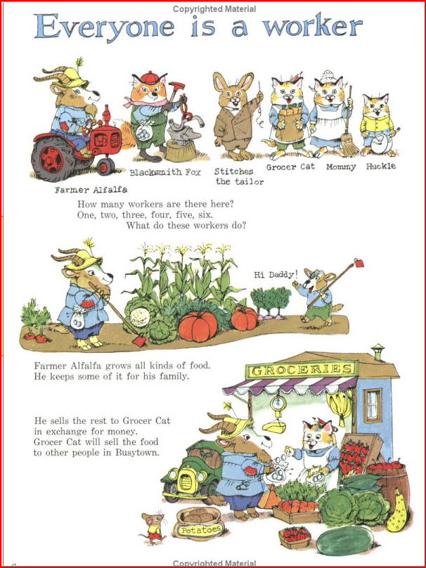
But Sendak's In the Night Kitchen does not. As shown yesterday, Sendak took a leaf from his model, comics master Winsor McCay, and pictured more than one instant on a single page. Two other author-illustrators who often used that technique are Jules Feiffer and Edward Gorey--the other children's-book creators that Scott McCloud proudly names in Understanding Comics. Yet another example that McCloud doesn't mention, but who I think clearly belongs in the same group, is Richard Scarry in his larger books. They all have multiple sequential images on a typical page, my first hallmark of comics style.
TOMORROW: How we read picture books and comics differently.
 I’m very fond of Chris Wormell’s picture book George and the Dragon, which I discussed back here.
 The same guy who created this bunny also painted the cover above.
  And that’s a wood engraving. By the same guy. Really.