29 November 2011

Kaliko Vision

In L. Frank Baum’s Ozma of Oz, Roquat the Nome King is served by a Nome introduced this way:
Meantime the King ordered refreshments to be served to those waiting, and at his command a rudely shaped Nome entered, bearing a tray. This Nome was not unlike the others that Dorothy had seen, but he wore a heavy gold chain around his neck to show that he was the Chief Steward of the Nome King, and he assumed an air of much importance, and even told his majesty not to eat too much cake late at night, or he would be ill.
Later, thinking himself out of the hearing of the guests, the Chief Steward tells the king, “You are a fool to waste so much time upon these people” from Oz.

Baum next visited the Nomes in The Emerald City of Oz, and in that book stated that the king’s steward was named Kaliko. He’s “frightened” by his master, “trembling and white with fear.” Baum offers this exchange:
“Fetch my pipe!” yelled the King.

“Your pipe is already here, your Majesty,” replied Kaliko.

“Then get my tobacco!” roared the King.

“The tobacco is in your pipe, your Majesty,” returned the Steward.

“Then bring a live coal from the furnace!” commanded the King.

“The tobacco is lighted, and your Majesty is already smoking your pipe,” answered the Steward.

“Why, so I am!” said the King, who had forgotten this fact; “but you are very rude to remind me of it.”

“I am a lowborn, miserable villain,” declared the Chief Steward, humbly.
Obviously that exchange shows a interpersonal dynamic very different from the earlier one.

In Who’s Who in Oz, Jack Snow stated that Kaliko first appeared in Ozma—in other words, that he was the Chief Steward in that book as well as the later one. As a young reader, I adopted that interpretation without question. It suggests that the Nome King’s anger over losing his Magic Belt in the earlier book makes it much more dangerous to talk back to him in the later.

More recently, however, such Oz scholars as David Hulan convinced me that might be too much of an assumption. What if the Nome King got rid of the first Chief Steward between the two books? In that case, Kaliko didn’t change his behavior drastically; rather, he could be obsequious enough to manage the angry monarch. What happened to the earlier Chief Steward? Based on what the Nome King orders for some Nome army officers in Emerald City, it would be nothing good.

The Marvel Comics adaptation of Ozma of Oz comes down firmly on the first interpretation, with the Chief Steward being named “Kaliko.” Scripter Eric Shanower’s choice makes for a smaller, more unified cast of characters for the series, and there’s certainly tradition behind it.

Artist Skottie Young also makes an interesting choice in how he designed the Nomes. His Nome King looks much like John R. Neill’s, with a human face, hair, and beard; five-fingered hands; and a caricatured but recognizably humanoid body. In contrast, Young draws the rest of the Nomes as little imps, basically isosceles triangles with tiny limbs and snappish personalities. And Kaliko is among them, as the picture below shows.
Looking ahead, will we see this little Kaliko assuming the Nome Kingdom’s throne?

28 November 2011

I Remember When Barney Frank Was in Worse Shape Than Me

Barney Frank has represented me in the U.S. Congress since before I could vote. [Well, in some college years I voted in another state.] I was sorry to hear this morning that he won’t run again, and hope he enjoys the next stage of his career immensely.

In what must have been the early 1980s Frank, then in his first or second term, spoke at an assembly at my high school. I asked a question about the House’s freshmen, which he praised. About twenty years later, I visited his local office to talk about work-for-hire, copyright, and fair use issues for writers. In that meeting he praised my group for lining up cosponsors from both parties even as he was brusque in getting to business (“Justletmereadthis”).

I recall attending a 2002 meeting with voters in which Frank announced he’d have to leave early because Nancy Pelosi was about to be chosen House Minority Leader. That might have been the same meeting in which he jocularly chided the audience for not being honest about wanting favors from our representatives.

Frank always had a sharp wit, making him a national media figure. But he also mastered legislation and House procedure. In 2008 and 2010, Capitol Hill staffers named him one of the chamber’s “workhorses.” The return of the Republican majority in 2011 left him with little to do, a situation he suffered for several years and which he can’t have relished.

In 1987, Frank famously told the public he was gay. He wasn’t the first gay Congressman by any stretch of the imagination, but he was the first to voluntarily acknowledge his sexuality. (Wikipedia notes that a Republican Congressman who led the effort to censure Frank was Larry Craig. Who had the healthier approach to sexual matters?) Unfortunately, being gay and progressive made Frank a lightning rod for America’s far right.

One of the many Republican lies of recent years has been to complain that Frank helped to bring on the housing bubble by pushing for more home mortgages. That doesn’t make sense in terms of timing (the act in question passed decades before the Bush-Cheney recession began), numbers (homeowners with loans under that law were less likely to default than others), policy (Frank pushed for more rentals, not more mortgages), scope (similar problems occurred in other countries), or power (the Republicans controlled the House in the years when the bubble grew, not to mention the White House). People making that claim willfully ignore the mistakes and crimes of the mortgage industry, even as evidence of those problems piles up. As I said, it’s just one of many Republican lies.

It’s too bad we won’t have Barney Frank to kick those around anymore.

27 November 2011

When Did Dick Grayson Become a “Ward”?

Prompted by an Oz and Ends reader, I plan to devote the next few installments of the weekly Robin to explore the legalities of the relationship between Bruce Wayne and Dick Grayson, and between Bruce and his subsequent crime-fighting partners.

Even people who’ve never read Batman comics have heard that Dick Grayson is Bruce Wayne’s ward. I suspect that label was reinforced in our minds by the iconic performance of Burt Ward. But I digress.

When did the comics establish that relationship? It took a few months. Detective Comics, #38, which introduced the Sensational Character Find of 1940, referred to Robin as Batman’s “ally” and “aid” [sic].

That story famously showed the Dynamic Duo swearing an “undying oath” to fight crime together, and it stated that “months” of training followed. But there were no scenes of Dick leaving the circus, nothing about any surviving family, and no sight of the child-welfare authorities. Simpler times, at least in pulp fiction.

Batman, #1, featured Robin in three of its four stories, and also used the term “aid.” The magazine makes clear that Dick Grayson lives in Bruce Wayne’s home, and will continue to be Batman’s partner past the Zucco case, but offers no formal explanation.

Detective, #39, started spelling the word for Robin’s role “aide.” Detective, #40, included a scene featuring Dick, Bruce, and Bruce’s fiancée Julie, so it’s clear that people know that a teenager is living in Bruce’s home.

But not until Detective, #41, did anyone refer to Dick as Bruce’s “ward.” The term appeared in that issue because in its story Bruce enrolls Dick at a fancy boys’ school so he can investigate crime there. For the first time, Bruce acts in loco parentis, requiring a legal relationship (or at least the disguise of one).

The word “aide” returned in Batman, #2 (which also offered “protege”) and #3, and in Detective Comics, #43. All of the Batman stories of this time (including World’s Fair Comics 1940) provided new readers with at least a quick introduction of the main characters, but none explained why Dick Grayson and Bruce Wayne live together. Not until the last story in Batman, #3, did the narration once again speak of “an idle playboy and his ward.”

COMING UP: Exploring the ramifications of Dick Grayson’s legal status.

26 November 2011

One of the Book Fair Faithful

I grew up with the New England Mobile Book Fair as one of my local bookstores. It was a store like no other. The company started as a wholesaler for book fairs, but, fueled by our local community’s firm opposition to buying anything at retail, became a superstore with everyday discounts years before Barnes & Noble and Borders started their battle to the death.

With its roots in wholesaling, New England Mobile never adopted some standard bookselling practices. Like shelving books by category rather than by publisher/distributor and, within those groupings, author name. Like shelving books on attractive shelves rather than rough plywood. Like offering a computer system geared to its stock rather than Bowker’s Books in Print. Like opening a café, even though it’s one of the best cookbook suppliers in the country.

Hey, I remember when a colleague from the publishing company went to work for the store and brought the revolutionary idea of maps and signs for customers.

The family that founded New England Mobile just sold it to a retired insurance executive named Tom Lyons, the Boston Globe reported today. And Lyons has big plans to turn it into…a bookstore.
Lyons wants to sponsor author events at the store, create a more family-friendly children’s section, and invite the area’s professors and professionals to give advice on what specialty books to sell. He must computerize the inventory.

And — this may sound like heresy to the Book Fair faithful — he plans to reorganize the volumes by genre instead of by publisher.
Those will be tremendous changes in an establishment that aesthetically owes more to used-book barns than any mall. Indeed, Lyons expects eventually to sell used books in addition to the huge stock of remainders. But getting from the current situation to that new model will be a seismic event.

Meanwhile, bookselling is undergoing plenty of general seismic events. The Globe article starts by quoting Lyons on loyalty to printed books: “Pretty much everybody I talk to loves books and reads books and wants their children to feel and put their hands on a book,” says Lyons. Which would bode well for the store’s prospects if he wasn’t, you know, a 66-year-old bibliophile. Of course his circle likes printed books.

My first piece of advice to Lyons would be to install an Espresso Book Machine. Then he could publish his novels, and serve our local community of thousands of other people who have unpublished novels. He could even offer that service at a nominal discount.

25 November 2011

Greatest Insight Ever—A New Age of Overstatement?

Back in 2008 I quoted Adam Gopnik writing in the New Yorker about an early-20th-century shift in prose style:

Writers like Shaw and Chesterton depended on a kind of comic hyperbole: every statement is an overstatement, and understood as such by readers. The new style prized understatement, to be filled in by the reader. What had seemed charming and obviously theatrical twenty years before now could sound like puff and noise. Human nature didn’t change in 1910, but English writing did.
Have we entered another age of overstatement? Increasingly common phrases like “Best [fill in the blank with something not all that special] ever!” and “[Rather innocuous annoyance] must die!” suggest that we have. Once again, writers expect readers to understand that they’re not being literal. Which of course brings us to the modern, overstating use of “literal.”

23 November 2011

“The ever-amazing Jefferson Mays”

Charles Isherwood’s review of Blood and Gifts, J. T. Rogers’s new play about Afghanistan in the 1980s, is positive all around, but singles out one member of the cast for particular praise:

the rather unimpressive first “gift” to the Afghan cause Warnock has come to offer: 100,000 rifles...inspires outrage in Afridi and snorts of scorn in Simon Craig (the ever-amazing Jefferson Mays), Warnock’s British counterpart, working for the British intelligence service MI6. . . .

I suspect Mr. Mays has been boning up on Greene and le Carré to prepare for his performance, so richly saturated is it in the sardonic humor and bruised humanity of the best depictions of cynical British operatives in those novelists’ work. Craig is always scrambling in late for meetings with the sweat of a hangover still upon him. He is also often hilarious in his bitter commentary on both the British government’s impecunious support for the cause and the moral morass that the Afghan conflict has become.

When he learns that major weaponry is to be channeled to Hekmatyar, Craig erupts in a typical burst of seething sarcasm, asking Afridi if the Afghans themselves have been consulted: “You know, ‘Hello Afghans! Would you mind terribly if we try and install a maniac to rule you and then sink your country into civil war?’”
Here’s an interview with Jeff Mays on this play from TheaterMania.

22 November 2011

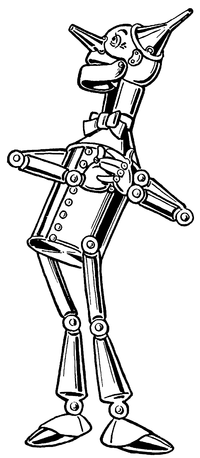
The Tin Woodman’s Head on My Mind

In The Wonderful Wizard of Oz, W. W. Denslow gave the Tin Woodman a skull-shaped head.

Of course, the long nose and ears riveted on that dome, as well as the lively eyes, make it possible to overlook the resemblance most of the time. But the rounded cranium and hinged jaw are quite reminiscent of fleshless human anatomy.

John R. Neill followed Denslow’s model in his illustrations for Ozma of Oz and Dorothy and the Wizard in Oz. As in the series’s first book, the tin man’s head bulges out at the back.

However, in The Marvelous Land of Oz, published before those two titles, and in all the Oz books that followed them, Neill used a different character design, with a cylindrical head. The neck varied at first, but eventually settled on the vague sort of attachment Denslow has used.

In most of those books, when the Tin Woodman takes off his funnel cap, we see that the top of his head is a rounded dome. Neill used the same design for Captain Fyter, the tin emperor’s doppelgänger in The Tin Woodman of Oz (1918).

Toward the end of his career, starting with Ozoplaning with the Wizard of Oz (1939), Neill made yet another variation: he drew the tin man’s head as flat on top, like a tin can. I suspect Neill was out of practice drawing his Tin Woodman; Ruth Plumly Thompson made little use of Baum’s more mature male characters.

I review this history to acknowledge that even within the Oz books there’s a significant variation in the Tin Woodman’s character design. On top of that, we have the costumes created for David Montgomery and Jack Haley, which have to allow a man to fit inside. Thus, people can imagine many things when they think of Nick Chopper.

Lots of comics artists like to depict the Tin Woodman as a robot. That’s doesn’t really fit his origin, in which he’s a living man whose body is gradually replaced with tin parts, and it leaves less room in the saga for Tik-Tok, an actual robot. But some artists just love drawing robots.

One example of that trend is David Hutchison in his Oz: The Manga series, as shown at right. His Tin Woodman’s head is a smokestack, and the robotic characterization extends to gear-shaped speech balloons.

Skottie Young avoided that temptation in helping to adapt the series for Marvel Comics. Indeed, his character design plays up the characters’ old-fashioned, rural beginning. (The man harvested wood, after all.) The tin mustache is reminiscent of L. Frank Baum himself.

And I have a hard time warming to the result. I think the problem for me is that as colored in a pale, tinny way, the mustache looks white. The character’s smooth round head and old-fashioned style reinforce that impression. As a result, this Tin Woodman always looks to me like an old man.

Based on Neill and Denslow’s art, and Baum’s writing, I think of Nick Chopper as a man in his twenties, preserved agelessly by being made into tin (and by living in Oz). Though the Tin Woodman has excellent and kind instincts, and matures somewhat over the series, he’s not old enough to have become wise. He makes mistakes and still regards his appearance with more than a little vanity.

I have trouble imagining the Tin Woodman as a Richard Farnsworth type, much as I admire that actor and some of the characters he’s played. Of course, it’s better than a robot.

21 November 2011

Daredevil and the Family Circus

A day after analyzing some big panels in which a single character appears multiple times, I read Tucker Stone’s Comixology interview with scripter Mark Waid highlighting this double-page spread designed by Marcos Martin for a recent issue of Daredevil.

Waid explained:
I said "look, I need the two of them in a street scene in the glory of all of New York". I used that Superman Vs. Muhammad Ali book as an example for him, that famous two-page spread that Neal Adams drew of the city. . . . It's an amazing drawing. And we needed something of that sensibility. And then I said I was sorry and that I would pay him back for it in the years to come. And you saw what he did. He turned an establishing shot into the Family Circus. And I mean that in a good way!
Stone notes that Martin did similar things in recent issues of Captain America and Spider-Man. I recall another example in Logicomix, by Apostolos Doxiadis, Christos H. Papadimitriou, and Alecos Papadatos.

Waid refers to the well-known “dotted line” Sunday strips of Bil and Jeff Keane’s Family Circus. Those are different, however, usually showing the moving character only at the end while preserving his path across a landscape with a dotted line.

In many ways this multiple-figure image works like those I discussed yesterday (and not just because, technically speaking, it appears in a Daredevil comic). The action moves left to right, background to foreground, helping us English readers to arrange the moments in chronological order. Having a horizontal space to work with probably makes that easier. In addition, both approaches involve maintaining the same basic mood throughout the scene.

Notably, the individual vignettes on this spread are visually separated by areas without balloons or major characters. We can thus insert mental gutters between the moments. In contrast, the multiple figures in yesterday’s panels often overlapped each other, signaling how we should consider them as all part of a single quick series of movements.

(The panel above displays another way of “showing the invisible” for Daredevil, who’s blind but has enhanced senses and radar due to one of those convenient early-1960s accidents with radioactivity. The square boxes popping up around the scene communicate what he’s hearing, smelling, and otherwise sensing.)

20 November 2011

Eleven Nightwings in One Panel

Earlier this month Miguel Rosa at Comics Without Frontiers set himself to “find a panel that shows a character doing multiple actions.”

This was because Devin Grayson had advised novice comics scripters to be sure they ask artists to depict only one action per panel, something she had to learn early on. In that respect, comics panels are not like shots in a movie.

Rosa found two examples of multiple-action panels from Frank Miller’s Daredevil. Yet another appears in this month’s Nightwing, drawn by Eddy Barrows:

There are also plenty of examples in the Flash comics: a speedster moves so fast that he or she appears in several places at once (yet another form of “showing the invisible”). But the relative rarity of such panels supports Devin Grayson’s point, that generally comics scripts need to specify one moment per image.

Artists pull out the technique of showing one person several times in one big panel to portray that character’s exceptional speed (as with the Flashes) or exceptional grace (as with Nightwing and Daredevil). Those images achieve their power because they’re unusual, and break the expected rules.

Furthermore, those panels almost always show only the main character doing multiple actions, and that character has a single goal and mood throughout. It would be much harder for one image to comprehensibly show two characters reacting to each other multiple times, or changing goals or emotions as they move.

Occasionally artists use the technique symbolically, as in the lower example showing how Dick Grayson grew up. This particular image demands that readers already know that history, however.

To make such panels easier to interpret, as Rosa’s examples and the picture above show, colorists usually render most of the figures in lighter shades. Motion lines can also guide our eyes from one figure to another in the proper order.

(The larger point of Rosa’s post is about how motion lines are vanishing from recent American superhero comics, along with other “show the invisible” techniques. He complains that pencilers are acting as “nothing more than glorified illustrators” rather than using the form’s full potential.)

19 November 2011

Eleanor Davis Shows the Invisible

I can’t keep writing about how comics “show the invisible” without pointing to Eleanor Davis’s delight-filled The Secret Science Alliance and the Copycat Crook. It’s a wonderful compilation of such techniques deployed for lively storytelling, and I’ve been meaning to mention it for months.

On pages 49-56 alone, I spot the following:
  • speech balloons, including variations for shouting (two types), electronic communication, machine readouts, interrupted communication, and hysterical laughter, along with boldface italics within speeches for emphasis.
  • cutaway views.
  • sound effects.
  • titles incorporated into the page design.
  • thought balloons.
  • labels for objects, including one listing the contents of a refrigerator and another describing an important notebook.
  • “wafterons,” Mort Walker’s name for the squiggly lines rising like hot vapors to indicate aromas.
  • “dites,” Walker’s term for the straight lines cartoonists use to indicate a smooth surface.
  • inset picture of something that the characters within the scene have lost (well, it’s invisible to them at that moment).
  • diagrams of devices that a character is thinking of.
  • paths showing the panel reading order as panels are stacked on the left.
  • motion arrow and manga-style motion label (“FLIP!”) together.
  • filmstrip displaying a digital recording, along with caption explaining that this format “looks cooler.”
Finally, page 57 provides a symphony of visual tricks in only five panels: speech and thought and yelling balloons, cutaway view, explanatory labels, sound effects, an oversized intrusive narrative caption, and manga-style motion labels.
That plethora of techniques is appropriate for this story, which celebrates the secret knowledge of science. The visual language of comics is, after all, a code for savvy readers. And while there’s a lot happening on every page, there’s also a lot happening in the characters’ heads.

Interestingly, Davis rarely uses motion lines or variations on what Walker calls “emanata” to show strong emotion until the climactic pages of her book. Only then does she pull them out of the cartoonist’s toolbox to depict the faster action and higher stakes.