22 November 2011

The Tin Woodman’s Head on My Mind
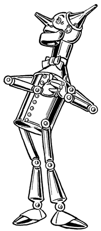
In The Wonderful Wizard of Oz, W. W. Denslow gave the Tin Woodman a skull-shaped head.

Of course, the long nose and ears riveted on that dome, as well as the lively eyes, make it possible to overlook the resemblance most of the time. But the rounded cranium and hinged jaw are quite reminiscent of fleshless human anatomy.

John R. Neill followed Denslow’s model in his illustrations for Ozma of Oz and Dorothy and the Wizard in Oz. As in the series’s first book, the tin man’s head bulges out at the back.

However, in The Marvelous Land of Oz, published before those two titles, and in all the Oz books that followed them, Neill used a different character design, with a cylindrical head. The neck varied at first, but eventually settled on the vague sort of attachment Denslow has used.

In most of those books, when the Tin Woodman takes off his funnel cap, we see that the top of his head is a rounded dome. Neill used the same design for Captain Fyter, the tin emperor’s doppelgänger in The Tin Woodman of Oz (1918).

Toward the end of his career, starting with Ozoplaning with the Wizard of Oz (1939), Neill made yet another variation: he drew the tin man’s head as flat on top, like a tin can. I suspect Neill was out of practice drawing his Tin Woodman; Ruth Plumly Thompson made little use of Baum’s more mature male characters.

I review this history to acknowledge that even within the Oz books there’s a significant variation in the Tin Woodman’s character design. On top of that, we have the costumes created for David Montgomery and Jack Haley, which have to allow a man to fit inside. Thus, people can imagine many things when they think of Nick Chopper.

Lots of comics artists like to depict the Tin Woodman as a robot. That’s doesn’t really fit his origin, in which he’s a living man whose body is gradually replaced with tin parts, and it leaves less room in the saga for Tik-Tok, an actual robot. But some artists just love drawing robots.

One example of that trend is David Hutchison in his Oz: The Manga series, as shown at right. His Tin Woodman’s head is a smokestack, and the robotic characterization extends to gear-shaped speech balloons.

Skottie Young avoided that temptation in helping to adapt the series for Marvel Comics. Indeed, his character design plays up the characters’ old-fashioned, rural beginning. (The man harvested wood, after all.) The tin mustache is reminiscent of L. Frank Baum himself.

And I have a hard time warming to the result. I think the problem for me is that as colored in a pale, tinny way, the mustache looks white. The character’s smooth round head and old-fashioned style reinforce that impression. As a result, this Tin Woodman always looks to me like an old man.

Based on Neill and Denslow’s art, and Baum’s writing, I think of Nick Chopper as a man in his twenties, preserved agelessly by being made into tin (and by living in Oz). Though the Tin Woodman has excellent and kind instincts, and matures somewhat over the series, he’s not old enough to have become wise. He makes mistakes and still regards his appearance with more than a little vanity.

I have trouble imagining the Tin Woodman as a Richard Farnsworth type, much as I admire that actor and some of the characters he’s played. Of course, it’s better than a robot.

21 November 2011

Daredevil and the Family Circus

A day after analyzing some big panels in which a single character appears multiple times, I read Tucker Stone’s Comixology interview with scripter Mark Waid highlighting this double-page spread designed by Marcos Martin for a recent issue of Daredevil.

Waid explained:
I said "look, I need the two of them in a street scene in the glory of all of New York". I used that Superman Vs. Muhammad Ali book as an example for him, that famous two-page spread that Neal Adams drew of the city. . . . It's an amazing drawing. And we needed something of that sensibility. And then I said I was sorry and that I would pay him back for it in the years to come. And you saw what he did. He turned an establishing shot into the Family Circus. And I mean that in a good way!
Stone notes that Martin did similar things in recent issues of Captain America and Spider-Man. I recall another example in Logicomix, by Apostolos Doxiadis, Christos H. Papadimitriou, and Alecos Papadatos.

Waid refers to the well-known “dotted line” Sunday strips of Bil and Jeff Keane’s Family Circus. Those are different, however, usually showing the moving character only at the end while preserving his path across a landscape with a dotted line.

In many ways this multiple-figure image works like those I discussed yesterday (and not just because, technically speaking, it appears in a Daredevil comic). The action moves left to right, background to foreground, helping us English readers to arrange the moments in chronological order. Having a horizontal space to work with probably makes that easier. In addition, both approaches involve maintaining the same basic mood throughout the scene.

Notably, the individual vignettes on this spread are visually separated by areas without balloons or major characters. We can thus insert mental gutters between the moments. In contrast, the multiple figures in yesterday’s panels often overlapped each other, signaling how we should consider them as all part of a single quick series of movements.

(The panel above displays another way of “showing the invisible” for Daredevil, who’s blind but has enhanced senses and radar due to one of those convenient early-1960s accidents with radioactivity. The square boxes popping up around the scene communicate what he’s hearing, smelling, and otherwise sensing.)

20 November 2011

Eleven Nightwings in One Panel

Earlier this month Miguel Rosa at Comics Without Frontiers set himself to “find a panel that shows a character doing multiple actions.”

This was because Devin Grayson had advised novice comics scripters to be sure they ask artists to depict only one action per panel, something she had to learn early on. In that respect, comics panels are not like shots in a movie.

Rosa found two examples of multiple-action panels from Frank Miller’s Daredevil. Yet another appears in this month’s Nightwing, drawn by Eddy Barrows:

There are also plenty of examples in the Flash comics: a speedster moves so fast that he or she appears in several places at once (yet another form of “showing the invisible”). But the relative rarity of such panels supports Devin Grayson’s point, that generally comics scripts need to specify one moment per image.

Artists pull out the technique of showing one person several times in one big panel to portray that character’s exceptional speed (as with the Flashes) or exceptional grace (as with Nightwing and Daredevil). Those images achieve their power because they’re unusual, and break the expected rules.

Furthermore, those panels almost always show only the main character doing multiple actions, and that character has a single goal and mood throughout. It would be much harder for one image to comprehensibly show two characters reacting to each other multiple times, or changing goals or emotions as they move.

Occasionally artists use the technique symbolically, as in the lower example showing how Dick Grayson grew up. This particular image demands that readers already know that history, however.

To make such panels easier to interpret, as Rosa’s examples and the picture above show, colorists usually render most of the figures in lighter shades. Motion lines can also guide our eyes from one figure to another in the proper order.

(The larger point of Rosa’s post is about how motion lines are vanishing from recent American superhero comics, along with other “show the invisible” techniques. He complains that pencilers are acting as “nothing more than glorified illustrators” rather than using the form’s full potential.)

19 November 2011

Eleanor Davis Shows the Invisible

I can’t keep writing about how comics “show the invisible” without pointing to Eleanor Davis’s delight-filled The Secret Science Alliance and the Copycat Crook. It’s a wonderful compilation of such techniques deployed for lively storytelling, and I’ve been meaning to mention it for months.

On pages 49-56 alone, I spot the following:
  • speech balloons, including variations for shouting (two types), electronic communication, machine readouts, interrupted communication, and hysterical laughter, along with boldface italics within speeches for emphasis.
  • cutaway views.
  • sound effects.
  • titles incorporated into the page design.
  • thought balloons.
  • labels for objects, including one listing the contents of a refrigerator and another describing an important notebook.
  • “wafterons,” Mort Walker’s name for the squiggly lines rising like hot vapors to indicate aromas.
  • “dites,” Walker’s term for the straight lines cartoonists use to indicate a smooth surface.
  • inset picture of something that the characters within the scene have lost (well, it’s invisible to them at that moment).
  • diagrams of devices that a character is thinking of.
  • paths showing the panel reading order as panels are stacked on the left.
  • motion arrow and manga-style motion label (“FLIP!”) together.
  • filmstrip displaying a digital recording, along with caption explaining that this format “looks cooler.”
Finally, page 57 provides a symphony of visual tricks in only five panels: speech and thought and yelling balloons, cutaway view, explanatory labels, sound effects, an oversized intrusive narrative caption, and manga-style motion labels.
That plethora of techniques is appropriate for this story, which celebrates the secret knowledge of science. The visual language of comics is, after all, a code for savvy readers. And while there’s a lot happening on every page, there’s also a lot happening in the characters’ heads.

Interestingly, Davis rarely uses motion lines or variations on what Walker calls “emanata” to show strong emotion until the climactic pages of her book. Only then does she pull them out of the cartoonist’s toolbox to depict the faster action and higher stakes.

18 November 2011

“The utter eradication of thought balloons”

Once established (as discussed yesterday), thought balloons became a valuable way that comics creators could “show the invisible,” which I posit is a dimension that sets that form apart from other types of illustrations. That was especially useful when there was a contrast between a character’s thoughts and his actions or speech, as with Cerebus or Peter Parker.

Too often, however, comics creators used thought balloons to tell rather than show, especially for the benefit of young readers and those who had never, ever seen a comic before: “Oh, no! Once again my ring won’t work against anything yellow! I must think of something else before...” (I exaggerate, but only a little.)

In the early 1980s, artist David Lloyd and writer Alan Moore were discussing a new feature for the magazine Warrior in their native Britain. This was meant to be a more sophisticated adventure for adult readers, and its main character’s plans and motives were opaque. Moore wrote of that planning:
Dave was giving me his ideas as to how he actually wanted to approach the strip in terms of layout and execution. These included the absolute banning of sound effects, and, as an afterthought, the utter eradication of thought balloons into the bargain.

As a writer, this terrified me. I wasn’t so much bothered about the sound effects, but without thought balloons, how was I going to get over all the nuances of character that I needed to make the book satisfying on a literary level? All the same, there was something about the discipline of the idea that fascinated me, and while dropping off to sleep at night I’d find it nagging away somewhere in the recesses of my cerebral swamp.

A couple of days later I wrote back to Dave telling him...that not only would we do without thought balloons and sound effects but I was prepared to get rid of most of the caption boxes as well and just rely entirely on pictures and dialogue.
The result was V for Vendetta, and a more cinematic approach to comics storytelling. There may well be earlier examples of mainstream comics creators deliberately doing without so many of their standard narrative tools, but this approach was most influential. That’s because Moore, getting over his initial reluctance, embraced the approach and carried it with him to Watchmen.

Meanwhile, a bunch of American comics creators, including Marv Wolfman, John Byrne, and Frank Miller, were experimenting with first-person narration in captions instead of third-person narration. Those captions offered a space for internal monologue separate from thought balloons. The popularity of the results, particularly Miller’s Ronin and Dark Knight Returns, worked with Watchmen and V for Vendetta to make thought balloons seem unsophisticated. And soon they were utterly eradicated.

17 November 2011

“Characters were constantly speaking to themselves out loud”

At a new blog called Comics Without Frontiers, Miguel Rosa traces the development of thought balloons in the first year of Superman and Spirit comics.

[Rosa started his blog to promote discussion of comics from outside the US, but a lot of the postings are on the standard American superhero stories. Not that there’s anything wrong with that.]

This posting complements my discussion of the same topic, which watched how thought balloons developed alongside whisper balloons since early on characters often seemed to be voicing asides to the audience.

Rosa writes:
I realized that one of the reasons why thought balloons were seldom used in those years was because the characters were constantly speaking to themselves out loud, like in this panel from Action Comics #1. In many of these cases, thought balloons should have been used instead. Rather than speaking out loud, a thought balloon containing a line like, “The cops are coming; I better change to my civilian clothes!” would make more sense.
He also reprints a delightful Spirit panel which shows the hero trapped under water and saying out loud: “I...can’t... hold...my...breath... much...longer!”

Soon, however, the thought balloon became a standard part of American comics punctuation, avoiding such unrealistic moments. Because superhero comics had to be realistic.

TOMORROW: Who started the thought balloon’s hibernation over the last thirty years?

15 November 2011

Cartoon Art Museum Has Gone to Oz

Last week the Cartoon Art Museum in San Francisco opened an exhibit on Oz comics. It draws heavily on the collection of Peter Maresca, publisher of Sunday Press (which would be a small press except that its books are so big).

Early comics artists in the exhibit include Walt McDougall (working with L. Frank Baum), W. W. Denslow (competing with him), and John R. Neill (before becoming Baum’s main illustrator). More recent ones include Eric Shanower, Skottie Young, Anna-Maria Cool, and Ramona Fradon.
Among the pages on display is one Eric Shanower drew for Oz-Story magazine a while back, showing moments in the Oz series illustrated in the styles of different famous cartoonists.

I visited the Cartoon Art Museum on my last trip to San Francisco beyond the airport, and admired how much good stuff it displayed in a small space. Definitely worth a visit. [Hey, there’s Jerry Robinson!]

14 November 2011

“Mine is full of slightly antiquated, pre-contemporary language”

The British publishing magazine The Bookseller has run an interview with debut fantasy novelist James Treadwell (also Godson’s Dad). Although his book Advent features teens as central characters, Treadwell agrees that it’s not typical YA:
The central theme of magic in the real world is reminiscent of the classic fantasy series The Dark is Rising (a sequence of seven [sic] books first published in the late 1960s and 1970s), and it’s no surprise to hear Treadwell describe those books as “a huge part of my mental geography growing up—I loved them”.

Advent is for a slightly more sophisticated readership though, and Hodder is pitching at both the adult and older YA market. With the rise in the appeal of fantasy for a mainstream audience, Hodder is hoping for a Jonathan Strange & Mr Norrell-style crossover. . . .

Treadwell doesn’t think his former academic career—he was a Romanticist specialising in 18th and 19th-century writers—has had a direct influence on Advent, but he does acknowledge that spending so much of his adult life reading will have an effect on his own writing: “Any writer has an internal echo chamber, full of bits of phrases and words and language. Mine is full of slightly antiquated, pre-contemporary language, because that’s what I read for a long time.”

Treadwell says while he loved the idea of writing for teenagers when he started the novel, “I realised that these are not young adult sentences. My hand wouldn’t do it. I’m quite prolix. I write long sentences, I don’t write straightforward fast-moving plots . . . but I would love teenagers to read it, and I hope that they will.”
The great thing about the teen years, of course, is that book-lovers can read both well above and below their stated age range.

13 November 2011

One Robin will not be enough.”

Batman: The Brave and the Bold, #13, issued this week, features six former and future Robins brought together by the convenient mystical powers of the Phantom Stranger. As with most of DC’s other semi-parodic superhero comics for young readers, it’s a simple, self-contained story that rests on and reinforces the archetypal characters.

In fact, the adventure stays simple to expand the space for interaction among the different Robins, their characters neatly summarized for us later in narrative captions. Batman is so archetypal that he’s actually back in Crime Alley witnessing a mugging (as in “To Kill a Legend,” Detective Comics, #500). And precisely because he’s Batman, he can breathe in space keep his sanity in a Lazarus Pit. Nightwing, ever optimistic, figures as much.

Scripter Sholly Fisch chooses to show Dick Grayson early in his Nightwing career, which makes him the obvious leader of the Robins and visually distinct from the rest. Penciler Rick Burchett differentiates the teens in red and green by picking up the important details of their canonical costumes. (In three panels, though, the colorist has mixed up the second Jason and Tim.)

Reading this magazine led me to two observations. First, regardless of DC co-publisher Dan DiDio’s public statements, the company’s creative people understand that Stephanie Brown was a Robin. Fisch’s script puts the denial of that obvious fact into the mouth of a ten-year-old boy, where it belongs.

Second, as I said about Tiny Titans, I’m puzzled by how young readers are supposed to respond to most of this comic’s references to the DC canon. I’m not talking about, say, the title spread’s homage to “Robin Dies at Dawn!”—that slips perfectly into this story without any rough edges sticking out.

But twice gags depend on knowing that Damian was once heir apparent to the head of the League of Assassins, a fact available in the regular Batman comics (the ones with people’s heads and faces getting chopped off) but not in this issue. At another point Carrie reels off some baffling slang, but the story never explains that she’s the Robin from furthest into the future(s).

As with Tiny Titans, such allusions left me feeling this comic isn’t really for kids. Its age label is just a screen that lets us older fans enjoy simple, archetypal stories.

12 November 2011

Pingback

The following review originally appeared at Slashdot. Later it was copied onto Amazon, as of this week 10,196 of 10,568 people found it helpful:
Using deft allegory, the authors have provided an insightful and intuitive explanation of one of Unix's most venerable networking utilities. Even more stunning is that they were clearly working with a very early beta of the program, as their book first appeared in 1933, years (decades!) before the operating system and network infrastructure were finalized.

The book describes networking in terms even a child could understand, choosing to anthropomorphize the underlying packet structure. The ping packet is described as a duck, who, with other packets (more ducks), spends a certain period of time on the host machine (the wise-eyed boat). At the same time each day (I suspect this is scheduled under cron), the little packets (ducks) exit the host (boat) by way of a bridge (a bridge). From the bridge, the packets travel onto the internet (here embodied by the Yangtze River).

The title character -- er, packet, is called Ping. Ping meanders around the river before being received by another host (another boat). He spends a brief time on the other boat, but eventually returns to his original host machine (the wise-eyed boat) somewhat the worse for wear.

If you need a good, high-level overview of the ping utility, this is the book. I can't recommend it for most managers, as the technical aspects may be too overwhelming and the basic concepts too daunting. . . .
What I’d really like to know is why the book was titled The Story about Ping instead of The Story of Ping.
