04 May 2008

The Many Modern Faces of Robin
I started last week quoting Douglas Wolk's proposition that the “default style of the superhero mainstream” in American comics, as defined by the magazines that dominated sales from the early 1960s on, as “doggedly quasi-realistic--or, rather, it’s realism pumped up a little.”

For me, coming back to comics after about twenty years, it's striking how that standard visual style is no longer standard. It's certainly no longer as dominant, and in some places it's awfully hard to find. That of course affects depictions of Robin.

From soon after the introduction of the Boy Wonder in 1940 until the mid-1960s, Dick Grayson looked much the same no matter who drew him. All Batman stories were signed with the name Bob Kane, so we should expect them to look like they came from the same artist--except that Kane drew as few of those comics as he could.

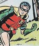
Instead, Robin was drawn by a shifting team of uncredited artists, hired by Kane or DC, all working to a strict style sheet. Readers discerned some stylistic differences; it's said that Dick Sprang was known as "the good Batman artist." But Robin always had a squarish face, a short nose, and a curl on either side of his forehead. The two portraits above were drawn years apart by different artists, but these drawings, and thousands of others from the same decades, share the same iconic features.

In the mid-1960s, Batman's style changed, with Neal Adams establishing a new look that dominated for the next twenty years. This was when Wolk's "quasi-realistic" mode really settled in. Robin changed as well, growing into an older teen and learning to part his hair. But there was still a standard look for Robin, and for superheroes as a whole.

As a comics reader in the next decade, I could see the differences in artists' work, and I liked some better than others. I could even recognize where some stylistic differences arose--in inking, layout, poses. But they were all still close enough to that default style that it was easy to envision those different artists all aiming for the same ideal, or different portraitists depicting the same people.

But sometime after I stopped reading comics a new approach arrived.
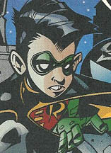
Now mainstream superhero comics exhibit a wide range of visual styles. It's no longer possible to think of all the artists eying the same ideal. They're obviously offering their different artistic visions. (The squat little Robin above is by Dustin Nguyen, from As the Crow Flies. Some of Nguyen's pictures make Robin look positively hobbitish.)

I think one milestone in this transition was Frank Miller's The Dark Knight Returns, published in 1986 (along with his earlier run on Daredevil for Marvel, where he developed a personal style). The success of that iconoclastic miniseries proved that superhero fans didn't have to see quasi-realism to buy lots and lots of copies. They could enjoy the same thrills with other approaches to faces, figures, and settings. (At right, Robin by Alé Garza in Fresh Blood.)

The Dark Knight Returns also helped to usher in a period in which certain comics artists became very big stars, with fans relishing their individual stylistic touches. And that of course only encouraged them.

Another factor was the growing popularity of Japanese adventure comics. Their artistic conventions allowed the same character to change shape for a panel or two as a way to express emotion. The lingo for this technique was straightforward: "super deformed." Again, realism didn't turn out to be that important to visual storytelling. (Left, Robin by Todd Nauck in the Young Justice/Spyboy crossover.)

The result is a sprawling range of styles today, with artists taking different approaches to anatomy, facial features, backgrounds, and action. And when it comes to the character of Robin, the range seems even more broad than that.

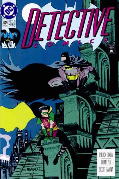
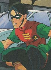
This posting shows the variety of Robins from the past fifteen years. The earliest, at right, is from Matt Wagner's striking cover for Detective #649, and the latest come from last year. This collection doesn't include depictions explicitly outside the standard DC universe, such as those created for the TV cartoons or Tim Sale's in Dark Victory.
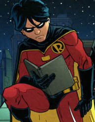
Apparently, as long as the current Robin is (a) a male teen with black hair, (b) smaller than Batman, and (c) wearing the current costume, any size or shape of body, face, and hair is acceptable. (Left: Trevor McCarthy. Right: Freddie E. Williams, II.)

I originally wrote the preceding paragraph to say that Robin had to be a white male teen, but there are a surprising number of images of Tim Drake with Asian features, from such artists as Francisco Rodriguez de la Fuente and Pop Mhan.

Every so often artists draw Robin's pre-1965 look, with the forehead curls--but in their signature styles. At right is Scott McDaniel's image of Jason Todd II from Nightwing: Year One.

Other artists might evoke details of that look, as in Rick Mays's stringy-haired Tim Drake from Robin: Unmasked, right. But neither of these portraits would ever pass muster under the old style sheet.

It took me a while to get used to the range and variability of visual styles in today's superhero comics, just as I was initially baffled by seeing magazines filed in plastic bags with the flap sticking up in the front instead of the back. (When did that change?)

Some artists, such as Jim Lee (left, from Hush), still work in the mode of "realism pumped up," and do it very well. It seems significant that Lee also does very well with this style; he's one of the top-earning artists today. Perhaps fans still like this approach best.

Nevertheless, other talented artists are working comfortably a long way from the old standards. At right, for example, is Joe Benitez's Robin in a one-shot story collected in Batman: Detective.

Sometimes a comic book will have one style on the cover and another inside. One issue of a magazine can look entirely different from the next. Such differences are even more obvious now that DC and Marvel collect short runs of their regular magazines into paperbacks and call the result "graphic novels," no matter whether the issues form a unified story or not.

The To Kill a Bird paperback, the first Robin story I read in over a decade, has pages penciled by four different artists: Damion Scott (his Robin at left actually comes from Batgirl: Death Wish), Pop Mhan, Giuseppe Camuncoli, and Scott McDaniel. Only Camuncoli comes close to the once-standard realistic superhero look.

For me that mix created a visual whiplash. I've learned to appreciate each artist's vision on its own, no longer needing to see the standardized pumped-up realism of my youth. But I still like the illusion that all the pieces of a single story fit together.

Or at least that I'll be able to recognize a character from one chapter to the next without needing to check the uniform.

02 May 2008

Wicked Pissah Show in Boston

I got a heads-up about this show from Dee Michel a few weeks ago, and today the Boston Globe reviewed it: Whizzin', the latest Gold Dust Orphans musical travesty by Ryan Landry.

Critic Louise Kennedy writes:

Landry mines his best humor from staying surprisingly close to his original source, but with the wry addition of social satire and affectionate parody. That cellphone for the Scarecrow - isn't that a perfect prop for the brainless chatterbox of today? Likewise, it feels completely natural for the Tin Man to walk around with a laptop permanently attached. . . .

[As for] the little problem for which Dorothy seeks the wizard's help: She's a bedwetter, though by the time the show is over she'll also have drenched just about everything else in sight. (Hence the show's title, in case you were thinking it had something to do with "Wizard" or the more recent Oz-travaganza, "Wicked.")
That's one way of melting the Wicked Witch.

The Strength of YA Fantasy and Science Fiction

AliceB provided a nice link to John Scalzi's remarks today about the strength of books sales of Young Adult Fantasy and Science Fiction compared to the same genre's numbers in the adult genre section of bookstores. I thought that essay was interesting enough to deserve an entry of its own.

So 50 YA titles are selling twice as much as 100 adult SF/F titles. The bestselling YA fantasy book last week (not a Harry Potter book) outsold the bestselling adult fantasy book by nearly four to one; the bestselling YA science fiction title sold three copies for every two copies of the chart-topping adult SF title. And as a final kick in the teeth, YA SF/F is amply represented at top of the general bestselling charts of YA book sales, whereas adult SF/F struggles to get onto the general bestselling adult fiction charts at all.

That serious adult science fiction/fantasy readers don’t seem to know any of this is a) a feature of the opaque nature of book sales, in which no one publicly talks about actual units sold and b) a feature of the apparent short-sightedness of adult sf/f readers, who are missing a genuine literary revolution in their genre because the YA section is a blank spot on the map to them, if not to everyone else.
I wonder if that trend existed or was as strong before Harry Potter, however. At that time, fantasy for young readers was a venerable genre, but not a blockbuster one that brought in many adult readers as well. There was more buzz for such adult science fiction and fantasy authors as William Gibson and Diana Gabaldon than for established children's authors like Diana Wynne Jones. Perhaps the dominance of one area over another comes in waves.

01 May 2008

We Need More Drool from the Dragon

Last October, Longwood Gardens in Kennett Square, Pennsylvania, issued a press release that said, in part:

The Secret Room is home to the Drooling Dragon...
For decades I've visited my grandparents near Longwood Gardens, and we occasionally made family visits to this arboretum. Those visits proved that you can lead a kid to horticulture, but you can't make him think that it's exciting to watch plants grow.

This new Longwood Gardens feature seems designed to appeal to today's kids, expecting thrills at every other corner. However, I can’t imagine a detail less likely to attract my grandmother than a “Drooling Dragon.” Then again, if the Garden Traveler is correct about what the Drooling Dragon looks like, I would have been terribly disappointed. Especially after seeing the type of dragon that the Longwood Gardens website seems to promise.

30 April 2008

Why YA?

Here are a few provocative remarks from this week's "Think Future" panel on what distinguishes Young Adult literature from adult literature, as reported by panel host Publishers Weekly. The panelists addressed the never-ending question of what distinguishes "young adult" literature. Perhaps because of demographics, we seem to have shifted from how YA differs from books for "tweens" and younger to how YA differs from adult books. And by "provocative," I hope to mean "thought-provoking" as well as "attention-getting."

  • H. Jack Martin, assistant coordinator of young adult services at New York Public Library: “Teen books are like adult books, without all the bullshit.”
  • Sherman Alexie, author of The Absolutely True Diary of a Part-Time Indian: the YA world is made of “99% women,” and that a significant percentage of them have no idea how boys and men think.
  • Alexie: If a YA title is created as a book for young people, “a more conservative point of view comes in. If they are about young people, it’s more about respecting and not protecting. As an Indian I’m used to being what I call ‘reservationized.’ There can be a sense of the category, instead of elevating us, doing the reverse.”
  • Alexie: “I thought I’d been condescended to because I’m an Indian. That was nothing compared to the condescension I get because I’ve written a YA novel. . . . Because I’ve written a book about a 16-year-old, that means I’m a capitalistic whore.”
  • While libraries often shelve copies of a title in both adult and young adult (and children's) sections, George Nicholson, senior agent at Sterling Lord Literistic, “pointed out a hard reality that factors into the ‘where do we put this book?’ discussion: chain bookstores will not multi-position a book in the store.”

29 April 2008

The Dishonesty Behind a Creationist Movie

I was struck by the level of dishonesty from the makers of the creationist movie Expelled that John Rennie and Steve Mirsky have highlighted on Scientific American's blog. Here are two of their "Six Things in Expelled That Ben Stein Doesn't Want You to Know...":

1) Expelled quotes Charles Darwin selectively to connect his ideas to eugenics and the Holocaust.

When the film is building its case that Darwin and the theory of evolution bear some responsibility for the Holocaust, Ben Stein's narration quotes from Darwin's The Descent of Man thusly:
With savages, the weak in body or mind are soon eliminated. We civilized men, on the other hand, do our utmost to check the process of elimination. We build asylums for the imbecile, the maimed and the sick. Thus the weak members of civilized societies propagate their kind. No one who has attended to the breeding of domestic animals will doubt that this must be highly injurious to the race of man. Hardly anyone is so ignorant as to allow his worst animals to breed.
This is how the original passage in The Descent of Man reads (unquoted sections emphasized in italics):
With savages, the weak in body or mind are soon eliminated; and those that survive commonly exhibit a vigorous state of health. We civilized men, on the other hand, do our utmost to check the process of elimination. We build asylums for the imbecile, the maimed and the sick; we institute poor-laws; and our medical men exert their utmost skill to save the life of every one to the last moment. There is reason to believe that vaccination has preserved thousands, who from a weak constitution would formerly have succumbed to small-pox. Thus the weak members of civilized societies propagate their kind. No one who has attended to the breeding of domestic animals will doubt that this must be highly injurious to the race of man. It is surprising how soon a want of care, or care wrongly directed, leads to the degeneration of a domestic race; but excepting in the case of man himself, hardly anyone is so ignorant as to allow his worst animals to breed.
The producers of the film did not mention the very next sentences in the book (emphasis added in italics):
The aid which we feel impelled to give to the helpless is mainly an incidental result of the instinct of sympathy, which was originally acquired as part of the social instincts, but subsequently rendered, in the manner previously indicated, more tender and more widely diffused. Nor could we check our sympathy, even at the urging of hard reason, without deterioration in the noblest part of our nature. The surgeon may harden himself whilst performing an operation, for he knows that he is acting for the good of his patient; but if we were intentionally to neglect the weak and helpless, it could only be for a contingent benefit, with an overwhelming present evil.
Darwin explicitly rejected the idea of eliminating the "weak" as dehumanizing and evil. Those words falsify Expelled's argument. The filmmakers had to be aware of the full Darwin passage, but they chose to quote only the sections that suited their purposes. . . .


3) Scientists in the film thought they were being interviewed for a different movie.

As Richard Dawkins, PZ Myers, Eugenie Scott, Michael Shermer and other proponents of evolution appearing in Expelled have publicly remarked, the producers first arranged to interview them for a film that was to be called Crossroads, which was allegedly a documentary on "the intersection of science and religion." They were subsequently surprised to learn that they were appearing in Expelled, which "exposes the widespread persecution of scientists and educators who are pursuing legitimate, opposing scientific views to the reigning orthodoxy," to quote from the film's press kit.

When exactly did Crossroads become Expelled? The producers have said that the shift in the film's title and message occurred after the interviews with the scientists, as the accumulating evidence gradually persuaded them that ID believers were oppressed. Yet as blogger Wesley Elsberry discovered when he searched domain registrations, the producers registered the URL "expelledthemovie.com" on March 1, 2007--more than a month (and in some cases, several months) before the scientists were interviewed. The producers never registered the URL "crossroadsthemovie.com". [See also the Bad Idea Blog on these registrations last September.] Those facts raise doubt that Crossroads was still the working title for the movie when the scientists were interviewed.
Until now Ben Stein, the public face of the Expelled movie, had been my favorite old Nixon hand. Of course, that was based only on his game show. But he seems to be once again in a nest of liars.

The people behind Expelled probably think of themselves as doing God's work. (There's always the possibility, however, that they're cynics aiming at a gullible market.) Seeing such obvious lies from those moviemakers leads me once again to ponder physicist Steven Weinberg's remark: "With or without [religion], you would have good people doing good things and evil people doing evil things. But for good people to do evil things it takes religion."

28 April 2008

“The Default Style of the Superhero Mainstream”

Early in Reading Comics: How Graphic Novels Work and What They Mean, critic Douglas Wolk states, “American art cartoonists generally try very hard to adopt a style that’s far away from the default style of the superhero mainstream.”

Which naturally leads him to the question of what defines or drives that “superhero mainstream” style:

You know it when you see it, but it’s hard to pin down. Here’s a stab at it: it’s designed to read clearly and to provoke the strongest possible somatic response. You’re supposed to react to it with your body before you think about it.

Most of its characters, especially the heroic ones, are drawn to look as “sexy” as possible--wasp waists, big breasts, and flowing hair on women; rippling muscles on men.

People and objects are partly abstracted and partly modeled, but always within a framework of representation. There’s a lot of foreshortening, for the somatic excitement of seeing something right in front of your face. The style gives a sense of even the most everyday actions and interactions being charged with sex, power, and beauty.

Most of all, generic mainstream drawing is doggedly quasi-realistic--or, rather, it’s realism pumped up a little, into something whose every aspect is cooler and sexier than the reality we readers are stuck with. It’s meant to provide an escape route into a more thrilling world than our own.
So do you think that applies to yesterday’s picture by Don Kramer?


Going back to Wolk’s introductory remark, if “art comics” creators try to stay far away from that visual style, do they deliberately seek a look that tamps down “somatic excitement” and blanches out “sex, power, and beauty”? That would certainly explain Jimmy Corrigan.

27 April 2008

The “Battle We’ve All Been Dreading”

This week Fuse #8 provided a link to Barcelona-based comics artist David Baldeon's online gallery, including some pages he penciled for Robin #169. These also appear on his Spanish-language blog, as do examples of how some of the same pages looked after digital inking and coloring. In addition, Baldeon had drawn Robin #172 and some issues of Teen Titans and Blue Beetle, which both featured, well, Robin.

The basis of this weekly Robin installment is Baldeon's full-page image (click on thumbnail to the right) of the current Robin (Tim Drake) and the original Robin, now Nightwing (Dick Grayson), about to confront each other over...well, some pool of immortality thing--I wasn't really following. This was the dramatic last page of one chapter in a story that arced over several of the Batman-related magazines late last year in the usual effort to boost sales.

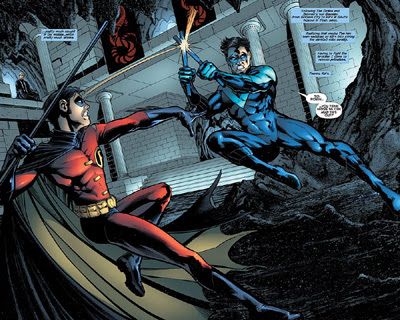
The next chapter appeared in Nightwing #139. Its cover showed Tim and Dick grappling, the headline "Brother vs. Brother," and the marketing copy "Is this the Nightwing vs. Robin battle that we've all been dreading?" The first full-page spread by Don Kramer looked like this.


(Bigger images here.)

Fights between two popular heroes are part of superhero comics' stock in trade, so common that they're cliché. They offer lots of action. They bring in two sets of fans. They answer the sort of question that burns in the minds of eight-year-olds: "What if Superman fought Wolverine? Wouldn't that be neat!"

But in this case, after about four pages of acrobatics, Robin and Nightwing hugged it out. And their fans weren't disappointed. Because Tim and Dick have the most comfortable, least emotionally fraught relationship of any two characters in the "Batman family," and possibly all of comics. Since 1991, they've been written as brothers, well before they had any familial or legal tie. (In recent years Bruce Wayne has adopted both as heirs.) They've remained close and respectful even when one or the other was estranged from Batman.

And fans love that aspect of these two characters. That's why folks were dreading a fight between Nightwing and Robin while a fight between Superman and Wolverine would still be neat.

26 April 2008

The Art of the Index

A good book index is "a thing of beauty," Prof. Enid Stubin wrote in her memoir of working for New York's leading index house on More Intelligent Life back in December. So it is. So is Stubin's article, an evocation of publishing in the early 1990s when most book production was still paper-based.

Along the way, Stubin subtly reveals how a book's index, though it looks unassuming, should be the product of long and careful thought. It's like the back door of a house, and often more people enter through the back door than the grand front entrance. Back when I was a full-time book editor, I tried to read over indexes as carefully as I read manuscripts and proofs, which surprised the Production people. As we get further into the era of keyword searching of entire manuscripts, however, indexing may come to be seen as less valuable and eventually a lost art.

Many publishing contracts stipulate that the cost of an index will be charged against an author's royalties, on the grounds that the index is part of the content of the book, and therefore the author's responsibility to supply. Of course, the last thing publishers want authors to do as production deadlines beat down on them in waves is try to crank out the first indexes they've ever created. I had one author, reporting on the computer business, convinced that he had the technological solution for indexing his proofs. He delivered on time, then told me that he'd been up all night and those last pages in his book were by far the hardest.

People in Washington, DC, are notorious for picking up a political book in a store, checking for their names in the index, reading those pages, and then putting the book back. Richard Ben Cramer insisted that his gossipy campaign chronicle What It Takes be published without an index to force politicos to actually buy and read it. Several other authors in the field followed suit.

I edited such one such Washington book: Bad Boy, John Brady's biography of the notorious political consultant Lee Atwater. I had the idea of commissioning a standard index but not printing it in the book; instead, people still had to read the book, but they could mail away for or download the index. This was back in 1996, and the idea of using the web to supplement printed books wasn't widespread outside of technology publishing. Unfortunately, the idea didn't gain the publicity we wanted; the only people who seemed to notice were irked by the whole idea.

Later, as a freelance editor, I assembled the index for the first edition of Linda Granfield's America Votes! The task wasn't as hard as I thought. Of course, the book was only 64 pages, well written, and carefully organized to begin with. I didn't even have to do the painful cutting I expected; the Production people surprised me by fitting all my topic lines onto one book page.

(Also at More Intelligent Life: a brief essay on P. G. Wodehouse's villains and a long interview with Philip Pullman.)

25 April 2008

An Extremely Well-Put-Together Little Droid

Via Desert Dispatches, I learned about Sillof's Steampunk Star Wars action figures, and a whole new artistic hobby: customizing commercial action figures to create new visions of popular fantasy universes.

The thumbnail picture shows, as an example, R2-D2 reimagined as a late Victorian, steam-powered droid. Visit Sillof's site to see pictures of how this R2 unit can light up from inside.

(Probably the best and best-known examples of "steampunk" in children's literature today are Philip Reeve's Larklight and Starcross. L. Frank Baum's Tik-Tok is steampunk without the retro irony.)

Sillof has also created Star Wars figures based on personal artistic vision, the pre-production drawings of Ralph McQuarrie, and (with another customizer named Glorbes) the military uniforms of 1942.

And where else can one find an action figure of the Invisible Man?