The Tin Woodman’s Head on My Mind
Of course, the long nose and ears riveted on that dome, as well as the lively eyes, make it possible to overlook the resemblance most of the time. But the rounded cranium and hinged jaw are quite reminiscent of fleshless human anatomy.
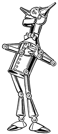
John R. Neill followed Denslow’s model in his illustrations for Ozma of Oz and Dorothy and the Wizard in Oz. As in the series’s first book, the tin man’s head bulges out at the back.
 However, in The Marvelous Land of Oz, published before those two titles, and in all the Oz books that followed them, Neill used a different character design, with a cylindrical head. The neck varied at first, but eventually settled on the vague sort of attachment Denslow has used.
In most of those books, when the Tin Woodman takes off his funnel cap, we see that the top of his head is a rounded dome. Neill used the same design for Captain Fyter, the tin emperor’s doppelgänger in The Tin Woodman of Oz (1918).
Toward the end of his career, starting with Ozoplaning with the Wizard of Oz (1939), Neill made yet another variation: he drew the tin man’s head as flat on top, like a tin can. I suspect Neill was out of practice drawing his Tin Woodman; Ruth Plumly Thompson made little use of Baum’s more mature male characters.
I review this history to acknowledge that even within the Oz books there’s a significant variation in the Tin Woodman’s character design. On top of that, we have the costumes created for David Montgomery and Jack Haley, which have to allow a man to fit inside. Thus, people can imagine many things when they think of Nick Chopper.

One example of that trend is David Hutchison in his Oz: The Manga series, as shown at right. His Tin Woodman’s head is a smokestack, and the robotic characterization extends to gear-shaped speech balloons.
Skottie Young avoided that temptation in helping to adapt the series for Marvel Comics. Indeed, his character design plays up the characters’ old-fashioned, rural beginning. (The man harvested wood, after all.) The tin mustache is reminiscent of L. Frank Baum himself.

Based on Neill and Denslow’s art, and Baum’s writing, I think of Nick Chopper as a man in his twenties, preserved agelessly by being made into tin (and by living in Oz). Though the Tin Woodman has excellent and kind instincts, and matures somewhat over the series, he’s not old enough to have become wise. He makes mistakes and still regards his appearance with more than a little vanity.
I have trouble imagining the Tin Woodman as a Richard Farnsworth type, much as I admire that actor and some of the characters he’s played. Of course, it’s better than a robot.
![]()


5 comments:
Neill's Tin Woodman was even more inconsistent than you've noted here. Nick also had a skull-shaped head in The Patchwork Girl of Oz. And he had both a skull-shaped head and a tin can-shaped head in Dorothy and the Wizard in Oz; it varied among illustrations.
You’re right, of course. I remember the Patchwork Girl endpapers and picture of Ojo catching the oil now. I don’t recall the Dorothy and the Wizard variations, but I’m sure they’re there.
The first Oz books I read after Wonderful Wizard were Tin Woodman and Marvelous Land, with the cylindrical head throughout. As a result, I consider that Nick’s true cranial shape.
I believe I prefer Denslow's original interpretation of the character over Neill's. Denslow's Tin Woodman is more human looking, and therefore, more relatable. Neill's design is so simplistic, it's kind of boring, and those limbs look a little too flimsy to me.
I prefer the Denslow skull for the Woodman. But I was ever in love with Denslow's pictures; even though I appreciated Neill I would always prefer Denslow's interpretation of a character.
Except Dorothy, maybe. That pudgy yellow girl ...
That's it exactly! I've always wondered what has made Young's Tin woodman not seem right.
He does look like an old man. I even imagine his voice being gruffer and older in that adaption.
but oh yes. You are right. So much better than a robot!
Post a Comment