28 August 2018

The Shift from Woodman to Woodsman

One of the attractions at OzCon earlier this month was a showing of James Ortiz’s The Woodsman, produced in New York in 2015. It was a striking piece of theater stylishly adapted from L. Frank Baum’s story of the Tin Woodman.

Another attraction was a preview of R. F. Wohl’s performance as Baum. He was workshopping a new one-person show with an audience of knowledgable Oz fans. Afterwards I heard an attendee note that Baum consistently referred to his tin creation as a “Woodman,” not a “Woodsman”—though many people (not just James Ortiz’s play) now use the longer word.

That prompted some musing that perhaps one form had become more popular than the other, so I turned to the Google Books Ngram Viewer. I asked it to graph out the popularity of “woodman,” “woodsman,” and “woodchopper” from 1800 to 2000. I restricted the query to lowercase only, eliminating “Woodman” as a proper name (and almost all mentions of the Tin Woodman as well).

Here’s the result:

As you can see, “woodman” was the more popular word when Baum grew up and when he published The Wonderful Wizard of Oz in 1900. “Woodsman” rose suddenly in popularity starting in 1880 and around 1910 surpassed the shorter form. Both forms have been declining in print use since 1940 as we’ve moved away from a wood-based economy.

In addition to affecting how people speak of the Tin Woodman, that shift in everyday language has also affected how we quote the George Pope Morris poem that begins, “Woodman, spare that tree!”

27 August 2018

Looking Back on an “Errand of Mercy”

A couple of years ago, I collaborated with artist Olivia Li, cover artist Catalina Rufin, editor E. J. Barnes, and the Massachusetts Historical Society to produce a short history comic about the Irish potato famine and Boston’s response to it.

Rick Silve at Comic a Day just posted a nice review of “Errand of Mercy: The Irish Potato Blight and the Good Ship Jamestown”:
Eight page b/w minicomic with a color cover. This begins with a general overview of the history of potatoes in Ireland and the potato blight and famine in the mid-1800s. It then goes on to document the response of Irish immigrants in Boston, who organized a relief effort, securing approval for the sending of the USS Jamestown, a navy ship, with a cargo of 800 tons of food and clothing to Cork, Ireland in 1847.

Considering the space limitations of the minicomic format, this book does a nice job of exploring the political complexities involved in mounting the mission of mercy.

This was a good snapshot of a moment in this history of Ireland and of Boston.
All I wanted was something better than Boston’s Irish Famine Memorial statues.

(Shown above is one interior page; all eight can be read on Olivia Li’s website.)

23 August 2018

Another Job Lost to Advancing Technology

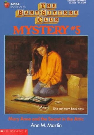
From the Los Angeles Review of Books’s interview with Holly Tommasino, who created the hand-lettered journal entries in the original Baby-Sitters Club books. Tommasino was first an in-house designer for Scholastic, then a freelancer, then out of a job:
What was your role with The Baby-Sitters Club?

When all the design elements for the series were initially coming together, I created the handwriting styles for each character. And then I handwrote all portions of the manuscripts that were flagged by editorial — usually BSC journal entries, but also the postcards and letters and lists that popped up from time to time. I continued to produce the handwriting even after I left Scholastic.

What happened then?

I worked as a freelancer until 1996. At that point, due to advances in technology, I was sent font forms by a company. They asked me to letter each character’s handwriting in spaces on the form. And these forms were long! They had me do a few different y’s and then write a w attached to a y or a t attached to a y. They didn’t want the handwriting samples to look totally uniform, so it was quite an extensive process. After that, the freelance work stopped, but the books continued.
The 1986-2000 series has of course been rejuvenated with comics adaptations by Raina Telgemeier and then Gale Galligan. Those editions appear to be the bestsellers today.

In contrast, 2010 Scholastic reissued two early titles, evidently retaining or reproducing the cursive writing, but those books didn’t spark a new craze among the children of the original readers. The latest reissue is clearly for the nostalgia market. Was the cursive handwriting, which kids today are said not to be able to read, to blame?

21 August 2018

Discovering Lost Tales of Oz

Joe Bongiorno’s Royal Publisher of Oz releases its latest book today: the short-story anthology Lost Tales of Oz, featuring illustrations by the multiple-Eisner winning artist Eric Shanower. This volume contains eighteen stories—over 500 pages of new fiction in all—inspired by and adhering to the Oz book series.

One of those stories is a little piece by me called “Ojo and the Woozy.” For folks who haven’t read The Patchwork Girl of Oz, in the jacket art above Ojo is the boy dressed in Munchkin blue and frills near the left side, and the Woozy is the cubist blue creature at the far left.

In the same year that he released The Patchwork Girl of Oz, L. Frank Baum wrote six short books collectively titled Little Wizard Stories of Oz. Each was about two established characters, such as Dorothy and Toto, or Jack Pumpkinhead and the Sawhorse, having a brief adventure together.

Several years back, I set out to create a new story along those lines, using some pair of characters Baum didn’t get to. Ojo and the Woozy felt like a natural choice. In Baum’s seventh Oz book they travel together to the Emerald City. The Woozy is almost always calm, cheerful, and straightforward while Ojo is a moody fellow, so their personalities can play off each other.

My “Little Wizard” story ended up never leaving the vicinity of the Emerald City. The drama of Ojo and the Woozy’s adjustment to life there after having spent years in isolated forests was too interesting. As a result, this tale offers its heroes no greater challenge than being a shy new boy who doesn’t know how to play the local sports.

Which is, of course, a great challenge indeed. I may have given Ojo some of my own childhood experiences.

Lost Tales of Oz is available in hardcover and paperback via Lulu.

07 August 2018

Heading Out to Oz

“In May I began describing, photographing, and re-housing a discrete collection of posters within the Ludlow-Santo Domingo (LSD) Library collection,” Rachel Parker writes on the blog of the Houghton Library at Harvard. “Tackling the Ludlow-Santo Domingo Library poster collection has been exciting, in part because of the descriptive challenges in title creation.”

Elsewhere the library explains, “The Ludlow-Santo Domingo Library is the world’s largest private collection of material on altered states of mind.” Which is to say, “The 50,000-plus-item collection documents psychoactive drugs and their physical and social effects.”

One suspects the initials LSD don’t just stand for Ludlow–Santo Domingo, even if the collection was produced by “Julio Mario Santo Domingo Jr.’s acquisition and integration of the Fitz Hugh Ludlow Library of San Francisco in 2001.”

The Houghton library blog credits the poster above to “James McMullen” at an unknown time. That artist spells his name James McMullan. Another website credits it to “The Push Pin Graphic, Issue 52 (1966).” (Seymour Chwast authored a 2004 book looking back on The Push Pin Graphic, and some poster-reprinting websites carelessly credit the image to him.)

In other news, I’m heading out to OzCon this week.

06 August 2018

Emilie and Ella

I had the pleasure of seeing Emilie Boon’s picture book Ella and Monkey at Sea develop in a writers’ group.

It’s just been published, and Emilie wrote about drawing on her own childhood experiences at the Nerdy Book Club:
I often explain to students I teach that not everything in the book happened to me in exactly the way I wrote it. I changed details for the sake of a clearer and more resonant story, while remaining faithful to the emotional truth I knew deep inside.

I always knew I had a story to tell about this voyage, but I wasn’t always sure how to go about telling it. I found a way into the story through the main character, Ella. Once I finally decided how to develop the character visually, her personality and voice came quickly. This is an example of the added benefit of being both the author and the illustrator where the pictures inform the story and the story informs the pictures.

Just like Ella, I drew a sun with crayon during the turbulent Atlantic crossing. How could the grown ups not like a picture of the sun amidst the stormy seas, winds and rain? In real life I even won a prize for that picture, but I didn’t think that was important for the story I wanted to tell.

I was more interested in the fact that a child can envision the good, or a happy ending, in the middle of a difficult situation, reflecting the amazing resiliency that many children have. As long as they have at least one loved one close, I think children can be strong and adaptable. Expressing fears, anxieties, and hopes for better times through art, is a well-documented way children can process adversity.
Congratulations to Emilie on making part of her own story into a story for many children!