Showing posts with label SERIES Artemis Fowl. Show all posts

21 February 2008

Coloring in Artemis Fowl

Yesterday I opined about how the story in Eoin Colfer's novel Artemis Fowl is a good match for the comics form. But the first thing you notice about a graphic novel is its art. The art in Artemis Fowl: The Graphic Novel actually made the story more enjoyable for me than the original prose novel.

Giovanni Rigano's line art looks somewhat influenced by Japanese comics, with the two main characters--Artemis the Irish brat and Holly the fairy police officer--both equipped with fairly big eyes and fairly small chins. Artemis's bodyguard and butler, Butler [oh, the irony!], is a manga "Hero" type, as I understand the term: nine heads high (with a neck two heads wide).

Rigano goes farther afield for the story's exotic creatures: the lizardy goblins, baboon-faced centaur, tusked troll. I'm most fond of Mulch Diggums, a munching, burrowing, thieving, farting dwarf. Rigano gives Mulch a most expressive face; his combination of desperation and deviousness improbably makes him the book's most sympathetic character.

Most of all, I think Artemis Fowl: The Graphic Novel is a triumph for colorist Paola Lamanna. The panels are full of shafts of light, curls of smoke, glowing monitors, bare light bulbs, fairy contrails, reflections, blurs, and other other moody details that Lamanna rendered using digital colors and effects over Rigano's line art.

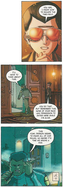
Rigano also carried out, and may have conceived, the book's color scheme. Artemis's family home is always rendered in reds and browns, dark and shadowy until the last pages. In contrast, the fairies' world is largely green and blue, and always nocturnal. It takes just one glance to know which side of this war a panel is showing.

On one early page spread, Butler prepares to shoot down the unsuspecting Holly. As the panels shift with increasing tension from one character/world to the other, they create a checkerboard of red and blue.

The three panels to the left show the color scheme at work in another way. At top, Artemis is negotiating with Julius Root, a fairy commander. In the second panel Root walks out of Artemis's tan house into the blue outdoors, and at bottom he talks to his colleagues.

Finally, here's praise for Ellice M. Lee's jacket design. The front cover shows Artemis with his antagonist Holly reflected in his mirrored sunglasses, and the lenses have spot varnish to make them shiny. (The panels on the back have spot varnish as well. And I haven't even mentioned the embossed title type. Designers can do a lot with an unlimited budget.)

As a visual package, Artemis Fowl: The Graphic Novel is amped up like the trailer for a superhero movie. And for this adventure, that works very well.

20 February 2008

How Artemis Fowl Goes Graphic

When Eoin Colfer's Artemis Fowl was first published in 2001, Miramax/Hyperion marketed it as a counterpoint to Harry Potter. Of course, back then every book from presidential memoirs on down was being compared to Harry Potter. At least Colfer had actually written in the same genre as J. K. Rowling.

Artemis is an anti-hero, angling to be a master criminal rather than a magical law enforcer. He has vast resources and loyal support. Though eventually we learn he's as hungry for a happy family as Harry is, long before then the reader might feel that what Artemis deserves most is a punch in the face.

Perhaps as a result, Colfer and Rowling used different storytelling strategies. The Harry Potter novels stick closely to Harry's point of view. When they narrate events through into someone else's eyes, as in the start of HP4, there must be a very important reason: in that case, to show Voldemort killing so we understand the stakes.

In contrast, Artemis Fowl was never all about Artemis Fowl. Yes, the story starts by tracking his scheme to steal fairy secrets and gold, but Colfer shifts to narrating over the shoulder of a young fairy law enforcer named Holly Short--a more upright and sympathetic character. For the rest of the novel, the point of view bounces among different characters, including Holly's gruff but dedicated boss, one of Artemis's household servants, and a dwarf expert in breaking and entering.

Comic books have shifted like that for years. The visual dimension makes it easier for readers to follow the change: we turn the page, see a new character in a new locale, and we get it. We don't even need "Meanwhile,..." captions anymore.

In the last couple of decades, the omniscient narrator who used to fill the captions of comic books with bombastic explanations has disappeared. Instead, most captions are in the first-person, present-tense voice of the main character. That technique has developed its own symbolic grammar: those captions often have different colors, symbols, and fonts for different characters. That lets comics delineate two or more points of view in the same scene, even the same panel.

Indeed, I think a great potential strength of the comics form is its ability to show two parties working against each other without making readers take sides (if the creators wish to remain neutral, of course).

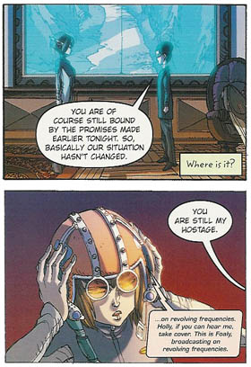
Artemis Fowl: The Graphic Novel uses that comics technique to replicate the prose novel's shifting points of view. Contrast the caption in the first of the four stacked panels above, its font and coloring, with the caption in panel three. The first is the fairy Holly's thought as she searches for her helmet. The second is Artemis's reflection as he sees Holly about to punch him in the face. The comics form offers both characters' thoughts in the same scene.

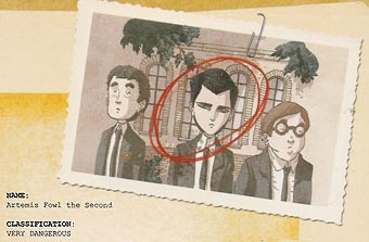
Another comic-book technique that pops up in Artemis Fowl: The Graphic Novel is the character profile; the top illustration is a bit of Artemis's. Each full-page profile offers a combination of words and image to introduce a magical creature or locale. Novels can't lay out such information without breaking the narrative flow, but such profiles are a comic-book tradition. DC publishes a whole series offering such dossiers on its heroes and villains: Secret Files. Another inspiration is probably card games like Magic: The Gathering. (It's no surprise that similar pages appear in The Spiderwick Chronicles; coauthor and artist Tony DiTerlizzi worked on Magic cards.)

There are other big points of overlap between Colfer's Artemis Fowl and comic-book adventures:

The second of those qualities is a flaw in any kind of novel, but the last one is a plus for the graphic form. The action allows visual storytelling in the hyped-up style that comic-book creators have developed to a high effect over the years. It's another way that, I found, Artemis Fowl: The Graphic Novel works as an over-the-top adventure comic.

Bottom line: A novel that reads a lot like a comic book makes a good comic book.

19 February 2008

Learning to Like Artemis Fowl

When I sat down to read the nominees for the Cybils Award for graphic novels (elementary/middle category), I didn't expect to like Artemis Fowl: The Graphic Novel.

I had read Eoin Colfer's original novel out of professional interest, never growing fond of it. That book was already a worldwide success, with sequels on its heels. In addition, as I wrote last year after helping to judge in the Fantasy category, in participating in the Cybils I hoped to be part of making a "discovery," helping to bring well deserved attention to a little-known book. An adaptation of a title that started getting international press even before it was published doesn't fit that bill.

Furthermore, it's clear that Artemis Fowl: The Graphic Novel was a corporate creation. As Publishers Weekly reported, Colfer took the idea of adapting his story into comics form to his publisher, Hyperion, part of Disney. The Editorial Director there accompanied Colfer to Accademia Disney in Milan, where they met artist Giovanni Rigano. To help with the script, the team then brought on Andrew Donkin, who started in comics (including one issue of Batman: Legends of the Dark Knight; no Robin) before writing prose books for kids. "With Colfer in Ireland, Donkin in London and Rigano and [colorist Paolo] Lamanna in Italy, the entire process was conducted through e-mail," said the magazine.

So this book was created in the assembly-line fashion of the big comic-book publishers, with the resources of Disney behind it. I suspect that our culture, in coming to recognize comics as a literary art form rather than just pop entertainment, gives more respect to books created by people who fit our traditional model of the serious novelist or high-minded artist.

That means author-illustrators who work alone, chasing their individual muses. Or at most a close working partnership of writer and artist. We imagine drawing boards set up in funky apartments, maybe even garrets. And we hope that process will produce something better than a market-driven collaboration of four established talents brought together by a worldwide entertainment conglomerate.

And yet, as I looked back on all five nominees in the Cybils' Elementary/Middle Grade Graphic Novel category, I ranked Artemis Fowl: The Graphic Novel at the top of my list. That assembly line had spat out a well-produced, entertaining, visually varied, and relatively complex comic.

TOMORROW: Why Artemis Fowl works as a comic book.

14 February 2008

2007 Cybils for Graphic Novels

The kidlit blogosphere's Valentine's cards to new books, the 2007 Cybils Awards, were conferred this morning. I was one of the judges in the Graphic Novels category, and here are those winners and their accompanying analyses.

ELEMENTARY/MIDDLE GRADE
21fv7sxv6ml_aa_sl160_Artemis Fowl: The Graphic Novel
written by Eoin Colfer and Andrew Donkin
illustrated by Giovanni Rigano and Paolo Lamanna
Hyperion
The comics format proves a good match for Eoin Colfer's tale of war between fairies and an obsessed young genius, already popular around the world in novel form. The energetic, manga-influenced drawings capture the book's technologically heavy action and many magical creatures. The book's creative team uses comics techniques from character profiles to changes in lettering to lead readers through the novel's shifting points of view and sympathies. A truly over-the-top adventure.

YOUNG ADULT
21hkbxs1dgl_aa_sl160_The Professor's Daughter
written by Joann Sfar
illustrated by Emmanuel Guibert
First Second
In late Victorian London, the frustrated daughter of an archaeologist and the repressed son of an Egyptian pharaoh fall in love. That he's been dead for many centuries is the least of their problems. The twisting, fast-paced story that follows takes readers to many landmarks of classic English adventure tales, from the British Museum and Scotland Yard and into the private study of Queen Victoria herself. While the panel layout is the same on nearly every page, the scenes inside those boxes jump from slapstick action to tender reminiscences to deadly danger.

You can find announcements of all the winners at the Cybils website.

Over the next coupla weeks I’ll post more thoughts about the two winners and the eight other nominated titles. Today I’ll close with some thoughts on the judging process. Last year, I was a Fantasy and Science Fiction judge, which meant reading five rather thick books, many of them excellent. Nonetheless, it proved very easy for the judges to reach consensus on the one that stood out as the winner. (That was Ptolemy's Gate, by Jonathan Stroud, lest we forget.)

This year, each of the winning books commanded a majority from the start of our discussions, but each also was one of the least favorites of at least one judge. And the runners-up also had some vocal detractors as well as supporters. Furthermore, we spent a lot of time discussing what those age categories meant (while ultimately sticking with how the nominating committee had sorted out the titles after their own long discussion).

I suspect that graphic novels are particularly challenging to assign ages to. What's the reading level of a book with no words? Do pictures instead of words make a story easier or harder to follow? If a book features anthropomorphic animals drawn in a simple style, or the gentle adventures of a preschooler, does that mean it's created for young children? If a book features a grumpy adolescent, does that mean it's created for older children? Is an anthology with stories about people ranging from late-elementary-school kids to adults Young Adult literature? And does America's prejudice that comics are for kids influence those classifications?

22 September 2006

Crying Artemis Fowl

Early in chapter 1 of his first Artemis Fowl book, Eoin Colfer offers this description of the title character: "A pale adolescent speaking with the authority and vocabulary of a powerful adult."

How could wish-fulfillment like that not find a worldwide audience? Plus, Colfer gives that pale adolescent boatloads of money, high-tech weapons and surveillance toys, and a loyal manservant to handle all the dangerous physical work. What more could videogame players want? Sure, Artemis's father is missing and his mother insane, but pale adolescents half-wish, half-believe they're in that situation already. As Gregory Maguire's review for the New York Times said, the novel may have only faint charm to go along with its thrills, but it does what it sets out to do.

I don't know how Penguin published Artemis Fowl in the UK, but Miramax Books did a fine job of positioning it in 2001 as the anti-Harry Potter, darker and older. Plus, just as news of the US book deal boosted Potter at its publication, Miramax crowed about the movie rights it had also bought. Since then, of course, the Harry Potter books have gotten dark as well, but Colfer gained his necessary toehold in North America.

As I read Artemis Fowl and things exploded and burst and farted around me, I found myself thinking about the book as a nationalist statement. Colfer is an Irish author who, until this book, hadn't been published outside Ireland. He portrays his home island as particularly beloved of the ancient fairies, but also extremely high-tech. Colfer's 2003 interview with C.M. McDonald hints at his feelings:

McDonald: His books also give us a sense in America what has happened because of the technology industry in Ireland. Have you found your corner of Ireland changing quite a bit?

Colfer: Very much so. People still have this Quiet Man vision of Ireland, and that does exist to a small extent, but Ireland has the largest growing economy in Europe and we have more computer plants per capita that I think anywhere else in Europe, as well. There’s a lot of American big business in Ireland--Mac and Dell and all these companies are there. A very high percentage of people are working in computers and are computer graduates. There are a lot of Porsches and BMWs driving around now that you never would have seen twenty years ago.
Indeed, in 1987 the per-capita income of Ireland was only 63% of that in the UK, but in 2004 the Irish measure passed Great Britain's. To some extent the picture of Eire as a high-tech hub is exaggerated. EU statistics show Britain still ahead of Ireland in internet access and use, and the level of poverty in Ireland remains higher. But Artemis Fowl emphasizes futuristic, not nostalgic, Ireland.

Compare Colfer's use of technology to what we see in the Harry Potter books. Rowling's wizards are determinedly old-fashioned, using quills and candles. Only the muggles have modern technology, which fascinates Mr. Weasley, but Harry's poverty and preference for the wizards' world leaves him without a PC, Gameboy, or cellular phone. His idea of high tech is a new flying broom. Artemis has much better toys, and his world's magical beings have also upgraded.

Perhaps later Artemis Fowl books, such as The Arctic Incident, don't have quite such an undercurrent of Ireland and what it means today. But I doubt Colfer has left that theme behind. He is, after all, author of The Legend of Spud Murphy, about a potato-blasting librarian.