Graphic Design in Oz
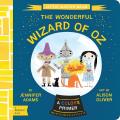
As the Deseret News reported, Gibbs Smith’s BabyLit line is publishing a board-book abridgment of L. Frank Baum’s story that uses its emphasis on color:
“The Wonderful Wizard of Oz: A Colors Primer” reflects the colorful, busy world of Oz. Each page is based on one of the story’s key features or characters of that color surrounded by many other objects. For example, the yellow brick road fittingly represents the color yellow while the Tin Man represents the color silver.There are no ruby slippers in this edition, of course. The text is by Jennifer Adams and the art by Alison Oliver.
![]()


1 comment:
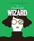
"The flatness of the design matches the alienness and surreality of the fantasy world," is what the Post says (I think I remembered the quotation accurately) -- and all I have to say is that the Post and this artist see Oz completely differently than I do. I am astonished that anyone would not see the excitement, adventure, caring, kindness -- what is the matter with these people that they can't see Oz? I'm not even going to go into the alienness and surreality of California, that would be rude --
Post a Comment