Showing posts with label comics form. Show all posts

30 June 2026

Two Takes on Charity and Sylvia
In recent years, publishers have worked with historians to adapt their scholarly studies into other types of books, more welcoming to teenagers and other regular people, and thus with potential for large and lasting sales to schools.

For example, after publishing Never Caught: The Washingtons’ Relentless Pursuit of Their Runaway Slave, Ona Judge in 2017, Erica Armstrong Dunbar worked with Kathleen Van Cleve to produce a Never Caught, the Story of Ona Judge: George and Martha Washington’s Courageous Slave Who Dared to Run Away, a “Young Readers Edition” published in 2019.

Marcus Rediker initiated collaborations with David Lester and Paul Buhle on graphic novels adapted from his books: Prophet Against Slavery: Benjamin Lay, a Graphic Novel; Under the Banner of King Death: Pirates of the Atlantic, A Graphic Novel; and Revolution by Fire: New York’s Afro-Irish Uprising of 1741, a Graphic Novel.

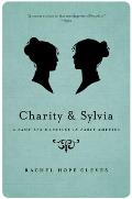
Earlier this month I saw an announcement of Tillie Walden’s new graphic novel Charity and Sylvia, published by Drawn & Quarterly, about a couple in Vermont in the early 1800s. I immediately connected that to Rachel Hope Cleves’s study Charity and Sylvia: A Same-Sex Marriage in Early America, published in 2014 by Oxford University Press.

I wondered if Walden had adapted Cleves’s work, or fictionalized it with her blessing. When I shared news of the graphic novel with the Boston Comics Roundtable, I added a mention of Cleves’s work.
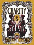
Unlike Dunbar and Rediker, Cleves isn’t credited as a coauthor of the graphic novel. In a line inside the book, an online bibliography and discussion of sources, and public talks, Walden cites Cleves’s Charity and Sylvia as a major source. But does that add up to enough acknowledgment for how much she relied on a previous author’s work?

Last night Cleves posted an open letter to readers that says in part:
I've tried to be happy that Walden's book is making their story more widely known, even if she chose to take my title and my cover design as well as my narrative and my research with only a single sentence of acknowledgement at the end of her book in her notes section. Walden's illustrations and storytelling are wonderful, as I told her when she reached out to me during the writing process. It would take nothing away from her hard work to be honest about how it is built on my hard work. But in Walden's publicity tour, she has repeatedly made the claim to have based her book on her extensive research in the archive without acknowledging that her book is, in fact, based on my book. . . .

I don't doubt that Walden spent time looking at letters at the Henry Sheldon Museum, but the story that Walden tells is not to be found there. It is a story that I pieced together from years of visits to at least twenty different archives and locations across the United States, not only in Vermont but in Massachusetts, New York, Illinois, and Washington State, as well. . . . Many of the details of that story which appeared in my book, and re-appear in Walden's, do not come from the Henry Sheldon Museum, where she claims to have done her research. They come from the countless additional archives I visited.
The process of creating a graphic novel is akin to dramatizing a narrative for stage or screen. The script turns narration and analysis into scenes with dialogue. The art builds on descriptions or imagination. Even the most nonfictional narrative comic is a fictionalizing adaptation of its sources.

With fiction, we readily recognize how a graphic novel or dramatization is a derived work. Unless the original story has entered the public domain, the new publication requires contracting for the right to adapt the original, crediting and compensating its author. After all, the story and characters wouldn’t exist without the first author’s creativity.

With nonfiction, the law is less clear. No one has a copyright claim on historical facts. No one can call dibs on the exclusive right to line up events in chronological order. As legal experts often say, copyright doesn’t protect ideas; it protects the expression of those ideas.

In her open letter, Cleves writes: “This is not just a question of facts but of story: the story of how Charity and Sylvia built a life together…” But was that “story” created by the subjects living their lives or by the historian reconstructing those lives in a meaningful form? Is a “story” a copyrightable expression of ideas that survives even when it’s expressed in a different form?

There’s no doubt that Cleves’s research unearthed facts about Charity Bryant and Sylvia Drake, produced enough detail to build a compelling story, and smoothed the path for future researchers. Unlike the tale of Ona Judge or the 1741 uprising in New York, there are no other books to draw from. So what claim should Cleve have on that subject? Our copyright law protects creative work, but should it also require compensation for hard work?

TOMORROW: Historical roots.

30 September 2017

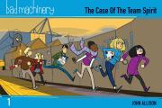
Pocketing the Bad Machinery Series

I heartily enjoy John Allison’s Bad Machinery graphic novels, following a team of teen detectives in the fictional mid-sized city of Tackleford, England.

Allison created these stories first as webcomics, and they retain that form’s rhythm. Each page has a payoff of its own. The narrative can jerk ahead in time from one to the next. That serves the sprawling stories well since they’re as much about upper-school personalities and the British class system as that term’s mystery.

Allison drew his pages to the dimensions of a computer screen, about half again as wide as they are tall. As a result, the first print editions were more than a foot wide, floppy and hard to shelve. I loved the stories, but I didn’t have space for them all.

Oni Press has started to reissue the Bad Machinery books in “Pocket Editions,” a shade less than nine inches wide. That makes them the same size as the seventh and latest volume, The Case of the Forked Road, which Allison created in a more traditional vertical format for print.

I was worried, however, that my aging eyes wouldn’t be able to read the balloons on the smaller pages. But I took a chance on the first two volumes, The Case of the Team Spirit and The Case of the Good Boy, and my eyes worked fine. While I still don’t see as many commas of direct address as I’d like, Allison’s verbal wit comes through just as well as his visuals.

(In addition to the seven Bad Machinery novels, one of the Tackleford teens, Charlotte, crosses over into another of Allison’s series in Murder, She Writes, set in the cutthroat world of children’s publishing. It’s a fine introduction to Allison’s work.)

05 November 2014

Before Frank Quitely Was Quite Quitely

Frank Quitely is one of the most respected artists working in superhero comics today, known for his distinctive drawing style, dynamic compositions, and willingness to experiment with form.

Which makes his statements in this interview at Comics Beat more interesting:
When I started out, I didn’t know a lot about storytelling because I never got a formal training in comics. It ended up being kind of intuitive and my main thing was about trying to make it clear and interesting. You know, I wasn’t really thinking in terms of narrative flow, it was more just about clarity and trying to make it as good as possible. Gradually, over the years, I just became more interested in storytelling.

There was a DC editor I worked with named Dan Raspler – the Lobo editor amongst other things. He was my editor on JLA: Earth 2 and before I did JLA, I did a short Lobo story for them and it was the first mainstream DC thing I’d done; I’d been working for [the imprints] Vertigo and Paradox for a couple years.

I sent him the pencils and it was the best thing I’d done up to that point and I thought “he’s going to phone me back and tell me how good this is” and he didn’t phone for a week. I was really panicking by the time he phoned; he started the conversation with “dude, I don’t know how to tell you this…”

Basically what he said was my drawings were really lovely, but my storytelling was really boring. He went through and told me what I should be thinking about and that was kind of a real milestone. As it was, that book never came out for different reasons. For JLA: Earth 2, he made me fax a rough for every page because he wanted to see that I could do art that makes sense in rough with a sharpie, then I could do it properly. . . . That was a big leap for me.
DC Comics published JLA: Earth 2 back in 2000. That was one of many collaborations between Quitely and scripter and fellow Glaswegian Grant Morrison.

As for the “short Lobo story” that Quitely mentioned, that was Lobo: The Hand-to-Hand Job, also subtitled It’s a Man’s World, scripted by another Scotsman, Alan Grant. It was never printed. This webpage on unpublished comics says, “Although the publisher has never commented publicly on the comic, the disappearance of the project could be chalked up to the reported nakedness of Lobo for at least half the issue, as well as a scene involving sexual self-gratification by a league of asteroid miners.” Yes, that would do it.

09 October 2014

Journey into the Footnotes

I’ve been musing about comics and history here and on Boston 1775, but didn’t realize until now that I’ve already been cited in the literature.

Bridget M. Marshall quoted a sentence I wrote about George O’Connor’s excellent first graphic volume in her essay “Comics as Primary Sources: The Case of Journey Into Mohawk Country.”

That was published in Comic Books and American Cultural History: An Anthology, edited by Matthew Pustz in 2012. Looking at the contents, I realize I must get my hands on a copy.

18 February 2014

Illustrating Picture Books versus Drawing Comics

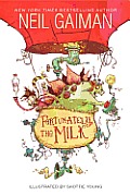
Toward the end of his conversation with Skottie Young on the Stuff Said podcast, artist Gregg Schigiel asks about Young’s experience illustrating his first picture book, Fortunately, the Milk by Neil Gaiman. (A lot of Schigiel’s interviews seem to be digging for career counseling, but that’s another story.)

Young sounds almost amazed as he reports how much easier illustrating a picture book was compared to drawing a comic. Jef Czekaj said the same thing on a panel I moderated a while back. I wouldn’t be surprised if other artists who’ve worked in both fields feel the same way. That’s not to say picture-book illustration is easy; but relatively it seems to be a more pleasant experience.

For one thing, picture books don’t require so many pictures. A 32-page picture book might require 20 separate images, which could fill as few as four pages of standard comics. True, those images have to be bigger and more detailed so that they reward multiple readings. On the other hand, they don’t have to be so tightly squeezed together on a page with captions and word balloons impinging on them.

More important, however, is how picture-book publishers treat artists. Editors and art directors choose an artist based on his or her past work and reputation, and they see their job as assisting the writer’s and artist’s visions come to fruition, not to move the corporation’s larger story along. They don’t try to exercise so much editorial control. They set more generous deadlines.

Schigiel’s book experience has come with licensed titles (i.e., those that are part of a corporation’s larger story). So he starts out asking Young what his Art Director told him. But Art Directors for picture books are far more hands-off than people with the same title in other parts of publishing. Young found himself surprised at how few “notes” he received back on his sketches.

The biggest difference between the mainstream book business and other forms of publishing is visible on the covers. On a book, the author’s and illustrator’s names are almost always the biggest; on Fortunately, the Milk, Gaiman’s name is huge, Young’s rather small. But the publisher’s name is usually smallest of all, slipped onto the bottom of the spine and the back. In a comic book or other magazine, the magazine’s name is the biggest; its employees are in charge, and its intellectual property and reputation is what mainly drives the sales.

30 January 2014

Balloonacy at the B.C.R.

This evening the Boston Comics Roundtable did an activity I invented called Balloonacy. It didn’t pan out exactly as I’d imagined since we’d talked so long about how to make the group more active that there wasn’t as much time left for an actual activity. But I think it was fun and productive for those involved.

I started by drawing the classic ellipsoid balloon with a short pointy tail and the letters “B.C.R.” inside. I posited that that’s the comics equivalent of a sentence with a period at the end. It’s a straightforward statement.

Then I challenged folks to draw balloons in which the lettering, punctuation or other marks inside the balloon, balloon shape, tail shape, or some other visual detail would give the letters “B.C.R.” a different meaning and perhaps sound.

The group then drew (in no particular order):
  • classic thought balloon.
  • dotted whisper balloon.
  • balloon with four tails, for four (or more) people speaking simultaneously.
  • balloon with nine tails over a cityscape to signal a chorus of millions.
  • collage of balloons all saying the same thing.
  • fancy letters for ornate speech.
  • The Yellow Kid with a message on his nightshirt.
  • balloon shaped like a luscious pair of lips.
  • burst balloon for shouting.
  • scroll-shaped balloon with blackletter/Gothic letters for a town crier.
  • three connected balloons each containing one letter for a single, slow, deliberate speaker.
  • three separate balloons each containing one letter pointing to a single depressed figure.
  • three separated balloons each containing one letter with tails pointing different places to denote three speakers.
  • balloon with tail going off the page to an off-panel speaker.
  • block letters and block balloon for a carnival barker.
  • two forms of white letters dropped out of a black balloon, one with the wavery white border that Todd Klein gave to Dream in Sandman. (We also looked at his Delirium balloons.)
  • wavery letters for a spooky voice.
  • icicle-dripping balloon for disdain.
  • two variations of rebuses spelling out “B.C.R.,” one assigned to a mime.
  • balloon with a long, meandering tail suitable for a character who talks and talks without getting to the point.
  • balloon containing musical notes as well as letters for singing.
  • letters strung out on an undulating musical staff for more singing.
  • wavery-bordered balloon with its tail dropping off the bottom of the page where the speaker is collapsing in a faint.
  • two balloons, one overlapping the other to show an interruption.
  • balloon blocked by the side of a panel as something interrupts.
  • vertical balloon containing Japanese kanji sounding approximately like “B.C.R.” 
  • huge letters from a loud character flattening other characters.
  • tiny, lowercase letters within a big balloon for quiet speech.
  • two examples of giant block letters crowding the edges of their balloon.
  • square block letters in a squarish balloon for a real square.
  • letters drawn within concentric radio waves spreading from an antenna.
  • jagged-edged balloon and with a lightning-bolt tail to denote electronic communication.
  • big block letters with small exclamation points instead of periods—verging on a sound effect!
  • round balloon with no tail for a disembodied or off-panel speaker.
  • squarish balloon and lettering for a robot.
  • balloon with its tail ending in a starburst against a window—a recent way of showing that someone is speaking inside that building.
  • various typographical symbols before the letters to indicate profanity.
  • chevrons on either side of the letters and an asterisked footnote to indicate speech in a foreign language (or, some people thought, HTML).
  • tailless thought balloon broken up with breath marks to denote psychic communication.
  • a long, boring speech wallpapered on the back of a panel.
We also came up with three balloons that not everyone agreed on how to interpret.
  • thought balloon with a pointed tail instead of the trail of puffs that thought balloons usually have. Could this indicate thinking aloud?
  • three numbered boxes each containing one letter. I didn’t catch the discussion on that one.
  • balloon butted up against the edge of a panel. That usually means the same thing as a balloon fully inside a panel—it doesn’t seem to reflect anything more than the available space and the preference of the editor and letterer who place that balloon. But perhaps it could have storytelling significance. Say, one dominant character’s speech balloons are always in the center of a panel and another’s are always crowded to one side.
  • word balloon in the shape of a real helium balloon with a knot at the bottom. What might this symbolize?
And that was just balloons. We haven’t yet talked about other ways comics show the invisible.

25 January 2014

The “Owl and Pussycat” Experiment

The Boston Comics Roundtable is conducting a group exercise we call “The Working Method.” One member writes a short comics script—only three pages in all. Artists take that script as far as they choose—character designs, thumbnails, pencils, or all the way to inks and letters.

Members did this first a couple of years ago, at the suggestion of artist Jay Kennedy. One of the resulting comics, “Amazons v. Valkyries” by Lindsay Moore and Laurel Lynn Leake, was eventually published in the Minimum Paige anthology.

The current exercise is using a script by me titled “Owl and Pussycat.” I gave myself the challenge to tell a superhero tale in only three pages, a story that I as a kid could have picked up and understood at the basic level. There are, to be sure, many unanswered questions left about Owl, Pussycat, and their evil nemesis Dr. Megalo—unanswered even for me.

At this point participating BCR artists are sharing their designs for Owl and Pussycat on a Tumblr page. The sketch above is by Roho, for instance. I see my job now as to keep quiet about how I might have imagined those characters or the setting, page layout, overall look, etc. in order to leave the artists with maximum freedom to make their own choices. At the end of February the whole group will sit down and discuss the different choices people made.

This exercise is also open to folks who aren’t involved in the Boston Comics Roundtable, or even in Boston. Here’s the link. We expect to post further scripts of different sorts in the future.

27 November 2013

Corporate Cultures and the Marvel Method

This episode of Decompressed, a podcast by British comics scripter and journalist Kieron Gillen, is one of the most interesting discussions of comics scripting that I’ve ever heard.

Gillon tries to focus his podcast on the mechanics of creating comics, not just enthusiastic appreciation. The nominal subject of this discussion is the contrast between Marvel’s three-stage plot–art–dialogue method of creating comics and the full-script (or plot–dialogue–art) method that DC and most of the industry use.

Gillen shares lots of examples from the participants, including script pages and finished line art, on his blog. (At left is a first-stage “Marvel Method” script with short action descriptions and the artist’s thumbnail sketches but no finished dialogue.) The practical insights from fellow writers Mark Waid and Matt Fraction and special guest artist Jamie McKelvie are useful but not particularly surprising.

I was more struck by the participants’ observations about how the cultures of the “Big Two” American comics publishers have been shaped by those different approaches. Fraction notes that Marvel still pays a writer separately for the plot and the dialogue even if he (since it’s usually a “he”) delivers them at the same time. Waid points out that DC, at least as of the 1980s when he was an editor there, paid twice as much for a story’s dialogue as for its plot—which naturally motivated writers to provide full scripts.

The comics creators in the conversation—three of them writers—also make interesting observations about what happened when artists Dick Giordano and Joe Quesada came to be in charge of DC and Marvel, respectively. Suddenly the artists were getting more compensation.

13 November 2013

History in Comics Form

Over at Boston 1775, I look at how Fred Van Lente and Ryan Dunlavey lay out the life of George Washington in Action Presidents!, #1.

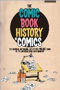
My favorite comics work by this comics team is The Comic Book History of Comics, which covers a lot of detail in only five or six issues. I suppose that one could argue that series left out a lot, as I found Action Presidents! did. But it continues to surprise me how much history Van Lente and Dunlavey found space for, including the European and Japanese comics scenes and the retail ups and downs of the 1990s.

21 October 2013

Battling for Space

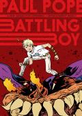
On Saturday a bunch of us were standing around the Million Year Picnic comics store looking at my newly purchased copy of Paul Pope’s Battling Boy, volume 1. (Okay, one of us was Jeff Smith.)

We were struck by the book’s size: 6 inches wide by 8.5 tall. That’s what publisher First Second has chosen as its “typical trim size.” (This spring the company tried 7 by 9 inches for the first time on a book for younger readers, more like a picture book.)

We weren’t convinced that size was ideal for Battling Boy. It’s an epic story of, basically, a godling come to Earth to fight huge monsters. Pope’s draftsmanship combines small details and messy chaos. Likewise, his lettering is too full of energy to be crisp. Those pages might have much more impact at a larger size.

But there is hope. According to this interview with Bleeding Cool, Pope and First Second are planning “a black and white oversized artists edition” for his 1990s THB comic, and:
We might even do this with Battling Boy depending on how the popularity is. My drawings are huge and a lot of the artists I meet in the industry give me the only complaint I’ve heard about Battling Boy which is that they wish it was black and white like THB where they can really see the line work.
Until then, maybe one quality that makes Battling Boy a comic for kids is that their eyes can get more out of it than us readers on the aging side.

02 October 2013

It’s All Dutch to Me

One of the most interesting mini-comics I picked up at the Massachusetts Independent Comics Expo this weekend was Daniel Pucca’s My Dutch Foreskin, published through the A28 Press cooperative.

This story starts with the author on his first day at a new school—in the Netherlands. As an American kid, he struggles to make himself understood, even with a dictionary.

The action then jumps ahead a couple of years to the day when Daniel and his Dutch friends are sent home with a note to parents saying there will soon be health exams. That letter contains a Dutch word our hero doesn’t know. He looks it up, and finds that it’s the equivalent of an English word that he doesn’t know, either. Another pile of books later, and Daniel learns what a “foreskin” is.

Given that theme of communication barriers, Pucca made a fine choice to have his characters’ Dutch dialogue printed in Dutch. But printed below those bright red letters are English translations in a pale blue (not visible in the image above). The comic comes with a translucent plastic red film in a tulip-shaped holder. Place that over the Dutch word balloons, and the red lettering fades while the blue lettering becomes darker and easily legible.

One can also puzzle out the English just by careful observation, preserving the tulip-shaped translator in pristine form. Either way, Pucca has found a nifty visual way to recreate his childhood experience with language barriers. My Dutch Foreskin must have cost a bundle to print and assemble, but it’s a fine mini at a good price.

19 August 2013

Is Analyzing The Killing Joke Like Dissecting a Frog?

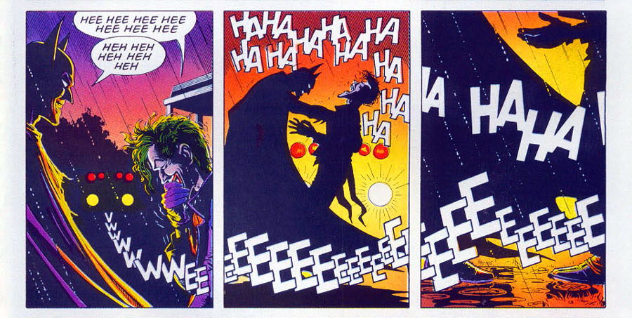
Retiring Batman scribe Grant Morrison went back on Kevin Smith’s Fat Man on Batman podcast this month and proclaimed his interpretation of The Killing Joke, a landmark graphic novel from 1989. As Robot 6 and Comics Beat reported, Morrison declared:
No one gets the end, because Batman kills the Joker. . . . That’s why it’s called The Killing Joke. The Joker tells the “Killing Joke” at the end, Batman reaches out and breaks his neck, and that’s why the laughter stops and the light goes out, ’cause that was the last chance at crossing that bridge. And Alan Moore wrote the ultimate Batman/Joker story—he finished it. . . . the laughter stops, it abruptly stops, it’s quite obvious. . . .

But he did it in such a way that it’s ambiguous, so people will never have to be sure, which means it doesn’t have to be the last Batman/Joker story. It’s brilliant!
This wasn’t a new theory. One can find traces of such speculation or interpretation on the internet for years. Artist Brian Bolland joked about the perceived ambiguity in his afterword to a recolored edition without resolving the questions. But letterer Richard Starkings recalls Bolland saying that he didn’t try to show Batman killing the Joker.

Prof. Scott Eric Kaufman rejected Morrison’s interpretation wholly, in part in a skilled interpretation of art and words and in part because it came from Morrison.

In fact, fans who think Batman kills the Joker don’t even agree on the method. Does he, as Morrison said, wring or snap the man’s neck (and, if so, where is the sound effect)? Or does Batman jab the Joker with one of his own poisoned needles (and does Joker venom even work on the Joker)?

The folks at Bleeding Cool did the important journalistic work of digging up Alan Moore’s script for that final page—which it say the site lifted material from the feed of transcriber Mr. Phil Jackson.

Moore didn’t write that Batman kills the Joker. He didn’t ask Bolland to depict the scene with any ambiguity, and he was quite explicit about motivation, symbolism, and multiple meanings elsewhere. (As I noted before, Moore opened this script by writing paragraphs about the endpapers of the book—that’s detailed.) Bolland’s drawings for the final page closely follow Moore’s very detailed descriptions.

But the sound-effects lettering is significantly different from what’s in the script. As Moore wrote the scene, the laughter ended in panel 5, the center of the nine-panel grid. Police sirens appeared in panels 5 through 7, in 8 “we can no longer hear the sirens” [I can’t bring myself to capitalize like Moore], and in 9 the sirens resume—presumably as the police take the Joker away.
Ultimately the book followed a different timing. The laughter continues for through panel 6 and off the right side of the grid. The sirens don’t recur for the last panel—which is a major improvement over having a bunch of EEEs breaking into what Moore sought for that image: “more an abstract design than anything else.”

Who made those changes and when? The evidence currently available doesn’t say. They probably occurred in the editing process as Moore, Bolland, and their editors discussed the book. So whatever Moore might have meant originally could have changed by the final product. But Bolland would still have needed to know what to draw.

Furthermore, Morrison’s interpretation puts a lot of weight on how “the laughter stops,” a phrase he repeated. But in the final book, the laughter doesn’t stop in panel 5 when Batman touches the Joker. Nor does it stop in panel 6—it continues off the right side.

So what have we learned or relearned from this worldwide discussion?
  • Grant Morrison likes people to think he has secret knowledge. (And to be fair, sometimes he really does.)
  • Superhero comics are a collaborative art form. The storytelling is the product of the writers, artists, letterer, and editors, with only the final product containing all their contributions.
  • A lot of fans really wish Batman could kill the Joker.

10 August 2013

Guided View Gone

I was disappointed to find that the second episode of the Batman 66 comic (digital issues #4-5, paper issue #2) does not have the digital tricks of the first.

As I described back here, the first story combined ComiXology’s “guided view” method of sliding from one panel to another with the sequences of similar panels as pioneered by Thrillbent to create a digital comic that has almost 300 “page turns,” or new elements, appearing over the course of the story.

Jonathan Case drew extra art to take advantage of that format so that readers could, for example, see three sequential pictures of Batman shinnying up a rope to the Riddler’s biplane. A single panel in the printed version served as up to half a dozen in the digital format, which the publisher modestly labeled “DC2.”

In contrast, the second story has fewer than fifty page turns, each simply a shift to the next half-page of the printed comic. (Each digital page is the top or bottom half of one page in the printed version.)

Ever alert for conspiracy theories, the Bleeding Cool website suggested that the reason for the change was a patent dispute. ComiXology’s “guided view” might infringe on patents from 2006-2012 owned by Disney, now owner of Marvel Comics.

However, commenter Hsielke at reported a more mundane explanation:
I contacted comixology and found out that not until chapter 10 will [Batman 66] be DC2 again. I also saw in an interview with the writer that they will not be doing all in DC2 because if they did they would not be able to hit their deadlines.
Which makes sense: drawing more pictures takes more time. Learning the new storytelling tricks takes more time. But I think it will be time well spent.

03 August 2013

Page by Gulledge

In her graphic novel Page by Paige, Laura Lee Gulledge harnesses the power of surrealism to explore the inner life of a teen-aged artist new to Manhattan.

That visual invention is what really carries the book because, although there’s tension involved in Paige’s search for friends and confidence, her journey doesn’t run her into any wrenching twists or setbacks.

Like The Plain Janes, this story involves absurdist guerrilla public art. Apparently that’s a thing kids do now. Or wish they could.

12 June 2013

What’s New in DC’s New Digital Formats?

Wired reports on two digital storytelling techniques that DC Comics is touting this month. First up:
“DC2, which will feature “dynamic artwork” that unfolds as the reader taps on the screen. . . . Rather than flipping through pages, readers will “tap on the screen to bring the next element of the story to life, whether it’s a whole panel, or a word balloon or a sound effect,” DC Entertainment Co-Publisher Jim Lee told Wired. “What’s cool is that you really get to challenge the rules of traditional storytelling. You aren’t beholden to a strict left to right western culture narrative. You can have elements that leap back and forth.”
“Dynamic artwork” is making its debut in a comics adaptation of the 1960s Batman TV show. So I expect it will let readers make sound effects that say “POW!” and “BAM!” pop up over the art, amplifying the campiness those comics are probably seeking to replicate. But that wouldn’t really “challenge the rules of traditional storytelling.” Will it do anything else?

Already Mark Waid, John Rogers, and colleagues at Thrillbent.com have been exploring how to employ the technique of changes within a panel in a digital comic. Their storytelling remains sequential, but tapping to bring up new elements can move the story forward at a deliberate pace or draw our attention to particular details. It’s not a gimmick like the the picture-book apps where the young reader can poke around for an element on each page that moves or makes sounds.

DC’s other proclaimed innovation is “DC2 Multiverse, a choose-your-own-path format that will allow users to make decisions at key points that will unlock different storylines.” That seems like an actual challenge to traditional storytelling since it might affect character choices and endings—an author’s basic prerogatives. It’s no surprise that the tryout title for that format is a videogame tie-in, an entertainment medium that’s all about branching storylines.

28 January 2013

The Evolution of Grease Monkey

Tim Eldred has published his comic Grease Monkey in a variety of ways: as a series of indy comics starting in the mid-1990s, with presses Kitchen Sink and Image, in this 2006 volume from Tor Books, and on the web.

Evidently inspired by the opening scenes of 2001: A Space Odyssey, Eldred imagined a gorilla in space alongside humans. He also wanted to explore slice-of-life stories instead of the usual battle-for-life sagas of superhero comics and space operas.

The result is a series of episodes set on a large military spaceship guarding Earth after one extraterrestrial race has nearly destroyed the planet and another has provided reparative technology and sped up evolution for gorillas to make them as intelligent as Homo sapiens. That spaceship isn’t at war; its personnel are training for war. But the tensions and rivalries of military life provide plenty of twists in the mild, character-driven plots.

Though Eldred started with his gorilla mechanic Mac Gimbensky, the main character really is Mac’s teen-aged assistant. That character—young, idealistic, and upright—is named Robin. (I’m just saying.) Most of the stories are coming-of-age episodes for Robin as he works through his role in the Barbarians fighter squadron, his crush on an assistant librarian, and his loyalty to dubious friends.

Indeed, Mac and an older gorilla in the custodial service provide so much help and wisdom to Robin that they might have become futuristic substitutes for the “Magical Negro” of single-species stories. But both those characters have their own plotlines, Mac especially, and Eldred provides a wide range of archetypal roles for both people and gorillas. Indeed, one of the few weaknesses of the saga is that most supporting characters fall quickly into familiar roles as antagonists or helpers.

Eldred draws in a classic American “realistic” comics style with some “cartoony” bulging eyes or floating hearts where called for. There’s a clear visual difference between the mid-1990s installments and when he picked up the series again a few years later, but the shift is interesting rather than jarring.

The only reading problem Grease Monkey posed for me was a tendency for panels to be stacked on the left without clear visual cues to guide the eyes. The online installments from the yet-to-be-printed sequel use word balloons as a visual bridge from one panel to the next in such layouts.

That sequel also provides a dangerous enemy for the spaceship’s crew—a shift back toward traditional adventure now that most of the characters have been established. I worry that the number of years since the end of that saga and now without a printed volume means Grease Monkey isn’t getting the readership it deserves.

14 January 2013

A Bent for Thrillbent

Yesterday I commented on the content of Insufferable, the online superhero story from Mark Waid, Peter Krause, and team. I was even more interested in Insufferable’s format. Waid and Krause chose to break from the demands of print publication and format their work for the iPad and other computers.

The most obvious difference, also reflected in DC Comics’s digital-first offerings, is that the “page” is aligned horizontally rather than vertically. The lettering is slightly larger than for a print comic book. Even more important is the change in what a “page turn” means. It can be a whole new set of images, as in regular comics. But it can also be the same image with a significant change:

  • more of that image than was in the frame before (as if a camera was pulling back to reveal more).
  • a new panel appearing.
  • a character’s shifting facial reaction or other change within the panel.
  • a word balloon, the “page turn” communicating a pause in the conversation.
  • captions (tweets in the case of Insufferable) filling up the screen.
  • a version of the movies’ “rack focus,” in which the foreground goes out of focus and the background becomes crisp, or vice versa.
Waid conceived of Insufferable as a way to show the potential of that new approach, and it clearly has storytelling potential.

I preferred to download the episodes of Insufferable in PDF form from Thrillbent and then read them on my iPad with the Stanza program. That reader provides a way to switch from one page to the next instantly without the “sliding” function that iPad programmers love to show off. That matters for the new types of “page turns” I list above.

Having the episodes also let me check back, not just on the story but also the underlying technique. Late in the adventure I began to feel that each installment contained less “story” than at the start. Yet each episode remained about 20 screens. That suggests either that Krause and Waid were playing more with the new page turn techniques as they got used to them, or that I was getting impatient.

ComiXology recently started selling issues of Insufferable, each containing a month of the original weekly installments. I don’t know if they differ at all from the experience of reading the Thrillbent PDFs. (ComiXology has a system for guiding the eye from one balloon or panel to the next, useful in the transition from print to digital but not seemingly needed for a comic conceived for a screen to begin with.) Those files include the sort of extras that comics fans have come to expect in collections: early sketches, creator commentary, etc.

The first storyline of Insufferable ends with the heroes once in partnership and some mysteries yet to be solved. However, one of those mysteries seems to be when the next storyline might pick up. In mid-2012, Waid also announced several more stories from other established creators and Top Cow’s “Pilot Season” program of test series would appear on Thrillbent this year. He tweeted that Insufferable would be back after a “short break.”

But as of this evening, Waid’s personal website is down. The last blog entries that appeared there and at Thrillbent in October. Thrillbent has been besieged by hackers before. I’m hoping its small staff is gearing up for a big leap ahead because the format has so much storytelling potential.

01 November 2012

The Color of Drama

Color is an element of comics I have very little handle on. I can spot broad patterns, like the contrasting worlds of brownish-red and blue-green in the Artemis Fowle adaptations. But more subtle color schemes need to be spelled out for me. (Spider-Man’s early villains were often green and purple because those contrast with his own red and blue—ohhh!)

I therefore latched onto this passage from Graphic Novel Reporter’s interview with Raina Telgemeier about Drama:
You worked with design studio Gurihiru to create a color scheme for this book that perfectly complements the tone of the story. Tell us a little bit about how you went about that.

Gurihiru (a two-women team, Kawano and Sasaki) is responsible for some of my favorite art and comics of the past half-decade or so. They illustrated the rebooted Marvel Power Pack series, and they’re working on the Avatar: The Last Airbender: The Lost Adventures with Gene Yang right now. They have a really soft, pleasing color palette, so I looked to them to help create the jewel-toned world of Callie’s universe, which I love.

In some cases, I had really clear ideas—the story is set in a specific part of California, where the weather and atmosphere are very distinctive. And because Gurihiru are Japanese and work through a translator, there were a few instances where they needed solid American references. Soda cans, the bookstore scene, things like that.
In the New York Times Book Review, Ada Calhoun praised that element of the art: “Telgemeier’s use of color, created with the design team Gurihiru, is eloquent; Callie’s amethyst-colored hair complements her suburb’s sky-blue skies and pistachio-green grass.”

Frankly I don’t see coloring the skies “sky-blue” to be that much of a stretch. But once the interview called it to my attention I could see how Telgemeier and Gurihiru had found a rich, luminous palette even as they stayed away from the stark primaries.

31 May 2012

Desert Island Discussions

At Vanity Fair, culture blogger Bruce Handy and New Yorker cartoon editor Bob Mankoff discussed the enduring popularity of the desert island cartoon well after people stopped being stranded on desert islands. I recall sketching one myself back in college, which just shows how common a trope they are.

Mankoff implies that such cartoons wouldn’t have seemed so funny back when sailors were really being stranded on unmapped shores. During the Age of Sail desert islands produced adventures like Robinson Crusoe, Gulliver’s Travels, Treasure Island, The Swiss Family Robinson, The Coral Island, Haakon Haakonsen, and more.

Lord of the Flies (itself a rewrite of Two Years’ Vacation) and John Dollar (a response to Lord of the Flies, and set nearly a century in the past) might be the last of that literary line. What remains are lifeboat sagas (Life of Pi) and science fiction that replicates the same situation off-Earth.

In the 1930s, when the cartoon genre seems to have become entrenched, the situation was still close enough for people to picture Amelia Earhart surviving for years on a Pacific island. Since then, Mankoff said, the database of New Yorker cartoons (360+ examples) has shown a pronounced change in the realism of desert-island cartoons:

The original ones were more about isolation from the strictures of society, especially the moral strictures of the time. If a man and a woman were on the island in the 30s or 40s, the cartoon probably has a sexual content. The woman might be asking the man, “How can I be sure you’re a millionaire?”

Then, later, the cartoons represent different things, mostly just isolation. And eventually they just represent the cartoon trope, if you will. For instance, I did a cartoon in the 80s that has a man on a desert island thinking, “No man is an island, but I come pretty damn close.” And he’s tiny, and the island is tiny. And that’s one of the interesting things that happened over the years, that it’s not a real island anymore. Originally it was a real island. Now it’s more the idea of an island, an icon. . . . And also now the jokes tend to be almost completely self-referential.
Curiously, castaway movies are still going strong.

28 May 2012

Jules Feiffer Tries Yet Another New Thing

Christopher Borrelli’s interview with Jules Feiffer in the Chicago Tribune brings out several interesting remarks about his multifaceted career:
Q: You've done so many different things — where do your biggest royalty checks come from?

A: (Laughs.) A diversity of places. Mostly children's books, I suppose. A lot of it comes from "The Phantom Tollbooth," the book I did with Norton Juster. That book has become a great annuity for me, a sizable one. It just celebrated its 50th anniversary, and it's amazing how well it still sells. It's also amazed me how much the book and my art has been remembered. At the time, in the early '60s, it was work that I didn't really appreciate that much. I had difficulty doing it and didn't feel like I was a natural at that kind of thing.

Q: Was it hard because so much of "Phantom Tollbooth" feels abstract?

A: No. Maurice [Sendak], in the new edition, wrote that I was one of the few cartoonists who can illustrate ideas. I've always felt that illustrating the abstract — drawing ideas — is one of the primary jobs of the cartoonist. . . .

Q: How did the death of Maurice Sendak affect you?

A: When you said his name my heart sank. I loved him. We rarely saw each other because he was in Connecticut. But we had deep affection for each other. When he had his first heart attack, he was in London and I happened to be in London, so I spent time with him. But we were very different in temperament. He was much more of a Russian Jew than I was, much more given to doubts of depression and grimness, and I never entirely lost some of the giddy boy-cartoonist traits I've always had. We would sit for hours and talk.

Q: And like Maurice, you seem too acidic to write children's books.

A: True. (Children's books) were a means to an end, a way to make me a living. Children's books were not a passion. That's how I felt in the '50s — once I met Maurice, I didn't think I would dare compete with him. But years later, after one of my plays, "Grown Ups," got beat up badly, I thought I needed another obsession. My idea was about this kid cartoonist, and that became "The Man in the Ceiling." I wrote it, then I called Maurice, and he gave me the name of his editor, Michael di Capua, and I've been with Michael ever since.
Feiffer’s current project is Kill My Mother, a graphic novel drawn in a film noir style he expects his fans not to recognize.
Yes, thought I could write a graphic novel, someone else could illustrate it. But as it developed, it ended up being long, starting in 1933, then switching to 1943, going from the Depression to World War II. And I couldn't find anyone to draw it right. For this kind of Chandler-Hammett noir thing, you need shadows, rain. So I had to learn how to do it. Fortunately, I have Turner Classic Movies. I record all this film noir, "The Maltese Falcon," "The Big Sleep," and hit pause on my remote. That's been my research medium. It will not be drawn (in a) traditional Feiffer style. I stole from [Will] Eisner. I hope it will be finished by the end of next year.
Last month Feiffer told Publishers Weekly about this project:
Feiffer went on to explain that, “when I started out in the comic book business, I didn’t plan on producing social and political commentary,” and said he really wanted to produce action/adventure comics strips like his cartoonist heroes, Will Eisner (The Spirit) and Roy Crane (Wash Tubbs). “But I couldn’t draw like them. Since I had no qualifications and couldn’t imitate them, I tried to do my own thing,” Feiffer said.
The Tribune interview also contains remarks about Hugh Hefner as an editor, Philip Roth as a joker, Jack Nicholson starstruck by Warren Beatty, and more.