31 December 2011

The End of Lord Peter Wimsey

I read the Lord Peter Wimsey novels as a boy, spurred by my mother’s fondness for them and by Ian Carmichael’s portrayal of the character on Masterpiece Theater. Like any good fuddy-duddy, I was therefore a little wary of Jill Paton Walsh’s sequels to Dorothy L. Sayers’s originals.

The first, titled Thrones, Dominations, grew out of notes that Sayers left behind, and her name appears on the cover before Walsh’s. For the second, A Presumption of Death, Walsh had only some fictional letters that Sayers had published as propaganda during the Battle of Britain, showing how her characters were coping with the Blitz. On that book, Walsh’s name came first.

For the third, The Attenbury Emeralds, Walsh had no unpublished Sayers material to draw from, simply allusions and remarks. She is sole author.

The Attenbury Emeralds tries to bookend Lord Peter’s career. The first half recounts a couple of his earliest cases as a detective, with Lord Peter and Bunter recounting the events at great length to Harriet. The narrative thus takes the form of a three-way conversation, interrupted by family business and daily life. It’s an awkward read, though more believable than those Conrad novels in which a narrator supposedly speaks for hours on end.

Naturally, this early case comes back in the book’s second half. That mystery involves a murderer who’s mad (mad, I say!), so I found that plot less than fully satisfying. On the other hand, the mystery of Thrones, Dominations depended on details of the proper dress for royal mourning after the death of George V, so it wasn’t good for the fashion-blind.

I found A Presumption of Death to be the most satisfying of this trilogy, with its interesting wartime setting and good roles for children. It has much the same feel as Sayers’s short story “Talboys,” her only glimpse of Peter and Harriet as parents. There are priceless moments with Harriet and Bunter.

What was truly satisfying, however, was how Walsh drew the whole Lord Peter saga to a close. Sayers left his nephew the Viscount St. George in the RAF during the Battle of Britain, and acknowledged that the young man probably didn’t survive the war.

I remember reading that factoid in a book about the series back around 1980, and realizing that would make Lord Peter heir apparent to his older brother, the Duke of Denver. The duchess was clearly past the age to have another child, even if she and her husband still got along, so the only way that succession would change is if she died, Denver remarried, and the new wife quickly had a male child. Which was, I suppose, what Peter would hope for.

The Attenbury Emeralds explores that situation. It’s set in 1951 as new tax rates and social rules are spreading peers’ inheritances and privileges more widely around the English nation. Peter and Harriet’s boys are at Eton and other public schools, as is Bunter’s son, clearly on the rise. And by the end of the book, Lord Peter is no more.

Which is not to say he’s dead. If in future he does any more mystery-solving, perhaps under another author’s pen, he’ll do it under a different name.

29 December 2011

Piling on The Seeker

Salon asked some children’s writers about movie adaptations, and a couple had interesting things to say about an uninteresting film, The Seeker: The Dark Is Rising. I read that piece just a couple of hours after watching the movie for the first time (I had a bunch of envelopes to stuff, all right?). M. T. Anderson is right on the mark about it:
The original novel, published in the ’70s, established a lot of the common tropes of kids’ fantasy novels – for example, the odd penchant of Forces of Light in general for engaging underage teens to save the world. (Really? Is that a wise choice? Are those the only resumes they receive?)

The qualities of the original that make it a classic of the genre also make it a tough thing to adapt into a movie. It’s richly atmospheric and moody, even dreamy, evoking a Celtic Christmas that is ancient and half-pagan – but the confrontations between Light and Dark are subtle. The action is almost ritualistic.

For the movie, they threw the whole Celtic thing out the window and focused on action. By sapping the story of everything that made it particular (its mood and its focus on a seductive blend of British mythologies) they left behind only the elements that have been imitated so many times in the 30 years since the book’s publication that they’ve become cliché. So the filmmakers managed to create something that fans of the book hated – because it gutted the original material – while at the same time boring the hell out of everyone who didn’t know the book, because all that was left was insipidly generic.
Charitably, Anderson says, “Some of the bustling family scenes, scripted by the talented John Hodge (‘Trainspotting’) have verve.” Family was also a major theme in Susan Cooper’s novel as well, starting from the first line, but used in a completely different way. Though one Stanton brother is exasperated by the number of siblings (which the movie doesn’t try to replicate fully), for Will his family is safe and sturdy. In contrast, the movie family is full of nasty teasing, sexual rivalry, and hidden shame.

I was struck by how desperate the moviemakers were to establish that The Seeker was set in the present, not the (gasp!) 1970s. Our first sight of Will is him putting in earbuds. Shortly afterward comes a shot of a line of teens all flicking open their cell phones. (Remember when phones flicked open?) Will’s brothers have a huge screen for their videogames, an older brother Skypes in from Hawaii for Christmas, and Will researches the ancient battle of light and dark through Google.

That technology theme fades away, however, and cell phones and computers aren’t allowed to affect the plot any more than in the Harry Potter stories. The conflict plays out in a series of very familiar special-effects shots. Giant snakes! Water bursting through archways! Glass breaking! Smoke billowing!

Diane Duane concurred on how much was lost:
…probably the adaptation I’ve seen that stands out as most completely screwed-up would be “The Seeker: The Dark Is Rising.” The basic concept was eviscerated and left staggering around like a zombie-ized shell of itself, and all the good character business was either dumbed down, ripped out or rendered meaningless. It infuriated me, because that book was the anchor of one of the great mid-’70s YA fantasy series, a nuanced piece of work.
I know mood is hard to translate from page to screen. But The Dark Is Rising offers one of the finest lines in children’s literature—“Tonight will be bad, and tomorrow will be beyond all imagining”—and The Seeker managed to screw up even that.

I have no compunction about spoiling what’s supposed to be one of the movie’s big reveals: that Will’s twin brother was kidnapped in infancy, and—despite his growing up in a family with two guilt-stricken parents and five older brothers who love to torment him—no one ever told him. This allows for a sight of the lead actor in an awful wig alongside his regular self in trick shots at the end of the film. Hell, I’ll even give away the ending! The brother returns to the family after fourteen years of captivity in a snow globe as if nothing has happened.

28 December 2011

Wisest Thing I’ve Read Today

Here’s a taste of economist and New York Times columnist Tyler Cowen’s remarks about storytelling at something called TEDxMidAtlantic (evidently the future is moving too fast for the spacebar to keep up).

I was told to come here and tell you all stories, but what I'd like to do is instead tell you why I'm suspicious of stories, why stories make me nervous. In fact, the more inspired a story makes me feel, very often the more nervous I get. So the best stories are often the trickiest ones.

The good and bad things about stories is they're a kind of filter. They take a lot of information, and they leave some of it out, and they keep some of it in. But the thing about this filter, it always leaves the same things in. You're always left with the same few stories. . . . There's monster, rags to riches, quest, voyage and return, comedy, tragedy, rebirth. You don't have to agree with that list exactly, but the point is this: if you think in terms of stories, you're telling yourself the same things over and over again.

There was a study done, we asked some people to describe their lives. And when asked to describe their lives, what's interesting is how few people said, "mess". It's probably the best answer; I don't mean that in a bad way. "Mess" can be liberating, "mess" can be empowering, "mess" can be a way of drawing upon multiple strengths.

But what people wanted to say was, "My life is a journey." 51% wanted to turn his or her life into a story. 11% said, "My life is a battle." Again, that's a kind of story. 8% said, "My life is a novel," 5% "My life is a play." I don't think anyone said, "My life is a reality TV show." Again, we're imposing order on the mess we observe, and it's taking the same patterns, and when something is in the form of a story, often we remember it when we shouldn't.

So how many of you know the story about George Washington and the cherry tree? It's not obvious that's exactly what happened. The story of Paul Revere, it's not obvious that that's exactly the way it happened. So again, we should be suspicious of stories. We're biologically programmed to respond to them. They contain a lot of information. They have social power. They connect us to other people. So they're like a kind of candy that we're fed when we consume political information, when we read novels. When we read nonfiction books, we're really being fed stories. Nonfiction is, in a sense, the new fiction. The book may happen to say true things, but everything's taking the same form of these stories.

So what are the problems of relying too heavily on stories? You view your life like "this" instead of the mess that it is or it ought to be. But more specifically, I think of a few major problems when we think too much in terms of narrative. First, narratives tend to be too simple. The point of a narrative is to strip it way, not just into 18 minutes, but most narratives you could present in a sentence or two. So when you strip away detail, you tend to tell stories in terms of good vs. evil, whether it's a story about your own life or a story about politics.
Even if we avoid the pitfall of assigning good and evil, we still face the other fallacies of seeking a well-constructed narrative: that things don’t just happen randomly, but for a reason already established in the story; that we as characters affect the outcome of events through our efforts (or fail because of lack of effort); that there’s a lesson or insight to be learned. In writing fiction, I’m eager to create good narratives. In studying history, I’m suspicious of them, yet it’s the natural way I lay out information.

Cowen’s whole talk can also be viewed as a video.

27 December 2011

Oz on the iPad

One of my gifts this holiday/birthday season was an iPad, and one of my first apps purchased for that iPad was Oz, created by Boluga.

The text is an abridgment of L. Frank Baum’s Wonderful Wizard of Oz, and the aesthetic is derived from W. W. Denslow’s illustrations. Not as they originally appeared, though, since the “pages” have also been digitally aged and dusted with grime for a “classic” look. In addition, key phrases are enlarged and laid diagonally on many screens, especially those with no art. As I noted before, Denslow’s thick-line cartooning adapts well to this format.

Kirkus found that shortening the text removed a lot of Baum’s charm. Knowing the story already, I didn’t pay much attention to that, but I agree that a lot of Baum’s strength as a storyteller—his ability to create a verisimilitudinous fairyland through respect for individual characters and quotidian detail—appears in passages unnecessary for the plot and therefore likely to be the first to go.

Some of the screens have interactive elements, but I found them inconsistent. From one page to the next, the art can:
  • do nothing but look pretty. It’s possible to spot these by the lack of a circular icon in the upper right corner. 
  • come with animation, music, or other sounds, but (aside from rerunning the screen by hitting that icon) there’s nothing for readers to do. This is how the Wicked Witches die, for example.
  • let readers play with visual elements, though to no clear purpose. I don’t know why one is supposed to knock down the Soldier with the Green Whiskers’s gun. One can fill the poppy field with poppies drifting snowglobe-style from the sky, which is kind of pretty, but it doesn’t seem to grow from the story. 
  • allow readers to be part of the story by, say, taking the Scarecrow off his pole or putting the heart in the Tin Woodman. These screens are, of course, the most fun. But Kirkus complains that such games and puzzles require too much fine-motor control for the app’s intended audience. I must admit I still haven’t got the Guardian of the Gates’s key into the lock—I’d actually decided it didn’t belong there.
Not being able to distinguish one type of interaction from another was also a little frustrating. For example, after Mr. Joker, the clown in the China Country, shatters into dozens of pieces, I kept trying to reassemble him. But I think he’s a lost cause.

Perhaps a version 2.0 will fix those frustrations. But honestly, for 99¢, Oz was a fine way to learn some of the tricks of my iPad while revisiting some familiar faces and places. I was more than satisfied.

Incidentally, I noticed only one sign of the MGM movie’s influence on this version: when the Tin Woodman’s heart goes into his chest, it starts to tick. All the other details are from the book.

26 December 2011

Cry Freedom

Over at Boston 1775, I’ve run an interview with Seamus Heffernan, the creator of a new independent comic called Freedom, set in an alternative 1779 when the American Patriots have lost their war for independence from Britain. We cover his inspiration, research, working methods, and plans for upcoming installments.

The first issue of Freedom is available now. It starts the adventures of Adam Farr, a fourteen-year-old Massachusetts farmboy going into redcoat-occupied Boston to work for a merchant who supports the Crown. Its website offers a preview, a scene in which Adam and his brother encounter trouble at an army checkpoint.

Freedom won a Xeric Foundation grant earlier this year, helping Heffernan to publish in an oversized 8" x 12" format that really shows off his art. This first issue raises a lot of questions, and the saga will probably take years to complete, but it’s off to a very intriguing start.

25 December 2011

Weekly Robin Holiday Greetings

This weekly Robin shares a few highlights from the holiday story in Batman, #15, dated February-March 1943 but on sale the previous December. That was even before Alfred Beagle arrived at stately Wayne Manor.

The tale, scripted by Don Cameron and drawn by Bob Kane and Jerry Robinson, begins with Bruce Wayne and Dick Grayson out holiday shopping. (As usual in winter scenes of this era, Dick wears earmuffs.) They see a poor newsboy and give him presents, but the image of his poverty lingers in their minds that night.
Bruce and Dick decide to bring gifts to the three loneliest men in Gotham. But of course they can’t do that simply as a wealthy philanthropist and his ward. No, they’ve got to show off the bat-tech!

One of the men they’ve targeted is a doorman at an “ultra-exclusive” nightclub.
Batman brings the doorman inside and asks the revelers for a show of appreciation for the doorman. The 1% obligingly rattle their jewelry. But because this is Gotham City, any upper-class entertainment is due to be disrupted by crooks. Sure enough, thugs arrive, walk through the now-unguarded door, and hold everyone at gunpoint.

Fortunately, the Boy Wonder has a brainstorm about one of the presents the Dynamic Duo has brought for the doorman.
Also fortunately, these are the two dumbest crooks in the world. (Full story here.)

23 December 2011

Bartimaeus Flattened on the Page

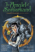
Andrew Donkin shares credit for the script of the Amulet of Samarkand graphic novel with Jonathan Stroud, just as he shared credit for the Artemis Fowle adaptation with Eoin Colfer.

I thought the Artemis Fowle comic was very good, equal or perhaps even better than the novel. However, I thought the comics adaptation of the first Bartimaeus novel was merely a flattened version of the original.

The Samarkand art, by draftsman Lee Sullivan and colorist Nicolas Chapuis, is just fine. Their pictures of a magical London are terrific; I especially like the way their London Eye has the five-pointed pentagram inside it. I found it somewhat difficult to follow how old Nathaniel was in different scenes as the narrative flashed back and forth, but that really points to the larger problem in this adaptation.

Colfer’s Artemis Fowle was practically made for the comics form. The narrative voice is an omniscient, detail-oriented third person. The conflict is built on opposing teams with clear goals. The narrative is built up from plot twists in the physical world rather than realizations in the mental one. The characters cover a broad range of physical types, with corresponding personalities.

In contrast, Stroud’s Bartimaeus books are a triumph of narration. There’s Bartimaeus’s own voice, with its boasts and footnotes, which brief comics captions can barely replicate. That voice helps us follow the djinn through his shapeshifting and world-jumping while in the graphic format we have to see Bartimaeus from the outside.

The novel’s other, third-person narrative voice shows us Nathaniel growing up and working his schemes. It provides the sense of distance useful for an anti-hero while letting us into his head as he thinks and rethinks.

The narration also keeps the timing of different scenes distinct. In the comics version, there’s a short sepia-toned flashback to when Nathaniel was very little, but all the other scenes unfold before us looking like the present, differentiated only by captions saying NOW and BEFORE.

Indeed, I wonder if this form would have worked better if it started at Chapter 11, “The Day Everything Changed”; using Nathaniel’s confrontation with Simon Lovelace to fill us in on the boy’s background and world; and then proceeding chronologically. That approach would have kept Bartimaeus off the stage for longer. However, if we can’t hear his voice in all its glory, it’s unfortunately not such a loss.

22 December 2011

“The lessons they want to hand down”

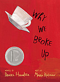
The Horn Book just sent me editor Roger Sutton’s interview with Daniel Handler on the textual side of Why We Broke Up. I don’t think it’s yet on the web, so this might be a reminder to sign up for the Horn Book’s electronic newsletter.

In any event, at one point Handler (né for book-buying audiences Lemony Snicket) says:
I don’t quite understand what YA literature is. To me it’s the genre where the authors publicly talk the most about the lessons they want to hand down to the reader, even more so than in picture books, I’d say. It seems like everybody who's writing a book for a fifteen-year-old is trying to save a particular kind of fifteen-year-old from a particular kind of thing.
That’s just not true. There’s a whole ’nother kind of YA lit whose valuable lesson about life is reassuring a fifteen-year-old that others are going through a particular kind of thing just like them, so they don’t need saving.

(Unless, of course, the “particular kind of thing” is the adolescent belief that nobody is suffering just like them, that everyone else in high school is having more fun than they are.)

But does Why We Broke Up at the end offer a sense of hope?

21 December 2011

Are Today’s Picture Books Too Short?

Last month, the reviewer, author, and former editor Anita Silvey delivered some sharp talk about picture books in School Library Journal, starting with the teapotted tempest about a New York Times article reporting that booksellers saw some parents hurrying their children through picture books to early novels:

I must admit, I’ve grown quite weary over the last few years of the all-too-predictable response from adults who champion children’s and teen books: attack anyone who makes critical comments about them. . . . The basic premise of the New York Times article—that new picture books are increasingly ignored in today’s marketplace—seems completely sound to me. During the 1990s and into the 21st century, picture books brought in about 33 to 35 percent of the revenue of any major publishing house’s list. As Houghton Mifflin’s publisher in the late ’90s, I observed years when picture books made up more than 40 percent of sales. But today that number has slipped to a mere 10 to 11 percent for most publishers. . . .

So outside of obvious demographics (the big teen bubble and adults who now read YA books), why has this magnificent genre [of picture books] fallen on hard times? It’s certainly not because children don’t need or want picture books. In fact, kids today appear happiest when the combination of art and text extends into chapter books like Jeff Kinney’s “Diary of a Wimpy Kid” series and even novels like Brian Selznick’s The Invention of Hugo Cabret.
Silvey thinks the crucial data is that new picture books aren’t selling, but older ones are, and concludes that the older titles offer features the newer ones lack.

One of those features, however, might just be being older. If parents are buying fewer picture books overall, the books they’re most likely to pick up might be those they recognize from their own childhoods.

The article doesn’t offer data for Silvey’s next conclusion: that older picture books are appealing because they’re longer and fuller. It notes the short word counts of two older books, but not the longer word counts of several others, and it’s not clear whether any of those are on the bestseller lists cited earlier.

Nevertheless, I suspect Silvey is right in her diagnosis. As she notes, there’s tremendous pressure on picture-book writers, especially new ones, to write very short, spare manuscripts:
During the last few years, publishers began to maintain that adults wanted shorter texts to read to children—because of the demands on their time and young readers’ shorter attention spans. In the 1990s, publishers believed that kids didn’t want novels longer than 200 pages—until J. K. Rowling set everyone straight.
While demanding that picture books not be “slight,” editors might be hemming authors in so much on word count that it’s extraordinarily difficult not to be. Is there actually a market space for new “picture storybooks,” or is that still simply a label hopeful authors cling to when they don’t want to edit down their wordy picture-book manuscripts? Are there enough readers of picture-book age to generate sufficient demand for a longer form?

20 December 2011

One-Page Wizard of Oz

This is an unabridged publication of L. Frank Baum’s Wonderful Wizard of Oz in poster form, available from Spineless Classics in the UK.

The same outfit has versions of Peter Pan, Treasure Island, and other classics, all in appropriate silhouettes.

But for £40?!

(I understand that expressing the price with the singular form of the currency—“Forty pound?!”—conveys indignation in British speech. But I could be wrong.)

18 December 2011

Not in the Mood

Of course, Robin still manages to get the pun out even as he insists he’s above such things now.

17 December 2011

Something That Makes Letterman Happy

A well-known critical voice on the opening of the CelebriGum photography exhibit at the Ameringer McEnery Yohe gallery in New York:
“At the very core of it, it’s stupid. And so if you take something stupid and magnify it to this extreme, then it’s really stupid. And I couldn’t be happier.”
That quote comes from the New York Times Arts Beat blog. The CelebriGum site itself says that the critic was actually instrumental in effecting the show.

16 December 2011

Dragons as an Evolutionarily Adaptive Construct

At Salon, Paul A. Trout summarizes the hypothesis of anthropologist David E. Jones’s An Instinct for Dragons:
Jones argues that the image of the dragon is composed of the salient body parts of three predator species that hunted and killed our tree-dwelling African primate ancestors for about sixty million years. The three predators are the leopard, the python, and the eagle.

According to Jones (what follows is a condensed summary of a complex argument), ancient primates evolved alarm calls to identify each of the three predators, with each call triggering the defensive response appropriate to the nature of the attack mode of the specific predator. Jones calls this predator-recognition template the “snake/raptor/cat complex.” This complex is the source of what Jones refers to as the “brain dragon.”

The brain dragon emerged when our apelike ancestors left the trees to walk on the ground. rather suddenly, the relatively small brain of Australopithecus had to process a lot of information about many new forms of predators and develop new alarms calls and strategic responses to them. Faced with information overload, the brain of Australopithecus resorted to lumping information into manageable and memorable chunks.

As a result, the cat, the snake, and the raptor were merged into a hybrid creature that had the salient predatory features of each: the face of a feline, the body of a snake, and the talons of a raptor. This is the hybrid “monster” that came to be known as the “dragon.”
But aren’t European dragons usually reptilian in their facial features? And what about the wings—or is that another carryover from the raptors?

15 December 2011

The Whole Tooth and Nothing But

In last Sunday’s New York Times a frustrated parent (who on second look I find is my college classmate Bruce Feiler) laid into the tooth fairy tradition:
Over the centuries, many cultures developed rituals to mark children’s loss of their deciduous teeth, which usually begins around 5 or 6. In some societies, witches were believed to covet discarded teeth for spells, so proper disposal was paramount. Children have variously tossed their teeth onto the roof (Vietnam, Haiti), buried them with ancestors (New Guinea), fed them to mice (Mexico, Afghanistan) or even burned them.

Americans were the first to popularize the idea of a tooth fairy early in the 20th century, though the custom did not become widespread until the 1950s, according to research by Rosemary Wells, a dental lecturer who lived in Chicago. American parents introduced two wrinkles to the age-old ritual, neither one for the better.

First, in the prosperity-obsessed climate of the 1950s, the tooth fairy began compensating children with cash for the alleged trauma of losing a tooth. Leave it to Americans to debase a perfectly good 3,000-year-old tradition by making it all about money.

Second, and even worse, while nearly all cultures mark the falling out of the first tooth, Americans extended the ritual to cover every tooth, a number that usually reaches 20. These days, losing a tooth is not a quaint right of passage, it’s the Ironman triathlon of parental obligation.
I can’t imagine that inflation has made this ritual any easier for parents. This year’s Visa survey of how much money the tooth fairy leaves per tooth found that the national average is $2.60. (In trying to calculate the median, I discovered that the proffered numbers on how many children receive what amount add up to only 82%, so who knows?)

I don’t think my brother and I ever saw more than small change from the tooth fairy back in the 1970s. Nowadays the idea of putting a dime or quarter in a child’s bed probably seems ridiculous. And what if she swallows it in her sleep and chokes?!

14 December 2011

The Crossover We’ll Never See

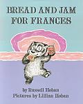
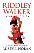
Russell Hoban died last night, the Guardian reports.

I remember being struck back in high school by the stark contrast between his delightful early readers and his post-apocalyptic novel. Could there be two authors named Russell Hoban? But no.

13 December 2011

“The First Teenage Print Culture” at the AAS, 20 Dec.

The American Antiquarian Society in Worcester, Massachusetts, has just announced this upcoming seminar:
On Tuesday, December 20, at 4:30 PM, Lara Langer Cohen--an assistant professor of English at Wayne State University, and a current American Antiquarian Society-National Endowment for the Humanities Long-term Fellow—will be presenting a regional academic seminar, titled:

Inventing Teenage Print Culture: The Postbellum Amateur Press


In the late 1860s, hobby printing presses for home use appeared on the market, leading to an explosion of amateur newspapers-nearly all written, edited, and printed by teenagers. Although amateur journalists were spread throughout the country, they were enmeshed in a tight-knit virtual community forged through exchanges; local, state, and national associations; and a determinedly insular focus; indeed, many amateur papers consisted of little more than columns of news about other amateur papers. This presentation will explore how the first teenage print culture helped shaped emerging ideas about adolescence, particularly the combination of rebelliousness and conformity we continue to associate with it today.
This seminar will take place in the the Society’s Goddard-Daniels House at 190 Salisbury Street, with refreshments and a dutch-treat dinner to follow. Contact Ann-Cathrine Rapp at AAS by Friday in order to attend.

Why do I post this on Tuesday, which I’ve reserved for stuff about Oz?

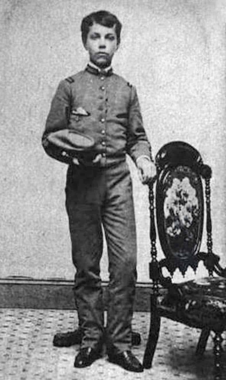
Because L. Frank Baum, born in 1856, and his brother Harry were participants in that “first teenage print culture.” In 1871 they wrote and printed a family newspaper called the Rose Lawn Home Journal, named after the family estate in upstate New York. It contained riddles, stories, poems, neighborhood news, and some advertisements for the family firm. (The photo above shows Frank in 1868 during his short career at a military academy.)

Frank went on to publish booklets about stamp-collecting and chicken-raising. Later in life, he used his printing skills to publish the weekly Aberdeen Saturday Pioneer newspaper and a book of his poetry called By the Candelabra’s Glare. For the latter, Baum asked W. W. Denslow to draw some decorative art, and their collaboration led in two years to The Wonderful Wizard of Oz.

What are the equivalent youth cultures today? One is, I suspect, the young folks who post videos on YouTube, commenting and favoriting back and forth. Networking is so much easier now.

12 December 2011

Wisest Thing I’ve Read Today

I much enjoyed editor Andrew Karre’s essay “#yamatters” at Hunger Mountain:

I’ve made the joke several times that there are two sure-fire ways to drive traffic to a blog or newspaper website. Barely informed speculation about a new Apple product is the first. Second is a half-baked analysis of the state of YA literature (“Think of the children!”). Sometimes this joke gets laughs. . . .

More than any other tech company, Apple thrives on disruptive technology. Remember the music industry before the iPod and iTunes? Remember what your cell phone looked like and what you expected it to do in 2006? Remember netbooks? And the list goes on. In short, a disruptive technology is some device or system that, when it enters an established market, changes everything. . . .

I believe modern novels for young readers—particularly YA novels—are a disruption in children’s books and maybe in books in general.
And just imagine what sort of disruption there will be when those crazy kids can read their books on their iPhones!

What? . . . Really?! . . . Oh, my god, the disruption!
Novels for teens and younger readers are substantially less intermediated and substantially more anticipated in real time. For affluent audiences of avid young adult readers, teachers and librarians no longer act as gatekeepers. They are still there, but now they’re just one of dozens of avenues for discovery. Fifteen years ago, authors were abstractions; today, they’re friends on Facebook, and we stay up until midnight to buy their new books at the moment of release.

Additional evidence of this disruption is abundant: Look at children’s and teen sections in stores and libraries now and fifteen years ago. Look at the sizes of book advances and print runs. Bestselling adult authors are writing YA novels (or feeling the need to deny that they’d ever do so—it’s the same thing really). Etc, etc. YA has disrupted children’s books.
Of course, this disruption follows the disruption of the Harry Potter series, with each volume rewriting the rules of publishing. Remember when it took months for books to be published on both sides of the Atlantic, when there was no New York Times best-seller list for children’s books, when everyone knew that eight-year-olds couldn’t possibly read more than 160 pages? And the scary part is that it’s the same readers!

11 December 2011

Robinson’s Visual Inspiration for Robin

In further honor of the late Jerry Robinson, this weekly Robin quotes from his 2004-05 interview by Gary Groth for The Comics Journal on the character design for Robin:
We had a long list of about 30 names, and we kept adding others. The names are very important for the characters. Bill  [Finger] was very specific about that, as well as Bob [Kane]. Most of the names, as I recall, were of mythological origin — Mercury and others. None of them sounded right to me, or to anybody, because we never agreed on any one.

My reservation was that I thought that it should be a name that evoked an image of a real kid. He didn’t have superpowers, nor did Batman. That was what distinguished it from Superman and the other superheroes. I thought the boy should be the same. And thinking of a more human name, I came up with Robin because the adventures of Robin Hood were boyhood favorites of mine.

I had been given a Robin Hood book illustrated by N. C. Wyeth — I think it was a 10th or 12th birthday present. It was a big, very handsome book for the time, very elaborate because it had full-color illustrations, maybe a dozen throughout the book. It was the full text with full-plate tip-ins. I remembered those because I had pored over them so many times as a kid.

I had a vision of Robin Hood just as Wyeth drew him in his costume, and that’s what I quickly sketched out when I suggested [the name] Robin, which they seemed to like, and then showed them the costume. And if you look at it, it’s Wyeth’s costume, from my memory, because I didn’t have the book to look at. But it is pretty accurate: the fake mail pants, the red vest, upon which I added the little “R” to correspond with Batman’s bat on his chest.

When I started to letter the strip, every legend I did started off with a little round drop-out white letter. So I thought of that for the vest.
Now in fact I don’t see many elements of the Robin costume in Wyeth’s paintings, particularly the one most often cited as inspiration: “Robin Meets Maid Marian,” shown at right above. Certainly the “fake mail pants” don’t show up many places before Detective Comics, #38.

But I think the title-page illustration at top, showing young Robin Hood learning to shoot, must have been in Robinson’s head. For one thing, it shows the hero as a boy wonder. And although the garments are quite different from what Robin would wear, the silhouette is rather similar: short boots with flared ankles, smooth legs from ankle to upper thigh, jerkin extending below the belt, puffed upper sleeves looking like short sleeves. And, of course, emblems on the chest.

09 December 2011

Tolkien the Teacher

Back in early 2010, I quoted reminiscences about J. R. R. Tolkien at Oxford from Diana Wynne Jones and Susan Cooper, as collected by Leonard Marcus. Cooper said, “He was a wonderful lecturer,” but Jones said his lectures were “absolutely appalling.”

It looks like many more people shared Jones’s response. Adam Gopnik’s recent article in the New Yorker about high fantasy for young readers begins:

At Oxford in the nineteen-forties, Professor John Ronald Reuel Tolkien was generally considered the most boring lecturer around, teaching the most boring subject known to man, Anglo-Saxon philology and literature, in the most boring way imaginable.

“Incoherent and often inaudible” was Kingsley Amis’s verdict on his teacher. Tolkien, he reported, would write long lists of words on the blackboard, obscuring them with his body as he droned on, then would absent-mindedly erase them without turning around.

“I can just about stand learning the filthy lingo it’s written in,” Philip Larkin, another Tolkien student, complained about the old man’s lectures on “Beowulf.” “What gets me down is being expected to admire the bloody stuff.”
Since Jones and Cooper were at Oxford at about the same time, and since Cooper can appreciate theatricality when she sees it, most likely she was remembering the more popular lectures of C. S. Lewis.

According to Philip Pullman, Tolkien left his stamp on the Oxford curriculum even after he had retired from teaching: “every undergraduate had to read and study—and suffer—Anglo-Saxon.”

08 December 2011

Weekly Robin Extra: Farewell to Jerry Robinson

Comics artist and advocate Jerry Robinson died this week at the age of eighty-nine. He was a teenager when Bob Kane hired him as an assistant in the summer of 1939. From inking and lettering he moved on to being the uncredited principal artist on some Batman comics before being hired away by the publisher.

At a signing in Boston earlier this year, I asked Robinson about the appearances of his and inker George Roussos’s names in early Batman pages—slipped onto shop signs and the like. Was that their way of “signing” the art alongside Kane? With a sly smile, Robinson said, “I probably signed Bob’s name more than he did!”

The photo above comes from Geoff Boucher’s 2009 profile of Robinson from the Los Angeles Times. Is it a sign of our values that lately Robinson has been celebrated more for co-creating the Joker than for co-creating Robin?

07 December 2011

Looking for Evrob

The detail above comes from one of the panels of the Marvel Comics adaptation of Ozma of Oz, drawn by Skottie Young. It shows the royal family of Ev soon after they’ve been disenchanted.

The big lunk in the lower left, with the single curly hair atop his dome, appears to be future king Evardo. At least that’s who is looking for cake in the royal pantry several pages later, as L. Frank Baum described.

However, an earlier page had the label “Evardo” on the smaller adolescent with the purple mantle and the even worse haircut. Either way, it’s quite a shift from John R. Neill’s portrait of a conventional young adolescent.

As in Baum’s novel, the prince we see most in this comic is Evring, the little prince whom Dorothy rescues. He’s also the most normal-looking of the boys that Young draws. Evring wears gloves on his spindly arms; since he’s not trained for manual labor like Tip in Young’s Marvelous Land of Oz art, the effect is to make him look more like a—gasp!—character in a cartoon.

Baum wrote that Evring is the baby of the family. I’m guessing that detail didn’t make it into Eric Shanower’s script because Young drew three other siblings as infants.

I’ve spent an abnormal amount of time thinking about the royal family of Ev because a few years back I wrote a story called “Evrob & the Nomes,” about one little prince’s second visit underground. It was published by the International Wizard of Oz Club in Oziana 2004; Sam A. Milazzo reviewed the story here.

That story required filling in more details about the royal family of Ev while staying close (in my mind) to those left by Baum and Neill. I liked the idea of the family as somewhat impoverished royals from the Edwardian period, wearing the medieval-style dress on the most formal occasions but early-twentieth-century military uniforms at other public events and early-twentieth-century bathing suits at the beach.

I kept Evring as the baby, but tried to show him through the next oldest boy’s eyes: as a mewling focus of resentment. I tried to paint King Evardo as an uptight adolescent stumbling his way through family responsibilities. The rest of the siblings were blank enough that I didn’t worry so much about being true to Baum.

One common element of the upper-class lifestyle of that time was domestic servants from colonized people: Indian and Chinese amahs, Southern mammies. So I gave the royal family of Ev an aged nanny from their country’s ethnic minority, the Wheelers.

In some ways I meant that story to upend readers’ assumptions about adventures in the Oz world, particularly Dorothy’s role in putting everything right. Like Young’s cartoons of the royal family of Ev, it’s an aggressively new look at an old tradition.

06 December 2011

Our First Glimpse of Evardo XV

The picture above, by John R. Neill, comes from the end of Ozma of Oz. It shows the dowager queen of Ev and her eldest son, the new King Evardo XV.

L. Frank Baum earlier described Evardo this way: “He was a grave and quiet youth, and would doubtless rule his people wisely and with justice.” He narrates this scene thusly:
Then the Queen took her eldest son out upon a balcony that overlooked the crowd of subjects gathered below, and said to them:

“Here is your future ruler, King Evardo Fifteenth. He is fifteen years of age, has fifteen silver buckles on his jacket and is the fifteenth Evardo to rule the land of Ev.”

The people shouted their approval fifteen times, and even the Wheelers, some of whom were present, loudly promised to obey the new King.

So the Queen placed a big crown of gold, set with rubies, upon Evardo’s head, and threw an ermine robe over his shoulders, and proclaimed him King; and he bowed gratefully to all his subjects and then went away to see if he could find any cake in the royal pantry.
He is fifteen, after all.

Baum has even less to say about most of the queen’s other children, aside from the youngest: Prince Evring, whom Dorothy rescues. The rest of the siblings are simply names: “The Princesses were named, Evanna, Evrose, Evella, Evirene and Evedna, while the Princes were Evrob, Evington, Evardo and Evroland.”

Baum derived the names of Evrob and Evedna from those of one son and his fiancée. Robert Baum was also inspiration for the young hero of Baum’s science-fiction novel The Master Key, and Edna Drucker was a family neighbor. They were in their early twenties when Ozma of Oz appeared, clearly older than the queen’s children.

As to other details of the Ev princes and princesses, especially as individuals, Baum’s book is basically silent.

TOMORROW: Filling in the gaps, one way or another.

05 December 2011

“What it takes to be a viable Republican candidate today”

In his New York Times column today, Paul Krugman provided a sharp analysis of the race for the Republican presidential nomination:

Think about what it takes to be a viable Republican candidate today. You have to denounce Big Government and high taxes without alienating the older voters who were the key to G.O.P. victories last year — and who, even as they declare their hatred of government, will balk at any hint of cuts to Social Security and Medicare (death panels!).

And you also have to denounce President Obama, who enacted a Republican-designed health reform and killed Osama bin Laden, as a radical socialist who is undermining American security.

So what kind of politician can meet these basic G.O.P. requirements? There are only two ways to make the cut: to be totally cynical or to be totally clueless.

Mitt Romney embodies the first option. He’s not a stupid man; he knows perfectly well, to take a not incidental example, that the Obama health reform is identical in all important respects to the reform he himself introduced in Massachusetts — but that doesn’t stop him from denouncing the Obama plan as a vast government takeover that is nothing like what he did. He presumably knows how to read a budget, which means that he must know that defense spending has continued to rise under the current administration, but this doesn’t stop him from pledging to reverse Mr. Obama’s “massive defense cuts.”
Krugman concludes that Romney’s strategy is “to pretend that he shares the ignorance and misconceptions of the Republican base.” I’m not sure that Romney and his highly paid consultants expect Republican voters to believe what he says. Rather, the Romney team is presenting him as willing to say anything in order to attack President Obama.

Consider the Romney campaign’s much-criticized television commercial “quoting” President Obama. That ad was doubly deceptive. First, Obama never said about his own campaign, “If we keep talking about the economy, we’re going to lose.” What’s more, the President has never stopped talking about the economy. For months he’s been pressing the Republicans in Congress to do more of what mainstream economists recommend to improve it.

All that commercial shows is that Romney is willing to play dirty in attacking the President—which is what the Republican base is looking for. Those core voters aren’t really motivated by deficit reduction, or cutting government services and benefits (especially their own, as Krugman notes), or foreign policy.

Grass-roots Republicans today are fired up almost solely about attacking Obama. Romney’s ad shows them that despite his nice-guy manners he’s willing to play just as dirty as the crazier candidates. He’s ready to claim that Obama apologized for American foreign policy, threatens the free market, and never worked in the private sector. All those statements are lies, but Romney has to tell them to keep up with his rivals.

04 December 2011

Panel One in Nightwings Seven

Above is another example of a single comics panel showing Nightwing in several poses, instants apart. It appears in Nightwing: Freefall. And I don’t think this one works. I remember having to pause to figure out what was going on—precisely the wrong effect for a panel intended to convey swift, fluid action.

We’re supposed to read the lower panel as showing Nightwing swinging himself over the front of his glider and into the air, somersaulting, to land on a winged pursuer. Not only is that physically implausible, but the art requires reading this Grayson as flying to the left and into the background. Most examples of this comics technique show the multiplied figure moving to the right foreground, the direction we westerners read.

Sometimes coloring can make a single figure in such a panel stand out helpfully as the most recent. But a small, distant figure doesn’t become more prominent than the large, nearby figure simply by being bluer.

At Comics Without Frontiers, Miguel Rosa continues to explore this technique by featuring giant panels from Gianni de Luca’s Italian adaptations of William Shakespeare. De Luca’s scripts were originally created for the stage rather than the page, of course, giving him a lot of words to fit in.

As Rosa shows, De Luca created several full-page or full-spread panels showing the same two characters several times as they move through a scene, conversing. It’s striking how almost all the movement in these examples flows from right to left, and usually background to foreground.
One of the few exceptions to that pattern appears in this two-page panel from De Luca’s Romeo and Giulietta. Yet it’s notable how in the portion of the duel that moves toward the background the word balloons thin out, with only one character speaking. That lowers the possibility of us becoming confused about what to read next.

So do possibilities like these negate Devin Grayson’s advice to novice comics scripters to “Avoid multiple actions in one panel”? I still don’t think so. Because it’s one thing for practiced comics writer-illustrators like De Luca and Frank Miller (Rosa’s initial example) to use the multiple-figure technique. It’s another for a novice scripter to unwittingly stumble into it, as Grayson warned against.

A good analogy might be the “rule” not to stack panels on the left because we readers will have trouble deciding how to move from the upper left panel: to the right or down? Many guides for beginning comics writers include that prohibition.

Yet it’s not that hard to find comics artists stacking panels on the left, with composition and balloons leading the eye down and then to the next column. I’ve noted a successful example as well as an unsuccessful one in a successful comic. Today’s Cul de Sac by Richard Thompson breaks the “rule” delightfully, word balloons guiding our eyes.

But just because practiced comics creators know how to make something difficult work doesn’t mean that new creators shouldn’t be warned against trying it until they’ve learned more.

03 December 2011

Coming to Americus

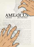
I first sampled this story as the webcomic Save Apathea. In print form, the graphic novel by scripter M. K. Reed and artist Jonathan Hill is titled Americus. And what valuable lessons about life does it hold for its readers?

The one that came through most clearly for me was:
People with dark hair are good.
Any Americus character who appears for more than one scene and has inked-in hair is smarter, funnier, more tolerant, and more interesting than the average person. People with lighter hair, left uncolored in this black-and-white book, can be nice or nasty, but all the major nasty people have lighter hair. Only three minor characters with dark hair break this rule, two just by being boring.

Unfortunately, that simple dichotomy reflects the overall story, which follows a protest against a fantasy novel in the library of a small American town. The woman challenging the book is not only self-righteous, but also bigoted, duplicitous, tyrannical, violent, and—just to cap the stereotype—overweight. 

The further away the story gets from that central conflict, the more true-to-life it seems. The main character’s social struggles as a high-school freshman, the horizons that literature and music can open up, the potential depths in some supporting characters—those details seem real and intriguing. In that respect, the title Americus plays to the book’s strengths: the portrait of a community is stronger than the battle to save the Apathea books in the fictional town library.

02 December 2011

Useful Term: “Plumber’s Review”

In my family we have the term “plumber’s review,” which is so useful that I’m surprised not to see it anywhere else. Perhaps we’ve got the wording wrong.

A “plumber’s review” is an assessment of a novel, or other work of art, based on one narrow concern. Say, a review of Robert Louis Stevenson’s Treasure Island focused entirely on details of south Pacific navigation, or an analysis of D. H. Lawrence’s Lady Chatterley’s Lover for its remarks on coal mining. In the academic world, it’s the comments from the professor miffed that you haven’t said more about the particular event or compound or poetic form that he or she happens to study.

An expert plumber’s perspective can be valuable, particularly on books about plumbing. Even a review of Edward Gibbon’s Decline and Fall of the Roman Empire focused entirely on water-systems engineering might offer useful insights.

In fact, it would have been valuable to have a whaler’s review of Moby Dick back in 1851. Instead, we had to wait nearly a century until Howard P. Vincent’s The Trying-Out of Moby Dick studied where Herman Melville got his technical information and what detail in the novel has no support in any other source of the time (the blacksmith’s apron).

The best type of “plumber’s review” acknowledges its narrow focus and the fact that there are other, wider perspectives. It offers inside information that general readers wouldn’t know but can incorporate with other responses. The worst “plumber’s review” misses that point, as well as other big points—which can make them very entertaining.

This fall at MICE I got to hear a preview of the “plumber’s review” echoing through this SLJ roundtable discussion of M. K. Reed and Jonathan Hill’s Americus. One of the important supporting characters in that graphic novel, Charlotte, is a youth-services librarian. And librarians, folks of that profession wish to make clear, don’t behave like her!

Despite public assumptions, Charlotte wouldn’t be reading in the middle of the day—she wouldn’t have time! She wouldn’t keep a patron waiting until she’d finished her reading. Most important, she wouldn’t snap back at a person lodging a complaint about a book, or tell a teenager that the complainer was a “control freak.” As Eva Volin stated in the SLJ discussion, “I would have been in big, big trouble had I handled the first contact the way Charlotte did.”

And since that conflict over a library book defines Americus’s plot, it seems like a problem for the novel. Indeed, it might subvert the book’s appeal to a key constituency.

TOMORROW: More lessons from Americus.

01 December 2011

Rediscovering The Lost Farm

The Lost Farm by Jane Louise Curry is a really strange book. Especially by today’s standards, but also by the prevailing standards when it was published in 1974.

The cover painting is an accurate depiction of an important scene near the end of the story. You might think that young readers are supposed to identify with the blond boy. But no, the book’s central character is the little old bearded farmer, yelling at the boy to get off his lawn.

The Lost Farm begins with that character as a boy named Pete living in rural Pennsylvania in the 1920s. His ne’er-do-well junk-dealer father is about to yank him out of school so he can do more work around the farm. Curry thus sets up a clear conflict. She also describes the rural setting in poetic language at a length possible in the early 1970s but no longer.

The book takes a turn into fantasy as Pete discovers a village that’s been miniaturized, with a few mini-people trapped in it—including a spunky girl about his age. Pete promises to help her escape the man who’s done this to her town and restore her to her proper size. Another clear conflict, and the promise of some adventure.

Then the villain miniaturizes Pete’s farm, leaving him six inches tall. He’s stuck on that isolated landscape with his useless father, spunky grandmother, and livestock. The physics of all this are unclear, but Curry’s descriptions of the family’s new setting are once again vivid. And we have yet another conflict: never mind school, put aside the girl—how will Pete rescue himself?

Well, he doesn’t. His mule dies. His father dies. He builds a horseless carriage, but it doesn’t achieve anything. His grandmother dies. Pete grows old on the little lost farm, somehow surviving predatory wildlife, lack of supplies, winters, disease, and every other threat. Eventually he’s a lonely sexagenarian. Because that’s what kids want to read about.

In the end other people rescue Pete, including the boy on the cover, whom we’ve never seen before. It turns out that the spunky girl was restored to her natural size decades before. There’s a thin connection between her and Pete’s rescuers, but this plot resolution basically arrives as a deus ex machina. In sum, The Lost Farm breaks nearly every “rule” of creating a satisfying story for modern children. Or for this adult.