Seeking an Irony Font
 Last November, MotherReader wrote: "I’d pledge my lifelong allegiance to the person who comes up with an ironic font--and no, the little winking emoticon isn’t enough." And that offers a fine topic to revisit as PUNCTUATION WEEK at Oz and End rolls on.
There are some other symbols beside ;-) to consider. According to Wikipedia, the Ethiopic languages already have a sarcasm mark. It looks like an upside-down exclamation point:¡ This mark is already programmed into many Western keyboards because it's used at the start of exclamatory sentences in Spanish. I rather like the idea of borrowing from Ethiopian culture, given its age.
The French poets Alcanter de Brahm and Hervé Basin proposed a punctuation mark for irony, as well as signals for doubt, certitude, indignation, and other emotional states. Most look like they'd belong in Dr. Seuss's On Beyond Zebra, but the irony sign is basically a backwards question mark. Alas, it was used in the Middle Ages for rhetorical questions, so in any exchange of letters with medieval monks it would simply cause confusion¡
Finally, as I wrote last fall, there’s the solution William Thornton proposed in 1793, of putting a plus sign on either side of an ironic statement or phrase. Supposedly, that's been adopted by Collegehumor.com since they're such big fans of eighteenth-century semiotics¡
But none of those symbols are fonts. By "font," I presume MotherReader meant a standardized variation within a typeface--a variation that can applied to any face. (As opposed to the recent use of "font" to mean a specific typeface with all its variations, such as Helvetica.)
Standard digital typography offers a plethora of ways to emphasize words.
We have italics, underlining left over from typewriters, boldface, ALL CAPITAL LETTERS, and even various colors.So theoretically we could take one of those styles and decree that henceforth it signals irony rather than emphasis. (I've already called for a halt to underlining for emphasis.) But using one of these formats would confuse some people. We need a style readers haven't seen before.
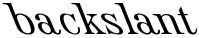
I propose that the best option would be backslant. Few typefaces have this style, but it would be relatively easy to create: it's basically the opposite of italics. And the fact that it makes letters lean in an unexpected way would help to convey a writer's ironic/sarcastic tone.
 (Backslant examples use variations of the Roemisch Rueckwaerts Liegend typeface.)
![]()


10 comments:
Oh, I LIKE IT.
Of course, now I'll have to figure out how to find the typeface that uses it and see if I can get it in Blogger. What did you use?
I went looking for a digital typeface that had a backslant option designed into it. Googling "backslant" brings up a few more, like this free version of Caracal.
Unfortunately, only a small slice of types have a backslant option, and type designers would have to add it for the "irony font" idea to gain critical mass.
It looks like web programming includes a «font-style="backslant"» parameter. However, not only would Blogger have to recognize it and the fonts, but so would readers' browser programs. The infrastructure still has to be built.
Since e-mail and chat works like conversation for many people, the irony font is a great idea. I've been "talking" for years by e-mail to one of my best friends and we've experimented with various signals for irony, but none as good as the backslant font.
I love it! What a great idea. I think that font designers should immediately set to work adding it to their typefaces.
A brilliant idea! I've often been uncertain of tone when communicating by email, etc. I don't want to use emoticons because they make me feel like an adolescent. Now, if anybody would come up with a system of communication to other drivers on the road, that would be good.
In greater Boston, we communicate our feelings about other drivers on the road by pretending not to see them at all.
i'm liking the idea, but it won't work on most web-site comment areas & such.
We need to use the TILDE!
it works perfectly
~i'm so smart~
and we don't use it for anything but decoration anyway
well, lookey here: http://en.wikipedia.org/wiki/Irony_mark
Discussed here.
IDK I think the snark ؟ denotes irony or what not pretty well.
Post a Comment