Good Punctuation Is Essential, Robin.
 Some Oz and Readers might have assumed (or hoped) that PUNCTUATION WEEK would mean skipping a weekly Robin installment. But comics have punctuation, too.
In fact, popular American comics have developed their own system of punctuation and typography, related to but not conforming to the standards for prose. Worries about capitalization go away when most sentences are rendered ALL IN CAPITAL LETTERS.
Comics punctuation allows writers and letterers to do some things that standard prose styles don't allow. Using boldface for emphasis, for example. Larger letters for more emphasis. Boldface and larger letters for even more emphasis!
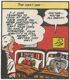
The shapes, sizes, and layouts of speech balloons function as a form punctuation--that topic could be a posting in itself. In fact, earlier this month I discussed how David Hutchison came to use balloon shapes and fonts to distinguish his characters in Oz: The Manga. So today I'll just mention a few miscellaneous quirks of comics punctuation. The panel on the right shows a rather unusual use of punctuation in a superhero comic dating from the "Golden Age" or early "Silver Age." Indeed, that usage probably shows up in this panel only because it was created in 1943, when the standard style was still being developed. Can you spot the detail?
It's a period. The first two sentences of the surgeon's speech end with periods. By the late 1940s, as far as I can tell, that punctuation had all but disappeared from DC Comics. Instead, most remarks in speech balloons became exclamations! Everything was dramatic! Even the most mundane remarks!
And if a speech really didn't call for an exclamation point or question mark...then it ended with an ellipsis--or two hyphens... (Or three hyphens, or one, or four dots--all shown in these 1940s panels.)
One sign that American comic books were maturing in the 1980s was that they welcomed back periods. And what about those two hyphens? It's almost impossible to find an em dash in superhero comics of the 1950s and '60s. But those comics were usually hand-lettered (mechanical type was cheaper, but awkward and less expressive). Letterers could easily have drawn a long dash; they weren't bound by typewriter conventions. But two hyphens must have appeared on the typewritten scripts, and thus two hyphens went into the speech balloons.
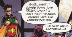
As time passed, the two-hyphen style became the comics standard. According to the Dark Horse Comics style sheet printed in Peter David's Writing for Comics, double dashes have multiple uses but "long dashes and semi-colons are not used in comics punctuation. Colons are used only on rare occasions." How long will that last? On the left, Nightwing demonstrates another form of punctuation found in comics of all kinds (not just superhero adventures): the combination of question mark and exclamation point.
The two punctuation marks almost always appear in that order, though I've seen such variations as ?!? and ?!?!?!
This punctuation usually signals a combination of puzzlement and alarm. In prose, it's possible to convey those emotions through words outside the dialogue:
But comics don't have those options; they have to convey how characters speak graphically. Hence the double punctuation.
Another combination of question mark and exclamation point is the interrobang. As World Wide Words relates, the advertising executive Martin Spekter invented this mark in 1962. He wanted it to signal a rhetorical question: "Have you ever seen such bargains‽" Enough type designers have liked the idea (or, more probably, the name "interrobang") that Unicode reserves space for this mark and its Spanish inverse. Nevertheless, neither the interrobang nor the juxtaposition of question mark and exclamation point fits in standard prose. They belong only in the most informal or experimental writing. To include them in a book manuscript is to risk being perceived as someone who hasn't read enough books to pick up the rules.
(All that said, the interrobang is on my short list of non-standard punctuation most likely to become standard in the next few decades, if people ever agree on what it signals.)
Finally, comics creators are now in a transition from lettering by hand to inserting digital text into digital art files. The hand-lettered aesthetic is still dominant, so even people who letter on computers use fonts that look like handwriting. (John Norton and Kevin Cannon offer tips on creating a font that looks like your handwriting.) Scott McCloud uses a font based on his writing in his comics, for example, while Eric Shanower still letters by hand--at least as of a year ago.
Given that trend, I suspect we'll see more of the symbol that appears in the following image from the recent Robin collection Days of Fire and Madness. You see the little box after the first period? It's not really punctuation. Rather, the text included a character which that font could not render, so the computer substituted a "missing character" glyph. And no editor caught it, either in the original magazine or this collected edition.


5 comments:
I still letter my comics by hand as of right now. How long this will last I don't know.
The traditional story I know about why periods were decades ago eliminated from comics was that engravers often thought they were specks on the plates and would eliminate them. Periods returned to comics in the 1980s as comics began to be printed better. I don't know whether that's a true story or not.
The term "word balloon" is more precise than "speech balloon." I wish you'd use it, J. L. "Word balloon" is definitely the preferred term among practitioners of comics. At least you don't use "speech bubbles" anymore, for which I'm grateful.
I am just beginning to read graphic novels/comic books and find this post so interesting. I am a grammar person (though because I've said this here, there is bound to be a mistake or two in this comment!) -- and have found myself getting caught up with the way language is played with in comics. Thanks for the food for thought...
I can't tell you your business, Eric. But I can report that as of tonight Google counts:
* 478,000 hits for "speech bubble"
* 60,400 hits for "word balloon"
* 34,100 hits for "speech balloon"
Wikipedia's main entry on the topic is "Speech balloon," which (again, as of tonight) starts: "Speech balloons (also speech bubbles, dialogue balloons, or word balloons)..."
And I run across folks like Eddie Campbell using both "speech balloon" and "word balloon," almost interchangeably. (I can easily see that a thought balloon, unless it comes from the currently late Impulse, is a word balloon but not a speech balloon.)
So this might be your version of my distaste for the term "graphic novel" for works that don't qualify as novels, even if that's the standard industry term that everyone uses.
(I can't find my use of "bubble" on this blog, so either I changed it or that was in a different online forum, when I was even more callow.)
Thanks for the "specks" explanation!
Can't remember exactly where you used "speech bubbles." It wasn't on this blog. It was back in the '90s, I think. Probably some Oz discussion list.
Anh, what does Google know, anyway?!
Buncha amachoors!!!
So it may take me ten years, but I can change my habits!
Post a Comment