The Many Modern Faces of Robin
 I started last week quoting Douglas Wolk's proposition that the “default style of the superhero mainstream” in American comics, as defined by the magazines that dominated sales from the early 1960s on, as “doggedly quasi-realistic--or, rather, it’s realism pumped up a little.”
For me, coming back to comics after about twenty years, it's striking how that standard visual style is no longer standard. It's certainly no longer as dominant, and in some places it's awfully hard to find. That of course affects depictions of Robin.
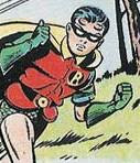
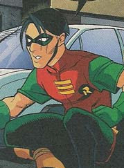
 From soon after the introduction of the Boy Wonder in 1940 until the mid-1960s, Dick Grayson looked much the same no matter who drew him. All Batman stories were signed with the name Bob Kane, so we should expect them to look like they came from the same artist--except that Kane drew as few of those comics as he could.
Instead, Robin was drawn by a shifting team of uncredited artists, hired by Kane or DC, all working to a strict style sheet. Readers discerned some stylistic differences; it's said that Dick Sprang was known as "the good Batman artist." But Robin always had a squarish face, a short nose, and a curl on either side of his forehead. The two portraits above were drawn years apart by different artists, but these drawings, and thousands of others from the same decades, share the same iconic features.
 In the mid-1960s, Batman's style changed, with Neal Adams establishing a new look that dominated for the next twenty years. This was when Wolk's "quasi-realistic" mode really settled in. Robin changed as well, growing into an older teen and learning to part his hair. But there was still a standard look for Robin, and for superheroes as a whole.
As a comics reader in the next decade, I could see the differences in artists' work, and I liked some better than others. I could even recognize where some stylistic differences arose--in inking, layout, poses. But they were all still close enough to that default style that it was easy to envision those different artists all aiming for the same ideal, or different portraitists depicting the same people.
But sometime after I stopped reading comics a new approach arrived.
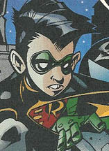
 Now mainstream superhero comics exhibit a wide range of visual styles. It's no longer possible to think of all the artists eying the same ideal. They're obviously offering their different artistic visions. (The squat little Robin above is by Dustin Nguyen, from As the Crow Flies. Some of Nguyen's pictures make Robin look positively hobbitish.)
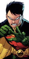
I think one milestone in this transition was Frank Miller's The Dark Knight Returns, published in 1986 (along with his earlier run on Daredevil for Marvel, where he developed a personal style). The success of that iconoclastic miniseries proved that superhero fans didn't have to see quasi-realism to buy lots and lots of copies. They could enjoy the same thrills with other approaches to faces, figures, and settings. (At right, Robin by Alé Garza in Fresh Blood.)
 The Dark Knight Returns also helped to usher in a period in which certain comics artists became very big stars, with fans relishing their individual stylistic touches. And that of course only encouraged them.
Another factor was the growing popularity of Japanese adventure comics. Their artistic conventions allowed the same character to change shape for a panel or two as a way to express emotion. The lingo for this technique was straightforward: "super deformed." Again, realism didn't turn out to be that important to visual storytelling. (Left, Robin by Todd Nauck in the Young Justice/Spyboy crossover.)
 The result is a sprawling range of styles today, with artists taking different approaches to anatomy, facial features, backgrounds, and action. And when it comes to the character of Robin, the range seems even more broad than that.
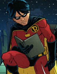
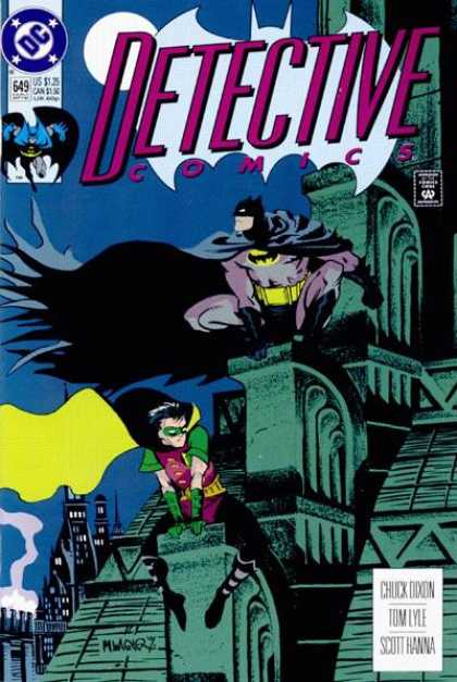
This posting shows the variety of Robins from the past fifteen years. The earliest, at right, is from Matt Wagner's striking cover for Detective #649, and the latest come from last year. This collection doesn't include depictions explicitly outside the standard DC universe, such as those created for the TV cartoons or Tim Sale's in Dark Victory.
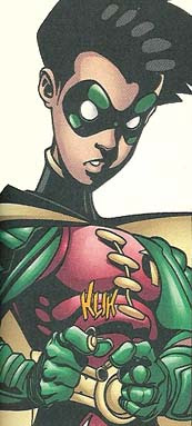
 Apparently, as long as the current Robin is (a) a male teen with black hair, (b) smaller than Batman, and (c) wearing the current costume, any size or shape of body, face, and hair is acceptable. (Left: Trevor McCarthy. Right: Freddie E. Williams, II.)
I originally wrote the preceding paragraph to say that Robin had to be a white male teen, but there are a surprising number of images of Tim Drake with Asian features, from such artists as Francisco Rodriguez de la Fuente and Pop Mhan.

 Every so often artists draw Robin's pre-1965 look, with the forehead curls--but in their signature styles. At right is Scott McDaniel's image of Jason Todd II from Nightwing: Year One.
Other artists might evoke details of that look, as in Rick Mays's stringy-haired Tim Drake from Robin: Unmasked, right. But neither of these portraits would ever pass muster under the old style sheet.
It took me a while to get used to the range and variability of visual styles in today's superhero comics, just as I was initially baffled by seeing magazines filed in plastic bags with the flap sticking up in the front instead of the back. (When did that change?)

 Some artists, such as Jim Lee (left, from Hush), still work in the mode of "realism pumped up," and do it very well. It seems significant that Lee also does very well with this style; he's one of the top-earning artists today. Perhaps fans still like this approach best.
Nevertheless, other talented artists are working comfortably a long way from the old standards. At right, for example, is Joe Benitez's Robin in a one-shot story collected in Batman: Detective.
Sometimes a comic book will have one style on the cover and another inside. One issue of a magazine can look entirely different from the next. Such differences are even more obvious now that DC and Marvel collect short runs of their regular magazines into paperbacks and call the result "graphic novels," no matter whether the issues form a unified story or not.
 The To Kill a Bird paperback, the first Robin story I read in over a decade, has pages penciled by four different artists: Damion Scott (his Robin at left actually comes from Batgirl: Death Wish), Pop Mhan, Giuseppe Camuncoli, and Scott McDaniel. Only Camuncoli comes close to the once-standard realistic superhero look.
For me that mix created a visual whiplash. I've learned to appreciate each artist's vision on its own, no longer needing to see the standardized pumped-up realism of my youth. But I still like the illusion that all the pieces of a single story fit together.
Or at least that I'll be able to recognize a character from one chapter to the next without needing to check the uniform.
![]()


5 comments:
Amazing. When you started on your Robinia, I had no idea you'd uncover so much. Or that it would be so interesting.
You've almost got me ready to dig out my comics horde looking for cool Robins.
I'm trying to remember what Robin looked like in Digital Justice.
Batman: Digital Justice was published in 1990, when the image and even the concept of Robin was in flux. I should track that futuristic story down.
I just found some cover copy from Batman: Digital Justice that’s too nostalgic to keep to myself. The heavily hyped detail of this story was that Pepe Moreno created it on a computer rather than a drawing board. The book boasted: “It was produced on a Macintosh II System with...8MB of RAM, a removable 45 MB hard disk drive and a 19" Trinitron monitor.”
You mention Frank Miller and that one prerequisite for Robin is that he needs to be male, but didn't The Dark Knight returns have a female quasi-Robin? (Probably not in official continuum but ...)
(Oh and thanks for using CoverBrowser.com!)
Sorry, I meant that in portraying Tim Drake, the current Robin, artists have wide leeway as long as they show a black-haired male teen.
I didn't wish to imply that Batman's partner can only be a black-haired male teen—though the DC editors' decision to have the first Jason Todd dye his red hair to black indicates that there's strong pressure in that direction.
Artists who portray female Robins, including Frank Miller with Carrie Kelly and other artists with Stephanie Brown, show female teens with lighter hair.
I suspect that over the last fifteen years there have been enough artists drawing Stephanie Brown (as Spoiler and Robin and out of costume) in enough styles that we could assemble a similar gallery of her in very different styles.
(I've relied on CoverBrowser.com for quite a while, and am pleased to have it as a resource.)
Post a Comment