A Look at Leroy Lettering

I’d made the common assumption that those letters were produced by some form of typesetting machine, but Klein explains that they were still drawn by hand:
It has a mechanical look, but is actually pen and ink, made with the Leroy lettering system of scriber and templates manufactured by the Keuffel and Esser company, and created for comics almost exclusively by Jim Wroten and his wife Margaret. The Leroy system was intended for technical artists doing things like machine parts diagrams and architectural drawings.The letterer drew each letter by following a groove in the template.
According to the Tales from the Crypt collection, Jim Wroten was originally a salesman for Keuffel and Esser, which made tools for architectural and drafting firms. Wroten found a market for the Leroy tool in comics when the industry boomed in the early 1940s. In 1945 he and his wife Margaret joined William Moulton Marston’s Wonder Woman team, according to Bhob Stewart at Potrzebie, who apparently interviewed Margaret Wroten in 1996.
Klein thinks the Wrotens had worked on the earliest Wonder Woman pages; perhaps they’d done so as freelancers, or perhaps someone else was using a Leroy template. That’s the problem with Leroy lettering—it has very little individual style.
Max Gaines, publisher of the Wonder Woman magazines at All-American, gave the Wrotens more business when he started Educational/Entertaining Comics, and his son Bill kept them on after suddenly inheriting the firm. By the 1950s, Klein notes, the Wrotens’ system had become more flexible:
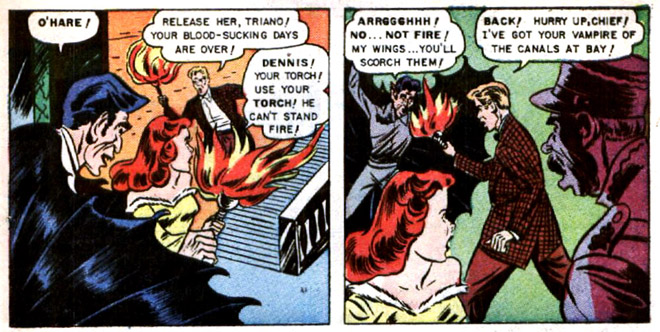
By the time of their work in EC Comics, the Wrotens had a variety of Leroy templates to use for different size lettering. They used vertical letters for regular text and a larger size slanted to the right with a thicker pen point for emphasized words. I believe the Wrotens did only the actual lettering, leaving the balloon and caption borders for the artists of the stories. This accounts for the wide variety of balloon shapes and styles at EC in particular.Though editor Al Feldstein didn’t care for the Leroy style, it fit well with his approach to writing comics: he scripted the stories, laid out the pages, and had the Wrotens insert the text at the tops of the panels. Only then did the pages go to the illustrators to fill with art. Feldstein’s stories often had a lot of text, and the Leroy characters kept that text clearly legible, if characterless.
![]()


4 comments:
I've actually heard of Leroy, but in relation to engineering plans. I haven't heard any mention of it in years, many years.
I sent this link to my husband. Turns out, we may have a Leroy set just like the one you show in this post somewhere in this house. He's not sure. His office stopped using them when AutoCAD appeared.
These days Leroy lettering might be better known for those 1940s-’50s comics, which are getting reprinted more than techical drawings from the same time. And the lettering stands out more in those comics because it seems unusual.
There are computer fonts that replicate Leroy lettering for very nostalgic comics makers, or very nostalgic architects and designers.
I ran across this while scrolling through Pinterest and boy did it bring back memories. I started my career right out of high school (1968)working as a draftsman/cartographer for the Maricopa County Assessor's offcame in aice here in Phoenix, AZ drawing assement maps of all the tax parcels. For the next nearly twenty years I used these K&E Leroy lettering templates and Koh-I-Noor Rapidograph pens on a daily basis. We drew on Vellum paper and later on mylar a plastic sheet medium that was polished on one side and frosted (to hold the ink) on the working side. The pens had replaceable tips and came with a desktop humidor and clamp to attach it to your drafting table. On Vellum paper the steel pen tips lasted quite a while, but when Mylar plastic became available and replaced Vellum the pen tips wore out quickly and Koh-I-Noor responded by attaching ultra small ruby tips to the pens which were more expensive but lasted much longer. Eventually in the late 1980's computers and AutoCad became cheap enough and in common use and replaced us all.
Post a Comment