31 October 2011

How Picture Books (and Life) Used to Be

Courtesy of the Albert Whitman blog, a page from Time to Eat: A Picture Book of Foods, by Mame Dentler and Frank Fenner, Jr., published in 1945:

30 October 2011

Finishing New Teen Titans: Games a Bit Hastily?

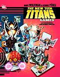
The last few weekly Robin installments have celebrated the art of George Pérez in New Teen Titans: Games. There are many more examples to enjoy.

Early in the book a series of panels of Dick Grayson using Central Park as his own steeplechase course for a workout, silhouettes interspersed with full-figure sketches. This visual effect returns as Nightwing and his adversary fight as silhouettes stomping on a scale model of New York.

Pérez and his inking and coloring colleagues drop the solid lines and strong colors of the ordinary settings to depict Azarath, Raven’s hellish home dimension. (See here for an early take on that page by colorist and collector Tom Smith.)

Despite being one of the DC graphic novel division’s premium new books, however, Games shows signs of hasty production. On one page (see above) a misplaced borderless white box cuts off characters’ feet. Presumably it was left over from some design program.

I spotted some panel lines incompletely erased, as in the example below. (Those panels also show how scripter Marv Wolfman, the editor, and the letterer made Nightwing’s speech appear before the villain’s even though it comes out of a later panel.)
The front- and backmatter are illustrated with images of the main characters cut out and enlarged from the pages in between. It’s possible that those images were inked digitally, and they were certainly colored and finished on a computer. That means they were created to be printed at a certain size, with an appropriate dots-per-inch measurement.

Rather than rescan and rework Pérez’s pencils at a higher resolution to make those big portraits look even more magnificent, the production team simply enlarged the images from the pages, resulting in jaggy lines. Beginner PhotoShop classes warn against doing that. Seeing the effect in a premium graphic novel makes the production look slapdash.

29 October 2011

Feeling Close to My Remote

I spent the day at the Southern New England SCBWI’s ENCORE session, featuring well-reviewed presentations from the past year. 

Although I was opening speaker (on the topic of “Milestones in an Exciting Plot”), my biggest contribution to the day might have been my remote control for PowerPoint presentations. Novelists Erin Dionne, Karen Day, and Mark Peter Hughes all used it during their sessions. (Mary Lee Donovan of Candlewick, like a good old-fashioned children’s-book editor, used actual books as her props.) 

For people who do presentations in various venues, I highly recommend a device like this. It works on either PCs or Macs, letting a presenter stand several yards from the computer or walk around during the presentation, instead of having to push buttons on a keyboard balanced nearby. There’s a laser pointer built in, and the Kensington version has a nice peanut-shaped design. 

This isn’t a paid product placement; I paid for the little thing like a normal person. But owning one really has made presentations easier for me. I’m glad I brought it along today—and I didn’t even have PowerPoint in my session.

28 October 2011

Children’s Literature Fellowships from the AAS

The American Antiquarian Society in Worcester has announced two new short-term fellowships for the study of early American children’s literature:

The Justin G. Schiller Fellowship supports research by both doctoral candidates and postdoctoral scholars from any disciplinary perspective on the production, distribution, literary content, or historical context of American children’s books to 1876.
As a teenager, Schiller helped to found the International Wizard of Oz Club, and he went on to become a leading dealer in children’s books.
The Linda F. & Julian L. Lapides Fellowship supports research on printed and manuscript material produced in America through 1865 for (or by) children and youth. The Lapides Fellowship will support projects examining the creative, artistic, cultural, technological, or commercial aspects of American juvenile literature and ephemera produced between the Puritan Era and the Civil War. It is open to both postdoctoral scholars and graduate students at work on doctoral dissertations.
The deadlines for applying for either scholarship is 15 Jan 2012. See the AAS website for more details.
Here’s an example of printed material produced in early America by youth: printer’s apprentice Job Weeden’s plea for New Year’s tips in 1772.

27 October 2011

Eloise et al.: “They were never children’s books”

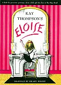
At Graphic Novel Reporter, of all places, illustrator Hilary Knight talked about how he co-created the Eloise books with song-and-dance woman Kay Thompson:
The Eloise character herself was totally Kay Thompson. She told me who this little girl was. Kay was not particularly visual, and when we worked together, she would talk to me and I would draw things. And that’s how we did all the books. We worked directly together, which is very unusual.

And the other thing that I keep talking about, because Kay was so adamant about it, is that they were never children’s books. They have become children’s books, but Kay never agreed that they were. It was sort of a joke in the beginning. There was a chain of bookstores called Doubleday on Fifth Avenue in New York, and Kay lived nearby at the Plaza. She used to go in and [see that the Eloise books] had been moved into the children’s section. She would march in and carry them to the front of the store and put them in the adult section. And then they’d just get moved back again.

It was the best thing, really, that happened to her because it was kind of a novelty adult book. It even says that it’s not a children’s book; it says that it’s a book for precocious adults in a banner across the top. She never wrote the books down to children. Of course, they look like children’s books and they were about someone who was getting away with something, so it appealed to kids, thank God.
That’s an interesting way to reconsider Eloise—as one of those adult books that look like picture books, but aren’t at all meant for the traditional picture-book readership. Certainly they weren’t created in the typical picture-book way, but that means nothing about the intended audience.

26 October 2011

A Peek Inside Minimum Paige

At Robot 6, local comics super-journalist Brigid Alverson interviewed Ryan Mita about the Minimum Paige comics anthology that he edited for the Harvard Book Store. It’s become the store’s top seller—no doubt because it’s not available anywhere else but the store’s print-on-demand book-making machine.

Ryan was, I think, the first person I met when I attended the Boston Comics Roundtable. Most folks there were interested in writing comics or drawing comics or both. Ryan said he was interested in marketing comics. And by assembling this anthology, he’s provided a platform for dozens of creators.

More than one hundred submissions came in, and among Ryan’s remarks in the interview is:
I think the biggest surprise was how professional all the artists were. Not a single submission came in after deadline. Not one. I remember having visions of artists calling at 5:01 asking for extensions, but it was silent, so I played with fonts instead.
Giving credit where it’s due, I must report that artist Alex Cormack handled the submission of our story, “Essex County Literary Wax Museum & Menagerie,” which leads off the collection. I might well have been on the phone at 5:01.

25 October 2011

The Nine

L. Frank Baum created the Nine Tiny Piglets in Dorothy and the Wizard in Oz, and they’re now hopping about in the Marvel Comics adaptation of that book by Eric Shanower and Skottie Young. The picture above is Young’s cover for one of those comic books.

Yesterday I stumbled across this verse about the piglets on my hard drive:
We piglets do not all agree.
Now three of us are saying, “No,”
While “Yes” declare another three,
And three aren’t sure which way to go.

We therefore caucus and discuss
The very best thing to be done,
What holds the most rewards for us,
And tally: four to four to one.

The argument turns fierce and hot
Until the vote is five to four.
At last we’re done! But we forgot
Exactly what we voted for.
Or maybe that’s in honor of the new Supreme Court session.

24 October 2011

Weekly Robin Extra: More Pérez Panels

Here’s another example of striking design from George Pérez in New Teen Titans: Games. Just before this sequence, the Titans have learned that there’s a bomb about to go off in New York City.

Pérez first creates a series of horizontal panels of Titans racing to the site of that bomb in their different ways: Joe Wilson in his circa-1988 car, Donna Troy gliding, Gar Logan flying as a hawk, Starfire blasting through the sky, and Vic Stone in the Titans jet. Each panel is slightly longer, extending further into the negative space above the jet, suggesting progress—but slow progress. Will they be on time?

At the bottom of the page is a series of six vertical images of the character Raven visiting her mother, an unusually untroubled moment for her. Like a movie director, Pérez pulls back from a close-up of Raven looking happy through a window into the house, and then moves forward into another close-up of her emblem, which also serves as her Titans radio. We realize that Raven, who could teleport instantly to the scene of the bomb, has not gotten the message.

Travis Lanham’s digital lettering of the alarm sound breaks horizontally across the bottom panels, growing bigger and darker. That line of letters reflects the horizontal, left-to-right movement of the Titans above. It’s impossible to resist turning that page to see what comes next.

23 October 2011

Fight at the Guggenheim Museum

Here’s a page from New Teen Titans: Games with visuals I found particularly striking. In this scene, George Pérez shows Joey (Jericho) Wilson fighting villains called Knight and Squire in New York’s Guggenheim Museum. At the top, the Knight knocks Joe over the rail of a balcony.

As Joe falls down the page, the Guggenheim’s tiers define the tiers of the panels, providing strong horizontal lines yet uniting the fall into a single image. The effect reminds me of Maurice Sendak’s In the Night Kitchen, which in turn drew heavily from Winsor McCay’s Little Nemo in Slumberland. Near the bottom, Joe grabs onto the rail of a lower balcony, and thus in a way grabs onto the top border of that panel to hold himself up.

Meanwhile, on the left, Pérez offers framed vignettes of the museum staff reacting to the fight, and at the bottom (within a differently styled frame to signal the difference) the Squire taunting them. The shapes and scale of those panels are reflected in the picture frames that Joe falls past on the right.

In the years when no one expected Games to come out, some of Pérez’s artwork circulated among fans. Titans Tower has posted a scan of the line art of this page, showing the bare design.

The finished page includes the contributions of Hi-Fi, the firm that provided digital coloring for Games. That process added not just colors but Joe’s shadows on the wall, and the images of famous nineteenth-century art in the frames, under glowing lamps.

Of course, that’s not the type of art that gets displayed in the Guggenheim. Modernist works, particularly Pop and Op Art, might even have worked better in this scene, playing off the medievalism of the villains and Jericho’s costume. But those works have more copyright protection. And the choice of Impressionism enhances the surreal contrast between this fight and the dignified placidity of its museum setting.

22 October 2011

Ruth Berman’s Quest for Bradamant

I’m pleased to post this interview with Ruth Berman, author of Bradamant’s Quest. This is a new novel about an old character, originally created in the late Middle Ages. Yet Bradamant is also the forerunner of the many female knights in fiction today, so this tale can speak to modern readers.
Bradamant’s Quest is set in a fantasy world that was immensely popular for centuries, but which we don’t visit much anymore: the “Matter of France,” or romances of Charlemagne. How did you decide to add to that saga? What does it offer that we don’t find in other great myths of the western world?

When I read the stories in the Incompleat Enchanter series by L. Sprague de Camp and Fletcher Pratt, many years back, their treatments of the worlds that Harold the I.E. visits made me interested in looking up and reading the books involved. That eventually led me to reading a translation of Ariosto’s Orlando Furioso, and I thought Ariosto’s Bradamant was a fascinating character, sure of herself and resourceful in going after her true love (a warrior in the enemy army’s forces? — no reason to give up, is her feeling).

Bradamant gets treated rather poorly in modern stories, being presented as a too-big, beefy, well-meaning-but-clumsy type in deCamp/Pratt, and as a rigidly military fighting machine in Italo Calvino’s The Non-Existent Knight. I thought there ought to be more adventures for Bradamant as strong without being therefore laughable or unpleasant, and eventually decided to do something about that.

Oberon also makes an appearance in Bradamant’s Quest. I know he’s got roots in the Middle Ages, but has he played a role in Carolingian romances before? Would we recognize him from A Midsummer Night’s Dream (or would he recognize himself)?

Oberon the Fairy King is a major character in the 12th century Huon of Bordeaux, Huon being one of Charlemagne’s knights. The 1534 translation of it into English is where Shakespeare got his Oberon. The name is equivalent to Auberon, which is equivalent to the German Alberich, meaning elf-lord, although Oberon would not recognize himself in the Alberich of the stories of the Volsung Saga/Ring of the Nibelungs. Huon’s Oberon is enough like Shakespeare’s to make them recognizable, for instance, in their power and in their inclination to befriend mortals, although Shakespare made important changes, such as introducing Titania and Robin Goodfellow into Oberon’s court.

The romance authors of medieval Europe freely added to each other’s work, as when Ariosto wrote Orlando Furioso to finish Boiardo’s Orlando Innamorato. These days, many people would call that plagiarism, or fanfiction (and which is more respectable?). What are your thoughts on this sort of collective fiction-making? Should we revise our ideas of originality and look at it differently today?

No one seems to object to modern Arthurian adventures. Jane Yolen likes to say that King-Arthur-and-his-knights make up one of the earliest shared-world settings, although by no means the earliest. Tennyson, when he was doing his retellings of stories from Greek mythology (and the same applies to his Arthurian adventures in his Idylls of the King) remarked in a letter to a friend that he did not like to re-tell a story if he thought it was simply a rechaufée, re-heated leftovers, but if he felt he had something to say that was more than could be found in the original, then he felt that his version was worth doing. And, as T.S. Eliot said: only bad poets borrow — good poets steal.

You’re a charter member of the Int’l Wizard of Oz Club, and you’ve been writing articles about fantasy literature and resurrecting lost stories for many years, as well as writing short stories. How does it feel to be publishing your first novel?

I’m delighted to have it in print. I remember some years back I was on a panel at a science-fiction convention about writing stories based on legends/myths. I tried to say something about Bradamant, and the moderator kept shutting me up, I think because she thought an unpublished novel could not be worth talking about. I take a good deal of satisfaction in thinking that now I can tell people about it, and if they think it sounds interesting, it’s possible for them to get it.
Bradamant’s Quest comes to us from FTL Publications of Minnesota, which offers a free peek at the first chapter.