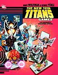
Finishing New Teen Titans: Games a Bit Hastily?
The last few weekly Robin installments have celebrated the art of George Pérez in New Teen Titans: Games. There are many more examples to enjoy.
Early in the book a series of panels of Dick Grayson using Central Park as his own steeplechase course for a workout, silhouettes interspersed with full-figure sketches. This visual effect returns as Nightwing and his adversary fight as silhouettes stomping on a scale model of New York.
Pérez and his inking and coloring colleagues drop the solid lines and strong colors of the ordinary settings to depict Azarath, Raven’s hellish home dimension. (See here for an early take on that page by colorist and collector Tom Smith.)
Despite being one of the DC graphic novel division’s premium new books, however, Games shows signs of hasty production. On one page (see above) a misplaced borderless white box cuts off characters’ feet. Presumably it was left over from some design program.
I spotted some panel lines incompletely erased, as in the example below. (Those panels also show how scripter Marv Wolfman, the editor, and the letterer made Nightwing’s speech appear before the villain’s even though it comes out of a later panel.)
The front- and backmatter are illustrated with images of the main characters cut out and enlarged from the pages in between. It’s possible that those images were inked digitally, and they were certainly colored and finished on a computer. That means they were created to be printed at a certain size, with an appropriate dots-per-inch measurement.
Rather than rescan and rework Pérez’s pencils at a higher resolution to make those big portraits look even more magnificent, the production team simply enlarged the images from the pages, resulting in jaggy lines. Beginner PhotoShop classes warn against doing that. Seeing the effect in a premium graphic novel makes the production look slapdash.


2 comments:
Good catches. I didn't notice these things, although when I read it, I came away feeling that there was some static in the book that I couldn't put my finger on. I chalked it up to the fact that part of it was drawn and written so long ago, and the rest reworked and newly drawn and written recently. But the fact that Games also shows some chop due to the transition in production methods doesn't surprise me.
That the book has three different credited inkers also produces some visible stylistic shifts, in addition to Pérez’s long break between first pages and last. But I’m happier to overlook that than obvious mistakes that arise from cutting corners.
In another twenty years, will there be an Absolute edition with these errors fixed? And will we feel compelled to buy it?
Post a Comment