04 March 2008

Hot Air from the “Heartland”

Today's New York Times ran a report by Andrew C. Revkin on the Heartland Institute's conference in New York, trying to refute the idea of global warming, or human-caused global warming, or harmful human-caused global warming, or any scientific notion that might press people in industrialized nations to change their behavior.

The Heartland Institute has been running ads in the Times and other newspapers for years, seeking attention for an online petition that supposedly shows 19,000 scientists expressing doubt about the mainstream theories of global warming.

The petition was actually initiated by the Oregon Institute of Science and Medicine, founded in 1980 by biochemist Arthur Robinson. The OISM has since grown to have one full-time employee--Arthur Robinson--and to promote positions on scientific questions well beyond the bounds of biochemistry.

The petition started circulating in 1998, along with an article Robinson and his young son coauthored and had typeset in the style of the Proceedings of the National Academy of Sciences even though it had not been published in any peer-reviewed scientific journal. The petition has proven equally dubious, as Sourcewatch reports:

The names of the signers are available on the OISM's website, but without listing any institutional affiliations or even city of residence, making it very difficult to determine their credentials or even whether they exist at all. When the Oregon Petition first circulated, in fact, environmental activists successfully added the names of several fictional characters and celebrities to the list, including John Grisham, Michael J. Fox, Drs. Frank Burns, B. J. Honeycutt, and Benjamin Pierce (from the TV show M*A*S*H), an individual by the name of "Dr. Red Wine," and Geraldine Halliwell, formerly known as pop singer Ginger Spice of the Spice Girls.
Given that criticism, you might think the Heartland Institute (which has much more money than the OISM) would be careful about vetting the data in the petition--especially when it presents itself as a source of scientifically rigorous information. Yet it actually designed and paid for ads that display duplicate names, as this scanned snippet shows.

Joe R. Eagleman is one of the relatively few names on the list who has credentials in climate science; he's a professor emeritus at the University of Kansas who has written books on meteorology. (He's also a creationist.) But does anyone think that "Dr. Joe R. Eagleman, PhD" and "Joe R. Eagleman, PhD" are two different scientists?

The two Eaglemans aren't the only anomaly in that snippet. The name of Charles R. Cabiac also appears twice. He's currently an adjunct lecturer in Physical Sciences at Embry-Riddle Aeronautical University. Cabiac has no apparent connection to climatology, but he does seem to qualify as a "scientist." But can he qualify as two scientists?

"Kennon Earle" appears nowhere on the internet but in this petition and as "the current nom de plume" of someone who shares poetry and other writings online.

Obviously, the Heartland Institute didn't bother to read over the signers' names, much less confirm their identities--even when preparing an ad meant to convince the public. But perhaps it simply wanted to grab the attention of potential donors who already share its position.

Puffing the number of scientists skeptical of climate change--and not even doing that in a convincing manner--seems to be standard procedure for the Heartland Institute. The Times article starts out by noting that "hundreds of people" attended the New York conference. How many of them were scientists? The article ends:
The meeting was largely framed around science, but after the luncheon, when an organizer made an announcement asking all of the scientists in the large hall to move to the front for a group picture, 19 men did so.

03 March 2008

The Movie Provoking the Most Fearful Responses

From today's New York Times comes this obituary of Dr. Peter B. Neubauer, a child psychologist who focused on violence on television. At the end it says:

In 1982, Dr. Neubauer turned to studying the effects of horror films and likened their gory images to television’s. He concluded that children with a healthy home life could usually see the difference between fantastic images and reality. But he also found that children from emotionally turbulent families sometimes made links between frightening images and their relationships at home.
Fair enough. And what "horror film" did Neubauer find to be the most effective?
Dr. Neubauer found that the film “The Wizard of Oz” provoked the most fearful responses. The film seductively mixed realism with fantasy, he said, and presented the actress playing the dream character of the witch in another role, that of a neighbor, which deeply troubled many child viewers.
Which I think was the moviemakers' point. They created a frightening villain for their young protagonist to overcome.

Neubauer could also find some value in the MGM The Wizard of Oz, citing the Wizard's remarks about courage on one page in Nature's Thumbprint, written with his son Alexander Neubauer.

02 March 2008

For a Guy Without Pants

A long-time Oz and Ends reader replied to my "For a Guy Without Super-Powers" essay that what Robin most obviously lacked wasn't powers, but pants.

Indeed, the costume that Dick Grayson wore for over forty years (and the two Jason Todds for about five more) is remarkable for showing a lot of leg. Robin not only wore shorts, he wore shorts on the short side.

(So did Aqualad, the fellow at the center of this panel--but he lived underwater, so of course he spent his life in bathing trunks. Among kid sidekicks Toro, the original Human Torch's internally-heated partner, wore the least clothing: only trunks and boots. In the late 1940s, he left off the boots.)

Of course, showing the main characters' musculature during frenzied action scenes is a hallmark of superhero comics. But artists were able to do that perfectly well by dressing Batman and Superman and Captain America in colored tights. Among the headlining superheroes, only the Sub-Mariner and Wonder Woman wore less than Robin.

And yet, as far as I can tell, nobody mentioned this fact for decades. Batman comics showed Robin wading through drainage pipes, climbing mountains, and visiting outer space. I don't recall any character suggesting that perhaps he'd forgotten something when he got dressed that evening.

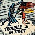
In one issue of Star-Spangled Comics, Robin even parachuted out of a plane over the Arctic. (Here's a more complete summary with pictures of him in what looks like his regular costume.) That story raised just enough questions to come with this reassuring caption:

Note: Robin’s Arctic costume is interwoven with fine wires that connect to a small but powerful battery in his belt. The radiating heat is well able to protect him from the cold.
And on tropical adventures Robin might wear even less.

Obviously, the original Robin costume made no sense on a practical level, but at the time it didn't need to. I think that for the comic's creators and readers that outfit made symbolic sense, for three reasons.

1) When Jerry Robinson designed the Robin costume in 1940, "long pants" were still a symbolic marker of maturity for American boys. Some comics showed Dick Grayson wearing britches. Thus, for those original readers, Robin's shorts underscored how he was still a Boy Wonder.

2) The Robin costume recalled the clothes of the trapeze artist Dick originally was. In real life, to be sure, circus flyers wear tights on their legs and tape their wrists to protect their skin. They don't wear pixie boots or flared gloves or capes, all of which would get in the catcher's way. But in its flashy styling and colors, the Robin costume looked like a circus outfit.

3) The main purpose of the Robin costume was to reflect the general outline of Batman's costume but provide a visual contrast in almost every way. The short sleeves, bare legs, and smaller mask were all part of that contrast. (More about this in a week.)

All seems to have been well, if a little chilly, until the 1980s. Then the conceit of the short pants had become simply too strained to go without comment. In the New Teen Titans magazine, Robin's teammates teased him by calling him "short pants." After the Crisis, DC's new gritty, realistic mode even allowed a new Robin, Jason Todd II, to point out how impractical the shorts were.

But it still took two shocks for DC Comics to rethink the Robin costume from the bottom up. The first was the death of Jason Todd in 1988, and the consequent reexamination of what readers wanted from the Robin character (which I'll discuss eventually). The second was the success of Tim Burton's Batman movie in 1989, with its redesigned Batman and Batmobile and its millions of dollars of merchandise sales.

DC Comics decided to introduce a new Robin into the comic books while another part of the same corporation, Warner Bros., thought about adding a Robin to a future movie. The publisher wanted the new Robin costume to reflect modern tastes in style and practicality. It asked up to a dozen artists to submit ideas.

This interview with artist Neal Adams, whose design (shown at right) was eventually chosen, confirms what he thought were the worst features of the 1940 look:
The problem with Robin came up when the movie company wanted to do Robin in the movies. So they said to DC, “We have to redesign Robin.” They couldn’t use Robin the way he was. . . .

The most important thing that I did was realize the character had to remain Robin, but had to be a new Robin, and there were some things that were really wrong. Like his legs were bare, that didn’t make any sense. He wore these little elf boots, that didn’t make any sense.
Another artist to submit ideas was Batman penciler Norm Breyfogle. He offers collectors a look at his memo on the topic, along with his redesigns. Breyfogle saw the same problem as Adams with the traditional outfit: "Bare legs are impractical; looks almost effeminate." Like Adams, he suggested "dark tights" and more body armor, and all his designs follow that path.

There were no doubt other redesigns; New Teen Titans co-creator George Pérez submitted some. The movie studio eventually went with something completely different. But I bet all those Robin designs got rid of the bare legs. Fans could no longer swallow that detail.

Today, Robin's short pants appear only in stories about Dick Grayson or Jason Todd set in the comic-book past, or in snarky parodies like Drastic Comics.

01 March 2008

Following the Money with Captain America

One of my theories of life is that a surprising amount of what we'd like to consider as artistic change is driven not by individual creativity or cultural trends, but by hidden financial incentives.

This "Follow the money" theory of literature reminds us not to forget that Dickens was paid by the word, or that Twain edited a chapter from Huckleberry Finn because he wanted to make it look better in a set with the shorter Tom Sawyer.

As another hidden financial incentive, I just read this example in the Comics Should Be Good column's periodic rundown of comics urban legends:

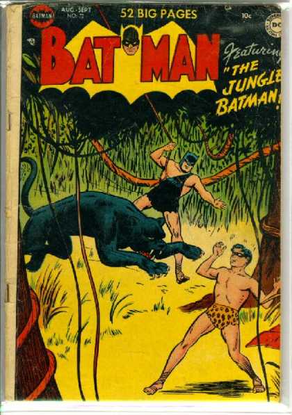
In the early days of comic books, one of the more intriguing aspects of comics was the presence of text pages in the midst of comics. . . . The truth of the matter is, to qualify for the second class bulk mailing rate (the same rate given to newspapers and magazines), periodicals were forced to include at least two pages of text.

Therefore, an amusing side effect occured. Desperate for text strips, the publishers would often print whatever was given them, which has led to some DREADFUL fiction over the years (this was Stan Lee’s first work in comics, churning out text pages for Timely when still in his teens).
Indeed, Lee's first professional publication was a two-page story in Captain America, #3, titled "Captain America Foils the Traitor's Revenge." He reprinted it--for nostalgia's sake--in Captain America, Sentinel of Liberty in 1979. It's a dreadful bit of prose, worthy of a eighteen-year-old who thought he was slumming under a pen name. The story leaves no emotion not spelled out, actually uses the word "interestedly," and has a typo in the final sentence. The pacing is only slightly better than Penrod's.

Such stories were long gone from comic books by the time I saw them. Why? The urban legends article explains what took their place:
However, as time went on, and fans became more involved in comics, publishers realized that letters pages could just as easily serve this purpose, so that is why comic books all went to include letters pages - so to achieve their mailing rate.
Marvel comic books also contained the "Bullpen" page in which Lee hyped other titles, praised "the mighty Marvel marching society" for our good taste, indulged in unmatched alliteration and superlatives, and generally dashed off the best prose of his career. And all because of postal regulations.

Those regulations changed in the 1990s, and fan commentary moved to the internet. However, superhero prose still tends to be poor.

(Comic book cover from the Grand Comic Book Database.)

29 February 2008

Shadowy Dragons’ Tails in The Arrival

In his New York Times review of The Arrival, Gene Luen Yang mentioned one striking detail of the early scenes: "Shadowy dragons’ tails haunt the Old Country..." But what do those tails represent?

Publishers Weekly said, "Shadowy dragon tails trawl the sky of the man's homeland, suggesting pogrom or famine..." The Washington Post, on the other hand, saw "the dragon shadow of totalitarianism."

Quiet Bubble suggested:

The drawing doesn’t want us to believe the city actually swarms with giant dragons--in a later full-page spread, as the wife and daughter walk home to the now-empty house, the tails look like shadows and smoke, which doesn’t make them any less threatening. Rather, Tan’s using fantasy in the right way--as a bravura, overloaded way of conveying symbolically the urgency of real-world terrors and hopes. The family isn’t actually beset by dragons, but oppressive governments and societies sure feel monstrous.
As does war. In calling the book one of 2007's Top Five Children's Books Between Cultures, Mitali Perkins described the story "as a young father escaping an unnamed war-torn country in search of a better life for his family in a new world."

Jetse de Vries at In the Plane of the Ecliptic sees the dragon tails as one of the book's "strong indirect autobiographical hints" that it's the story of artist Shaun Tan's own family, his father having emigrated from Malaysia to Australia.

Finally, Piers Kelly at the Compulsive Reader wrote, "The ambiguous reasons for his departure are suggested by sinister and threatening shadows that swirl like dragons' tails along the empty streets."

My own guess: In the course of the book, Tan has his hero take in the stories of a couple of other immigrants. One has escaped from oppression, the other from a war. Though those episodes are fantastic in their imagery, there's not much room for other interpretations. I suspect Tan wanted to depict all the major aspects of the immigration experience, and I don't see such immediate physical dangers threatening the central man and his family. So I think the dragon-tail shadows represent the threat of want, spurring the man to migrate for new opportunities.

In other words, The Arrival asks us to feel sympathy for not a refugee from violence, but an "economic migrant." That's not so fashionable, so societies create laws against it. But economic migrants are, after all, what most of our own ancestors were.

28 February 2008

Who Should Welcome The Arrival?

Shaun Tan's The Arrival was one of the five titles on the shortlist for the 2007 Cybils Award for Best Graphic Novels for teens and young adults. And that proved to be a problem.

Because we Cybils judges weren't all sure it was for teens and young adults. Or at least for those readers exclusively. We discussed the possibility of naming The Arrival as 2007's best graphic novel for middle-grade readers. It just screams "award-winner": it's beautiful; it's serious; even if it's not strictly speaking historical fiction, it has historical resonance; it leaves us with a "sense of hope." It's one artist's vision, not a shiny corporate product.

But The Arrival wasn't nominated in the middle-grade category. After we raised the question of age range, we learned that the organizing/nominating committee had already had long discussions about how to categorize this book. In the end we respected their decision.

After all, those organizers had checked with The Arrival's US publisher, Scholastic, which markets the book for ages "12+". Amazon and the ALA have put it on their lists of best books for teens (though other authorities have said it's simply one of the year's best books for children). For another insightful perspective on this discussion, see Dave Elzey's "what was i thinking? notes of a cybils judge".

All of that thinking raises interesting questions about how to determine the reading level for a wordless comic. Extrapolation says that almost anyone should be able to read them. Fewer words = younger readers. Shorter words = younger readers. So no words at all = ?

Of course, not having any words to guide us makes The Arrival harder to read, not easier. Indeed, making us struggle to interpret a strange world is how the book coveys the immigrant experience. It also demands some knowledge of history and population movements. So perhaps teen readers are the right audience after all.

On the other hand, The Arrival's underlying story, once decoded, is very simple. It's a cycle: one immigrant finds a place in a new society, and ultimately his daughter welcomes another. The protagonist never seems to face problems that last more than a page spread. For all its strangeness, he's found himself in a very friendly world. Even the strange creature infesting his new apartment...
...turns into a pleasant, helpful pet.

The Arrival simply doesn't have the levels of plotting, characterization and tone of The Professor's Daughter, which was our top choice for teen graphic novel. Tan's book was one of my top choices in its age category, but not the top. So perhaps it would be better for younger readers.

But would those readers relate to a protagonist who's a grown man rather than a child? I actually don't think this should be a big problem. The first pages establish that that man isn't just any man: he's a daddy. I bet young readers would have an immediate feeling for a parent going off to work and hoping to see his child again. Throw in the funny pet and the daughter's role in closing the cycle, and I think The Arrival holds plenty of emotional meaning for younger readers.

I think the real challenge for The Arrival is not being mistaken for a picture book. It looks an awful lot like one, with its oversized trim and its many pictures. So parents might be tempted to treat it as a story they can read aloud to a child in one sitting. That won't work. The book's four times as long as the usual picture book. And how does one share a wordless book with a child?

The Arrival demands--and deserves--a new approach. Instead of reading the text together, an adult and child probably have to discuss the pictures. They can take turns narrating what's happening on the pages with many drawings, or picking out favorite details in the two-page cityscapes. They can track visual motifs through the book. They can talk about their own family histories. They can puzzle over mysterious pages--like a whole page spread of small pictures of clouds--without the adult having all the answers. (My best guess: Each cloud shows a day passing on the protagonist's voyage.) The Arrival has chapters: it doesn't have to be read in one sitting.

Of course, I don't have an elementary/middle-grade child to experiment on. So I might give copies of The Arrival to different families and monitor from afar.

27 February 2008

Interpreting The Arrival

Shaun Tan designed The Arrival to look like a weathered scrapbook. The paper-over-boards cover shows a fraying leather binding. The tones of the interior art are muted to sepias, their lines blurred, all to recall photographs from a century ago.

As this sample from New York magazine shows, many of those images are reminiscent of photographs of Ellis Island in New York harbor. Indeed, Tan writes in his author's note of studying pictures of immigrants arriving there from Europe.

Interestingly, Tan himself is Australian, not American. Like his main character, he appears to be from Asia, not Europe. Apparently the Ellis Island experience not only stands for all US immigrant experiences, but carries similar resonance in some places overseas.

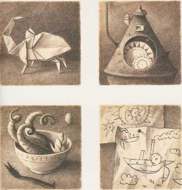
The book opens with a page of small drawings of household objects that any reader would recognize: an origami bird, a clock, a cooking container, a child's drawing of her family, and more.
The pictures then follow a man as he leaves his family and boards a steamship, eventually arriving in a strange harbor.
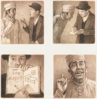
And strange the book becomes at that point. Everything appears in unfamiliar forms, from the immigration authorities' uniforms and examination instruments to this society's writing system and modes of transportation. Even the animals and vegetables are like nothing we've seen before (though they're shaped oddly much like each other).

All this comes at us in a series of sequential images, somewhere between that album of snapshots and the well defined panels of a traditional comic. There are no word balloons or captions. What labels and writing appear in the images are unintelligible to us.

That lack of words and explanations plunges us readers into the immigrant experience. We watch the man walk down the street, a street in a strange world. He doesn't speak the language, he holds no currency. As the protagonist struggles to express himself across the language barrier (as shown yesterday), we struggle to follow what happens to him.

The man finds an apartment, though the appliances take a lot of getting used to. He gets a job hanging posters, but he pastes them upside-down because he doesn't know the lettering. Eventually he ends up working on an assembly line; the factory's product, like so many other objects in the book, is impossible to identify.

Occasionally The Arrival breaks for some side narratives, two- or three-page stories of other immigrants. There's a woman fleeing oppression, a man caught up in a war, a shopkeeper with a young son. But we come back to the initial protagonist as the months pass. Finally he is able to send for the wife and young daughter we saw in the first pages.

Toward the end of the book, we see another page of objects from the family's life, the equivalents of the first. But now those objects reflect the flora, fauna, and culture of their new country. They have arrived.

The Arrival was shortlisted for the 2007 Cybils Awards in the category of graphic novels for teens--more about that tomorrow.

26 February 2008

A Few Words on Wordlessness

In The Art of the Comic Book (University Press of Mississippi, 1996), R. C. Harvey states: "A cartoonist is one who creates in the visual-verbal mode of the comics--someone who is a writer-artist. And in the creative processes of the cartoonist, neither words nor pictures take precedence over the other: they blend."

Harvey is expert in cartooning, comics history, and literary analysis, and this is a very good book on the form. However, his attempt to locate the essence of the comics art form in a half-and-half blend of words and pictures is untenable. (Dylan Horrocks has complained that Harvey's adherence to this theory leads him into "some rather asinine critical judgements." I wouldn't go that far, not when I can simply link to Horrocks's essay.)

The most obvious problem with Harvey's hypothesis is that it offers no space for wordless comics. He acknowledges that some exist, offering an example from a daily strip, but treats them as exceptional. Most comics creators and readers would probably say that comics without words and comics with them share more qualities than not. Both are sets of sequential pictures, they usually adopt the same visual vocabularies and techniques, and we interpret them through similar processes.

Shaun Tan's wordless The Arrival was one of the 2007 Cybils finalists in the graphic novels category (older readers division). I think its wordlessness is crucial to how it works, as I plan to discuss tomorrow. Tan even includes an episode about communicating through pictures instead of words:


The label "wordless" seems to mean something different when applied to children's picture books. As Scholastic published Sara Varon's Chicken and Cat in 2006, the catalogue copy labeled it a "wordless picture book." Booklist and The Horn Book echoed that label. School Library Journal called it a "wordless story." But the book contains words, as this detail from one spread shows.

In fact, out of sixteen page spreads in Chicken and Cat, ten contain words. Some are labels on shops, products, or structures that appear in the scenes (e.g., on the seed packets in the picture above). Others are sound effects and motion labels (e.g., "pat pat pat"), as I described back here.
Chicken and Cat got labeled as "wordless" because it doesn't have words where most picture books do. There's no narration explaining the scenes and the transitions between them. As with truly wordless picture books, an adult can't read it aloud to a child. And of course adults need some sort of warning.

Varon's Robot Dreams was another Cybils graphic novel finalist this year. It, too, was described by its publisher as "without words," but again it has a few. Unlike The Arrival, however, that seems simply to reflect Varon's storytelling style; it's not thematically linked to the book's story.

25 February 2008

Models of Magical Law Enforcement

My recent return to the world of Artemis Fowl left me thinking about magical law-enforcement. It's widely recommended that fantasy authors figure out how magic works in the worlds they create, communicate those processes and limits to readers, and then stick to them. So rules of magic are part of nearly all fantasies.

But rules against magic that characters could do but shouldn't are another matter. These, too, have a long history, back to the sorcerer's apprentice and beyond.

Sometimes such laws are given the force of government, as when Princess Ozma of Oz forbids her subjects from practicing magic, excepting only Glinda and the Wizard--and herself--and Dorothy, when she needs to--and her other friends, come to think of it. Hmmm.

Diana Wynne Jones's Chrestomanci is also a magical law enforcer and fixer, though his source of authority is not exactly clear. This is an aristocratic model of government: a carefully educated strong man chosen for his power, passing down his title and property (though not within his family).

In recent years, magical regulation has become more bureaucratic. We met the feckless Ministry of Magic in J. K. Rowling’s Harry Potter series, a branch of the British civil service headed by a politically minded wizard. Harry and his friends get a close-up look at its workings in HP7, when they penetrate its headquarters in disguise, and that book's epilogue tells us that as adults they basically seize its levers of power.

We also encountered an entire magical government of Great Britain in Jonathan Stroud's Bartimaeus trilogy. In these books, wizards don't serve a non-magical Prime Minister but hold the ministries themselves, oppressing the commoners who can't work magic and the genies who actually perform all the spells.

All these models of magical law enforcement involve human magicians regulating other humans. Magical creatures, even sentient ones, basically remain above (or below) any law but nature's. A genie or giant might have to be suppressed here and there, but no one expects magical creatures to significantly adapt their behavior to society. After all, such creatures are basically embodiments of mysterious natural forces.

Which brings me back to Artemis Fowl. In that novel Eoin Colfer shows us all the bureaucratic rivalries and back-biting of the Bartimaeus books, the abject concern for public relations and petty rules of the Ministry of Magic. But in Colfer's world, the law enforcers are fairies themselves. They have natural laws they must follow, but they also have rules they've decided on for their protection and enforce ruthlessly. Far from being beyond human-style politics, they're in the thick of it. No wonder the series leaves some readers dyspeptic.

24 February 2008

Rolling in the Gutters

In book production, the "gutter" is the place where two facing pages meet at the binding. Because book pages rarely lie flat there, picture-book artists and book designers working on full-page spreads learn not to let important details fall into the gutter.

In comics, the "gutters" are all the gaps between panels. Sometimes there's no physical space to a gutter; two panels bump right up against each other. But there's still a conceptual space created by the differences between one panel's image and the next. (To be technical, comics bound in the middle also have the other type of gutter; it can correlate with the panels' gutter or cut right through a panel, in which case we're supposed to conceptually ignore it.)

Comics gutters have acquired great theoretical weight since the publication of Scott McCloud's Understanding Comics, which posits that readers' intellectual act of connecting two images (which he calls "closure") is what sets comics art apart from all other forms. Thus, the meaning of a comics story can actually lie in those empty gutters. Very deep.

McCloud offered a taxonomy of transitions from one panel to another:

  • Moment to Moment
  • Action to Action
  • Subject to Subject
  • Scene to Scene
  • Aspect to Aspect
  • Non Sequitur
Here are examples of each from a McCloud student.

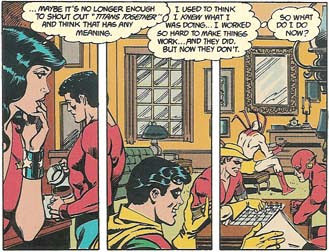
Every so often, however, comics artists insert gutters into what by all rights should be a single panel. Today's weekly Robin is an example of that technique from New Teen Titans, second series, issue 20, script by Marv Wolfman and art by Eduardo Barreto and Romeo Tanghal.

In the drawing below, Wonder Girl on the left contemplates how she's going to lead an ad hoc Titans group she's assembled, including (from left) Aqualad, the third Robin, Speedy, Hawk, and the Flash. In her mind she quotes the group's usual motto/battle cry, "Titans Together."
By dividing what looks unmistakably like a single scene at a single moment into three panels through the tactical placement of gutters, the comic's creators signal that this team is divided. They haven't worked together before. They all have different things on their minds. These Titans aren't "together" at all.