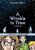
A Wrinkle in Lettering
Powell’s really really really needs to add Madeleine L’Engle as a linked author on its webpage for Hope Larson’s adaptation of A Wrinkle in Time into comics form. It’ll sell more copies that way.
I was struck by this detail from MTV Geek’s interview with Larson about the particular challenges of adapting A Wrinkle in Time, with its cerebral vibe, to a graphic format:
I was struck by this detail from MTV Geek’s interview with Larson about the particular challenges of adapting A Wrinkle in Time, with its cerebral vibe, to a graphic format:
I tried to trim the dialogue for space wherever possible, but most of the time it wasn’t. The dialogue carries the burden of almost everything that happens in this book. What saved me was doing final lettering as part of my thumbnail step, so I was sure there’d be room for everything before I put pencil to paper. There are a few panels where the characters are being crushed under a ton of text, but those are infrequent. By making the book nearly 400 pages long, I was able to air it out some.That reminded me of the method Gene Luen Yang used for Prime Baby, as he described here:
Because Prime Baby was both text-heavy (the protagonist is a wordy little sociopath) and limited in space (it was originally published in The New York Times Magazine), I laid out the words in Photoshop first and then sketched over print-outs of the dialog.Looking ahead to L’Engle’s sequels, Larson said:
I can’t see myself doing another adaptation. I talked to friends about this adaptation being like grad school—I got my Masters in L’Engle, and now I’m done. I’m done drawing comics, period, for the time being. I felt similarly after completing Mercury, and took a year off drawing, which was the same amount of time it took me to draw that book. Maybe I need to be off drawing for two years, since that was how long it took me to draw Wrinkle. I’ll reevaluate things next September.So if you were the publisher, considering how long adaptations take, would you have already recruited another graphic novelist to adapt A Wind in the Door? And whom would you choose?


No comments:
Post a Comment