30 April 2008

Why YA?

Here are a few provocative remarks from this week's "Think Future" panel on what distinguishes Young Adult literature from adult literature, as reported by panel host Publishers Weekly. The panelists addressed the never-ending question of what distinguishes "young adult" literature. Perhaps because of demographics, we seem to have shifted from how YA differs from books for "tweens" and younger to how YA differs from adult books. And by "provocative," I hope to mean "thought-provoking" as well as "attention-getting."

  • H. Jack Martin, assistant coordinator of young adult services at New York Public Library: “Teen books are like adult books, without all the bullshit.”
  • Sherman Alexie, author of The Absolutely True Diary of a Part-Time Indian: the YA world is made of “99% women,” and that a significant percentage of them have no idea how boys and men think.
  • Alexie: If a YA title is created as a book for young people, “a more conservative point of view comes in. If they are about young people, it’s more about respecting and not protecting. As an Indian I’m used to being what I call ‘reservationized.’ There can be a sense of the category, instead of elevating us, doing the reverse.”
  • Alexie: “I thought I’d been condescended to because I’m an Indian. That was nothing compared to the condescension I get because I’ve written a YA novel. . . . Because I’ve written a book about a 16-year-old, that means I’m a capitalistic whore.”
  • While libraries often shelve copies of a title in both adult and young adult (and children's) sections, George Nicholson, senior agent at Sterling Lord Literistic, “pointed out a hard reality that factors into the ‘where do we put this book?’ discussion: chain bookstores will not multi-position a book in the store.”

29 April 2008

The Dishonesty Behind a Creationist Movie

I was struck by the level of dishonesty from the makers of the creationist movie Expelled that John Rennie and Steve Mirsky have highlighted on Scientific American's blog. Here are two of their "Six Things in Expelled That Ben Stein Doesn't Want You to Know...":

1) Expelled quotes Charles Darwin selectively to connect his ideas to eugenics and the Holocaust.

When the film is building its case that Darwin and the theory of evolution bear some responsibility for the Holocaust, Ben Stein's narration quotes from Darwin's The Descent of Man thusly:
With savages, the weak in body or mind are soon eliminated. We civilized men, on the other hand, do our utmost to check the process of elimination. We build asylums for the imbecile, the maimed and the sick. Thus the weak members of civilized societies propagate their kind. No one who has attended to the breeding of domestic animals will doubt that this must be highly injurious to the race of man. Hardly anyone is so ignorant as to allow his worst animals to breed.
This is how the original passage in The Descent of Man reads (unquoted sections emphasized in italics):
With savages, the weak in body or mind are soon eliminated; and those that survive commonly exhibit a vigorous state of health. We civilized men, on the other hand, do our utmost to check the process of elimination. We build asylums for the imbecile, the maimed and the sick; we institute poor-laws; and our medical men exert their utmost skill to save the life of every one to the last moment. There is reason to believe that vaccination has preserved thousands, who from a weak constitution would formerly have succumbed to small-pox. Thus the weak members of civilized societies propagate their kind. No one who has attended to the breeding of domestic animals will doubt that this must be highly injurious to the race of man. It is surprising how soon a want of care, or care wrongly directed, leads to the degeneration of a domestic race; but excepting in the case of man himself, hardly anyone is so ignorant as to allow his worst animals to breed.
The producers of the film did not mention the very next sentences in the book (emphasis added in italics):
The aid which we feel impelled to give to the helpless is mainly an incidental result of the instinct of sympathy, which was originally acquired as part of the social instincts, but subsequently rendered, in the manner previously indicated, more tender and more widely diffused. Nor could we check our sympathy, even at the urging of hard reason, without deterioration in the noblest part of our nature. The surgeon may harden himself whilst performing an operation, for he knows that he is acting for the good of his patient; but if we were intentionally to neglect the weak and helpless, it could only be for a contingent benefit, with an overwhelming present evil.
Darwin explicitly rejected the idea of eliminating the "weak" as dehumanizing and evil. Those words falsify Expelled's argument. The filmmakers had to be aware of the full Darwin passage, but they chose to quote only the sections that suited their purposes. . . .


3) Scientists in the film thought they were being interviewed for a different movie.

As Richard Dawkins, PZ Myers, Eugenie Scott, Michael Shermer and other proponents of evolution appearing in Expelled have publicly remarked, the producers first arranged to interview them for a film that was to be called Crossroads, which was allegedly a documentary on "the intersection of science and religion." They were subsequently surprised to learn that they were appearing in Expelled, which "exposes the widespread persecution of scientists and educators who are pursuing legitimate, opposing scientific views to the reigning orthodoxy," to quote from the film's press kit.

When exactly did Crossroads become Expelled? The producers have said that the shift in the film's title and message occurred after the interviews with the scientists, as the accumulating evidence gradually persuaded them that ID believers were oppressed. Yet as blogger Wesley Elsberry discovered when he searched domain registrations, the producers registered the URL "expelledthemovie.com" on March 1, 2007--more than a month (and in some cases, several months) before the scientists were interviewed. The producers never registered the URL "crossroadsthemovie.com". [See also the Bad Idea Blog on these registrations last September.] Those facts raise doubt that Crossroads was still the working title for the movie when the scientists were interviewed.
Until now Ben Stein, the public face of the Expelled movie, had been my favorite old Nixon hand. Of course, that was based only on his game show. But he seems to be once again in a nest of liars.

The people behind Expelled probably think of themselves as doing God's work. (There's always the possibility, however, that they're cynics aiming at a gullible market.) Seeing such obvious lies from those moviemakers leads me once again to ponder physicist Steven Weinberg's remark: "With or without [religion], you would have good people doing good things and evil people doing evil things. But for good people to do evil things it takes religion."

28 April 2008

“The Default Style of the Superhero Mainstream”

Early in Reading Comics: How Graphic Novels Work and What They Mean, critic Douglas Wolk states, “American art cartoonists generally try very hard to adopt a style that’s far away from the default style of the superhero mainstream.”

Which naturally leads him to the question of what defines or drives that “superhero mainstream” style:

You know it when you see it, but it’s hard to pin down. Here’s a stab at it: it’s designed to read clearly and to provoke the strongest possible somatic response. You’re supposed to react to it with your body before you think about it.

Most of its characters, especially the heroic ones, are drawn to look as “sexy” as possible--wasp waists, big breasts, and flowing hair on women; rippling muscles on men.

People and objects are partly abstracted and partly modeled, but always within a framework of representation. There’s a lot of foreshortening, for the somatic excitement of seeing something right in front of your face. The style gives a sense of even the most everyday actions and interactions being charged with sex, power, and beauty.

Most of all, generic mainstream drawing is doggedly quasi-realistic--or, rather, it’s realism pumped up a little, into something whose every aspect is cooler and sexier than the reality we readers are stuck with. It’s meant to provide an escape route into a more thrilling world than our own.
So do you think that applies to yesterday’s picture by Don Kramer?


Going back to Wolk’s introductory remark, if “art comics” creators try to stay far away from that visual style, do they deliberately seek a look that tamps down “somatic excitement” and blanches out “sex, power, and beauty”? That would certainly explain Jimmy Corrigan.

27 April 2008

The “Battle We’ve All Been Dreading”

This week Fuse #8 provided a link to Barcelona-based comics artist David Baldeon's online gallery, including some pages he penciled for Robin #169. These also appear on his Spanish-language blog, as do examples of how some of the same pages looked after digital inking and coloring. In addition, Baldeon had drawn Robin #172 and some issues of Teen Titans and Blue Beetle, which both featured, well, Robin.

The basis of this weekly Robin installment is Baldeon's full-page image (click on thumbnail to the right) of the current Robin (Tim Drake) and the original Robin, now Nightwing (Dick Grayson), about to confront each other over...well, some pool of immortality thing--I wasn't really following. This was the dramatic last page of one chapter in a story that arced over several of the Batman-related magazines late last year in the usual effort to boost sales.

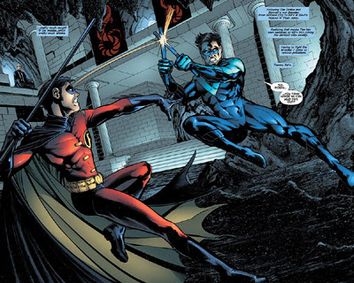
The next chapter appeared in Nightwing #139. Its cover showed Tim and Dick grappling, the headline "Brother vs. Brother," and the marketing copy "Is this the Nightwing vs. Robin battle that we've all been dreading?" The first full-page spread by Don Kramer looked like this.


(Bigger images here.)

Fights between two popular heroes are part of superhero comics' stock in trade, so common that they're cliché. They offer lots of action. They bring in two sets of fans. They answer the sort of question that burns in the minds of eight-year-olds: "What if Superman fought Wolverine? Wouldn't that be neat!"

But in this case, after about four pages of acrobatics, Robin and Nightwing hugged it out. And their fans weren't disappointed. Because Tim and Dick have the most comfortable, least emotionally fraught relationship of any two characters in the "Batman family," and possibly all of comics. Since 1991, they've been written as brothers, well before they had any familial or legal tie. (In recent years Bruce Wayne has adopted both as heirs.) They've remained close and respectful even when one or the other was estranged from Batman.

And fans love that aspect of these two characters. That's why folks were dreading a fight between Nightwing and Robin while a fight between Superman and Wolverine would still be neat.

26 April 2008

The Art of the Index

A good book index is "a thing of beauty," Prof. Enid Stubin wrote in her memoir of working for New York's leading index house on More Intelligent Life back in December. So it is. So is Stubin's article, an evocation of publishing in the early 1990s when most book production was still paper-based.

Along the way, Stubin subtly reveals how a book's index, though it looks unassuming, should be the product of long and careful thought. It's like the back door of a house, and often more people enter through the back door than the grand front entrance. Back when I was a full-time book editor, I tried to read over indexes as carefully as I read manuscripts and proofs, which surprised the Production people. As we get further into the era of keyword searching of entire manuscripts, however, indexing may come to be seen as less valuable and eventually a lost art.

Many publishing contracts stipulate that the cost of an index will be charged against an author's royalties, on the grounds that the index is part of the content of the book, and therefore the author's responsibility to supply. Of course, the last thing publishers want authors to do as production deadlines beat down on them in waves is try to crank out the first indexes they've ever created. I had one author, reporting on the computer business, convinced that he had the technological solution for indexing his proofs. He delivered on time, then told me that he'd been up all night and those last pages in his book were by far the hardest.

People in Washington, DC, are notorious for picking up a political book in a store, checking for their names in the index, reading those pages, and then putting the book back. Richard Ben Cramer insisted that his gossipy campaign chronicle What It Takes be published without an index to force politicos to actually buy and read it. Several other authors in the field followed suit.

I edited such one such Washington book: Bad Boy, John Brady's biography of the notorious political consultant Lee Atwater. I had the idea of commissioning a standard index but not printing it in the book; instead, people still had to read the book, but they could mail away for or download the index. This was back in 1996, and the idea of using the web to supplement printed books wasn't widespread outside of technology publishing. Unfortunately, the idea didn't gain the publicity we wanted; the only people who seemed to notice were irked by the whole idea.

Later, as a freelance editor, I assembled the index for the first edition of Linda Granfield's America Votes! The task wasn't as hard as I thought. Of course, the book was only 64 pages, well written, and carefully organized to begin with. I didn't even have to do the painful cutting I expected; the Production people surprised me by fitting all my topic lines onto one book page.

(Also at More Intelligent Life: a brief essay on P. G. Wodehouse's villains and a long interview with Philip Pullman.)

25 April 2008

An Extremely Well-Put-Together Little Droid

Via Desert Dispatches, I learned about Sillof's Steampunk Star Wars action figures, and a whole new artistic hobby: customizing commercial action figures to create new visions of popular fantasy universes.

The thumbnail picture shows, as an example, R2-D2 reimagined as a late Victorian, steam-powered droid. Visit Sillof's site to see pictures of how this R2 unit can light up from inside.

(Probably the best and best-known examples of "steampunk" in children's literature today are Philip Reeve's Larklight and Starcross. L. Frank Baum's Tik-Tok is steampunk without the retro irony.)

Sillof has also created Star Wars figures based on personal artistic vision, the pre-production drawings of Ralph McQuarrie, and (with another customizer named Glorbes) the military uniforms of 1942.

And where else can one find an action figure of the Invisible Man?

24 April 2008

Yet Another Bunny

This is "Bunny-Foo-Foo-Bop," one of Tiffany Laurencio's picture-book illustration samples. Laurencio is a young Massachusetts illustrator.

All Bunny-Foo-Foo-Bop needs, I think, is a hug.

You first.

Thanks to Seven Impossibles for the introduction.

23 April 2008

Market Forces in Kids’ Comics Today

Publishers Weekly's report on the Kids Comics Publishers Roundtable at the New York Comic-Con had some news about the economics of publishing "graphic novels" for kids. These factors will have an effect on what creators can and can't do in the medium--at least profitably, and at least for now.

To start with, there's been a generational shift in how the comics retail chain perceives its market. Once people saw comics as a medium for kids only. Now comics created for kids are "the most underground of underground comics," according to Janna Morishima of Diamond, the dominant distributor.

On the economic side, Liesa Abrams of Simon & Schuster’s Aladdin Books stated: “Children’s retailers need prices to be kept low, much lower than you can get away with for the direct market” (i.e., comic-book shops, which now cater mainly to adults). That matches the gap in prices for novels of equal length for adult and younger readers. More specifically, PW said:

Randall Jarrell of Oni Press agreed, pointing out that readers could buy a 200-page Captain Underpants chapter book for $4. “That’s a really hard price point for most graphic novel publishers to meet,” he said. His solution was to publish Salt Water Taffy, a new graphic novel series by Matthew Loux, on a quarterly basis at $6 for a 96-page graphic novel.
Let's check that math. The first Adventures of Captain Underpants book is actually $4.99 for 144 pages. That's not as stark a contrast with $5.95 for 96 pages, the price for a Salt Water Taffy volume. Still, there is a difference, and if parents have a lingering reluctance to spend much on a comics volume ("I remember when these were a dollar! And how much is a comic book worth?"), that price gap could be significant.

Why do graphic-novel publishers have trouble matching a traditional book publisher’s price? Both books in that comparison are small paperbacks with one-color printing inside. I suspect the determining factors are paper quality and, most important, economies of scale. Captain Underpants is, after all, from Scholastic. It knows better than any other company how to publish and distribute mass-market books for kids.

Another piece of important news for creators is what the market now looks for in trim size.
Jarrell said he saw sales on his Courtney Crumrin trade paperbacks skyrocket when he reduced the trim size from standard comics format to manga size. “We cannot underestimate the importance of manga,” he said. “It is a format and trim size and experience that kids are growing up with.”
The smaller trim is called "digest" size on Oni's website.

In reissuing the Bone series, I note, Scholastic not only worked with Jeff Smith to add color to his books but also reduced the trim--not all the way to manga size, but significantly smaller.

Since a digest/manga page has less space and usually fewer panels than a comic-book-size page, young readers' preference for the smaller trim will have a direct impact on scripts and art.

22 April 2008

What “Agonized ‘Arts & Ideas’ Articles”?

Earlier this month Dan Kois gave New York magazine a catch-up review of two novels for kids that have already been on the bestseller and awards lists for months: Brian Selznick's The Invention of Hugo Cabret and Jeff Kinney's Diary of a Wimpy Kid volumes.

Kois linked those books to yet a third set of successful kids' books with lots of art: manga, and comics-style books in general. And then he tried to expand the whole thing into Significance by calling all this "the incursion of comics into 'respectable' children’s fiction."

Kois is quite right that "for typical young-teen readers, graphic storytelling [i.e., comics] is now as familiar a language as traditional chapter books." But I think only the manga fit the comics form. I've already made my case that the graphic elements of Hugo Cabret work differently from the graphic elements of comics, more like the images of cinema.

As for the art in the Wimpy Kid volumes, there's a lot more of it than in a typical middle-grade novel, but it functions in a traditional way. Kinney's drawings usually comment and supplement his text but don't replace it. The pictures have more in common with single-panel gag cartoons than with "sequential art." In number and style, the Wimpy Kid illustrations don't fit the usual model of an illustrated children's novel, but they're a lot closer than Kois's other examples.

I appreciate the scarequotes that Kois put into his phrase "'respectable' children's fiction." At the same time, I think he wildly overstated the walls around that respectability when he concluded that:

Cabret and Wimpy Kid [are] books whose success might ten years ago have provoked agonized “Arts & Ideas” articles about the debasement of children’s literature.
Yes, given its style of art and humor, Wimpy Kid would probably be seen as "product" in nearly any era (including, perhaps, ours)--not that it debases anything. But I find it hard to imagine that Hugo Cabret would have raised eyebrows very high, much less "agonized" folks in the field of children's literature, ten or even twenty or thirty years ago.

Hugo Cabret is, after all, historical fiction. It comments on Art. It ends with a sense of hope (more hope than poor Greg Heffley enjoys). It's the sort of story for children that has always won admiring reviews and awards, and the fact that it contains pretty pictures that can also be analyzed as Art only increases its "respectability."

21 April 2008

Spring Arrives at Last

Yesterday I attended a fife and drum muster, and ended up sitting behind an energetic nine-year-old. He was quite excited about going barefoot outside for the first time this year, about throwing around his Frisbee, about jumping on his father's tender knees. Excited, indeed, about nearly everything but fife and drum music. (It's not that he disliked the music; he just didn't seem to notice it.)

What first agitated this young fellow, however, was that he didn't have sunscreen on. His father was bringing the bottle, and as he waited the boy expressed a little anxiety to his mother. When the bottle finally arrived, he sprayed a veritable fogbank of it around himself.

This struck me as being completely opposite the dynamic I remember growing up. Parents used to have to chase and nag their children to put on any sort of sun protection. Of course, I also remember some pretty bad sunburns. This child was nagging his parents about sunscreen, telling them earnestly how it's good for your skin. (And skin is apparently more vital than knees.) All the public education about sun protection may have produced a sea change in how kids today think about sunscreen.

The other detail of this lad that I've filed away for some story was his baseball shirt, with the team name on the front and the number and sponsor on the back. The sponsor was a local coffee shop in the modern taste--which is to say, bourgeois-bohemian. So somewhere in Middlesex County is a whole team of nine-year-olds playing ball, their narrow little backs promoting:


20 April 2008

The Greatest Gotham Stories Ever Told

DC Comics published forty issues of Gotham Central from 2003 to 2006. The magazine won admiring reviews, industry awards, and consistently low sales. This comic book stretched the bounds of storytelling within the oldest superhero universe, but ultimately showed the persistent dominance of the traditional superhero tale.

I first saw Gotham Central recommended by comics creator Eric Shanower. But that was before I'd decided to explore my fanboy roots through the Robin characters, so I didn't follow up. Last year I read all five "graphic novel" collections of the series with pleasure.

Created by writers Greg Rucka and Ed Brubaker and penciler Michael Lark, Gotham Central was a police procedural set in Gotham City, the home of the Batman and all his crazy nemeses. The stories read like Ed McBain's novels of the 87th Precinct in comics form, except that every other criminal out there is the Deaf Man--with super powers.

The detectives and commanders of Gotham's police department depend on the half-crazy vigilante named the Batman to capture those crazies, but also resent their dependence. Ordinary cops get caught in the sights of mad criminals like Mr. Freeze, the Joker, and the Firefly. Gotham politics and society are corrupt. Some citizens have become fixated on supervillainy, trading souvenirs from crime scenes on eBay or committing spectacular crimes to gain attention. And in the middle of that all is the GCPD's Major Crimes Unit, trying to solve what crimes they can, manage their personal lives, and keep from beating each other up.

The series was not without its weaknesses. As in some procedurals in prose and on television, the realistic depiction of police work means a large, changing cast. The noirish art style and fly-on-the-wall dialogue which work so well at setting the mood also make it hard to keep all those detectives straight. One character reveals some psychic powers, a development that never gets fully explored but bends the series' dedication to regular folks. Even so, these stories are far grittier than the grittiest Batman melodramas.

The Gotham Central series eventually came to focus on two partners in the Major Crimes Unit, detectives Crispus Allen and Renee Montoya, both introduced in earlier DC stories (Montoya actually in the animated Batman TV show). A major ongoing subplot was Montoya's relationship with her traditional parents, aghast that she was in love with another woman.

It looks to me like DC tried to tie issues 33 through 37 more closely to its superhero world, perhaps in an effort to boost sales. This story arc, collected in Gotham Central: Dead Robin, follows the investigation of a serial killer murdering young men in Robin costumes--meaning that the first issue could scare comics readers into wondering if the real Robin has died. Subsequent covers feature the Batman and the Titans instead of series regulars. Tim Drake eventually enters the scene, as quietly decent as ever, and the Batman's never been scarier. But that superhero celebrity didn't save Gotham Central, and the series ended with issue 40.

As soon as this comic book was canceled, Allen became the human host of the Spectre, a Golden Age comics figure who embodies the avenging wrath of the murdered. Montoya took the identity of the Question, a 1967 creation for Charlton Comics. I can't think of a clearer example of how superhero stories dominate mainstream American comic books than how that genre literally swallowed up the heroes of Gotham Central.

19 April 2008

Revisiting the Builder of The Little House

I was always a bigger fan of the Caldecott-winning The Little House than of Virginia Lee Burton's more popular book, Mike Mulligan and the Steam Shovel. I may have been attracted to the notion of historical change that forms the storyline of The Little House, and not that impressed by Mike's poor project planning.

A long-time Oz and Ends reader alerted me to Jean Nathan's article about Burton in the May issue of Vogue magazine. I can't find that story online, and I worry that if I delve too deeply into the Style.com website it will start to smell of perfume, like the magazine. But Burton fans should look for this article in libraries.

The fashion magazine takes note of Burton because she was the head of a design cooperative named after her neighborhood of Folly Cove, on Cape Ann. Its fabrics and garments are apparently quite collectible. The article also refers to a recent film, Virginia Lee Burton: A Sense of Place.

On biographical details, Nathan goes well beyond the biography of Burton on Houghton Mifflin's website. It reveals, for example, that after Burton's mother left her father, she and her siblings spent a long time in foster care. It's no wonder that when Burton found a place for her own family, she clung to it.

Nathan writes that all of Burton's picture books have "anthropomorphized female protagonists." I knew that Mike Mulligan's steam shovel was named Mary Anne, and that Burton also wrote about a tractor named Katy, a cable car named Maybelle, and a locomotive named Choo Choo. I didn't recall the Little House having a gender, however. But I guess she does.

18 April 2008

“The Theme Is Your Spine”

Yesterday I quoted a remark by comics novelist Alan Moore on how a powerful plot works. In the same essay that passage came from, Writing for Comics, Moore also insisted: "A plot isn't the main point of the story or the story's main reason for existing. It is something that is there more to enhance the central idea of the story and the characters who will be involved in it."

And earlier, "A good starting point would perhaps be the aspect that lies at the very heart of any creative process: the idea. The idea is what the story is about; not the plot of the story, or the unfolding of events within that story, but what the story is essentially about."

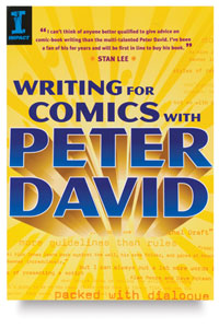
That reminder is echoed in another book called Writing for Comics, by Peter David--another scripter who's achieved a great deal of respect in adventure comics, if not the outright adulation that Moore can inspire. Using different terminology, David offered similar advice:

Furthermore, you need to have a solid grasp of your theme. If ideas and conflict are the skeleton of your story, the theme is your spine. I define theme as that aspect of the human condition upon which your story offers commentary. Ideally everything that transpires in your story should somehow connect to your theme. It sounds simplistic, I know, but you must have a clear idea of your theme, and whence the conflict stems, before you embark upon telling your story. Without that, your story will be unfocused and vague.
While books about writing fiction in prose forms also discuss "the theme" or "the central idea," I rarely see such emphasis on that quality as a necessary early step in storytelling. Rather, many novelists argue that their themes develop as they write, and are in any event far more interesting to English teachers than to working writers. Novel-writing advice books often stress characters as the starting-point.

I think there are several reasons why these two writers put so much emphasis on theme in their advice to people wanting to enter the comics field.
  • First, in the superhero comics where David and Moore did their most visible work, characters have often been defined by other writers decades before, and are owned by corporations rather than individual creators. David, for instance, is admired for writing a long, successful run of The Incredible Hulk, about a character created by Stan Lee and Jack Kirby in 1962. While it's important in writing such comics to understand the central characters, what drives them, and what they represent, the writer isn't called on so often to invent them. (I'll say more on Moore's use of established characters at some future point.)
  • Moore and David also work in a field that requires stories to have action that can be illustrated. Commercial comics have long thrived on plot-driven stories with twist endings. In sum, anyone trying to write mainstream comics probably already knows that plots are required; that's where they'd start. They'd need help with remembering to think about why a plot matters. I also wonder if such plotting has always come easily to Moore and David--hence their success. Writers who are excellent at scene-setting, or character-building, or style, might need more of a push on plots and less on those aspects of storytelling.
  • Perhaps most important, Moore and David have probably seen a lot of stories, both unpublished and published, that are all plot and action with no central idea or theme. ("What if Wolverine fought Superman? Wouldn't that be neat!" "Why would they fight? What would be that story's central idea? What would it say about the human condition?" "Um, I dunno. But wouldn't it be neat!") Moore and David might have emphasized this step for beginning writers not because it's the first thing they do when they write, but because it's what they see others not doing enough.

Big Time

Alison Morris's Shelftalker blog at Publishers Weekly recounted several author events that the Wellesley Booksmith recently handled, with photos. Among them was the Belmont Children's Picture Book Festival, organized by Melissa Stewart.

And one of the photos from that event shows the back of my head while Timothy Basil Ering reads Necks Out for Adventure! Good thing I got that haircut.

17 April 2008

The Back Alleys of Your Narrative

In my presentation on plotting last Saturday, I quoted from the writer Alan Moore's essay Writing for Comics, available as an unnecessarily illustrated booklet from Avatar.

Mainstream comics publishing puts a premium on plot, sometimes at the expense of other elements of storytelling. For decades adventure comics have promised conflict and confrontation, twists and trick endings, a roller coaster of emotions and expectations that leaves readers wanting to take another ride. To succeed in that business, therefore, Moore had to figure out that element of a good story early on. And here's what he learned.

As I see it, a successful story of any kind should be almost like hypnosis: You fascinate the reader with your first sentence, draw them in further with your second sentence and have them in a mild trance by the third.

Then, being careful not to wake them, you carry them away up the back alleys of your narrative and when they are hopelessly lost within the story, having surrendered themselves to it, you do them terrible violence with a softball bat and then lead them whimpering to the exit on the last page.
Believe me, they'll thank you for it. TOMORROW: More Moore.

16 April 2008

Best Batman Parody

As long as I'm discussing comics awards, the nominees for Oz and Ends's prize for Best Parody of Batman's Origin Story are:

Votes are now accepted in the comments section. If you don't get the references, then you probably shouldn't vote. If you do get the references, additional nominations are more than welcome.

As a bonus, here's Bully on Batman's finely honed sense of timing and another Shortpacked take on the Dynamic Duo. Thank you.

Image courtesy of the Grand Comics Database Project. Because assembling galleries of every comic book ever published in America is what we invented the internet for.

Eyeing the Eisners

The just-announced 2008 Eisner Award nominations for best work in the comics form include three for Shaun Tan's The Arrival:

  • Best Graphic Album--New
  • Best US Edition of International Material
  • Best Writer/Artist
However, that book is not listed in the categories of Best Publication for Kids and Best Publication for Teens. (This despite the break-up of the previous category Best Title for a Younger Audience into two, providing twice the slots for nominations.)

Thus continues the long discussion of the most appropriate audience for The Arrival.

Other comics mentioned here on Oz and Ends that were nominated for some award or another include: However, as usual, most of the nominated works are new to me.

15 April 2008

Oz Park Plaques Gone Missing

Oz Park in Chicago contains sculptures of the Tin Woodman, Cowardly Lion, Scarecrow, and Dorothy with Toto.

However, it now contains the plaques for only two of those statues, In March, someone stole the bronze plaque from the base of the Scarecrow. On 10 April, the similar plaque from the Cowardly Lion disappeared.

If these come on the market anywhere, the Oz Park Advisory Council asks people to contact the Chicago Police at 312-742-5870.

The photo above, by Wendy HW Chen, shows the statue and its plaque last year. The plaque doesn't look that interesting in itself, which makes me wonder if it was stolen for its copper content. We'd better look after Tik-Tok.

Plotting for a Curious Monkey

Sometime in the early 1960s, Children's Hospital in Boston approached Margret and H. A. Rey about telling a story of their beloved character Curious George going to a hospital. George had already spent some time in a hospital in Curious George Takes a Job, when he dropped from a fire escape and broke his leg. The Children's Hospital staff hoped that children might feel less anxiety about going to the hospital themselves if they'd seen their favorite curious monkey survive the experience.

Now that's not a plot or a story; it's a mission. Likewise, the title Curious George Goes to the Hospital is simply a premise (and "high concept") for a story, but not a story itself. The Reys had to create a compelling plot for their character.

The big challenge of building a plot around a hospital visit is that strong plots are usually fueled by the protagonist's desire and steered by the protagonist's actions. But very few people desire to go to a hospital. Hospital patients have limited power to affect what happens to them. They need help from other people, such as doctors; that's why they're in the hospital.

So what plot did the Reys come up with? For a workshop at the recent SCBWI New England conference, I used Curious George Goes to the Hospital as a lab monkey for my idea of an "in response to..." synopsis. This is a tool for summarizing and thus analyzing a plot that foregrounds the protagonist's (and antagonists') actions and thus the cause-and-effect connections between events. Here's the result:

George is a very curious monkey. In response to seeing a big box on the man with the yellow hat's desk, George eats one of the colorful things inside. As a result of George having eaten a piece of a wooden jigsaw puzzle, he and the man in the yellow hat can’t finish the puzzle. In an additional response, George feels sick.

In response to George’s illness, the man in the yellow hat calls a doctor and takes him to the hospital. In response to an X-ray, doctors spot the puzzle piece and recommend an operation, so a nurse puts George in a ward with a sad girl named Betsy and a boy named Steve with a bandaged leg and a wheelchair.

In response to the surgery, George feels better, so he eats ice cream, puts on a puppet show in the playroom, and takes a spin on a record player. In response to George wearing himself out, an attendant puts him back in bed.

The next day, Steve is taking his first steps as part of his rehabilitation. In response to seeing Steve’s empty wheelchair, George gets curious and rides it out into the hall. In response to gravity, the chair rolls down a ramp, smashes into two lunch carts, and launches George into the arms of the visiting mayor. In response to this mess, George feels ashamed and sad.

In response to seeing the same mess, Betsy laughs for the first time since she entered the hospital and kisses George. In response to hearing Betsy laugh, the hospital director forgives George. In response to the man in the yellow hat coming to take George home, a nurse gives them a small box. Inside they find the puzzle piece, and in response George and the man finish the puzzle.
This synopsis reads terribly, of course. But it does the job of highlighting what episodes in the book are crucial to the plot, what George does, and how events tie together. And that's all an "in response to..." synopsis is supposed to do.

The synopsis shows that George goes to the hospital not because he wants to, but nevertheless as a consequence of one of his actions. The synopsis also shows that the plot doesn't turn on George's operation, but rather on an event he instigates: his wheelchair ride. George and his readers can't anticipate the storyline's big turn--Betsy's laughter, and the hospital staff's pleasure--but the Reys set up that moment earlier and fit it into the plot's cause-and-effect structure.

This synopsis also shows that some emotional moments in the book, such as George screaming when he sees the anesthetic needle, are mere blips in the plot. I suspect that needle episode was always part of the plan for the book, but it's supported by the storyline rather than supporting the plot. If the story were to show George running away when he saw the needle, his response would have been an important turning-point in the plot, but it wouldn't have served the book's mission.

I also tried this tool on some Dr. Seuss narratives: Horton Hatches the Egg and The 500 Hats of Bartholomew Cubbins. Both of those stories' plots, it showed, depend on the protagonist doing the same thing over and over in response to increasingly difficult pressures until he is vindicated. So their "in response to..." synopses are even more repetitive. Plot twists were not Dr. Seuss's thing.

14 April 2008

Rowling and the World of Intellectual Property

J. K. Rowling doesn't have a new book out or one anywhere on the horizon, but she's still making publishing news--in two different ways, yet! Both this month's developments involve the wrinkles of copyright law.

Today Rowling is scheduled to testify in New York in her lawsuit to stop RDR Publishing from issuing a "Harry Potter lexicon" based on Steve Vander Ark's website of the same name. She has praised this website (and others), but feels that a book version would compete with her own plans for an encyclopedic guide to her fantasy world.

Everyone agrees that critical writing about Rowling's storytelling and universe (like my own) falls under the copyright law's "fair use" provision. But simply cataloguing and repeating statements from her books, website, and interviews probably would not. The legal question in this lawsuit is whether the Harry Potter Lexicon in book form displays enough creativity to justify its borrowings.

The suit filed by Rowling and her partners says the book lacks "any new creativity, commentary, insight or criticism" about the Harry Potter series. RDR responds that the work "provides a significant amount of original analysis and commentary." I suspect that much of the appeal of the online Harry Potter lexicon was that it didn't claim to offer much original analysis, but rather reflected the books' factual statements with as little editorializing or speculation as possible.

According to the New York Times report,

Mr. Vander Ark said he had initially worried that a book might constitute copyright infringement. “I honestly can’t tell you the origin of that belief,” he said. But when RDR assured him it wasn’t a problem, he said he assumed that because the material was available online and had never been challenged by Ms. Rowling, the book wouldn’t be either.
Vander Ark is not a party to this lawsuit, apparently making this the exceedingly rare case of a publisher indemnifying an author against plagiarism complaints rather than the other way around.

In other Rowling news, Amazon.com is promoting a writing contest for young people with the prize of a look at the company's copy of The Tales of Beedle the Bard. Rowling hand-wrote seven copies of this book and offered them for sale through a charity auction last year. (Ironically, the contest limits entrants to 100 words; Rowling herself is not notable for terseness.)

Amazon has posted lots of photographs of its purchase, either taken with a very small depth-of-field setting on the camera or digitally blurred before posting, so that almost none of the text comes through clearly. That's because Amazon owns one physical copy of Beedle, but Rowling still owns the work's copyright, and the text can't be issued without her permission.

Amazon has published what look like rather thorough summaries of the stories, but those come with critical interpretations. All those in-house reviews are positive to the point of gushing, and focus on the stories' valuable lessons about life rather than on the storytelling:
"Babbitty Rabbitty and her Cackling Stump" highlights the winking ingenuity of the old witch--who should remind fans of a certain wise and resourceful wizard--and you can imagine how old Babbitty might become a folk hero to young wizards and witches. But more than just a story about the triumph of a clever witch, the tale warns against human weaknesses of greed, arrogance, selfishness and duplicity, and shows how these errant (but not evil) characters come to learn the error of their ways.
Nevertheless, Amazon's reviews are reviews, with creative and critical thought added to the derivative material. Plus, Amazon hasn't moved to publish them in book form in competition with Rowling's own ultimate plans for Beedle.

13 April 2008

"And Here’s a Site for a Detail”

Last month Newsarama ran an interview with Peter J. Tomasi, the current writer of the Nightwing comic book. (And Nightwing is...? Anyone? The lady in the back? Yes! He's Dick Grayson, the original Robin, all grown up and fighting crime on his own. Which makes this another weekly Robin posting.)

Within that interview was a link for downloading part of Tomasi's script for Nightwing #140 in MS Word form, provided to the eager public to illustrate his method of writing action scenes.

I found that script interesting for a number of reasons. Like many others from experienced comics writers, it addresses the artist--in this case, Rags Morales--directly in a conversational tone. I haven't seen that in any other type of script or manuscript besides comics.

As with other comics scripts I've seen, the level of detail that Tomasi put into his action descriptions is striking. I'm used to the required minimalism of children's picture-book manuscripts, and the comics business's approach appeals to the control-freak in me.

But what really seemed new to me was Tomasi's use of weblinks to provide Morales with reference images and information.

PAGE 13

panel 1
Inside the Cloisters, FIVE THIEVES DRESSED COMPLETELY IN BLACK, decked out in hi-tech thief gear, infrared goggles hang from their neck or are atop their head, and cool-ass looking P90 submachine guns (website: http://www.fnherstal.com/html/Index.htm).

They are in a chapel where two tombs/effigys lie in the middle of the stone floor. Also, there's a hole in the stone floor where they entered and we can see a cylindrical hi-tech type of digger laying next to the hole (Rags, call me about this). There's a beautiful stained glass window that the moonlight streams through, and a large wooden chandelier with UNLIT candles. Here's a place for you to go to see a shot of the chapel: http://www.mrfs.net/trips/2001/New_York_City/Upper_Manhattan/gothic_chapel.jpg

And here's a site for a detail of the stained glass:
www.metmuseum.org/explore/Mirror/187.htm

Also Rags, Google the: Tomb of Jean D'Alluye and look at images, cause that's one of the tombs I'd like you to make sure we see since it's the reason they're there.

panel 2
Closer on our Thieves, as they take great care and struggle to try and open the tomb of Jean D'Alluye. Two of the thieves are using a small, handheld laser to cut around the sealed stone lid as the others stand guard with weapons ready.

panel 3
Overhead shot as our thieves are successful, we see them opening the tomb lid to reveal the skeletal remains of Jean D'Alluye, laid out just like the tomb cover bas relief carving, with his crusader shield and sword.

panel 4
Another angle now, moments have passed and they have already removed the skeleton and are now in the process of carefully zipping up the sturdy black body bag that it's now in. They are unaware that in the background, TWO SMALL BALL-LIKE DEVICES with Nightwing's symbol on it, have been tossed up from the hole and are at the moment in mid-air ready to go...
Decades ago, Batman co-creator Bill Finger was famous for clipping articles and photos to his typewritten scripts for artists to rely on. With web addresses and the dominance of Microsoft software, such sources can now be embedded in the scripts themselves.

Back at the start of Oz and Ends's first COMICS AND NON-COMICS WEEK, comics artist David Lee Ingersoll commented:
I'd say that the best script is the one that gives the artist everything he/she needs to do the job well. Sometimes that means providing reference material for the artist if the artist has been asked to draw something obscure. (The internet has made this a lot less necessary. Yay internet!)
I'm not sure whether David was thinking of URL-rich scripts like this one or being able to use the internet when he had to do his own research. Tomasi might be unusually sensitive to artists' needs since he was editor of Nightwing and other magazines for over a decade before returning to writing; he therefore probably heard every artist's complaint about scripts, and every excuse there is for the art (or script) not to be delivered on time.

11 April 2008

Plot, Plot, Fizz, Fizz

Today I head to the SCBWI New England annual conference, where tomorrow morning I'm leading a workshop on plotting challenges in children's books. The first step in assembling this workshop was, of course, finding alliterative labels for the main qualities that I think make up a good plot.

As with my 2006 presentation on narrative voices, this workshop will be brought to us by the letter P.


10 April 2008

Some Origami

This example of "wet paper" origami art by Michael LaFosse is called "Wilbur the Pig." It's part of an exhibit of origami at the Peabody Essex Museum in Salem, Massachusetts, which I thoroughly enjoyed with my godson and his family last weekend.

Many of the folded-paper sculptures on display were inspired by geometric patterns and by nature, but a surprising number reflect the artists' pleasure in fantasy literature. Among those is Brian Chan's "Attack of the Kraken" (giant squid attacks two-masted sailing ship, all folded out of one piece of paper) and Joseph Wu’s “Grand Dragon,” both visible in the website’s slide show. I recall the exhibit also included a "St. George and the Dragon" and some Tolkien creatures.

In the hands-on room beside the exhibit gallery, I made a butterfly by following the instructional video also available here. Video makes beginning origami so much easier than diagrams! For folks in New England, this exhibit will be at the Peabody Essex only until 8 June 2008, and I highly recommend it.

09 April 2008

The Way They Live Now

From a letter by Dan Niven published in yesterday's Boston Globe:

Judging a 10th-grade English class's poetry slam last week gave me insight on why there is a gender gap in eighth-grade writing levels in Massachusetts. . . .

Seven of the 10 boys competing waxed on about their Xbox 360s with the same tenderness Romeo used to describe Juliet. Four of the six girls in the slam drew from their extensive Facebook repertoire and included the line "No one knows the real me" in their opening stanzas. The poetry was wretched, but, as Irene Sege points out in her article "Dear blog..." (Living/Arts, April 5), girls are at least regularly engaged in the writing process.

Last fall, while hiking in the Berkshires, I passed a family of four trudging up a trail. Like ducklings, the tween daughter and son dutifully followed their parents' footsteps. But unlike his sister, the boy's head was bowed in concentration as he both negotiated the trail and played on his Gameboy.
Of course, if the cell-phone reception were better, the girl might have been texting her friends.

08 April 2008

Two Years of Bully's Life

Among the things I can't presently do because my commute usually runs from my bedroom to my desk downstairs is to read lots of books while waiting for the subway to ever start moving again. So I'd never be able to keep up with Bully's Wodehouse a Week project.

After all, diligently reading a P. G. Wodehouse book a week is an undertaking of slightly less than two years. As Bully explains:

Consider this when you want to mull the length of P. G. Wodehouse's writing career: he published his first book a year before the Wright Brothers' flight at Kitty Hawk. He published his final book during his lifetime five years after Neil Armstrong stepped on the moon.
Rather than reading in order, or by series, Bully appears to be picking titles nearly at random from all periods of Wodehouse's oeuvre. I say "nearly" because he seems to be saving the best titles for later, with the understandable exception of Joy in the Morning. Thus, I'll have to check back for Bully's thoughts on Leave It to Psmith, Summer Lightning, and Hot Water, among my other favorites.

But Bully can even appreciate the lesser books:
The beautiful thing about Pearls, Girls, and Monty Bodkin is not its originality or uniqueness, oh no no no.
Of course not. Late Wodehouse was just a fun riff on middle Wodehouse. But early Wodehouse? Well, that can be strange territory indeed, as he tried out different modes before confirming that his strength lay in a certain type of comedy rather than, say, the serious themes of The Coming of Bill, the broad farce of The Swoop, or even the children's story William Tell Told Again.

Bully analyzes each book with generous excerpts, and offers occasional other remarks, such as these in regard to Psmith in the City, Wodehouse's transition from school stories to novels of young men about town:
both [Mike and Psmith] wind up working as junior clerks at The New Asiatic Bank, a thinly disguised City of London financial institution not unlike the Hong Kong and Shanghai Bank in London Wodehouse himself toiled at for two years in the early twentieth-century. Ah, isn't that a name that takes you back? "The Hong Kong and Shanghai Bank." It seems to suggest romance and adventure and far away places. It's a pity there aren't any such banks these days, isn't it? Well, actually, stand on a street corner and look around. Can you spot a HSBC bank anywhere near you? Same company. Had I known this when I was looking for a new bank in Manhattan, I would have trotted into the lobby of the HSBC on Fifth and Thirty-Ninth, placed my clinking bag of dimes on the counter, fixed the teller with a stern stare and declared "I would like to deposit my money in a bank that Mister P. G. Wodehouse once worked in." And if they knew what I was talking about, then boy howdy, that's the bank for me.

But I digress.
Each review also comes with important bibliographical tips for folks who like their popular literature cheap:
The Swoop is back in print in at least a couple public domain editions. Mine (printed by Bibliobazaar) features the odd design choice of a peacock on the cover. There are no peacocks in this book.
Since many Wodehouse novels were published with different titles in the UK and the US, this is helpful for keeping them sorted out. (For more complete dissections of different editions, you can try PGWodehouseBooks.com.)

I should also note that Bully's blog is nominally about comics, so it's also generous enough to offer this tribute to Charlton Heston and a summary of "For the Man Who Has Everything", a Superman story by Alan Moore and Dave Gibbons that was probably the first Jason Todd's finest hour as Robin.

07 April 2008

Choice Words on the Children’s Choice Book Awards

As the Oz and Ends staff has been tracking, the Children's Book Council recently changed how it operates to become more marketing-oriented. Part of that effort has been to move Children's Book Week, a tradition since 1919, from November into May.

Another new initiative is the Children's Choice Book Awards, with children invited to vote online to determine the winners. This new honor grew in part out of the CBC's 34-year-old Children's Choices program. However, the shortlists of nominees also reflect popularity as measured by bestseller lists.

There are two types of awards. One is for recent books in three age categories: grades k-2, 3-4, and 5-6. These nominees "were determined by the IRA-CBC Children's Choices program."

The other type of award designates children's favorite author and artist for the year, and the CBC website says:

These finalists were compiled from a review of bestseller lists, including those prepared by BookScan, The New York Times and USA Today.
The awards thus appear to represent two sides of the CBC's efforts, and of publishing culture in general: highlighting quality, as chosen by dedicated readers and reviewers, and rewarding popularity, as determined by sales to the public. Of course, books can be both excellent and widely read.

It will be interesting to see which type of Children's Choice award gets more attention in the press. I suspect that the strange energy of celebrity will bend attention toward the individual book creators, even though they don't need extra sales as much as little-known but good books do.

Miscellaneous further thoughts:
  • Both the 3-4 and 5-6 categories include titles in comics form: Camp Babymouse (also a Cybils nominee) and Beowulf: Monster Slayer.
  • There are several nonfiction titles among the nominated books, particularly for the older grades: one third of all those titles. But none of the nominated authors or illustrators is known primarily for nonfiction.
  • The "favorite authors" category includes Jeff Kinney, who both wrote and illustrated The Diary of a Wimpy Kid; that book's illustrations are crucial to its appeal.
  • The "favorite artists" category includes Brian Selznick, who both wrote and illustrated The Invention of Hugo Cabret; that book's text is crucial to its appeal.
Maybe in future years the children's-book field will have to come up with separate awards for authors, illustrators, and author-illustrators.

06 April 2008

Out of the Robin Costume at Last

This is not yet another weekly Robin essay about the costume of Robin the Boy Wonder. No, these are remarks on the costume that Dick Grayson, the original Robin, adopted after he gave up that crime-fighting moniker.

In 1984, Dick was a central character in DC's most popular comic book, The New Teen Titans. But he was also still an occasional supporting character in various Batman comics, meaning that the New Teen Titans creative team, Marv Wolfman and George Pérez, had to consult with the Batman squad on any major events involving him. "A trip into space to visit his gorgeous alien girlfriend's parents and, incidentally, save the planet? Sorry, not this month--he has to be in Gotham to stumble onto a payroll robbery and get tied up by crooks."
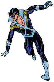
Eventually the company decided to have the Batman team create a new Robin (the first Jason Todd), while Wolfman and Pérez got to portray Dick adopting a new persona: Nightwing! That name, and the mostly dark blue costume he started wearing, were tributes to Batman (and, for those in the know, Superman), but the new identity was also a signal that Dick Grayson had come of age. After over forty years, he'd left the protection and shadow of Batman's cape. He didn't even need a cape of his own.

Some fans today find the original Nightwing costume quaint. Criticism centers on the "disco collar," but I'm sure practical people also find fault with the neckline that leaves so much chest exposed, and how the light blue and yellow would stand out at night. (Since most Titans missions took place in the daytime, that wasn't a problem.)

Since I was a New Teen Titans fan before I stopped reading comics altogether for quite a while, this Nightwing costume looks just fine to me. After all, a handsome man looks good in anything he wears.
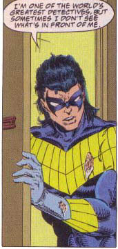
Except a mullet.

At some point in the early 1990s, for reasons I don't understand and the World Wide Web wasn't around to record in detail, Dick started wearing a new Nightwing costume. It had more bright yellow areas, and something resembling feathers folded between the arms and the chest.

Dick also grew his hair long in the back. At times he wore it in a ponytail, such as when he had to fit it inside the Batman cowl during a brief period of standing in for Bruce Wayne. Around 1995, in the Nightwing: Ties That Bind miniseries, Dick's hair reached full Fabio proportions, as shown to the right.

This costume also allowed Nightwing to glide through the air in a prone position. Apparently all that we humans need to become aerodynamic is to wear some yellow fans in our armpits. The panel below shows Dick traveling that way while Tim Drake, the fourth Robin, swings on a rope in more traditional fashion. (They may appear to be making catty remarks about their acquaintance Jean Paul's taste in capes, but it's a passionate discussion about the previous stand-in for Bruce Wayne.)
During the Ties That Bind miniseries, Dick Grayson received yet another Nightwing costume, but this one looked really good. No yellow anymore--just black highlighted with a jagged blue stripe from the fingers of one hand to the fingers of the other. And in the first issue of Nightwing magazine in 1996, some bad guys sliced off Dick's ratty ponytail, thank goodness.

Since then, the Nightwing look has remained generally consistent, as shown in the big picture below. Dick's hair has sometimes been long and messy, but never again in a style made famous by hockey players. The simplicity of the costume lets artists put their attention to the acrobatic body it sticks to.

Nightwing doesn't need to fly, as the cover image to the left shows. Through his extraordinary athletic ability and readers' willingness to suspend disbelief, Dick can jump off buildings and catch himself on the way down. This picture also shows the eskrima sticks that Nightwing adopted as his signature non-lethal weapon at some point.

For a brief period in 2005 Nightwing started to wear a red and maroon variation on his regular outfit, as shown on the Renegade collection. That costume lasted about five issues, which I haven't seen. Most comics fans seem to think that storyline better forgotten.

The image below, created by Ryan Sook, appeared on a 2007 issue of Nightwing magazine and then on the Lost Year graphic novel, issued last month. It shows Dick Grayson in his current costume with two of his previous outfits reflected in the windows around him. It's a very handsome portrait, but I still wonder why we don't see the real Nightwing costume with the spiffy collar.

05 April 2008

Running the Numbers on a New Publishing Model

Yesterday's New York Times Business section reported:

HarperCollins Publishers is forming a new publishing group that will substitute profit-sharing with authors for cash advances and will try to eliminate the costly practice of allowing booksellers to return unsold copies.
Good luck to Robert S. Miller, who's leaving Hyperion after seventeen years to head this venture. He's going to need it.

Allowing bookstores to send back unsold copies for full credit is a standard industry practice that dates back to the Depression. The first publisher to offer those terms was Simon & Schuster, which had stumbled onto a gold mine with the first crossword puzzle collections. Most of its initial titles were crosswords books. Those were ideal for experimenting for fully returnable sales; customers couldn't do the puzzles and then return the books to the stores to return them to S&S.

Today, "fully returnable" is standard in most of the book industry. Mass-market paperback publishing works on the basis of "cover returns," meaning stores don't even have to send back the whole book. Booksellers, who think their financial situation is just as precarious as authors' and publishers', will be skeptical of any non-returnable deal unless it also offers them better-than-usual terms, such as a discount higher than 50% off the cover price. And even then the people likely to suffer most from non-returnable terms are new, unproven authors; booksellers will be wary about stocking their books in case those copies don't sell and the store is stuck with the inventory.

And now that I've broached the arithmetic of the situation, the Times article reports that Miller hopes to "offer authors a 50-50 split of profits." How will that really work? Profit-sharing has long been on literary agents' wish lists. I recall hearing the Publisher of the book division I worked for, David C. Miller (now a literary agent, and no relation to Robert S. Miller), describing how an agent had said that would be part of his ideal deal.

David also pointed out the following math. When a publisher commits to a standard 10-15% royalty on the cover price of a hardcover book, but sells that book to a wholesaler or bookstore at a discount of close to 50%, then the royalty amounts to 20-30% of the publisher's gross revenue. Even a 7% paperback royalty translates in about 14% of the gross. Under the new HarperCollins model, authors would give that up for 50% of the net profit, presumably after the costs of production, printing, and marketing.

Anyone who's spent more than a few months in Hollywood knows that actors, writers, and directors never see a percentage of the net profit if that's what their contracts promise; the only deals worth fighting for stipulate a slice of the gross revenue. Hollywood accounting is legendary for its trickiness, of course. Publishing accounting is more straightforward, but publishing companies have never had an incentive to calculate a low net profit before. Authors have always been paid out of the first revenue the book earns, not the last.

The Times erroneously states:
Typically, authors earn royalties of 15 percent of profits after they have paid off their advances. Many authors never earn royalties.
The 15% royalty is typical of hardcover sales only after a certain number (say, 10,000 copies) sold at lower royalty levels. Royalties have nothing to do with "profits," as described above. And while many authors never see royalty payments after publication, their books do earn royalties as long as they sell.

Indeed, the advance system that this HarperCollins division will try to avoid lets authors receive money from their books' royalties even before those books are published and start earning those royalties. Hence the term "advance." Will authors and their agents really prefer the uncertainty of profit-sharing over guaranteed cash up front?

The key to understanding this new sort of publishing economics seems to lie in the types of books Miller's division will publish. Again with the Times:
The new group...will most likely publish hardcover editions priced at the low end of the market, around $20 a copy. She pointed to some of the titles that Mr. Miller had published while at Hyperion as models, including The Five People You Meet in Heaven by Mitch Albom and The Best-Loved Poems of Jacqueline Kennedy Onassis.
In other words, books from household names who have already created blockbuster bestsellers, aimed at the vast middlebrow market, and priced to go immediately onto the next bestseller list. This model can't work with anything less than a guaranteed mega-seller. For a guaranteed mega-seller, bookstores would be willing to forgo returns. For a guaranteed mega-seller, profit-sharing would make more sense for an author than an advance against royalties. But only for a guaranteed mega-seller.

Of course, everyone in publishing would like to identify guaranteed mega-sellers. No one can. That's why the current system of advances, royalties, and returns evolved as it did.

04 April 2008

It May Sound Harsh

The first Jack of Fables collection, The (Nearly) Great Escape (script by Bill Willingham and Matthew Sturges; art by Tony Akins and Andrew Pepoy) offers a--well, let's say rare picture of the most beloved Oz characters.

At some point I'll praise Willingham's Fables comics in more detail, but for now I'll just report that this volume is based on the premise that a bunch of characters from fairy tales, nursery rhymes, and fantasy literature are being held captive in a prison camp surrounded by tigers. (Don't you hate when that happens?)

The title character, Jack--as in Horner, Beanstalk, being nimble, etc.--masterminds a mass escape. And among the characters who make a dash for the fence are Dorothy, her three famous companions from Oz, and her little dog, too.

Dorothy is pictured as a teenager in cowboy boots, jeans, tight stomach-baring top, and hairband. Such a depiction is only to be expected in the Fables comics, since they're published by the adult division of DC and they show other human fairy-tale characters dressed (or undressed) like pretty young things of today. Plus, we've seen similar Dorothys in many other recent comics.

As this Dorothy and her friends climb the fence, a tiger roars up. Toto starts to snap and bark at it, just as he barks at the Cowardly Lion when they first meet.

And the tiger eats Toto. We see this in some detail. It's like a National Geographic special for a couple of panels.

Then Dorothy tells her other friends, "It may sound harsh, but I'm kind of relieved. That's the first time that flea-bitten mongrel's quit yapping in a hundred years!"

A couple of pages later, other characters explain, "killed Fables often get magically replaced by new versions of the same Fable." That should reassure us about Toto's ultimate fate, but the same panels offer another look at his half-eaten hindquarters.

Did I mention that the Fables comics are written for adults?

03 April 2008

Back to Comics and Picture Books

The latest Notes from The Horn Book newsletter contains this exchange from editor Roger Sutton's interview with Françoise Mouly on the debut of the first TOON books--comics for beginning readers.

2. What’s the difference between a comic book and a picture book?

Both have pictures, but the similarities end there. Comic books offer a visual narrative, with words as only one of the elements intertwined with the pictures. The visual narrative in a comic book helps kids crack the code of literacy, teaching them how to read from left to right, from top to bottom. Speech balloons facilitate a child’s understanding of written dialogue as a transcription of spoken language. In a sense, comics are similar to face-to-face interaction. Comics blend words, images, and facial expressions with panel-to-panel progression, sound effects, and even shifts in type size to engage readers and propel the story. Many of the issues that emerging readers have traditionally struggled with are instantly clarified by comics’ simple and inviting format.
I don't fully agree with some of Mouly's statements, but heartily concur with others. The quibbles:
  • Both picture book and comics forms have pictures in sequence. (In fact, "sequential art" was one of Will Eisner's "will you respect us now?" attempts to relabel comics. Unlike his "graphic novel," it doesn't seem to have leaped the fence from the comics field to the larger world.) Neither form is simply a collection of pictures; the sequential images make it possible to tell stories.
  • Both forms usually have pictures and words. There are wordless picture books and wordless comics, of course, but those are the exceptions. (We don't have to say "wordful picture book" or "worded comic.")
  • Some of the elements of comics that Mouly highlights are also elements of picture books:
    • Left/right (at least in our culture), top/bottom progression.
    • "Words, images, and facial expressions."
    • Digital layout and typography have made it possible for picture books also to use "shifts in type size," as well as:
      • shifts in type color.
      • shifts in type placement.
      • okay, I didn't really need this list, but I wanted to see what would happen if I kept adding new layers of bullet points.
As the key features that differentiate comics from picture books, I emphasize the number of pictures on a page spread and the way comics "show the invisible" through speech balloons, sound effects, and some other elements Mouly doesn't mention, such as the motion and emotion lines in this sample from TOON Books's Benny & Penny in Just Pretend, by Geoffrey Hayes.

I think those ingredients could indeed lead to comics being easier for some beginning readers to understand. The left/right, top/down progression that appears in both book forms is more apparent when a child can see several sequential images at once. The speech balloons' little tails provide a non-verbal link from characters to their dialog for someone who already has enough work to do puzzling out that dialog.

On the other hand, when children hear stories from their parents, what they hear is more like prose than like comics. In telling tales, we can rarely point to different people to indicate who said what; instead, we use verbal dialog tags like "he said." We describe events and actions rather than act them out. So for some children, a traditional prose picture book might be an easier transition from hearing to reading.

Of course, there's no reason for families to choose one form or the other.