31 March 2008

The Nesbit Model and the Baum Model

For a while I've been mulling over two types of fantasy adventures that start in a world that readers recognize as much like their own. The difference involves the young protagonist(s). Does a group of children have the adventure together, or is a single child on his or her own? It's struck me that authors and series usually favor one form or the other.

The books with a group of children always have some boys and some girls, usually siblings but sometimes augmented with cousins and long-standing neighbors whose connection predates the book. I identify this grouping as constructed on the "Nesbit model," after the British novelist E. Nesbit, who nearly perfected the form more than a century ago in Five Children and It, The Enchanted Castle, and other delights.

Other fantasy books constructed along the Nesbit model include:

  • Peter Pan, by J. M. Barrie.
  • The Ship That Flew, by Hilda Lewis.
  • Mary Poppins and its sequels, by P. L. Travers
  • The Magic Bed-Knob and sequel, by Mary Norton
  • The Lion, the Witch, and the Wardrobe and its sequels, by C. S. Lewis.
  • every Edward Eager book, of course, since he openly took Nesbit as a model.
  • The series that began with A Wrinkle in Time, by Madeleine L'Engle.
  • Over Sea, Under Stone, by Susan Cooper, who was motivated to write a "family adventure story" by a contest a publisher announced in Nesbit's honor, as she explained in her Newbery acceptance speech.
  • The Ogre Downstairs, by Diana Wynne Jones, and several of her other books.
  • The Spiderwick Chronicles, by Tony DiTerlizzi and Holly Black.
These books have a sort of collective protagonist, with the siblings and friends bringing different strengths to the adventure and bucking each other up. That model has proved its value in non-fantasy series as well, such as Swallows and Amazons and its successors by Arthur Ransome; The Famous Five and its many, many clones by Enid Blyton; and Mystery Manor, by Mary Evelyn Atkinson, which I've never read, but which had such intriguing endpapers.

(I didn't include in that group books that have multiple protagonists, usually of both sexes, who are brought together by the adventure itself: Diane Duane's Wizards series, J. K. Rowling's Harry Potter books, Philip Pullman's His Dark Materials trilogy, and so on.)

I identify the other set as following the "Baum model," though there might be precedents before L. Frank Baum's The Wonderful Wizard of Oz, such as Charles E. Carryl's Davy and the Goblin. In this set, a young protagonist travels alone into a fantasy world and attracts companions there, or deals alone with a magical element intruding into his or her world.

The protagonist in this sort of story is often an only child; it took 34 Oz books before any young protagonist had a sibling (in The Wonder City of Oz, shown at top), and four more before a brother and sister had an adventure together. If the protagonist in one of these book has a sibling or two, they're often obstacles to fun and adventure rather than companions.

Fantasies built along this model include:
  • The Old Tobacco Shop, by William Bowen.
  • Peter Graves, by William Pène du Bois.
  • David and the Phoenix, by Edward Ormondroyd.
  • The Magic Shop books by Bruce Coville.
  • The Phantom Tollbooth, by Norton Juster.
  • The Indian in the Cupboard, by Lynne Reid Banks.
Now perhaps I'm simply dividing books by one factor (quantity of protagonists), and deluding myself into perceiving that that classification leads to something of further significance. But I note that most of the authors in the first grouping are British, and most in the second are American.

Was that difference simply the result of Nesbit's and Baum's influences in their respective countries since the start of the 20th century? Or does it speak to a deeper significance about national cultures--America's cult of individualism, for instance?

30 March 2008

Dressed for a New Teen Titans Universe

In 1992 a cartoon called Batman: The Animated Series became the best adaptation of the Batman legend ever made for television. As with Rocky and Bullwinkle and The Simpsons, top-notch writing made up for cheap animation. These superhero stories could be complex, dark, and character-driven. They were not your father's Superfriends.

This Batman series inspired others, and eventually the DC Animated Universe (DCAU) became its own "continuity" distinct from the regular DC Universe. The TV cartoons, originally inspired by comic books, spun off their own lines of comic books, with art in the simplified style.

The first of these Batman shows didn't include a Robin, but in later seasons the writers introduced Dick Grayson as Robin and Nightwing, and then a version of Tim Drake with Jason Todd's backstory and a new, red costume. Yet another take on the legend, The Batman, has yet another take on Robin.

This weekly Robin article isn't about Batman: The Animated Series, however. It's about another TV cartoon some of that show's creators went on to launch in 2003: Teen Titans.

That series was inspired by the Marv Wolfman/George Pérez New Teen Titans comic books dating from 1980, which were the last I read as a teenager. But the Teen Titans cartoon was aimed at younger kids. It pared down the 1980s group from seven members to five, made their personality differences bolder, and played up the humor.

The look of the TV show was greatly influenced by Japanese anime. (The best episode of the first season, titled "Mad Mod" or "Detention," also paid homage the Beatles animated cartoons of the 1960s.) Characters' faces and bodies could change shape drastically to express emotion.

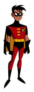
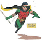
Among the cartoon's other innovations was Glen Murakami's new Robin costume, shown above. Since animation requires eliminating hard-to-draw detail, Murakami drew a version of Neal Adams's redesign with green pants and less stuff hanging off the gloves and sleeves. His additions included:

  • spiky hair--the show's first episode hinted that this Robin uses massive amounts of hair gel.
  • the big feet of early adolescence, accentuated by even bigger shiny boots.
The Teen Titans TV show was such a hit that it spun off a manga-size comic book titled Teen Titans Go! Together this cartoon and comic create yet a third DC Universe, separate from the other cartoons and magazines. That universe's Robin, like his teammates, doesn't appear to have a non-costumed identity. He sleeps in his mask, and for years there were only hints that he was ever named Dick Grayson.

Batman never appeared in the Teen Titans show; producer David Slack explained:
the thing about Batman is: If we ever bring him in the show, Robin becomes a kid. We put a lot of energy into getting Robin out of Batman's shadow. A lot of out younger fans think of Robin as a leader, not a sidekick. And that's a good thing for them.
This Robin even threw red "birdarangs" instead of black "batarangs."


Despite enjoying the Teen Titans cartoon on its own terms, I wasn't planning to discuss its Robin costume along with the others. (Honestly, I thought I was done with that topic!)

But last week I came across this drawing by Somerville's own Joe Quinones, artist for some stories in the last issues of Teen Titans Go! It shows how Murakami's costume would look on a more realistic body, and I thought it was interesting enough to share. (Here's another.)

In fact, Quinones has produced yet another variation on the classic Robin costume. What happened to the yellow fastenings at the top of the Boy Wonder's chest? Quinones explains: "I just have never liked that element of his costume. Never made sense to me, so I yanked it out."

29 March 2008

What an Honor!

This afternoon at the Belmont Children's Picture Book Festival, organizer and author Melissa Stewart presented me with a copy of one of her latest nonfiction picture books, When Rain Falls, illustrated by Constance R. Bergum.

Melissa then told me that she had dedicated this book to me. I wasn't surprised. I believe a more accurate term would be "flabbergasted," or perhaps "gobsmacked." Given the book's meteorological theme, "thunderstruck" is probably the best fit.

Melissa's written over 100 books on all sorts of scientific topics, so I figure she's already dedicated books to her relatives, old friends, teachers, college roommates, hairdressers, and other very important people. But this still feels a tremendous honor. I've been cited and acknowledged in books before, but not dedicationed.

During the book-signing, Melissa reminded me of how we'd met. We were both at a Foundation for Children's Books meeting, and she told people about wishing to meet with other writers. Afterwards, I chased her to the parking garage to give her my card as an SCBWI Regional Advisor, and the rest went on from there. So that's the way to get books dedicated to you, kids! Pursue people through parking garages at night.

Since then, Melissa has directed an SCBWI New England conference, volunteered for the regional group in other ways, and serves as a board member of the parent organization. So this is a public thanks to her, not only for her dedication in When Rain Falls but for her dedication to children's books.

28 March 2008

Popping Up All Over

Roaring Brook Press is publicizing this office-made video showing off French paper artist Marion Bataille's ABC3D, a pop-up book that works its way through the alphabet. This is a book trailer that makes sense, for multiple reasons:

  • The press created the video for its sales reps since there aren't enough prototypes of the October title to go around.
  • The moving parts of a pop-up book are integral to its appeal, and customers like to see what they're buying.
  • Those parts can be worn out or damaged in a bookstore's sample copy.
Ironic that this use of viral video is coming from a press that still doesn't have a website.

And on the subject of pop-up books, a while back Blair Frodelius at the Daily Ozmopolitan pointed me to the University of North Texas library's attractive online exhibit of historic pop-up books.

27 March 2008

The Emergence of the Comic-Book Supervillain

There were larger-than-life villains in popular literature before comic books: Prof. Moriarty, Dr. Fu Manchu, and, as far back as 1862, Jean Diable. But the character type really took off after American comics created a world of superpowers and colored costumes.

The first supervillain naturally faced off against the first superhero, created by Jerry Siegel and Joe Shuster. In the thirteenth issue of Action Comics, with a publication date of June 1939, Superman met:

the Ultra-Humanite!

Until then, Superman had been battling natural disasters, economic injustice, and human evildoers who couldn't possibly match his strength. His antagonists in his first year included a wife beater, kidnappers, warmongering munitions dealers and their lobbyists, the owner of an unsafe mine, a hit-and-run driver, gamblers trying to fix a college football game, crooked stock brokers, and a fraudulent licensor of the valuable Superman trademark.

The Ultra-Humanite looked like he could be a real threat. Like Superman, he represented a further stage in human development. But while Superman was physically superior, this villain was physically debilitated--confined to a wheelchair, his hair sparse and white. The Ultra-Humanite claimed intellectual superiority to the rest of humanity. And while Superman was waging a "one-man battle against the forces of evil and oppression," the Ultra-Humanite was out for power.

Yet I can't help but note that Superman tracked down the Ultra-Humanite through a racket called the "Cab Protection League." Was this ultra-genius really expecting to achieve "DOMINATION OF THE WORLD" by forcing one city's independent taxi owners into an association? I imagine him skulking in his lair, boasting to himself:
"Why, soon I'll be taking in $300 or even $400 a week! At that rate, how long could it be before I can finance my death-ray construction plans?

"Let's see...multiply by 52 weeks, carry the 2,...

"That can't be right. I'm an evil genius. Let me do this again...."

26 March 2008

Awesomely Depressing Adolescent Fantasies

About a month ago, I was delighted to follow a path from Desert Dispatches to the Neon Season's "Awesomely Depressing Books" tag.

In that series of postings, Rachel M. Brown presented her YA Agony Award to "Susan Beth Pfeffer's depressingly realistic apocalypse novel Life As We Knew It." But her commentary on the whole tradition of awesomely depressing literature for adolescents offers nothing but joy. (For folks not used to LiveJournal, when you see highlighted text between parentheses at the end of an entry, you can click on that link and read even more.)

I don't care for deliberately depressing books and never have, but I might have to check out Ann Halam's Taylor Five, which Neon Season summarizes as "your brother is dead and your family failed to save the orangutans." Because adding great apes to any plotline automatically makes it more awesome.

25 March 2008

The Most Remarkable Man

The best part of I Shall Destroy All the Civilized Planets!: The Comics of Fletcher Hanks is Paul Karasik's afterword in comics form. Of course, most people should sample Hanks's own comic-book work from the early 1940s once in a lifetime, just to appreciate the depths of human madness, but seeing more of it doesn't add up to more insight.

In contrast, Karasik's afterword about visiting Fletcher Hanks, Jr., does offer that insight. As a comics fan and chronicler, Karasik (at least the version depicted as a character) starts with high hopes that he might meet the legendary lost cartoonist, maybe even come away with some original art or enough material for a New Yorker profile. As in Art Spiegelman's Maus, the cartoonist depicts himself at work on the book we're reading, thinking about how to tell a story while trying to justify his comic-book interests to a parent.

As the afterword proceeds panel by panel, however, Karasik learns that the senior Fletcher Hanks was a nasty, violent drunk. Instead of being a planet-saving hero like his creations Stardust and Fantoma, Hanks was more like his stories' malevolent villains. Karasik inserts panels from those stories to show the parallels.

Fletcher Hanks, Jr., was happy to tell Karasik about his father, but the matter-of-fact, level-headed World War 2 vet was well beyond hero worship. Instead, he displays the heroic qualities that Karasik depicts himself as looking for.

24 March 2008

All the Questions You'd Like to Ask Mr. Cormier

Here's an amusing set-up from Peter at Collecting Children's Books:

Robert Cormier, whose brilliant and controversial novels had changed the landscape of young-adult fiction, was one of my personal heroes -- but his bookstore appearance was scheduled for a weekday afternoon and I had just begun my first full-time job and couldn't possibly get the day off work.

Happily, my brother volunteered to take my books to the store and have them signed. . . .

My brother arrived early, but he was the only one there. When he walked into the store with a couple Cormier books in his hand, the store manager was so relieved she almost hugged him. "Now Mr. Cormier isn't here just yet, but if you just wait patiently, he should be here very soon. Till then, why don't you just browse for a few minutes."

Browsing in a bookstore. Yeah, my brother was going to LOVE that.

Soon there was a small fuss at the back of the store and the manager came running over to my brother. "He's here! He's here! We're serving him a light lunch in the backroom, but then Mr. Cormier will be right out to sign your books!" She dragged my brother to a chair at the back of the store and pushed him into it: "Now you just sit HERE and think of all the questions you'd like to ask Mr. Cormier."

Of course my brother, who had never picked up a Cormier book in his life before I'd handed him my copies that morning, didn't have any questions at all to ask the author. Except maybe, "How was your light lunch?"
The rest of the posting provides graphic evidence of how this turned out and what a gentleman Robert Cormier was.

Of course, in fiction the brother would have made something up that implied he had read Cormier's books, and the author would have invited him out to lunch to hear what young people are up to these days, and the brother would have phoned Peter for tips on what to say, and Peter would have insisted on coming along in the role of his own aliterate brother, and...laffs galore, people! I'm going to have to go write this one down.

(Thanks to Fuse #8 for the pointer.)

23 March 2008

Robin Goes Red

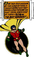
The last few installments of my weekly Robin series have explored Dick Grayson's original crime-fighting costume, which in practical terms would have increased the danger he faced rather than decrease it.

I haven't yet mentioned the source for the green parts of that 1940 costume: flared gloves, pixie boots, and trunks patterned vaguely like chain mail. (Ouch!) The red vest fits the source of a red-breasted robin, but what part of a robin is green? As the original comic book explained, the "Robin" name also came from Robin Hood. The green, quasi-medieval elements of the costume were thus borrowed from Errol Flynn.

That uniform was redesigned in 1990 for a new Robin named Tim Drake, shown above. His legs were fully covered, allowing the costume to contain both more red and more green. And that costume lasted for a little more than fifteen years, or less than half the time of the original.

With Robin, #148, published in early 2006, DC gave Tim Drake a new costume. (I haven't found any individual artist's name attached to the redesign. The particular rendering on the right is by Freddie Williams II.)

All the green is gone. Now Robin's dominant colors are red and black, with yellow accents (and cape lining). He has a new utility belt with pouches. There are pointy bits on the sides of his mask, on his gauntlets, and along the bottom of his cape (when artists remember to draw them).

This was part of DC's heavily-hyped "One Year Later" relaunch of its storylines after its heavily-hyped "Infinite Crisis" crossover event. Within the DC universe, Tim explained his new costume by saying he had adopted the colors of the second Superboy, his best friend, who had died saving the universe in that "Crisis." Superboy didn't wear any yellow, and for most of their years as friends his costume contained a lot of blue, but let's not quibble.

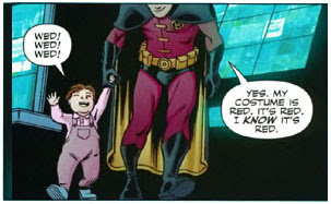
One obvious influence on the new Robin costume was the uniform worn by the version of Tim Drake in the television cartoon series, The New Batman Adventures. Shown at left, this outfit is credited to animator Bruce Timm. Even in reruns, a TV show attracts an audience of millions. Meanwhile, comic books are considered big successes if they sell 100,000 copies, and the real year-in, year-out revenue from superheroes comes in licensed products. So DC Comics has every reason to adopt the styling of the TV show, which more fans see.

Another influence, not lost on comics fans, was Batman's costume. For over sixty years he's had pointy fins on his gloves, scallops on the edge of his cape, a pouched utility belt, and black trunks over tights of a single color. Tim's uniform thus became more like Batman's. Which is both ironic and ominous since Tim's overarching personal narrative, running through all the comics he appears in, is his desire not to end up like Batman despite all his losses in life.

22 March 2008

Tracking the “Children of Oz”

A couple of years ago I started tracking one of the curious manifestations of Oz's cultural legacy in America, the term "Children of Oz" as a synonym for what others had called "Indigo Children". That label seemed to trace back to a man named James Twyman, who claimed to be bringing messages of peace from such children, as on this page from his website:

We are the children of light. Several names have been given to us such as: Indigo, Children of Oz, the Psychic Children, Rainbows and Mystics. . . .
That webpage has a 2003 copyright date at the bottom. The previous year, Twyman had published the book Emissary of Love: The Psychic Children Speak to the World. Here's a sample of its wisdom:
PRETEND that you are still that Original Self.
PRETEND that nothing ever changed.
Then know that what you are pretending is indeed fact.
It is true.
Build your life around it.
Give everything you have to realize it.
Nothing else matters but this,
And that is why it is the message of the Children of Oz.
Twyman's first book in this vein was Emissary of Light, first published in 1996. That prompted David Sunfellow of an organization called New Heaven, New Earth to publish an online "report" about Twyman. Among other things, it says:
As far as we have been able to determine, there are kernels of truth in everything Twyman claims. At the same time, virtually every aspect of his story has also been misrepresented, embellished, and spun in dubious ways. Similarly, while Twyman's main contention that he physically met 13 spiritual masters in Bosnia is almost certainly not true, he seems sincere, and genuinely committed to personal and planetary transformation. Indeed, a part [sic] from his megalomaniac claims, he seems like a regular guy -- warm, personable, friendly.
Emissary of Light starts with a "psychic child" in San Francisco giving Twyman the power to bend spoons. That seems minor as far as powers go (only slightly above the Robin level). Spoon-bending was so long ago exposed as a parlor trick that I thought the very term had become a synonym for humbuggery. Twyman must feel otherwise since he's selling an online course called Spoonbenders. The text of the lessons seems to be here, and is analyzed on this page. It includes such instruction as:
First, find a thin spoon that you can easily bend with your hands. You don't want to start off with one that is too thick. . . .

Take the spoon in your hands, holding the handle in one hand and the bowl in the other. Notice how much pressure it takes to bend it around 45 degrees. . . .

At a certain moment you will know that it is time to put some pressure on the bowl. As you imagine that the molecules are spreading apart, assist the movement by giving a slight push with the first two fingers of your other hand.
Somehow I don't think Glinda would be impressed.

As for the Oz connection, the label "Children of Oz" seems to be nothing more than grabbing a term with cultural resonance. There's no deeper understanding of how the Oz books depict children than is evident from this extract from "Regaining Your Indigo Power" on Twyman's website:
The ego doesn't want you to remember Love or Oneness, because then it will lose its power, just like the Wicked Witch in the story of the Wizard of Oz.
The “Children of Oz” meme seems to have died down recently. Almost no websites using the phrase have been added in the last six months, according to Google, and the phrase doesn't appear in Google's blog search (though of course that changes now). Even James Twyman has moved on: his latest message, available in book, movie, and lecture form, is “The Moses Code.”

(Picture above from Printfinders.com, which has a variety of John R. Neill illustrations for sale, not all correctly labeled.)

21 March 2008

The Full Meaning of “Chutzpah”

Here's an Oz anecdote from Dick Cavett's blog at the New York Times, linked to the recent death of William F. Buckley, Jr.:

Dick Clurman of Time magazine, an affable gent, was a guest on the Buckley yacht in the Caribbean. After dinner, Bill B., leafing through a TV log, announced that “The Wizard of Oz” would be starting in half an hour — in English, broadcast from Puerto Rico. Clurman was delighted and confessed to never having seen it.

At the appointed time the set was switched on, but to everyone’s chagrin it seemed the movie had already been on for a good half hour. Bill had read the starting time wrong. Clurman’s disappointment was visible.

“Let’s see if my name cuts any ice down here,” his host said. The incredulous Clurman later described how his friend grabbed the phone, rang up the station in Puerto Rico, managed to get through to the engineer, explained his guest’s disappointment, and asked if it would be too much trouble to start the movie over!

In disbelief, Clurman saw the screen go blank, followed by a frantic display of jumbling and flashing. And then — the opening credits and the comforting strains of “Over the Rainbow.” The movie began anew. Clurman declared that never until then had he known the full meaning of “chutzpah.”

I think Bill decided to let a year go by, giving Clurman time to regale all his friends and acquaintances with the tale of the Oz miracle. It was then, still reluctantly, that the magician revealed his secret. The movie had not been broadcast at all that night — except on Bill’s tape deck, which he had secretly manipulated with his unseen left arm while “talking on the phone” using the other.
You all should try that the next time you're cruising the Caribbean on your yacht.

20 March 2008

Revisiting Baum and Pullman

Back in my first month of blogging, I posted an entry called "Pullman and Baum tackle the same scene". It noted some parallels between Philip Pullman's The Scarecrow and His Servant and L. Frank Baum's The Marvelous Land of Oz, particularly a scene in which a clever child pretends to translate between two characters who are actually speaking the same language.

This morning I heard from Laurie Frost, author of The Elements of His Dark Materials, that another guide to Pullman's trilogy, The Rough Guide to His Dark Materials by Paul Simpson, cited that posting to support this statement:

The story of Oz--in celluloid and literary form--has had a significant impact on Pullman's imagination. As the fantasy writer J. L. Bell has shown, Pullman's The Scarecrow And The [sic] Servant is directly influenced by Oz, paying homage to specific scenes and character names.
Actually, I didn't show that at all. I simply pointed out some similarities, but I didn't feel they were close enough to prove influence, nor did I have any evidence about Pullman's reading. The Wizard of Oz is not such a presence in British culture as it is in America, and Baum's sequels are even less known over there.

Both Baum and Pullman wrote about live scarecrows and characters named Jack. Other authors have explored the idea of a live scarecrow as well, and Jack is not simply a common name--it's generic.

As for the translation scenes, I found it interesting to consider how the two fine authors handled the same notion. My only implication about influence was that if Pullman had been inspired by Baum, he made more of the idea: his character's "strategem actually plays a role in the plot" while "Baum's scene is characteristic vaudeville [with] no consequences." But a fake-translation joke is basic enough that it could well have occurred to each of these authors (and others) independently.

Simpson's book appears to be a very "rough guide" indeed. I'm flattered at being cited in it as an expert, but surely there are better ways of gathering information about Pullman's influences than trawling for remarks on the internet and reading too much into them.

Frost tells me she had actually asked Pullman about the possibility of inspiration from Oz in connection to the interaction between Dorothy and Toto, which reminded her of the tighter bond between Lyra and her daemon, Pan. (The Rough Guide makes the same point with a picture from the MGM movie.) Frost writes:
I was flabbergasted when he wrote back that he has never seen the movie, or read the book. He knows a few of the songs, and he has seen Wicked! which he found very confusing, but that's the extent of his Oz knowledge.
Frost's Elements seems to be self-published; it's the only title from The Fell Press. It doesn't have the benefit of the Rough Guides' branding or market reach. But it has an endorsement from Pullman himself, and it's clearly a more reliable guide to what actually inspired him.

19 March 2008

Dorothy, We Hardly Knew Ye

I'm intrigued by news of the upcoming Marvel Illustrated adaptation of L. Frank Baum's Wonderful Wizard of Oz. Not because we don't have lots of Oz comics to choose from already, but because this one will be scripted by Eric Shanower, creator of Adventures in Oz. The only disappointment is that he won't do the art himself. That task will be handled by Skottie Young, whose style may be more oriented to younger tastes today anyway.

Another intriguing detail about that Newsarama interview on the Oz adaptation is that it credits Baum in part as an "independent filmmaker." He was a partner in a Hollywood studio in the 1910s that went belly-up after only a couple of years. But I guess you can't get more artistic street cred these days than by being an independent filmmaker. (Thanks to Eric at the Wonderful Blog of Oz for the news.)

In other Oz comics developments...
This comics-format update on Oz titled Dorothy of Oz comes from Korea. The publisher's description:

When Mara Shin’s dog Toto gets lost one fateful day, she goes in search for him along a yellow brick road and ends up in the wonderful land of Oz! Everyone starts calling her Dorothy, but these aren’t the cowardly lion, scarecrow and tin man adventures you remember! This fantastic fairy tale features familiar characters...but with a definite Asian twist!
[Too many exclamation points! Cannot process!]

The further description mentions such things as "the Oz Military" and secret agents. I checked out the preview, and about all I can tell is that the inside has a lot of exclamation points, too. This page is supposed to show little Dorothy--after her transformation, of course.

18 March 2008

Toto Talks!

Here, as promised yesterday, is the scene at the end of Tik-Tok of Oz (1914) in which Dorothy hears Toto speak like a person for the first time. By this point he’s shared several published adventures with her and has never said a word. He's been holding back. That runs the risk of breaking one of Oz and Ends's orts of wisdom: Don't mess with Dorothy Gale.

As they turned away Betsy said wonderingly:

"Do all the animals in Oz talk as we do?

"Almost all," answered Dorothy. "There's a Yellow Hen here, and she can talk, and so can her chickens; and there's a Pink Kitten upstairs in my room who talks very nicely; but I've a little fuzzy black dog, named Toto, who has been with me in Oz a long time, and he's never said a single word but 'Bow-wow!'"

"Do you know why?" asked Ozma.

"Why, he's a Kansas dog; so I s'pose he's different from these fairy animals," replied Dorothy.

"Hank [the Mule] isn't a fairy animal, any more than Toto," said Ozma, "yet as soon as he came under the spell of our fairyland he found he could talk. It was the same way with Billina, the Yellow Hen whom you brought here at one time. The same spell has affected Toto, I assure you; but he's a wise little dog and while he knows everything that is said to him he prefers not to talk."

"Goodness me!" exclaimed Dorothy. "I never s'pected Toto was fooling me all this time." Then she drew a small silver whistle from her pocket and blew a shrill note upon it. A moment later there was a sound of scurrying foot-steps, and a shaggy black dog came running up the path.

Dorothy knelt down before him and shaking her finger just above his nose she said:

"Toto, haven't I always been good to you?"

Toto looked up at her with his bright black eyes and wagged his tail.

"Bow-wow!" he said, and Betsy knew at once that meant yes, as well as Dorothy and Ozma knew it, for there was no mistaking the tone of Toto's voice.

"That's a dog answer," said Dorothy. "How would you like it, Toto, if I said nothing to you but 'bow-wow'?"

Toto's tail was wagging furiously now, but otherwise he was silent.

"Really, Dorothy," said Betsy, "he can talk with his bark and his tail just as well as we can. Don't you understand such dog language?"

"Of course I do," replied Dorothy. "But Toto's got to be more sociable. See here, sir!" she continued, addressing the dog, "I've just learned, for the first time, that you can say words--if you want to. Don't you want to, Toto?"

"Woof!" said Toto, and that meant no.

"Not just one word, Toto, to prove you're as any other animal in Oz?"

"Woof!"

"Just one word, Toto--and then you may run away."

He looked at her steadily a moment.

"All right. Here I go!" he said, and darted away as swift as an arrow.
With regret I report that three books later, in The Lost Princess of Oz, Toto talks up a storm. And reveals himself to be as self-centered as any of the other Oz folks proud of their particular makeup and habits. I much prefer to imagine him as quietly devoted to Dorothy.

17 March 2008

Allusions to Oz

This week I plan to bolster up the Oz side of "Oz and Ends" with a few postings on L. Frank Baum's century-old fantasy series and its cultural legacy.

As a fan of the books more than the now-better-known MGM movie, I'm always pleased to see allusions to Oz that reflect literary rather than cinematic knowledge. Sometimes it's not so clear, however. Carrie Hedges of the International Wizard of Oz Club board passed on this reference:

In a United States Supreme Court case, Cleveland Bd. of Educ. v. Reed, 445 U.S. 935, 938, 100 S.Ct. 1329, 1331 (1980), Justice Rehnquist wrote in dissent: "Even if the Constitution required it, and it were possible for federal courts to do it, no equitable decree can fashion an 'Emerald City' where all races, ethnic groups, and persons of various income levels live side by side in a large metropolitan area."
It would be nice to believe that the Justice was alluding to the Emerald City under Princess Ozma, which is indeed home to a wide assortment of different types of people (straw, wooden, cotton, meat, fairy princess raised as mortal boy, immigrant Americans, etc., etc.). As Marc Berezin noted in an essay on Frankensteinia, even Dr. Frankenstein's creature might find the Emerald City to be a hospitable home.

However, I can't help but suspect that Rehnquist was merely using "Emerald City" as American shorthand for a city he believed never did and never could exist. He did, after all, get his political start by enforcing literacy tests on black and Latino voters in Arizona, and bought houses with racist restrictive covenants. The notion of an "Emerald City" of equality and tolerance would likely have struck him as a fantasy rather than a social goal. (Photo of Rehnquist in 1971 courtesy of the New York Times.)

On the other hand, writer Peter David offered a knowledgeable reference to the Oz series in his Writing for Comics handbook:
Why hadn't Lockjaw [a dog in the Fantastic Four comic] said a word in the past thirty-some years? Like Toto, who it turned out was perfectly capable of speech while in Oz, he just hadn't had all that much to say.
TOMORROW: The scene from Tik-Tok of Oz that David alluded to.

16 March 2008

A Strange Concatenation of Interests

Last week Seven Impossible Things featured in a single posting both

  • a picture of Dick Grayson as Robin (albeit in the background of Zachary Baldus's portrait of Batgirl), and
  • the cover of an edition of The Wizard of Oz--Robert Sabuda's pop-up adaptation.
Plus so many other things that I couldn't keep up.

The Dynamic Duo as a Study in Contrast

My last two weekly Robin installments talked about how Robin's skimpy, colorful costume, impractical as it was, provided a powerful visual contrast to Batman's dark outfit. Here's an comics artist making that point more dramatically than my observations.

Writer Jeph Loeb and artist Tim Sale collaborated on The Long Halloween and some other Robin-less stories of Batman's early career. Then Loeb proposed telling a version of Dick Grayson's arrival in Batman’s life.

Sale described his response this way:
“But I hate Robin, he doesn’t make any sense, he’s so colorful, Batman’s a loner, he can’t escape the tragedy that shaped his life, blah, blah, blah,” I said.

“That’s the point. You wait and see,” Jeph said.

What he saw, and this is the talent that is Loeb, was a way to filter a Reality through Comic Book Melodrama and find the poignancy, the sentiment. . . . Jeph’s answer lay in the contrast: His depiction of Dick as an extroverted, talky little kid, and the conflicts in personalities that arose from that...made sense to me.

It will come as no surprise to anyone who has ever looked at my work that I love visual contrasts--heavy blacks and thin lines, big panels on the same page with tiny, dense backgrounds and big empty spaces. It heightens the comedy or drama in each scene, and when I realized that the figures of Batman and Robin gave me the opportunity to play with that--big, hulking super-hero and little kid--Jeph had won me over.
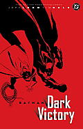
No artist has drawn Dick Grayson so small and spindly as Sale did in the resulting story, Dark Victory. (The remarks above comes from his foreword to that book.)

Sale’s contrasts are visible in the book's cover art, up above. It shows Robin and Batman from overhead, the boy's light cape and gloves making a yin to the big man's broad black yang.

And the end of the book offers this climactic panel.

(It's just been announced that Loeb and Sale will collaborate on a new book about Batman and Robin's Marvel counterparts, Captain America and Bucky. Sale will have much less visual contrast to play with since those heroes' costumes share the same red and blue.)

15 March 2008

Divided by a Common Language: How Different Governments Spell “Program”

Yesterday the Independent newspaper in Britain ran an article about "a lesson plan commissioned by an organisation called Kids Connections for the Ministry of Defence aimed at stimulating classroom debate about the Iraq war." (Thanks to HNN for the pointer.)

A British teachers' union complained, and the newspaper's quotations appear to confirm, that this lesson plan includes a one-sided set of talking points on the benefits of invading Iraq. The material avoids mentioning civilian casualties, regional destabilization, difficulties in reconstruction, worldwide disapproval, and other weak spots in the pro-war arguments.

Among the points in the military-supplied curriculum, the Independent quotes:

“Iraq was invaded early 2003 by a United States coalition. Twenty-nine other countries, including the UK, also provided troops... Iraq had not abandoned its nuclear and chemical weapons development program”. After the first Gulf War, “Iraq did not honour the cease-fire agreement by surrendering weapons of mass destruction...”
The newspaper notes errors of fact, such as how Iraq had in fact abandoned its nuclear and chemical weapon programs years before the invasion.

Indeed, the newspaper may have missed some errors: In March-April 2003, the period of the invasion, fourteen countries besides the US--not twenty-nine--provided troops in Iraq, according to Perspectives on World History and Current Events.

What I thought most interesting is how much weight the newspaper puts on the quoted phrase “nuclear and chemical weapons development program.” That's the American, not British, spelling of “program.” Elsewhere in the same document “programme” appears. Obviously, some of these Ministry of Defence talking points have their roots in American word-processing files. And for the Independent and much of the British public, that's not a good thing.

British anti-war groups started protesting this "Defence Dynamics" curriculum last August, according to the New Statesman and other news sources. The "organisation called Kids Connections" is actually a London advertising agency; its website says, "we specialise in marketing, research and school programmes targeting toddlers, tweens, teenagers and their families." It lists many commercial enterprises among its clients, but not yet the Ministry of Defence.

14 March 2008

What Means This Pi Day?


When I was in school, we had math.

In math we had ten-times tables (10 x 1 = 10, 10 x 2 = 20,...), which of course are part of the nice easy break between the nine-times tables and the twelve-times tables. But we didn't have 100th Day. I never had to bring 100 of anything to class, and risk scorn for my parents if they'd sent me in with the same hundred unimaginative items that several other children brought.

In math we eventually had π. I recall my mother devising a home lesson to teach me about about that unusual number before I'd learned to divide fractions, which turned out to be a recipe for frustration. But in school, even after our math lesson plans had caught up to π, we didn't have Pi Day every 14 March. Indeed, once I'd mastered those fractions I believe I would have asked why 3/14 isn't called ".2142857... Day." I was that kind of kid.

But now 100th Day and Pi Day appear to be firmly established on school calendars--particularly the latter, since it's the same day in every school. (Of course, schools in countries where people abbreviate today's date as 14/3/08 will never have the pleasure of celebrating Pi Day.)

As for how to celebrate, teachers' favorite activities include:

  • "writing myths on the origin, creation, or the original use of Pi"
  • "make a song!"
  • "my 8th graders have always created their own T shirts using Fabric Paint or Fabric Markers"
  • "making a pi paper chain and bracelet (each digit represented by a different color)"
  • "pi shuffleboard"
YouTube archives such student projects as this "Pi Day Movie", from three boys somewhere in the north (to judge by their accents). Apparently, Pi Day activities need not contain any mathematical content at all.

When I was in school, we had math.

13 March 2008

Plain Talk on The Plain Janes

The one nominee for the 2007 Cybils Award for Graphic Novel for Teens that was undoubtedly Young Adult Literature with a capital "YA" was The Plain Janes, written by Cecil Castellucci and drawn by Jim Rugg.

The Professor's Daughter and Laika were created in Europe for graphic-novel readerships that include more adults. The Arrival has a simple story appropriate for younger readers. Flight, vol. 4, is an anthology, with selections for every age group. But for high-school social angst, irrationally strict adults, self-centered self-righteousness, and recovering a sense of hope after a difficult experience, the only option is The Plain Janes.

And for all those things, which I don't particularly seek out in my reading anymore, it's not bad. I read The Plain Janes first on my own, then returned to it as a Cybils judge and found more to like than I'd remembered. It still feels more like a short story that brings up issues than a novel that fully explores them. I think Bill Sherman at Blog Critics Magazine hit the nail on the head when calling this book:

a well-intended piece of adolescent lit whose modest charms threaten to be overwhelmed by its status as a Significant Publishing Event: DC Comics' much-touted attempt at snagging the long elusive tween- & teen-girl audience.
DC contacted Castellucci, an up-and-coming YA novelist and comics fan, and commissioned this book for the inaugural list of its Minx imprint.

The Plain Janes begins with a terrorist bombing in "Metro City." The details are deliberately unclear because all that matters is how this affects our heroine, Jane. She's survived and even helped save the life of an injured young man (who remains in a coma), but her parents--especially her mother--are so psychologically traumatized that they move to a much smaller town. Jane responds with moping, a completely new hair style and color, and a one-sided correspondence/infatuation with coma guy.

"Making friends at her new school is nearly impossible," says Chicklish's review, but that misreading makes Jane's situation more common and less novel. The cool girls actually invite Jane to eat at their table in the cafeteria. Instead, wishing to keep a low profile, she decides to make friends with the school's social outcasts.

I think the social milieu at Buzz Aldrin High School is the strongest element of The Plain Janes; Castellucci understands teen culture, and Rugg makes familiar character types into something closer to individuals. (Rugg literally adds grays to the book, working in grayscale rather than the black-and-white that predominates in his Street Angel comic. I see Ghost World influence, with gray instead of blue.)

Jane has picked up coma guy's small sketchbook, and decides that what her new home really needs is art--mild guerrilla art left in public spaces by a group that signs itself P.L.A.I.N. These projects help to build a friendship among the Janes and, as the months pass, to unite the rest of the high-schoolers as well. Because, you see, the town's police chief doesn't appreciate such art. As the book's designated villain, he makes John Lithgow's character in Footloose seem like a monument of intellectual open-mindedness and depth.

It doesn't really matter if P.L.A.I.N.'s art is good or, as Geoff Hoppe at Comic Book Bin argues, little more than attention-demanding clichés. Because this part of the book assures us that Art is Good. Free expression is Good. Having confidence in yourself is Good. Seeing the value in different sorts of people is Good. It's all very reassuring.

For me, the story of The Plain Janes ended with a dangling, and troubling, loose end: the character of Damon. He's another new kid in school. He reads. He has floppy hair. He's nice to the cafeteria staff. His name is almost like "Dylan." Can you tell he's going to be the love interest?

One night Damon just happens by while the Janes are preparing one of their artworks, and he helps them avoid being caught. Another night he just happens by while Jane is trying to hitchhike back to Metro City; he drives many miles for her sake and is there when she learns that coma guy has recovered and returned to Poland. Damon insists Jane come back home rather than hop a plane to Warsaw, and they end up snogging in the car.

But shortly after that, Damon tells Jane he doesn't feel as much romantic interest in her as he thought. And for that, of course, he must die.

Well, not die, but be arrested and charged with all of P.L.A.I.N.'s acts of vandalism/guerrilla art, having participated in only one and that for Jane's sake. A panel tells us that Jane's tried to see Damon again, but couldn't, so she gave up. The book never shows or mentions him again. Instead, Jane goes back to dreaming about Poland guy. And this is growth? Well, the Janes all feel better.

(As I wrote before, I really liked another of the first Minx titles: The Re-Gifters. It, too, explores a teenage subculture in interesting ways, but I thought its plot and characters offered more surprises and came together at the end.)

12 March 2008

Belmont Children’s Picture Book Festival, 29 March

A new event for picture-book lovers in the Boston area!


As a teeny-tiny bonus to getting to hear Sarah S. Brannen, Anne Broyles, Timothy Basil Ering, Laura & Leo Espinosa, James Kaczman, and Melissa Stewart talk about their new picture books, you can also hear a little of me talking about them. I'll be this event's moderator. I'll probably even get a haircut beforehand.

Here are directions to the church. See you there!

11 March 2008

New Direction for The Golden Compass?

Monica Edinger alerted me to an interesting article in Variety about the movie version of The Golden Compass. Although it's seen as an expensive dud here in the US, it's been performing very well overseas. In fact:

After its strong start in Japan last week, "The Golden Compass" is on course to make box office history as the first film to gross $300 million in foreign while failing to reach $100 million in North America.
None of that helps the executives at the New Line studio, which is being absorbed into parent company Warner Bros. For one thing, they had sold off most of the international distribution rights, so those grosses "in foreign" aren't helping the company. For another, the situation implies that the movie could have been a hit in America as well if New Line's Marketing Department had taken the right approach.

Variety suggests The Golden Compass should have been marketed as a family film (i.e, for middle-grade kids and parents, like The Lion, the Witch and the Wardrobe) rather than a special-effects adventure film (for teen boys, like the studio's magnificently successful Lord of the Rings). I don't have enough of a feel for movie marketing to parse the differences here. But the controversy over the books' portrait of an oppressive church might have foreclosed some of those Narnia marketing channels. Then again, the movie grossed "a perfectly decent $15 million" in Italy even after the Pope himself had spoken up for oppressive churches everywhere by calling it "the most anti-Christmas film possible."

Producer Deborah Forte seems determined to proceed with a sequel based on The Subtle Knife, my favorite of Philip Pullman's His Dark Materials series. Back in 1999 Sony Pictures president Amy Pascal told Entertainment Weekly, “If a movie makes $400 million, you make a sequel. It’s that simple.” She was talking about the Roland Emmerich-directed Godzilla, released in 1998. It made $136 million in the US and $243 million overseas--more than The Golden Compass has so far, without even adjusting for inflation. And we still haven't seen a sequel to that.

We also haven't seen DVD revenue for The Golden Compass. Though its visuals won't look so handsome on a smaller screen, the movie might find its family audience at home and start to grow American interest in a sequel.

10 March 2008

A Bone to Pick

Cynthia Leitich Smith's Cynsations provided a link to this BookPage article on comics artist Jeff Smith, creator of the delightful comic Bone.

The conversation offers this glimpse of Bone's transition from self-published comic magazine to multi-volume set from the major children's publisher Scholastic:

Smith encountered his own surprise when he began talking with Scholastic--namely, the suggestion that the Bone series be published in color. Smith says that, when he first created Bone, he stuck with black-and-white for several reasons, including a small budget, an affinity for newspaper comics and his desire to pay tribute to Art Spiegelman’s Pulitzer Prize-winning graphic novel memoir, Maus. . . .

"At first, I thought the idea was a little sketchy, that it would be like colorizing Casablanca," Smith says, adding that he's not comparing Bone to the classic movie. "But then, I felt we could do storytelling things with color: create depth, direct people's eyes, create a mood. If something is happening at sunset or twilight, you can only tell the reader or draw really long shadows [in black-and-white]. But if you throw a bright orange light on it, you can really change it. I've been won over."
Although Scholastic is sending Bone into children's libraries, Smith also says he originally created the magazine "for other cartoon-heads. . . I definitely wasn't picturing them as children's books."

That's another piece of evidence for something I've been ruminating about since reading Cybils graphic-novel nominees in January: that in American culture people are more apt to think that a book in comics form is for kids even when that's not very apt at all. Bone reminds me of nothing more strongly than Walt Kelly's Pogo, and although I and many other young readers enjoyed that newspaper strip it was definitely directed at grown-ups.

09 March 2008

Dressing Like a Stoplight to Sneak Around at Night

My last weekly Robin posting quoted Batman artists Neal Adams and Norm Breyfogle agreeing in 1990 on how it didn't make any sense for Robin's costume to leave his legs bare. They also agreed on another impractical aspect of the character's original uniform, designed by Jerry Robinson fifty years earlier.

Adams:

His colors were too bright — yellow and red — and he was going to be out at night, it doesn’t make any sense.
Breyfogle:
Too bright; Robin is living target; yellow cape with yellow color is main problem.
Originally, Robin's costume didn't need to be so practical. An early superhero costume was basically symbolic, and in Robin's case the design signaled that he was a boy from a circus.

Just as important, Robin's uniform offered a visual contrast to Batman's, providing more sensation for readers' eyes and making it easy to distinguish the two characters. The printing presses of the time didn't offer comic-book artists a wide range of colors. Since Batman's costume was already being depicted in black, gray, and blue, Robin apparently got his choice of the remaining tints. He took nearly all of them: red, green, and yellow.

Again, this costuming operated more on a symbolic level than as a reflection of life. The artists often used the same color contrast to distinguish Batman and Robin's civilian identities. The first decade of Batman comics would show Bruce Wayne in a blue suit or dressing-gown. Dick Grayson would wear the same eye-popping color combination during the daytime as at night. That meant readers rarely missed where Dick/Robin was in a scene.
By the 1980s, however, superhero philosophes had started to question why a teenager who was supposed to be sneaking around dangerous places at night would wear a bright yellow cape. Yet the character of Robin had been established--and lucratively licensed--for almost half a century. Changing his costume too much could jeopardize that trademark.

It's interesting that both Adams and Breyfogle came up with the same way of providing the Robin costume with a concealing dark exterior while keeping some yellow around his shoulders: a dark cape (or wings, or collar) with a yellow lining. There's no crime-fighting reason for the bright lining, but without it Robin wouldn't be Robin.

Adams's redesign, which DC eventually adopted, also emphasized various forms of protective fabrics, body armor, and built-in tools and electronics. The new, longer cape was said to be made of Nomex and Kevlar with an armored collar, and it had pockets and a quick-release button and goodness knows what else. DC had no choice but to keep the cape, after all--though how all that weight could flap so dramatically is best left unexamined.

Even with the new cape, however, the redesigned Robin was still known for wearing that eye-popping combination of red and green.

08 March 2008

Flipping for Yotsuba&!

Sharp-eyed manga fans no doubt recognized that yesterday's page from Yotsuba&!, volume 4, was flopped, or laterally reversed. As laid out by writer-artist Kiyohiko Azuma in Japan, the panels and the balloons proceed from right to left, top to bottom (though the English translations of the words read from left to right). The original scan looked like this.

Which brings up the question of why some English translations of Japanese comics, or manga, are laid out to be read from right to left, and others have their images manipulated before publication so they can be read left to right like other English books.

Digital imaging now makes that sort of conversion easy and inexpensive; it took me about eight minutes to manipulate the page above. Even before that technology, however, a book production department could flop the film that stored book pages before inserting the English translation. And I'd think that attracting lots of English-language readers would be easier with books that didn't demand retraining in how to read.

I looked on the web for answers to this publishing question. The 2007 Maryland Library Association Conference included a session called "Why Are These Books Printed Backwards? An Introduction to Anime and Manga for Library Staff." In a manner more typical of the Modern Language Association, the presentation doesn't seem to have ever answered the question its title raises.

Manga4Kids patiently explains to parents:

If you pick up a manga and glance through it, you will notice a few stylistic peculiarities. First of all, the book may appear to be printed backwards, with the front cover on what appears to be the back of the book. This is how Japanese books are printed, and many manga publishers prefer to keep the original format, rather than making mirror images of the pages for the English-speaking market. The panels in a manga page should be read right to left and top to bottom.
But that doesn't answer the question, either. It just confirms the phenomenon.

The Salt Lake City Library's manga FAQ (which I suspect Anna at TangognaT had something to do with) states:
This practice is known as "flipping" and is often criticized by the readers and artists citing that it goes against the original intentions of the creator.
So would translating the Japanese words into English, though.

Some websites mention exactly what manga artists might object to about flipping:
  • Reversing images can make significant Japanese cultural details, such as how a kimono is tied, look wrong. (On the other hand, it would make automobiles look like those driven in America.)
  • Sound effects drawn into the art could not be read, or would appear backwards to anyone who could read them. (Of course, many folks who can read them wouldn't need an English translation of the speech balloons.)
  • Flopping any image can make flaws appear. Indeed, artists are often advised to look at their sketches in a mirror to catch such problems early.
But how often does an artist's perfectionism stop a publisher who sees a way to make more money? The fact that many manga publishers do flip indicates how little weight these arguments can hold. I think there must be a market-based explanation for this phenomenon.

My theory is that the first readers of manga in English translation were Americans with ties to Japan, already familiar with the characters and genres. Those readers would have been more bothered by mistaken cultural details and illegible sound effects than by the need to page from right to left.

Later, English readers began to enjoy those same manga because they told stories rarely found in left-to-right comics, and were thus worth the extra effort. For those secondary readers, learning to read from right to left then became a point of distinction and pride. Not being "flipped" became a sign of a book's authenticity, and thus an asset to the publishers. But that's just a guess.

07 March 2008

Yotsuba Says the Darnedest Things

Several of this year's Cybils graphic novel nominees, especially in the younger age category, showed some influences of Japanese comics, or manga. One actually came from Japan: the fourth volume of the Yotsuba&! series, written and drawn by Kiyohiko Azuma.

That title is pronounced "yot-SOO-ba and...," because this comic is primarily about a little girl named Yotsuba and whatever wonderful new experience she has today. Each episode is titled something like "Yotsuba & Fishing" or "Yotsuba & the Newspaper." The exclamation point symbolizes the exuberance which Yotsuba brings to each new activity, whether it's going to the neighborhood market for eggs or trying to cheer up a neighbor about her love life.

It's not apparent in Azuma's line art, but the covers show Yotsuba's hair as green, with her four pigtails making her resemble a four-leafed clover.

Yotsuba's backstory is also not apparent in volume 4, so I looked it up on Wikipedia, which explains:

At the start of the series, Yotsuba and her adoptive father, Koiwai, relocate to a new city with the help of Koiwai's best friend, an impressively tall man nicknamed Jumbo. Yotsuba makes a strong impression on the three daughters of the neighboring Ayase family, Asagi, Fuka, and Ena, and many of her misadventures come from her interactions with them.
It's a mystery why Koiwai adopted Yotsuba and which social-services agency thought he'd make a good parent. He's a single slacker, and he seems to regard his daughter as a puzzle to play with. In the story that opens this volume, they're playing a version of "rock, paper, scissors" which involves batting her over the head with a rolled-up newspaper.

Not that I didn't want to do that too, sometimes. For me, Yotsuba's level of energy and cheer was best enjoyed in short, periodic doses. The name of "Tonstant Weader" occurred to me more than once as I read this volume. That said, in moderation I found the Yotsuba&! comics pleasantly entertaining. Here's one moment when Jumbo has brought Yotsuba and Koiwai ice cream treats in three flavors, and she can't figure out which one is best.

As this episode shows, in Yotsuba&!, unlike most stories written for children (at least in America), the joke's often on little Yotsuba. We laugh at what she says and does rather than with her. Cybils judge Snow Wildsmith informed us that cartoonist Azuma creates Yotsuba&! for Dengeki Daioh, "a manga magazine aimed at 20-something men." In other words, the original audience is Koiwai and Jumbo, not little girls like Yotsuba.

I can still see kids enjoying this comic, just as they enjoy the daily strip Fox Trot or other family sagas. In its quirky and good-hearted characters, its low-level everyday drama, and its unchanging core situation, Yotsuba&! reminded me of the family sitcoms that networks used to produce before everyone got his or her own TV set--in particular, The Courtship of Eddie's Father with Bill Bixby and Brandon Cruz. And that's not bad.

06 March 2008

Wisest Thing I've Read Today

From an essay by Steve Almond on the opinion page of today's Boston Globe:

It's not enough anymore simply to offer besieged publishers a nuanced work of imagination. They need an inspirational figure the marketing people can dangle as interview bait. They need a pitch dramatic enough to resonate within the frantic metabolism of our perpetual news cycle.

If these fake memoirs feel "ripped from the headlines" it's precisely because they're calibrated to feed the same media machine that habitually markets "real life" trauma as a narrative trope. It's all there: the innocence lost, the tried and true villains, the cinematic victimhood.

I'd be willing to bet that if [Margaret] Seltzer (like [James] Frey) had shopped her book as fiction, editors would have taken a pass. They might have even complained that the plot twists felt clichéd or unrealistic. But presented as a work of nonfiction, her editors knew they'd struck gold. They wanted to believe her story, so they did.

And the critics and culture editors - who often take more interest these days in the authorial persona than the work - went right along.
Of course, authors have made their writing seem more respectable and marketable since Ossian and before, but such hoaxes seem especially prevalent in today's publishing world, for precisely the reason Almond describes: it's easier to market a book based on an author's story than on an author's style.

That phenomenon also affects fiction publishing. The search for an "authentic" literary voice dovetails with the search for a marketable author. Dan James would have a much harder time submitting Famous All Over Town as "Danny Santiago" today than he did in the early 1980s; the Marketing Department now wants a lot more from a new novelist that a filled-out questionnaire. Kaavya Viswanathan, on the other hand, got a book contract and a boatload of deadline pressure because her life seemed to parallel that of the heroine in the novel she'd outlined--even though that outline was a fairly standard "chick lit" makeover story. Viswanathan seemed to be a familiar, reassuring story come to life.

05 March 2008

A Guy Who Really Knows Where His Towel Is

The day after Oz and Ends's weekly Robin segment entered upon the tough question of superhero garments, the 10 March issue of The New Yorker appeared, bearing novelist Michael Chabon's reflections on the same topic. He even makes one of the same points I did: "Robin’s gaudy uniform hints at the murder of his circus-acrobat parents." So I can't resist the urge to assert some primacy by commenting on Chabon's remarks.

He begins by recalling a difficult moment in his religious-school lessons in "Jewish Ethics":

The one time I felt my soul to be in danger was the Sunday Mr. Spector raised the ethical problem of escapism, particularly as it was experienced in the form of comic books. That day, we started off with a fine story about a boy who loved Superman so much that he tied a red towel around his neck, climbed up to the roof of his house, and, with a cry of “Up, up, and away,” leaped to his death. There was known to have been such a boy, Mr. Spector informed us--at least one verifiable boy, so enraptured and so betrayed by the false dream of Superman that it killed him.
This story made a brief appearance in Frederic Wertham's influential 1954 anti-comic book manifesto, Seduction of the Innocent. Wertham summarized (without identifying details) an article that Time had run on 22 Jan 1951: "I Almost Did Fly." According to the news magazine, however, the caped hero who tempted six-year-old Dickie Bonham to his doom was not Superman but Mighty Mouse. That mouse had appeared in animated cartoons before entering comic books, but neither the magazine nor the doctor dared to suggest to Americans that movies were inherently harmful.

Chabon's main point is:
like the being who wears it, the superhero costume is, by definition, an impossible object. It cannot exist.
Exhibit A in his argument is folks who attend comic-book conventions in cosplay mode. Even fans who dress up successfully can't replicate the eye-popping perfection of illustrations, and it's best to stay away from the other end of the cosplay spectrum. (What did I just tell you?)

But Chabon stumbles when, seeking to arrive at the skin-tight unitard or even the naked muscular form as the essence of superhero costuming, he tries to dismiss the cape by dropping one anomalous, self-parodying example:
Capes have been an object of scorn among discerning superheroes at least since 1974, when Captain America, having abandoned his old career in protest over Watergate, briefly took on the nom de guerre Nomad, dressed himself in a piratical ensemble of midnight blue and gold, and brought his first exploit as a stateless hero to an inglorious end by tripping over his own flowing cloak.
Captain America had no experience dealing with a cape, of course. If Chabon wanted a fair consideration of what "discerning superheroes" think of capes, he should have asked one who wears the garment what the essence of a hero's costume is.

In fact, even though not all superheroes wear capes, the garment is so closely associated with them that in much of the superhero universe cops and cynics use "capes" as a term for all costumed heroes. In our world, Dickie Bonham certainly understood where superpowers could be found. Even Chabon's final anecdote involves a towel tied around the neck at one end.

The very fact that capes make no sense is why they (along with muscle-displaying tights or bare skin, to be sure) are the essence of superhero costuming. FDR aside, they were past fashionable when Superman showed up in one in 1938--ensuring that he had a special, out-of-this-world look. They're highly impractical, as The Incredibles discussed. Even when comic-book creators try to provide a reason for a cape, as in Batman's cheiropterous disguise, we all know the real reason for one is simply that a cape looks cool in the artwork. Real capes never drape or flutter the same way, alas. But a superhero costume is symbolic from the start; "it cannot exist," as Chabon says, but it's not really supposed to.