Repeated Robins
One of the visual techniques of comics that I find most interesting is a sequence of similar panels. I'll explain what I mean with help from--who else?--Robin the Boy Wonder.
It's relatively rare to find such repetitive images in modern picture books because that form has come to emphasize visual variety and richness, usually just one full-spread image at a time. The technique depends on the readers' eyes quickly comparing two juxtaposed images, which is harder with a page turn in between. There are exceptions to that rule, of course; Ellen Raskin was a master at producing meaning from repetitive illustration, spread to spread.
One version of this technique is to show several instants in one scene from the same angle, with the same framing and the same background. That directs our eyeballs to what changes from one image to the next, usually the characters in action. This sequence of panels featuring the current Robin, Tim Drake, comes from Robin Plus Fang, script by Chuck Dixon, art by Anthony Williams and Andy Lanning.

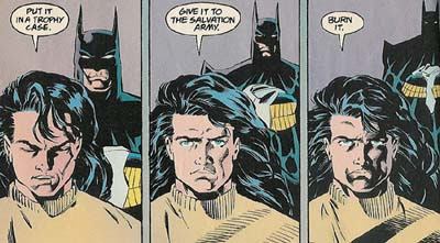
The changes in similar panels don't have to be so physical, though. Here's a sequence from the first Nightwing miniseries, collected in Ties That Bind, by Dennis O'Neil and Greg Land. Dick Grayson has decided to get out of the vigilante business. (I suspect that his hair was taking up a lot more of his time than he'd expected.) He's telling Batman what to do with his costume.
 With each panel, Dick's face grows darker, and the Batman more distant. The similar but changing images convey the protagonist's mood.
Repetitive images can also focus our attention on one changing detail which might otherwise be lost, such as the grin that appears on "Batman's" face in the second panel below. That's all the clue that Nightwing needs, trained detective that he is.
 That sequence is from JLA/The Titans: The Technis Imperative, by Devin Grayson and Phil Jimenez.
Repetitive images are also a tool for pacing. Seeing two similar panels, especially with no word balloons, tells us that time passes even when we don't see change. In the next sequence, Batman asks the third Robin, Jason Todd, to explain what happened to the rape suspect who was just with him on that balcony.
 Batman's figure stays the same, so we sense he's waiting and waiting for an answer. These panels are from Batman, #424, script by Jim Starlin, art by Mark "Doc" Bright and Steve Mitchell.
Given how repetitive panels affect pacing, they can also be used for comic effect. After all, what's the key to comedy?
Timing. In the next sequence, the adult mentor of the teen-aged superhero group Young Justice orders Tim Drake as Robin and his speedy friend Impulse not to search for their missing comrade Secret.
 This page comes from an uncollected issue of Young Justice, script by Peter David and drawing by Todd Nauck.
The brief, silent passage of time created by wordless panels in each of the last three examples is the equivalent of what screenwriters have come to call a beat. Such a silence can be hard to convey in prose, and The New Yorker has caught some lazy novelists instructing readers that characters "waited a beat" before they speak.
The visual dimension of comics makes it easy to convey that silent moment. Here's yet another example, from the current teen-superhero magazine to feature Robin, the third volume of The Teen Titans.
 This deathless conversation was published in the volume Teen Titans/Outsiders: The Insiders. Scripted by Geoff Johns, penciled by Matthew Clark, inked by Art Thibert.
That last example also hints at something I don't like about how comics artists are applying this technique today. Many artists now work on computers ("penciled" and "inked" are just digital metaphors). That makes it awfully tempting to copy and paste an image from one panel to the next, especially when working under a tight deadline. The three-panel sequence of Nightwing and his hair far above is obviously hand-drawn, and the artists made many changes, large and subtle, from one panel to the next. But the two images of Robin above are identical down to the cross-hatched shadows and coloration.
A growing number of copy-and-paste jobs strike me as having been done without enough regard for the dramatic needs of the scene. This last example comes from Outsiders: Looking for Trouble, script by Judd Winick, art by Todd Raney and Scott Hanna. In these panels, it makes sense to draw the redhead the same because he's making a deadpan joke. His expression shouldn't change. But doing the same for Nightwing just looks like laziness. And using the same image for two panels with different characters talking apparently means that neither can be shown with his mouth open.
 The only place I enjoy watching cardboard cutouts talk to each other like that is Wondermark.


1 comment:
After posting this, I realized in the last example that the letterer didn't even both to change the size of the speech balloon from the first panel to the second to fit Nightwing's fewer words.
Post a Comment