Let's Get Messy
 What's the deal with British book designers? With a few exceptions (Salman Rushdie's Satanic Verses), I much prefer American covers. But that's not just a mild liking. In many cases UK presses' choices just baffle me. I recall hearing a sales manager suggest that the same aesthetic behind British book jackets also infuses British fast-food breakfasts.
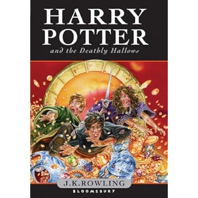
Here's the latest example, the UK children's edition of Harry Potter and the Deathly Hallows. This book is supposed to be the culminating battle of good versus evil, right? And the young protagonists' coming-of-age? Instead, it looks like Ron, Harry, and Hermione have just won big on Fun House. I expect to see a mulleted J. D. Roth clapping on the spine.
The American wraparound jacket produces a greater sense of foreboding and confrontation, though the caption that occurs to me is, "Stop Snitchin'!" Surely Harry and Voldemort won't resolve all their differences in a quidditch stadium, will they?


4 comments:
And why-oh-why does Harry have buckteeth??
I actually like the British cover better than the American one. It has all three of the heroes, as opposed to just Harry, which is a big sell for me. The American cover just struck me as really boring, like it was calculated to be as free of information as possible. I see your point about the treasure around them, but I like that Ron is holding the sword, it suggests that there's a point to the whole situation.
Ron is not holding the sword: a house-elf is (presumably either Dobby or Kreacher).
And it's about time that house-elf plot moves forward.
Post a Comment